Editorial SaaS Insights Landing Page Template
Byline is a premium editorial SaaS landing page built on a masonry gallery layout and a Warm Stone color system. It reads like a printed quarterly journal and converts anonymous readers into known subscribers through a five-question diagnostic quiz. Designed for SaaS founders, product marketers, and growth ops leads, it makes deep-dive content feel as authoritative as it looks.
by Rocket studio
Quick summary
Byline is a single-page editorial SaaS landing page template built around a masonry gallery, a typographic chapter-style hero section, and a persistent "Find Your SaaS Blind Spot" quiz ribbon. The Warm Stone palette and sharp serif typography give every scroll the weight of a premium printed journal, while the five-step diagnostic modal converts curious readers into identified subscribers without asking them to fill out a generic sign-up form.
Who this template is for
This template speaks directly to anyone building a premium content brand inside the SaaS industry. It is especially strong for publication-style projects where thought leadership and lead generation need to coexist on a single landing page.
- SaaS founders and co-founders at Series A through C stage who publish longform growth analysis and want their landing page to match the depth of their writing
- Product marketers and growth ops leads who need a well designed landing page that positions their content as authoritative, not promotional
- Early stage startups launching a content-led acquisition channel and looking for a high converting SaaS landing page template without building from scratch
What problem this template solves
Most SaaS content sites feel like dressed-up blog archives. They present articles without hierarchy, offer no clear value proposition to first-time visitors, and give readers no reason to identify themselves. The result is high bounce rates and anonymous traffic that never enters the conversion funnel.
- A flat article list wastes the editorial authority you have already built and fails to communicate clear benefits to potential customers in the few seconds they take to judge your page
- Generic newsletter pop-ups interrupt reading without offering personalized value, which means more visitors leave before the call to action ever registers
- Without structured social proof placement, reader testimonials and success stories get buried below the fold where they have no impact on trust
What you get with this template
This template delivers a complete, opinionated layout for a premium SaaS editorial landing page. Every section is purpose-built, from the typographic hero image to the quiz modal to the social proof strip.
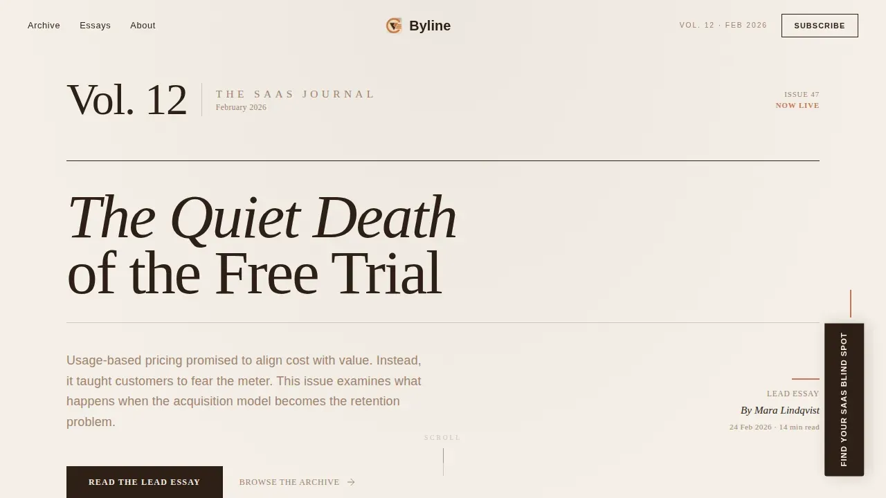
- A full-width Chapter/Book hero section with a large serif volume numeral, a bold headline, a thin rule divider, a one-sentence deck, and a paper-grain texture background
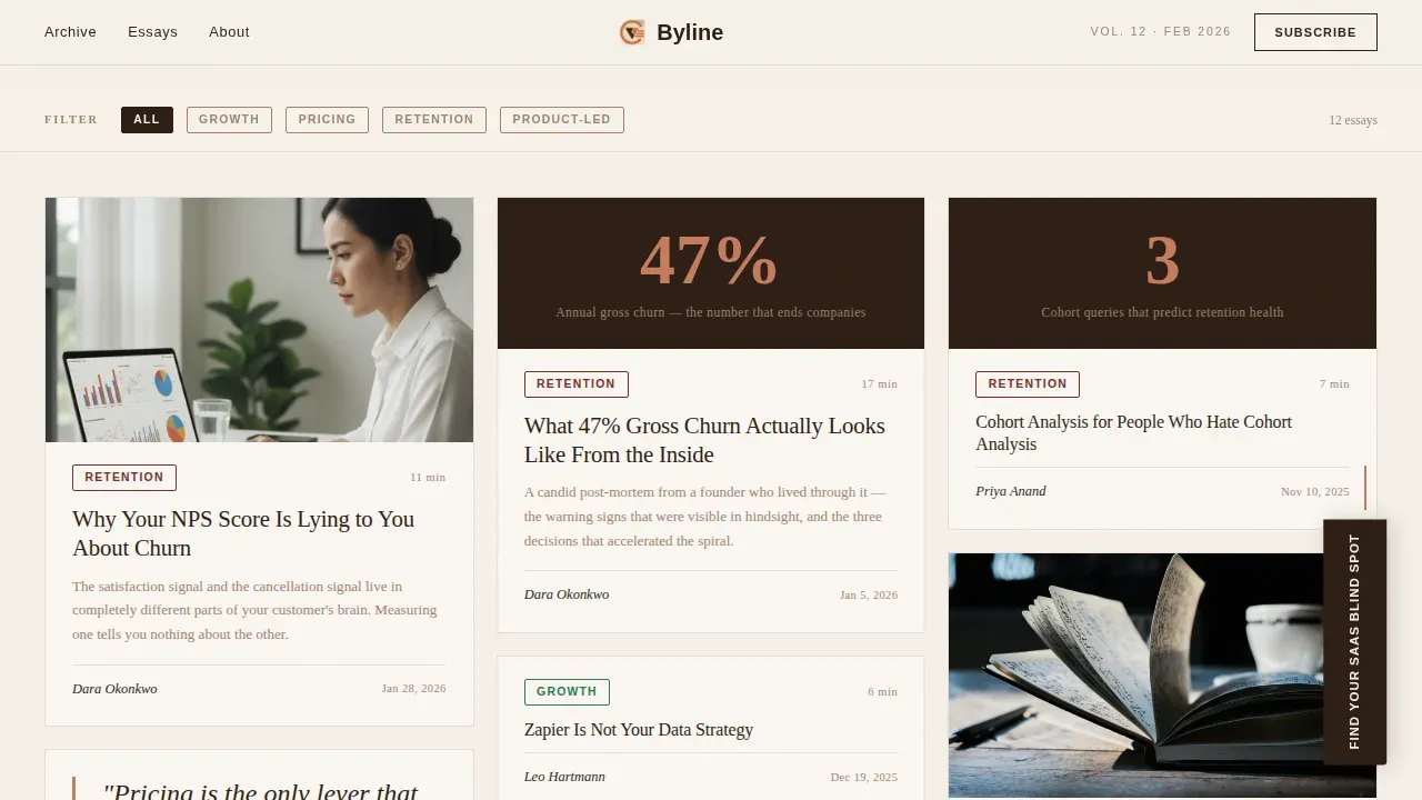
- An asymmetric masonry gallery of article cards in varying heights with a sticky category filter rail, stagger-in scroll animation, and cascade reshuffle on filter selection
- A five-question "Find Your SaaS Blind Spot" diagnostic modal styled as an editorial questionnaire, delivering a personalized reading list on screen and to the reader's inbox
Feature list
This section walks through the key features built into Byline and explains what each one does for your landing page and your readers.
Typographic Chapter Hero Section
The hero section opens like the title page of a printed volume. A large serif numeral ("Vol. 12") anchors the top-left corner, a bold headline spans the center, and a thin horizontal rule separates the headline from a one-sentence deck and a byline date. There is no hero image in the photographic sense; the typography itself functions as the visual. A subtle paper-grain texture sits in the background, adding tactile depth to a backlit screen without distracting from the clear headline. Including a strong editorial byline just below this opening establishes experience, expertise, authority, and trust (E-E-A-T) from the first scroll position, making the entire landing page feel more credible than a standard blog index.
Masonry Gallery with Category Filter Rail
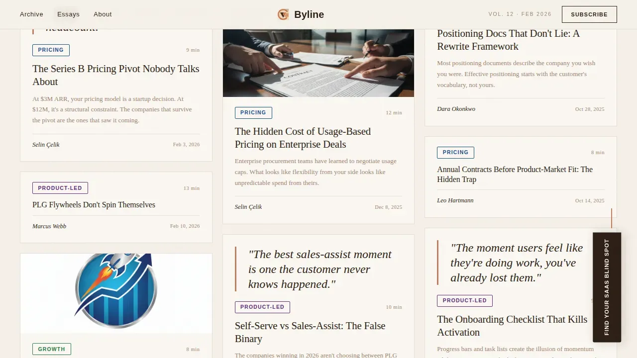
The gallery section renders article cards in an asymmetric Pinterest-style masonry grid. Cards vary in height and width: some carry pull-quotes, some display data callouts, and some show only a headline and a category pill. A sticky filter rail at the top of the section lets readers narrow content by theme, Growth, Pricing, Retention, or Product-Led, and each filter click triggers a gentle cascade reshuffle animated with GSAP ScrollTrigger. The stagger-in effect as cards enter the viewport mimics walking past framed pieces in a gallery corridor, rewarding scroll with visual rhythm rather than a static wall of links. These interactive elements keep user engagement high and give the landing page a sense of curation rather than accumulation.
Five-Step Diagnostic Quiz Modal
The primary conversion tool on this landing page is a persistent bookmark-ribbon element fixed to the lower-right corner. Clicking it opens a five-question modal styled as an editorial questionnaire. Each question occupies its own screen with a progress bar rendered as chapter markers. The five questions cover current ARR range, primary growth motion, biggest reported bottleneck, team size, and one open-ended prompt about what keeps the reader up at night. On completion, the visitor receives a personalized reading list mapped to their diagnosed gap, delivered both on screen and to their inbox. This entire process converts an anonymous reader into a known subscriber without a conventional sign-up form, which is one of the sharpest lead generation mechanics available on a content-led SaaS landing page.
Featured Deep-Dive Section
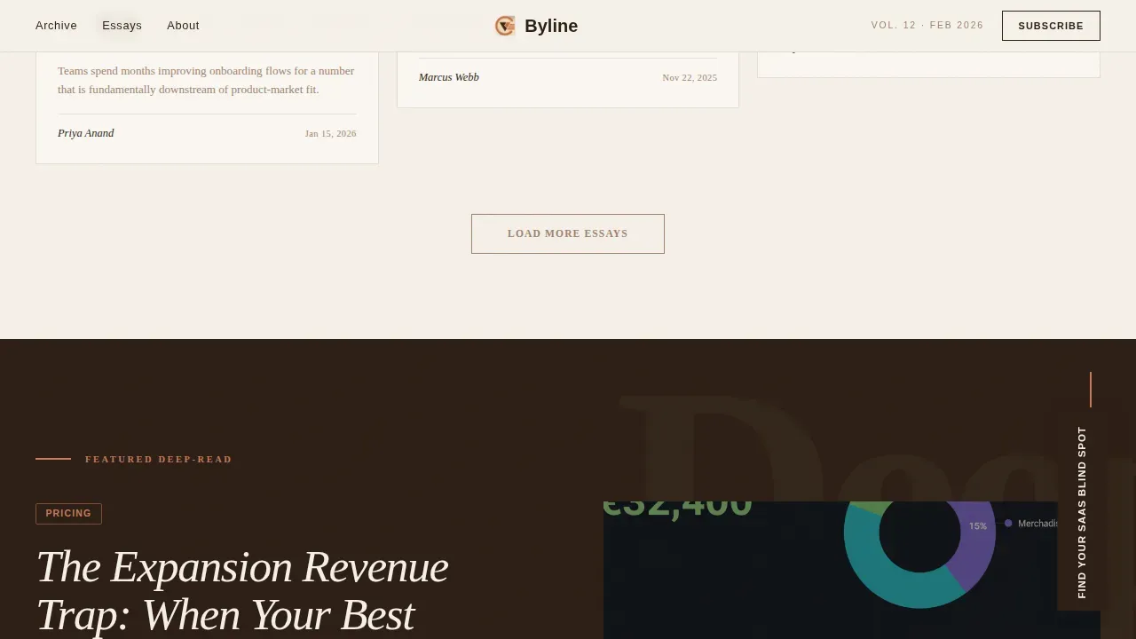
Below the masonry gallery sits a full-width editorial feature section. It presents a single long-form article with a large pull-quote and a data callout block, giving the most substantive piece of content on the site a dedicated stage. This section functions as a showcase for the publication's analytical depth, demonstrating the product features of the editorial brand to first-time visitors who may not scroll through the full gallery. The layout mirrors the visual grammar of a magazine center spread, with generous white space and espresso-ink typography commanding full attention.
Reader Voices Social Proof Strip
The testimonials section presents quotes from founding team personas with role and company attribution. Social proof placement here is deliberate: testimonials appear after the gallery and deep-dive, once the reader has already experienced the content quality, so the quotes arrive as confirmation rather than cold persuasion. The section can include user stats, such as a subscriber count metric, to build credibility further. Video testimonials are supported in the layout if you want to showcase video testimonials from real readers in future iterations. Customer testimonials with clear context provide instant credibility to potential customers who arrive via referral or search.
Warm Stone Design System
The entire landing page runs on a four-color Warm Stone palette: sandstone cream (#F5F0E8) as the dominant canvas, deep espresso ink (#2C1E14) for all body text and headlines, kiln-fired clay (#A0826D) for card borders and category pills, and muted terracotta (#C67B5C) reserved for hover states, pull-quote borders, and active filter tags. Fraunces serves as the serif display face for all headings and pull-quotes, while DM Sans handles body copy. This web design system is warm without feeling soft and intellectual without feeling sterile, qualities that distinguish this template from dark mode alternatives or clinical SaaS product landing pages.
Page sections overview
| Section | Purpose |
|---|---|
| Chapter Hero | Sets editorial tone with typographic title-page composition, volume numeral, bold headline, rule, and paper-grain texture |
| Masonry Gallery | Displays article cards in asymmetric grid with sticky category filter rail and stagger animation |
| Featured Deep-Dive | Showcases one long-form article with pull-quote and data callout in a full-width editorial layout |
| Quiz Ribbon Modal | Persistent call to action ribbon opens five-question diagnostic, delivers personalized reading list and captures subscriber email |
| Reader Voices | Testimonials from founding team personas with role, company, and optional subscriber count metric |
| Footer | Horizontal flow footer pattern with navigation, publication credits, and final call to action |
Design & branding system
Byline's visual identity is rooted in the aesthetics of a leather-bound quarterly journal. Every design decision serves the editorial tone first and the conversion goal second, which is exactly how a well designed landing page in this niche should feel.
- Color system: sandstone cream (#F5F0E8) dominates the canvas; espresso (#2C1E14) carries all text; clay (#A0826D) defines borders and pills; terracotta (#C67B5C) appears only on interaction states, rewarding hover like a page corner folding under a thumb
- Typography: Fraunces (serif display) handles all headings, pull-quotes, and the hero numeral; DM Sans (body) handles paragraph text, category labels, and user interface elements; the pairing produces a clear visual hierarchy without relying on color contrast alone
- Texture and motion: a paper-grain background texture adds tactile depth to the hero section; GSAP ScrollTrigger powers the card stagger and filter cascade animations, giving the entire landing page a sense of physical weight and gallery-paced rhythm
Mobile & speed optimization
While Byline is designed desktop-first to serve readers in late-night debugging sessions, the layout is built to hold on smaller screens without losing its editorial character. A responsive mobile layout ensures the landing page remains usable and visually coherent across devices.
- The masonry gallery collapses to a single-column card stack on mobile, preserving the stagger animation and filter rail in a touch-friendly format
- Server Components handle the static hero, deep-dive, and testimonials sections, keeping the initial page load lean; Client Components are scoped to the quiz modal and masonry filter for interactivity only where needed
- The paper-grain texture and parallax effect are applied in a way that does not degrade the reading experience on lower-powered devices, ensuring saving time for the reader rather than waiting for assets to resolve
How this template helps you convert
A SaaS landing page is designed to convert visitors into leads or customers. The average conversion rate for SaaS landing pages falls between 3% and 5%, but top-performing pages can reach 10% or higher. Byline is structured to push toward that upper range by making the conversion feel like a natural editorial experience rather than a marketing interruption.
- The persistent quiz ribbon invites immediate action without blocking reading. It stays visible across the entire landing page scroll without interrupting the gallery or the deep-dive, so readers engage with content first and identify themselves when they are ready.
- The five-step quiz delivers a personalized reading list as the reward, which means the value proposition of subscribing is concrete and specific rather than a vague promise of "great content." This makes the call to action far more compelling than a standard email marketing opt-in form.
- Social proof from reader testimonials, combined with user stats in the testimonials strip, builds credibility at the exact moment a reader is deciding whether to trust the publication, reinforcing the conversion funnel before the reader reaches the footer.
Other information about this template
This section covers additional practical details and context that are useful for evaluating this template against other landing pages and similar design projects.
- If you are studying saas landing page examples to benchmark your own landing page, Byline draws from the same design grammar as some of the best saas landing page references in the SaaS industry. The masonry layout and quiz-driven conversion mechanic are distinctive among other landing pages in the editorial niche.
- Real world examples of high converting landing pages in the SaaS space, such as the ahrefs landing page which leads with product visuals, or Notion and Cursor which open with a clear headline and a sharp value proposition, all demonstrate that effective saas landing pages succeed by communicating a bold claim and a specific key benefit in the first viewport. Byline applies the same principle through its typographic hero image rather than a product screenshot.
- Many landing page examples in the SaaS content niche rely on dark mode palettes or minimal white layouts. Byline deliberately avoids dark mode to stay warm and tactile, which differentiates it from other landing pages targeting the same saas business audience.
- This template is well suited as a design project for teams building a content-led saas product brand. It ships with design assets including the Warm Stone color system, Fraunces and DM Sans font pairings, and all animation configurations, reducing time saved versus building the same system from scratch.
- Byline supports no code customization for teams who want to adjust copy, swap category filters, or update the quiz questions without touching component logic. For teams with development resources, the Client and Server Component split makes it straightforward to extend the quiz with product analytics or connect the email capture to an email marketing platform.
- The byline editorial saas insights landing page template is particularly effective for positioning founders and product leads as thought leaders. A byline editorial in this context is typically a 400 to 1,000 word piece written by a subject matter expert. Placing bylines just below the hero section makes the publication feel expert-driven and builds trust through demonstrated E-E-A-T signals.
- For teams exploring website templates across multiple categories, Byline sits at the intersection of a content brand and a high converting saas landing structure. It is not a general-purpose tool for task management apps or file hosting service pages; it is purpose-built for editorial SaaS publications targeting specific audience segments like growth-stage founders and operators.
- Build landing pages for content-led SaaS brands faster by starting from Byline. The entire landing structure, from hero to footer, is pre-configured, so your team can focus on writing and positioning rather than web design from scratch. Continuous improvement is straightforward: update article cards, add new categories to the filter rail, or refresh the quiz questions as your publication evolves.
- Social proof placement in Byline follows deliberate sequencing. Customer logos and brand logos can be added to the testimonials strip or positioned near the hero section to provide instant credibility to new users arriving for the first time. The layout supports customer testimonials with role, company, and optional photo attribution, which helps build credibility across the entire landing page.
- Interactive elements in the quiz modal include a progress bar styled as chapter markers, single-select and open-text question types, and an on-screen results card with a curated reading list. These interactive elements, combined with the filter-based masonry gallery as an interactive section, give more visitors a reason to engage beyond a passive scroll. User engagement is built into the structure, not bolted on.
- The key elements of an effective saas landing page, a clear headline, a strong value proposition, social proof, product features, and a focused call to action, are all present in Byline. The template demonstrates how a well designed landing page can address pain points with content depth rather than product screenshots, which is the core distinction of an editorial SaaS landing page versus a standard saas product page.
- This template is compatible with the Rocket.new platform, an AI-powered app builder that lets non-technical users generate and deploy production-ready pages from natural-language prompts. Rocket.new handles code generation, backend wiring, and deployment, which means early stage startups and product managers can launch their own landing page built on Byline without traditional programming. Rocket.new competes with other no code tools in the low-code space and offers a free trial with paid plans starting at $25 per month.
Theme
Editorial Magazine
Creative direction
Gallery Walk
Color system
Warm Stone
Style
Masonry/Pinterest
Direction
Quiz/Assessment
Page Sections
Typographic Chapter Hero Section
Masonry Gallery with Category Filter Rail
Five-step Diagnostic Quiz Modal
Featured Deep-dive Editorial Section
Reader Voices Social Proof Strip
Warm Stone Editorial Design System
Related questions
Who is Byline built for?
Can I customize the quiz questions and category filters?
Does Byline support adding social proof like testimonials and subscriber counts?
How does the quiz convert readers into subscribers?
Is this template suitable for a dark mode design?



