Honest SaaS Review Blog Landing Page Template
Byline is a single-page editorial landing page template built for the one-person SaaS review desk. It combines a broadsheet-style masthead, an origin-story scroll, a published rating rubric, and a three-step interactive stack quiz. The warm Ink & Paper design system and asymmetric 60/40 grid give every section the weight and credibility of a real publication.
by Rocket studio
Quick summary
Byline is a SaaS review blog landing page template with a broadsheet editorial identity. It is designed for a single reviewer who publishes honest, methodology-driven tool assessments. The page flows from a founder's frustration story through a transparent rating rubric, a featured reviews grid, and a three-step quiz that delivers a personalized tool-stack recommendation.
Who this template is for
This template is built for independent voices publishing in the SaaS review space. If you run a one-person editorial desk and want readers to trust your process before they trust your verdict, Byline is the right starting point.
- Solo SaaS reviewers and independent tech journalists who publish without a team
- Startup founders or operators who have turned their tool-evaluation process into a content product
- Freelance consultants building a newsletter-backed review brand to attract a loyal reader base
What problem this template solves
Most review sites look like affiliate directories. Readers can smell the commission before they finish the headline. This template solves the trust deficit by leading with methodology, not with star ratings. It shows the work before it shows the score.
- Founders comparing multiple project management tools have no reliable, bias-free source to consult
- Ops managers inherit SaaS bills they never approved and need a clear, honest audit trail
- Solo consultants are surrounded by affiliate noise and want one voice that shows its math
What you get with this template
You get a fully structured, single-page editorial layout that moves visitors from curiosity to conviction. Every section serves the origin-story creative direction, building trust by revealing process rather than pushing product.
- A full-width broadsheet masthead with a typographic headline, hand-drawn dateline, fictional volume number, and a torn-edge SVG border
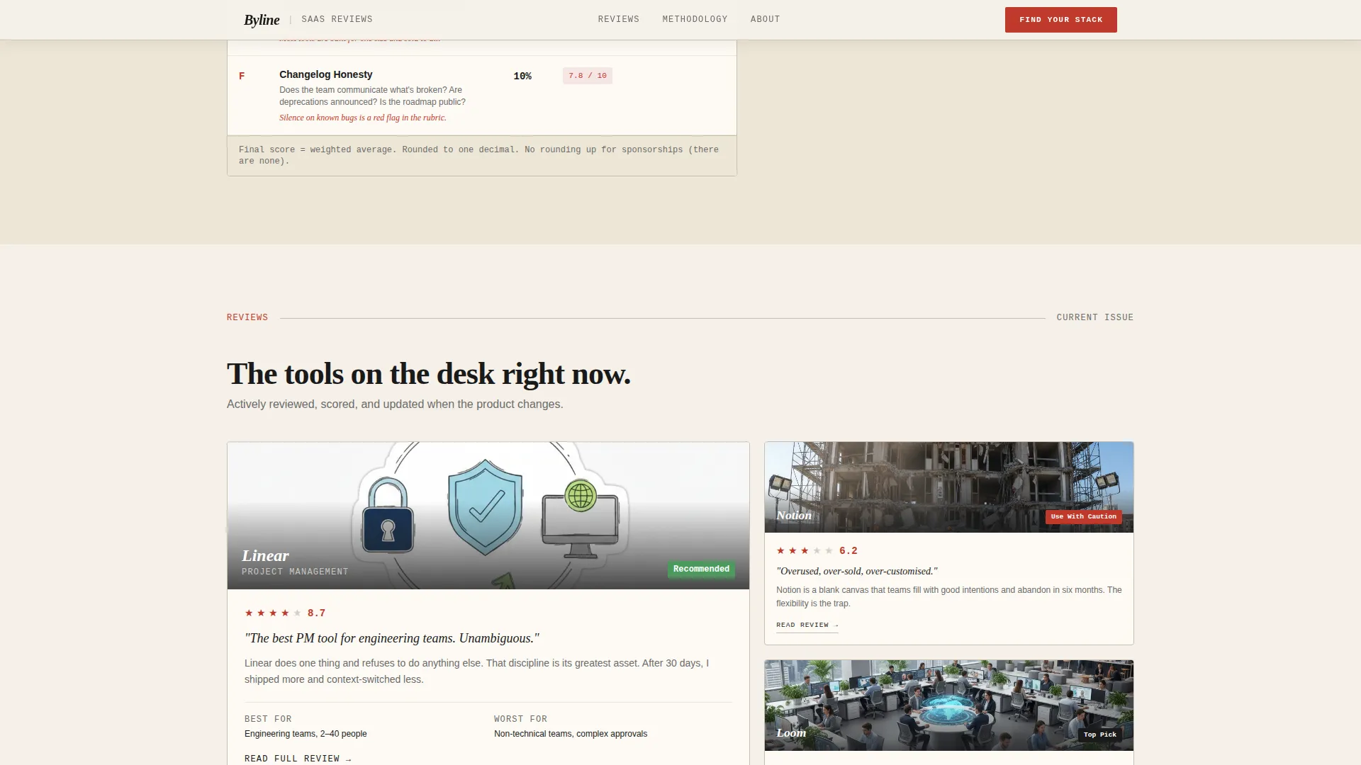
- An asymmetric 60/40 bento grid for featured reviews, with varied card sizes and rating callouts styled in marginalia red
- A three-step interactive stack quiz with role, pain-point, and team-size questions, plus a results view delivering three personalized tool recommendations with links to full reviews
Feature list
This section covers the core built-in capabilities that make Byline a functional and distinctive editorial landing page.
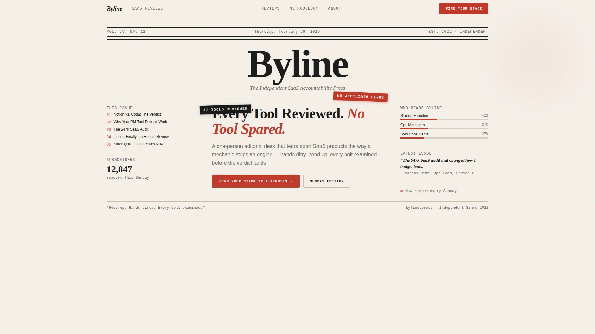
Broadsheet Hero Masthead
The header is a full-width typographic composition styled as a broadsheet front page. It includes a hand-drawn dateline, a multi-column headline reading "Every Tool Reviewed. No Tool Spared.", a fictional volume number, and a torn-edge SVG bottom border that bleeds into the first content section below it.
Origin Story Scroll Section
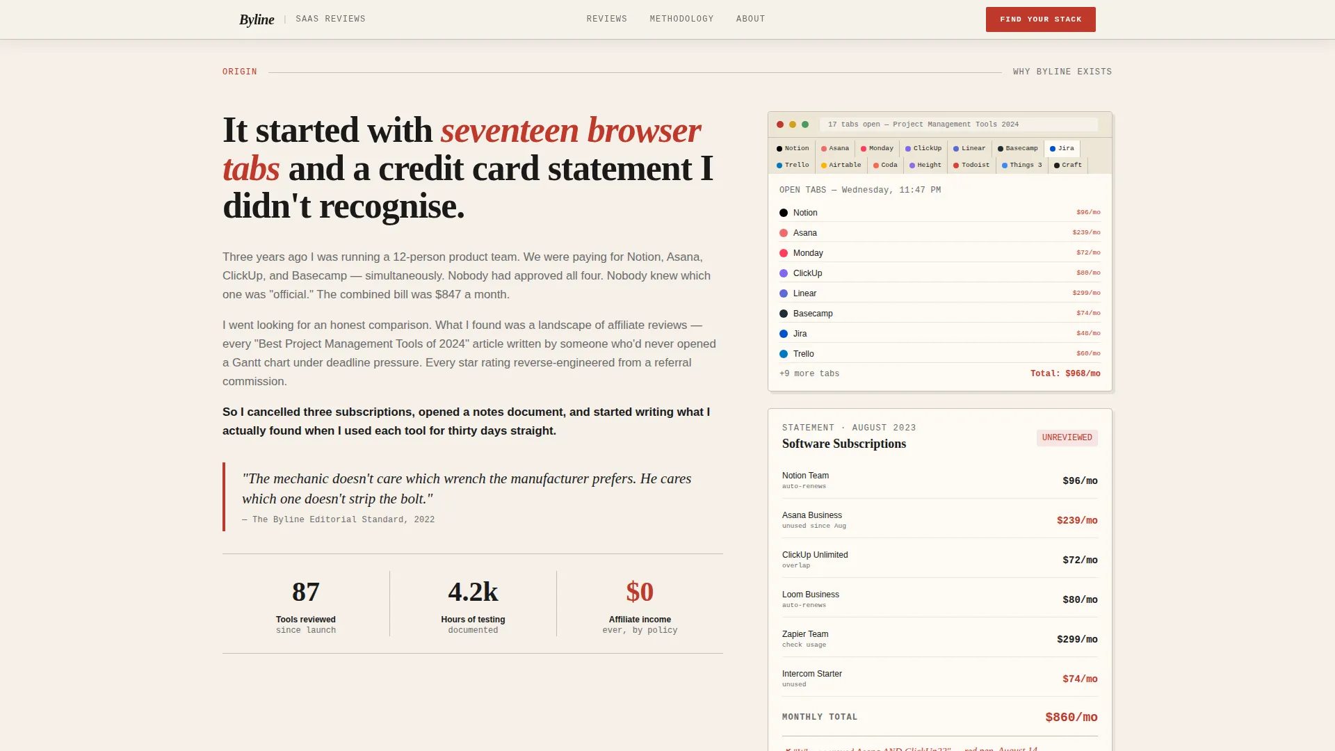
The page opens with the founder's frustration moment, visualized through a screenshot of seventeen open SaaS tabs and a credit card statement graphic. This section anchors the editorial voice in a real, relatable experience before any review content appears.
Transparent Rating Rubric Block
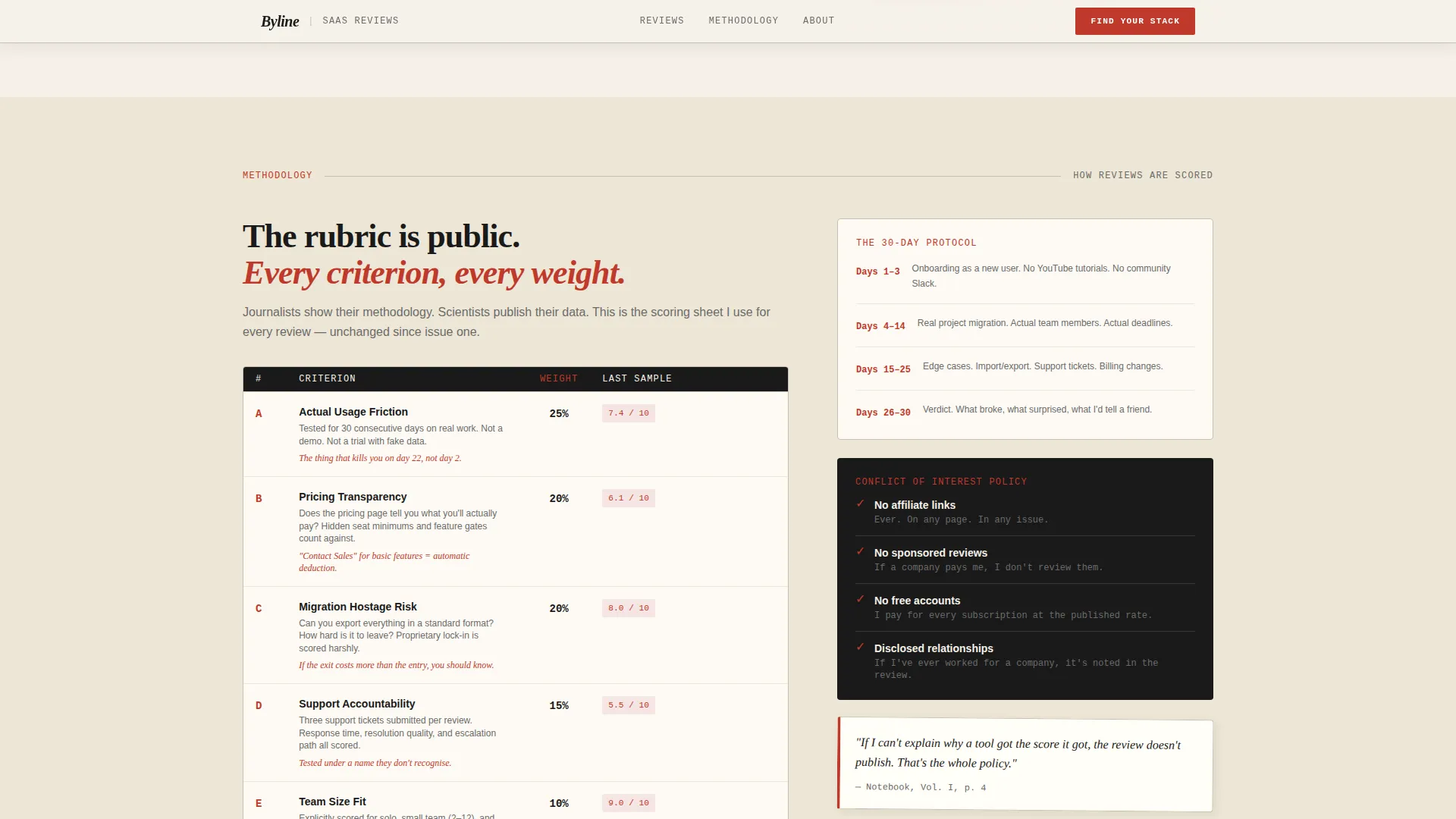
The scoring system is revealed like a journalist's methodology notes. Readers see exactly how tools are evaluated before they read a single review, which separates this template from every affiliate-driven alternative on the market.
Asymmetric Bento Reviews Grid
Featured reviews live in a 60/40 asymmetric grid with cards of varied sizes. Rating callouts appear in marginalia red, reinforcing the editorial color system throughout the content area.
Three-Step Interactive Stack Quiz
The primary call to action, labeled "Find Your Stack in 2 Minutes," launches a three-question quiz. Visitors answer their role, their biggest pain point, and their team size. The results screen delivers a curated three-tool stack with direct links to full reviews.
Newsletter Subscription Card
A secondary conversion path styled as a broadsheet subscription card reads "Get the Sunday Edition." It captures visitors who are not ready to take the quiz but want to stay in the reading habit, growing the subscriber base alongside the quiz funnel.
Page sections overview
| Section | Purpose |
|---|---|
| Broadsheet Hero Masthead | Sets editorial identity and frames the publication's core promise |
| Origin Story Block | Establishes founder credibility through a relatable frustration moment |
| Rating Rubric Reveal | Builds trust by exposing the scoring methodology before the reviews appear |
| Featured Reviews Grid | Showcases tool assessments in an asymmetric bento layout with rating callouts |
| Quiz Call to Action | Converts active buyers with a personalized three-tool stack recommendation |
| Newsletter Signup Card | Captures future readers with a low-commitment subscription offer |
| Editorial Footer | Closes the page with a minimal horizontal flow footer |
Design & branding system
The visual identity follows a Warm Artisan theme expressed through an Ink & Paper color system. Every design decision references the physical experience of reading a marked-up galley proof under lamplight.
- Color palette: aged newsprint cream (#F5F0E8) for backgrounds, fresh typeset black (#1A1A1A) for body text, marginalia red (#C0392B) for ratings and callouts, and pencil-lead gray (#6B6B6B) for secondary text and rule lines
- Typography pairing: a high-contrast serif face for editorial headlines combined with a monospaced face for data points, creating a visual contrast between authority and transparency
- Layout system: a 60/40 asymmetric grid gives the featured reviews section the uneven tension of a real broadsheet layout, with floating editorial badges and staggered scroll-reveal animations throughout
Mobile & speed optimization
The template is designed desktop-first to honor the broadsheet reading experience. A mobile fallback ensures the editorial identity holds at smaller screen sizes without collapsing the layout into a generic blog grid.
- Static sections use server-rendered components to keep initial load lightweight, while the interactive quiz runs as a client component only where interactivity is needed
- Scroll-reveal animations and staggered text effects are set to medium intensity, keeping the page lively without creating motion-heavy delays on slower connections
- The torn-edge SVG border and floating editorial badge elements are built to scale gracefully across breakpoints without distorting the masthead composition
How this template helps you convert
Every section of this template is sequenced to move a skeptical reader toward a decisive action. The conversion logic follows the origin-story arc, earning trust at each step before asking for anything in return.
- The masthead and origin story section qualify the visitor immediately. Founders and ops managers recognize their own frustration in the credit card statement visual, which creates instant relevance before any tool name appears.
- The rating rubric reveal deepens trust by showing the methodology. Readers who see a transparent scoring system are far more likely to trust the quiz results and click through to full reviews.
- The dual conversion path catches the full range of buyer readiness. Visitors ready to act take the quiz; visitors who want more time subscribe to the newsletter, keeping them in the funnel for the next edition.
Other information about this template
Byline sits at the intersection of the Blog and Editorial category, the SaaS Blog and Media subcategory, and the SaaS review blog niche. The template is built for a very specific editorial product, and that specificity is a feature, not a limitation.
- The template style is an Asymmetric Grid at a 60/40 ratio, which gives the featured reviews section editorial tension without requiring custom CSS overrides
- The creative direction is Origin Story, meaning the scroll sequence is intentional: every section earns the next one rather than dumping all content in a flat hierarchy
- Social proof elements include role-specific reader quotes, a subscriber count display, and a review count metric, all positioned to reinforce the publication's credibility before the quiz call to action
- The footer follows a minimal horizontal flow pattern, keeping the closing section editorially clean without adding visual noise after the newsletter card
- Animation intensity is set to medium, using scroll reveals, staggered text, and floating badges to add motion without overwhelming the reading experience
Theme
Warm Artisan
Creative direction
Origin Story
Color system
Ink & Paper
Style
Asymmetric Grid (60/40)
Direction
Quiz/Assessment
Page Sections
Broadsheet Masthead with Torn-edge Border
Origin Story Scroll with Visual Assets
Published Rating Rubric Display
Asymmetric Bento Reviews Grid
Three-step Interactive Stack Quiz
Sunday Edition Newsletter Card
Related questions
Can I change the quiz questions and results?
Does this template work for a brand-new publication with no audience yet?
Can I use this template for multiple SaaS review categories?
Are the masthead headline and dateline editable?
How do I connect the newsletter card to an email platform?



