Sports Blog Blog Website Template
Cadence is an asymmetric 60/40 landing page template built for creator-led cycling blogs. It pairs a handheld video hero with a blinking-cursor creator intro, scrolls through long-form content pillars with hand-lettered marginalia, and anchors conversion in a five-question riding-style quiz that sorts readers into personalized newsletter tracks.
by Rocket studio
Quick summary
Cadence is a single-page template designed for cycling bloggers who write with literary ambition. The 60/40 asymmetric grid creates a journal-like reading experience from the first scroll. A short-form reel hero, content-pillar sections, a mid-page quiz, and a newsletter footer work together to turn casual visitors into committed subscribers.
Who this template is for
This template fits creators who treat cycling writing as craft, not content marketing. It works best when the voice behind the publication is the main draw.
- Weekend century riders and gravel cyclists building a personal blog or newsletter
- Bike commuters and gear-focused writers who want a publication-style home base
- Creator-led cycling media projects that grow through reader trust, not paid traffic
What problem this template solves
Most blog templates treat every reader the same. Cadence solves the segmentation problem by qualifying visitors through a quiz before asking them to subscribe.
- Generic blog layouts flatten the creator's voice instead of amplifying it
- Readers arrive with different riding identities and leave without a reason to stay
- Standard calls to action miss the chance to match content to what each reader actually wants
What you get with this template
You get a fully structured single-page layout that moves a reader from curiosity to commitment. Every section has a defined role in that journey.
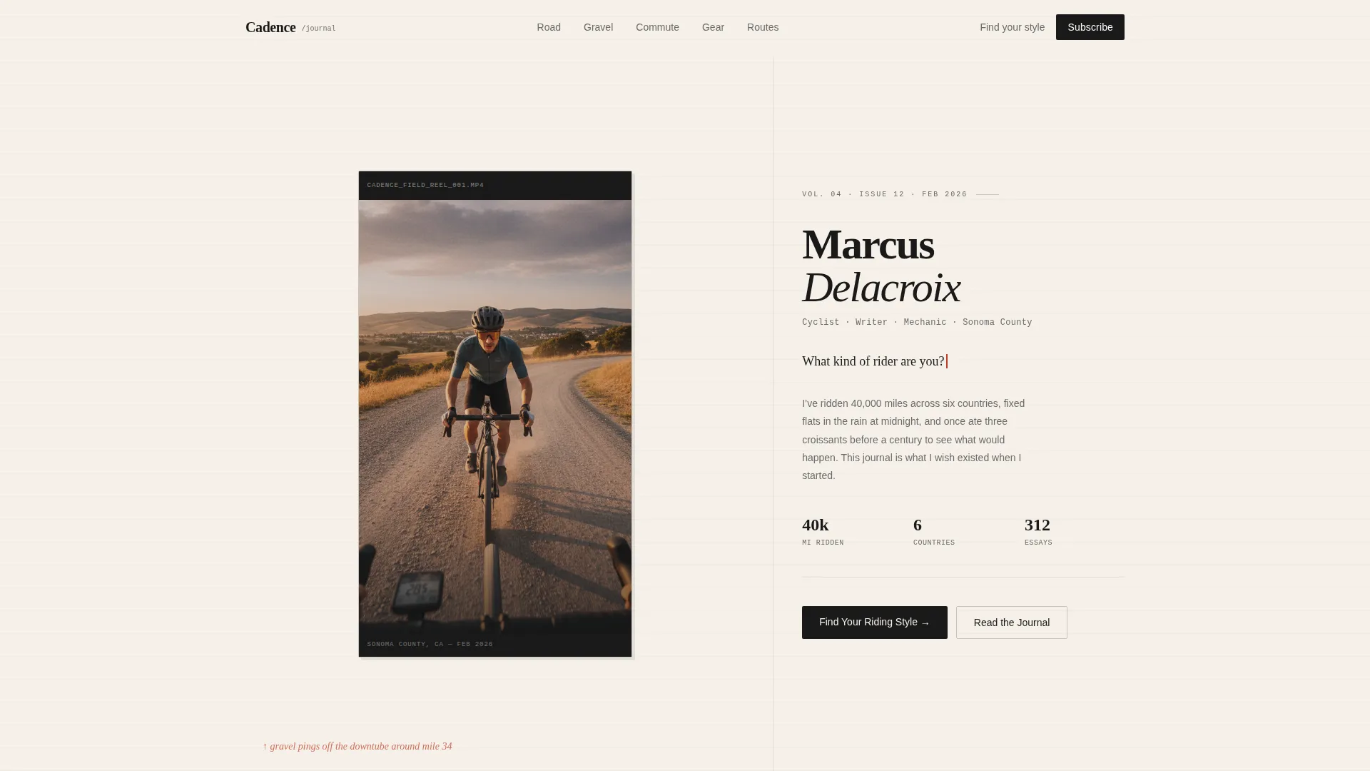
- An asymmetric 60/40 hero with a letterboxed handlebar-mount video on the left and a creator intro with an animated blinking cursor on the right
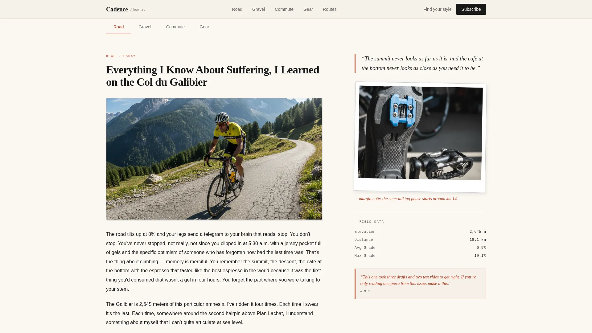
- Four content-pillar scroll sections pairing long-form excerpts with creator marginalia, gear polaroids, and pencil-scrawled ride stats
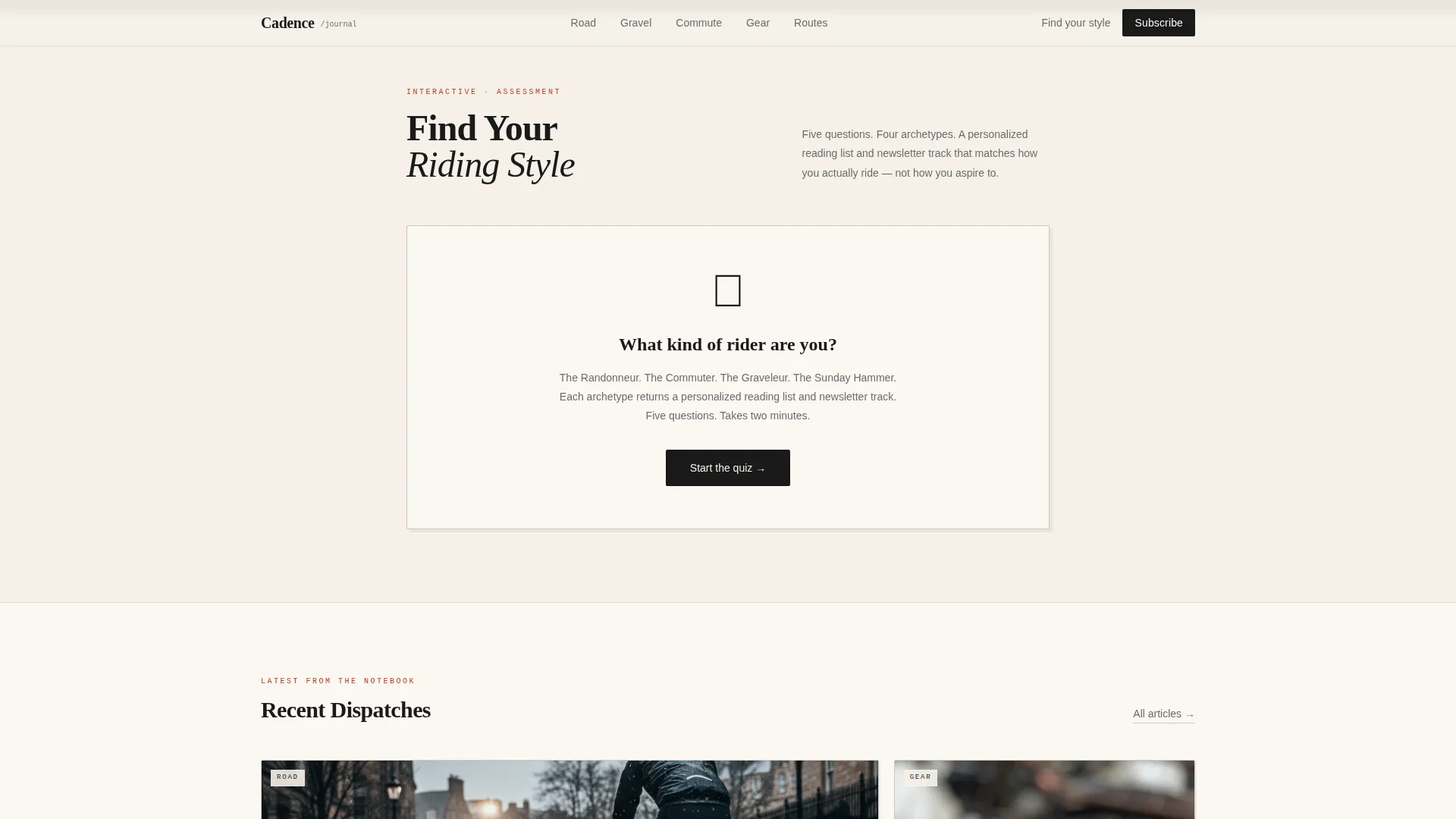
- A five-question illustrated quiz embedded mid-page, sorting readers into four archetypes with personalized reading lists
- A centered symmetric footer with a "Subscribe to the Notebook" call to action for visitors who skip the quiz
Feature list
This template is built around a specific reading and conversion flow. Each feature below comes directly from the page structure.
Asymmetric 60/40 Hero Layout
The hero splits into a 60-column video zone and a 40-column creator introduction. The video is letterboxed and plays a handheld golden-hour ride clip. The right column holds the creator's name, a byline, and an animated cursor blinking after a direct question to the reader.
Riding Style Quiz with Archetype Results
A five-question illustrated quiz sits after the third content section. Questions cover ride frequency, terrain, gear philosophy, distance comfort, and motivation. Answers sort readers into one of four archetypes: The Randonneur, The Commuter, The Graveleur, or The Sunday Hammer, each returning a personalized reading list and newsletter track.
Content Pillar Scroll Sections
Four scroll sections cover the blog's core topics: road, gravel, commute, and gear. The 60-column carries actual long-form article excerpts. The 40-column carries the creator's marginalia, including hand-lettered annotations, gear polaroids, and ride stats in a monospaced typeface.
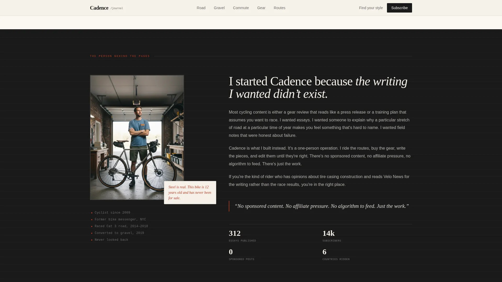
Creator Spotlight with Pull Quotes
A dedicated creator section builds authority through obsessive specificity rather than credentials. Pull quotes appear in margin red, drawing the reader's eye to the most resonant lines before they decide whether to subscribe.
Ink-Sketched Article Bento Grid
The "Latest from the Notebook" section presents recent articles in an asymmetric bento layout. Each card carries an ink-sketch category tag identifying its content pillar at a glance.
Scroll-Linked Reveal Animations
Sections reveal as the reader scrolls, using staggered article loads and scroll-linked transitions. The quiz includes its own state transitions between questions and result screens.
Page sections overview
| Section | Purpose |
|---|---|
| Hero: 60/40 Split | Introduce creator and blog with video and animated cursor prompt |
| Content Pillars Scroll | Showcase road, gravel, commute, and gear writing through paired excerpts and marginalia |
| Creator Spotlight | Build personal authority with pull quotes and specific detail |
| Riding Style Quiz | Segment readers into archetypes and deliver personalized reading lists |
| Latest from the Notebook | Surface recent articles with ink-sketch category tags in a bento grid |
| Footer Newsletter call to action | Capture subscribers who skipped the quiz via a centered signup prompt |
Design & branding system
The visual identity is built around an Ink & Paper aesthetic: analog warmth layered over mechanical precision. Every color decision reinforces the journal metaphor.
- Cream background (#F5F0E8) with ink black body text (#1A1A1A) and graphite secondary text (#6B6B6B) for a printed-page feel
- Margin red (#C23B22) used sparingly for highlights, pull quotes, and hover states, mimicking a handwritten editor's annotation
- Fraunces serif for headlines, DM Sans for body and interface text, and JetBrains Mono for stats and data fields
Mobile & speed optimization
The template is designed desktop-first, with a careful mobile adaptation built into the grid logic. The asymmetric layout collapses gracefully on smaller screens without losing its editorial feel.
- The 60/40 grid stacks vertically on mobile, keeping the video and creator intro readable at any screen width
- Client-side interactivity is scoped only to the quiz component and the blinking cursor, keeping the rest of the page static and fast to render
How this template helps you convert
Cadence converts through trust built incrementally across the scroll, not through a single aggressive call to action.
- The hero quiz prompt ("What kind of rider are you?") creates immediate personal relevance and pulls readers further down the page.
- The five-question riding-style quiz segments readers before they subscribe, so each archetype receives a matched reading list and newsletter track rather than a generic welcome email.
- The footer "Subscribe to the Notebook" call to action catches readers who engaged with the content but skipped the quiz, giving them a low-friction second entry point.
Other information about this template
This template is well suited to creator-led cycling publications that want a distinct editorial identity from day one. A few additional details worth knowing before you start building:
- The template is localized for English (US) with imperial measurements and US geography in mind
- Animation intensity is set to medium: scroll-linked reveals, blinking cursor, quiz state transitions, and staggered article loads are all included
- The design system references Moleskine-style analog warmth, making it a natural fit for any cycling blog that values voice and craft over algorithmic content
- The quiz archetype names (The Randonneur, The Commuter, The Graveleur, The Sunday Hammer) are built into the result screens and can be edited to match your own reader segments
- The footer follows a centered symmetric pattern, keeping the newsletter call to action balanced and uncluttered
Theme
Ink & Paper
Creative direction
Creator Spotlight
Color system
Ink & Paper
Style
Asymmetric Grid (60/40)
Direction
Quiz/Assessment
Page Sections
Asymmetric 60/40 Hero with Video
Five-question Riding Style Quiz
Content Pillar Scroll Sections
Creator Spotlight Section
Ink-sketch Article Bento Grid
Scroll-linked Reveal Animations
Related questions
Can I use this template without publishing a video in the hero?
How does the riding-style quiz work on mobile?
Do I need to keep the four content pillars as road, gravel, commute, and gear?
Is the newsletter footer connected to an email platform out of the box?
Can I edit the quiz archetype names and result content?



