Editorial Productivity Waitlist Landing Page Template
Cadence is an editorial productivity landing page template built for digital magazines and content-driven waitlist launches. It pairs a giant serif headline with a masonry creator card grid, a pinned waitlist banner, and an ink-and-paper color system to convert curious readers into signups before launch day.
by Rocket studio
Quick summary
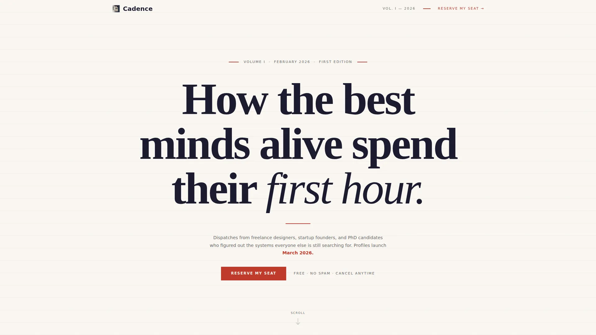
Cadence is a single-page waitlist template for a productivity editorial brand. It opens with a full-viewport serif headline, flows into a scrolling masonry grid of creator profile cards, and gates the full content behind a minimal email signup form. The design feels like a freshly printed broadsheet, high contrast, deliberate whitespace, and every element earning its place.
Who this template is for
This template is built for editorial founders and content creators who want to launch a productivity-focused digital magazine with real visual authority. It suits anyone who needs to capture early interest before a full site goes live.
- Freelance designers, startup founders, and deadline-driven creatives building a content brand
- Newsletter writers and editorial teams launching a productivity publication
- Indie makers who want a waitlist page that reads like a magazine, not a coming-soon placeholder
What problem this template solves
Most waitlist pages feel thin. They ask for an email but give readers nothing worth pausing for. Cadence solves the trust gap by showing enough editorial quality upfront to make the signup feel like gaining early access to something genuinely worth reading.
- Readers scroll past a striking headline and through a curated grid of creator cards before they ever see the form
- The "locked" card treatment creates intellectual curiosity without revealing everything too early
- A live waitlist counter and a purposeful dropdown question make the form feel active and worth completing
What you get with this template
You get a fully structured, single-page landing page designed around a waitlist conversion flow. The layout is editorial-first, built to feel credible before it asks for anything.
- A giant centered serif hero section with a red typographic rule and a dateline-style subhead
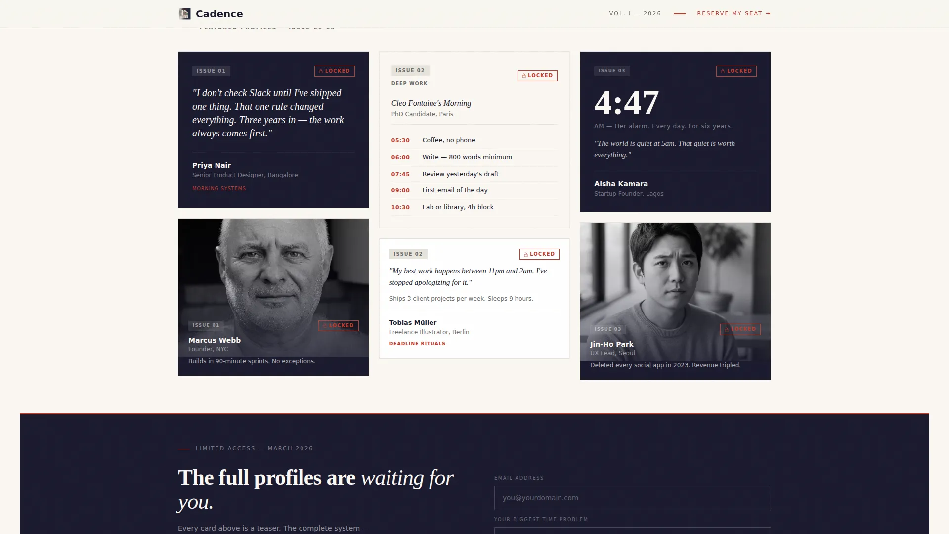
- A two-part masonry grid with ten creator profile cards at varied heights, pull-quotes, and locked tags
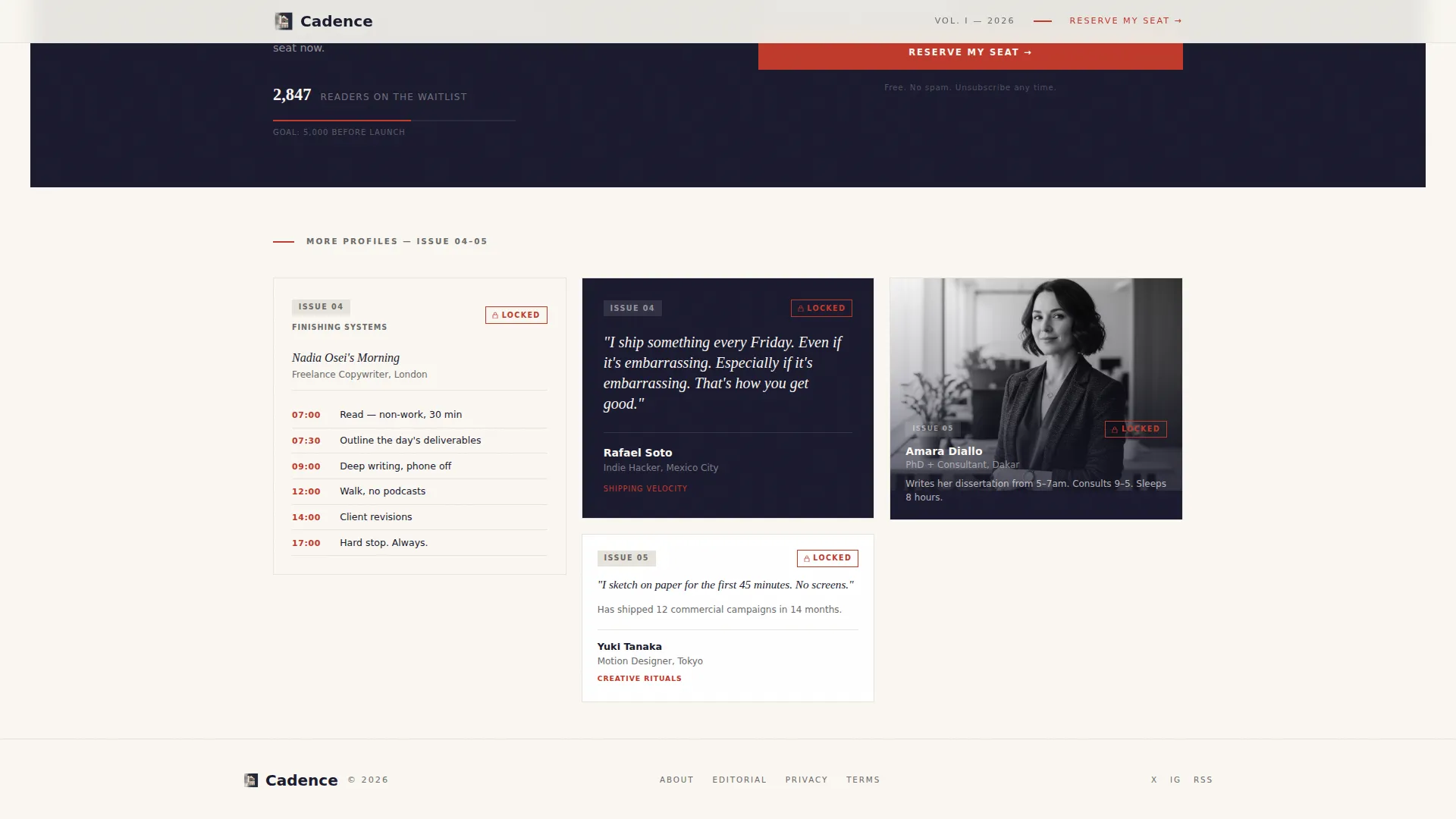
- A pinned waitlist banner with an email input, a single dropdown, and a live counter beneath the call to action
Feature list
This template is built around five core design and layout capabilities sourced directly from the brief.
Giant Serif Hero Section
The hero fills roughly eighty percent of the viewport with large serif type set in deep manuscript black on warm cotton stock. A thin red rule sits beneath the headline. A graphite-gray dateline subhead anchors the section without competing with the type. No images are used, the typographic conviction does all the work.
Two-Part Masonry Creator Grid
Ten creator profile cards are spread across two grid segments, separated by the waitlist banner. Cards vary in height and content type: some display large italic pull-quotes, others show cropped black-and-white portraits, and others feature photographed handwritten schedules. The variety makes the scroll feel like flipping through a magazine's table of contents.
Locked Card Treatment
Every creator card carries a small red "locked" tag. This signals that the full profile is behind the launch gate. The effect builds curiosity card by card, rewarding scroll depth and making the waitlist signup feel like the logical next step.
Pinned Waitlist Banner
A slim banner appears after the third row of the masonry grid. It contains an email address input and a single dropdown asking "What's your biggest time problem?" with options including Starting, Focusing, Finishing, and All of it. A live counter beneath the button shows the current waitlist size.
Ink and Paper Color System
The palette uses four values: deep manuscript black (#1A1A2E), warm cotton stock (#FAF7F2), pencil-graphite gray (#6B6B6B), and a single red editorial marker accent (#C0392B). The red is reserved strictly for links, timestamps, locked tags, and the call-to-action button, keeping visual noise at zero.
Scroll Animation and Interaction States
The template includes medium-weight scroll reveal animations and staggered card entrance effects. Creator cards have hover states. The live counter uses a counter animation on load. All interactions are built with a static-first, minimal JavaScript approach.
Page sections overview
| Section | Purpose |
|---|---|
| Hero headline block | Opens with giant serif type, red rule, and dateline subhead to establish editorial authority |
| Masonry grid part one | Displays six creator cards at varied heights to build scroll momentum and curiosity |
| Waitlist banner | Captures email and time-problem dropdown with a live counter below the call to action |
| Masonry grid part two | Continues with four more creator cards to reward scroll depth before the footer |
| Footer | Closes the page with a horizontal layout pattern |
Design & branding system
The visual identity follows a printed broadsheet aesthetic. Typography is set in Fraunces for serif display headings and DM Sans for body text, creating a clear editorial hierarchy that reads naturally at every viewport size.
- Color palette: manuscript black (#1A1A2E), cotton stock (#FAF7F2), graphite gray (#6B6B6B), and red marker accent (#C0392B) used sparingly
- The red accent appears only on links, timestamps, locked card tags, and the primary call-to-action button
- Whitespace carries most of the layout weight, keeping every element visible and intentional
Mobile & speed optimization
The template is designed desktop-first but includes strong mobile adaptation so the editorial experience holds across screen sizes. The masonry grid reflows cleanly for narrower viewports.
- Scroll reveal animations and staggered card effects are kept at medium weight to avoid heavy paint costs
- The static-first, minimal JavaScript build keeps the page lean by design
- The hero type scales down proportionally so the headline retains its visual impact on smaller screens
How this template helps you convert
Cadence earns the email before it asks for it. The conversion logic is built into the scroll sequence itself, not bolted on at the end.
- The hero headline sets a high editorial bar immediately, giving readers a reason to keep scrolling rather than bouncing
- Creator cards build proof of quality and intellectual curiosity across two grid segments, so by the time the waitlist banner appears, readers already feel invested
- The minimal form, one email field, one dropdown, one live counter, lowers friction at exactly the moment curiosity peaks
Other information about this template
This template sits inside the Blog and Editorial category, specifically built for the productivity and time management content niche. It is a strong fit for anyone launching a productivity blog, editorial newsletter, or content-led membership before full site launch.
- The template style is masonry and Pinterest-inspired, making it well suited for content brands that rely on varied visual pacing
- The waitlist direction means it is built to collect pre-launch signups rather than to sell a product or display a full archive
- The Moleskine-notebook aesthetic and broadsheet print sensibility make it feel distinct from generic blog templates in the same category
Theme
Editorial Magazine
Creative direction
Creator Spotlight
Color system
Ink & Paper
Style
Masonry/Pinterest
Direction
Waitlist/Coming Soon
Page Sections
Giant Serif Hero with Red Rule
Two-part Masonry Creator Grid
Locked Card Curiosity System
Pinned Waitlist Banner with Live Counter
Ink and Paper Color System
Scroll Animations and Card Hover States
Related questions
Can I change the headline and creator card content?
Does the live waitlist counter require a backend service?
Can I add or remove creator cards from the masonry grid?
Is the waitlist form connected to an email platform?
Who is this landing page template best suited for?



