Horology Podcast Landing Page Template
Caliber is a hub and spoke landing page template built for a serious horology podcast. It opens with a broadsheet-scale masthead, flows through a manifesto, episodes, philosophy, and hosts sections, and drives every visitor toward the play button. The editorial design uses ink black, warm cotton stock, and watch-hand gold to make the page feel like a first-edition monograph on watchmaking.
by Rocket studio
Quick summary
Caliber is a single-page, anchor-nav landing page template for a weekly watch collecting and horology podcast. It is designed to feel like unfolding a broadsheet newspaper: weighty, authoritative, and unhurried. The page converts curious visitors into listeners by making them feel they have already missed essential episodes, then places a gold-on-black play button directly in their path.
Who this template is for
This template is built for podcast creators who serve a deeply knowledgeable audience and refuse to chase the algorithm. It suits the host who wants their landing page to reflect the editorial seriousness of the content itself.
- Horology podcast hosts targeting serious watch collectors, vintage hunters, and authorized dealer waitlist navigators
- Watchmakers and trade professionals who want a publication-grade online presence
- Newcomers to the watch collecting world who want a credible, content-rich entry point
What problem this template solves
Most podcast landing pages look identical: a hero image, a list of episode tiles, and a subscribe button. That generic format fails audiences who expect the same depth from the page that they get from the show itself.
- Visitors have no reason to trust the podcast before they press play, so they leave without listening
- The page gives no editorial identity, making it indistinguishable from hundreds of other shows
- There is no clear hierarchy guiding a visitor from curiosity to commitment
What you get with this template
You get a complete, scroll-driven landing page that reads like a single editorial issue. Every section is a different department of the same publication, connected by a persistent anchor navigation bar.
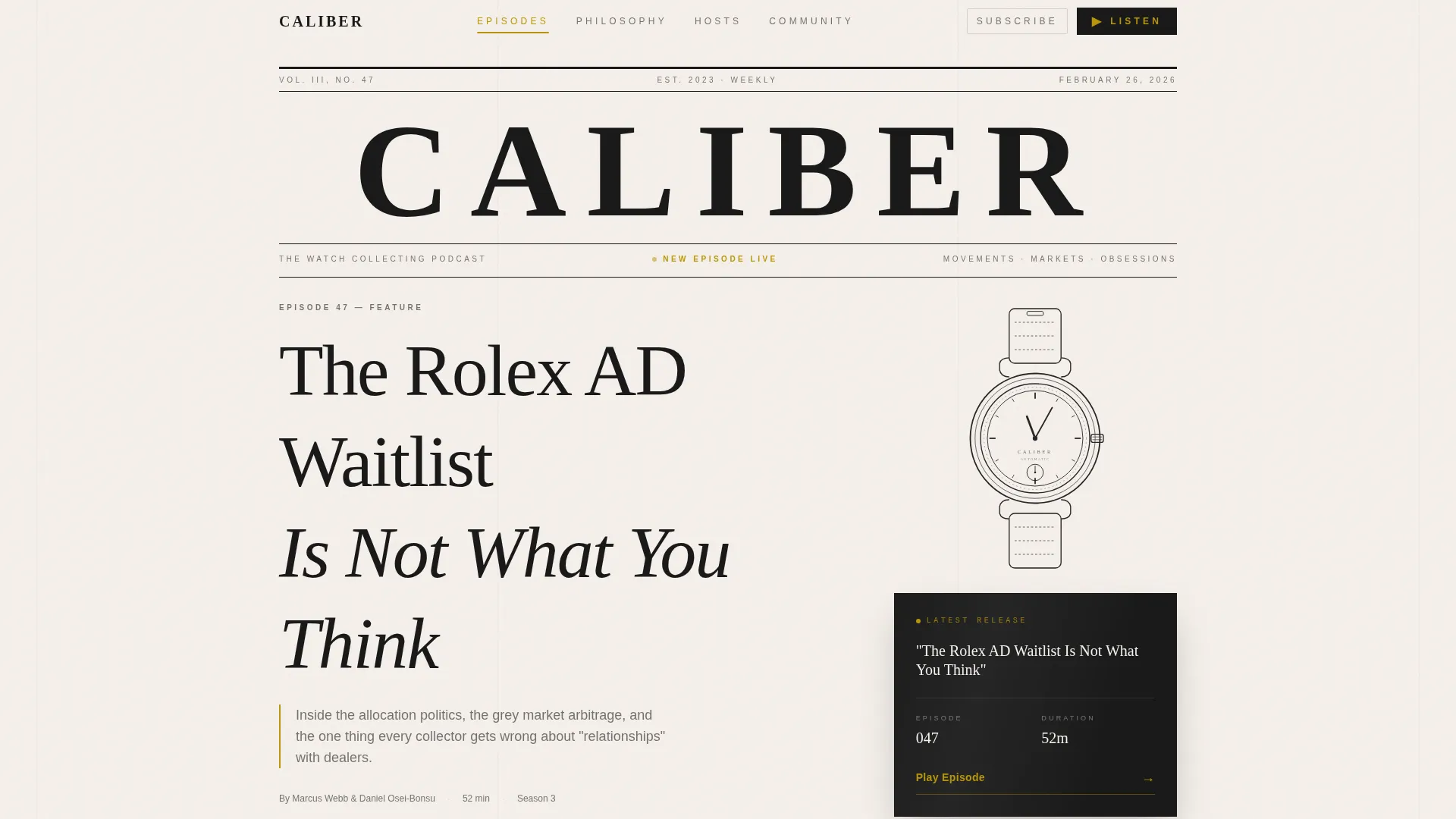
- A full-viewport newspaper masthead header with episode lead headline, dateline, and ink-line watch illustration
- A manifesto section, an episodes section, a philosophy section, a hosts section, and a minimal footer
- A persistent anchor nav with a gold indicator, a primary call-to-action, and a subscribe dropdown for Apple Podcasts, Spotify, and RSS
Feature list
Broadsheet Masthead Header
The header fills the full viewport and presents as a newspaper front page. It includes the masthead title in a high-contrast editorial serif, a dateline showing the latest episode number and release date, a lead headline set in enormous editorial type, a subhead that serves as the episode thesis, and a single ink-line illustration of the featured watch. There is no photography and no color beyond the defined palette.
Manifesto Section with Oversized Type
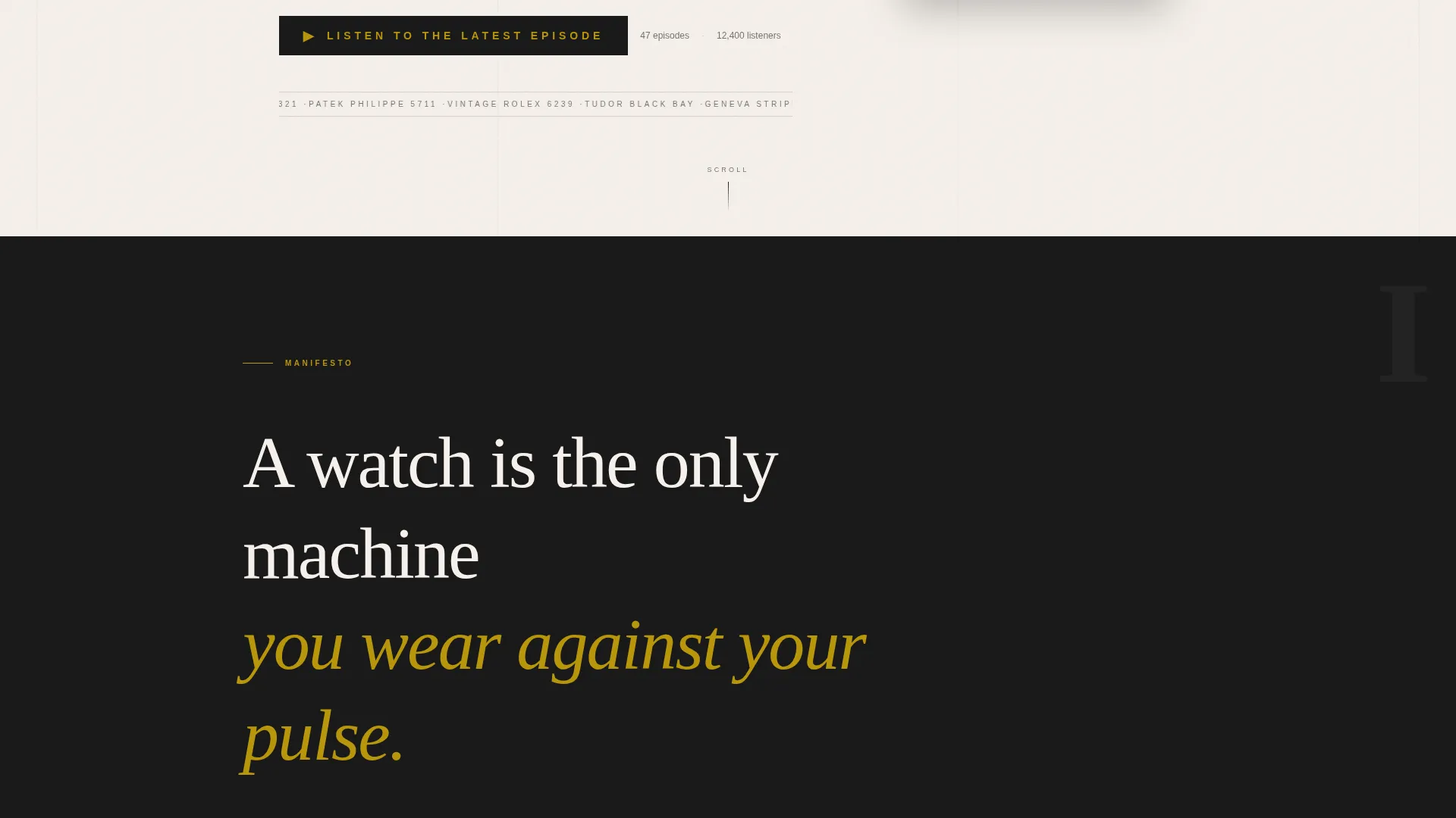
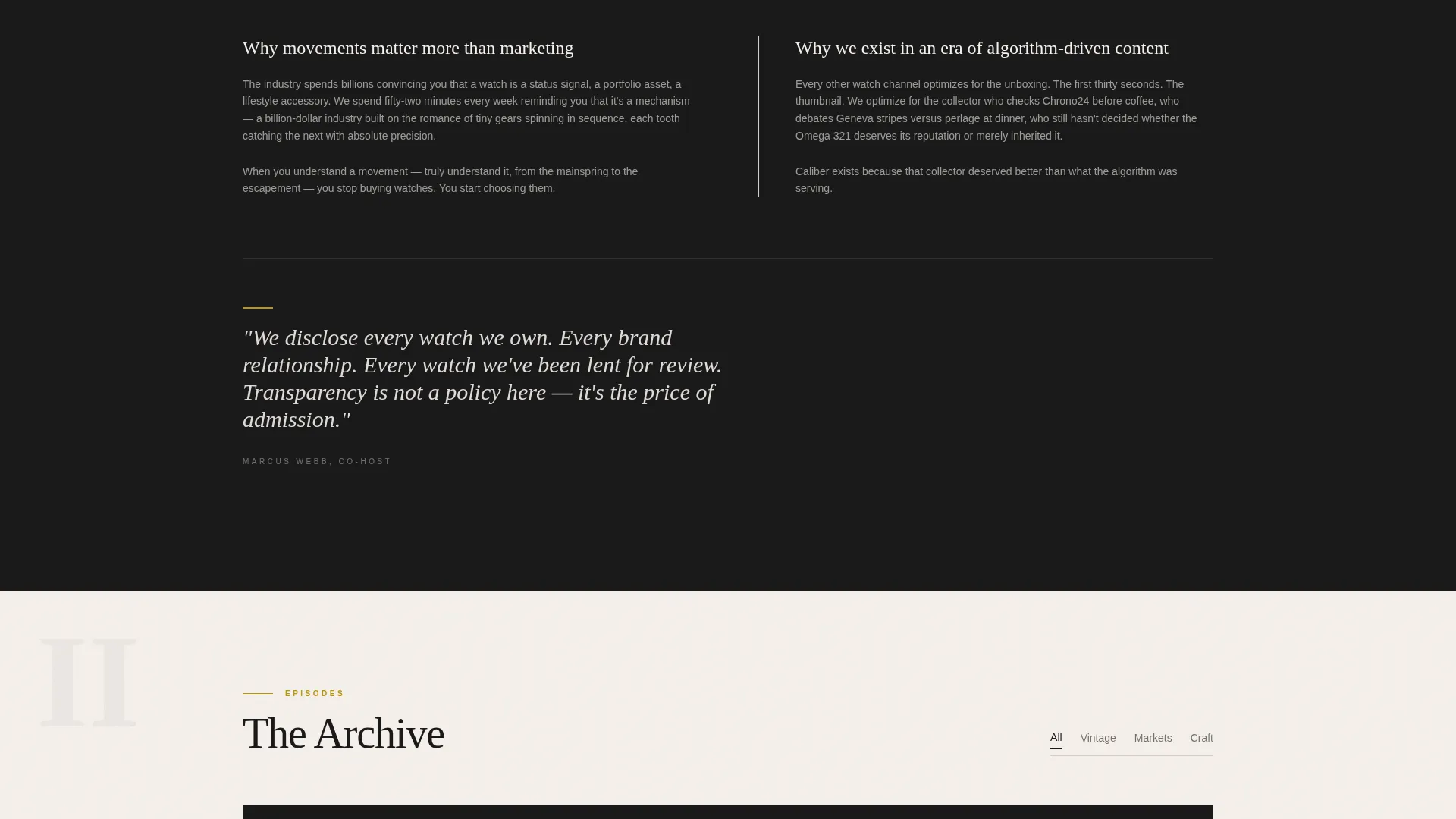
The first section below the fold opens with a single provocative sentence rendered in oversized type. Each following paragraph deepens the editorial argument, explaining why movements matter more than marketing and why the podcast exists in an era of algorithm-driven content. The scroll feels like turning through the opinion pages of a serious publication.
Anchor Navigation with Gold Indicator
A persistent anchor navigation bar links to every spoke section: Episodes, Philosophy, Hosts, and Community. The active section is marked with a watch-hand gold indicator. The primary call-to-action, "Listen to the Latest Episode," is always visible inside the nav, removing friction at every scroll position.
Episode Cards with Gold Play Buttons
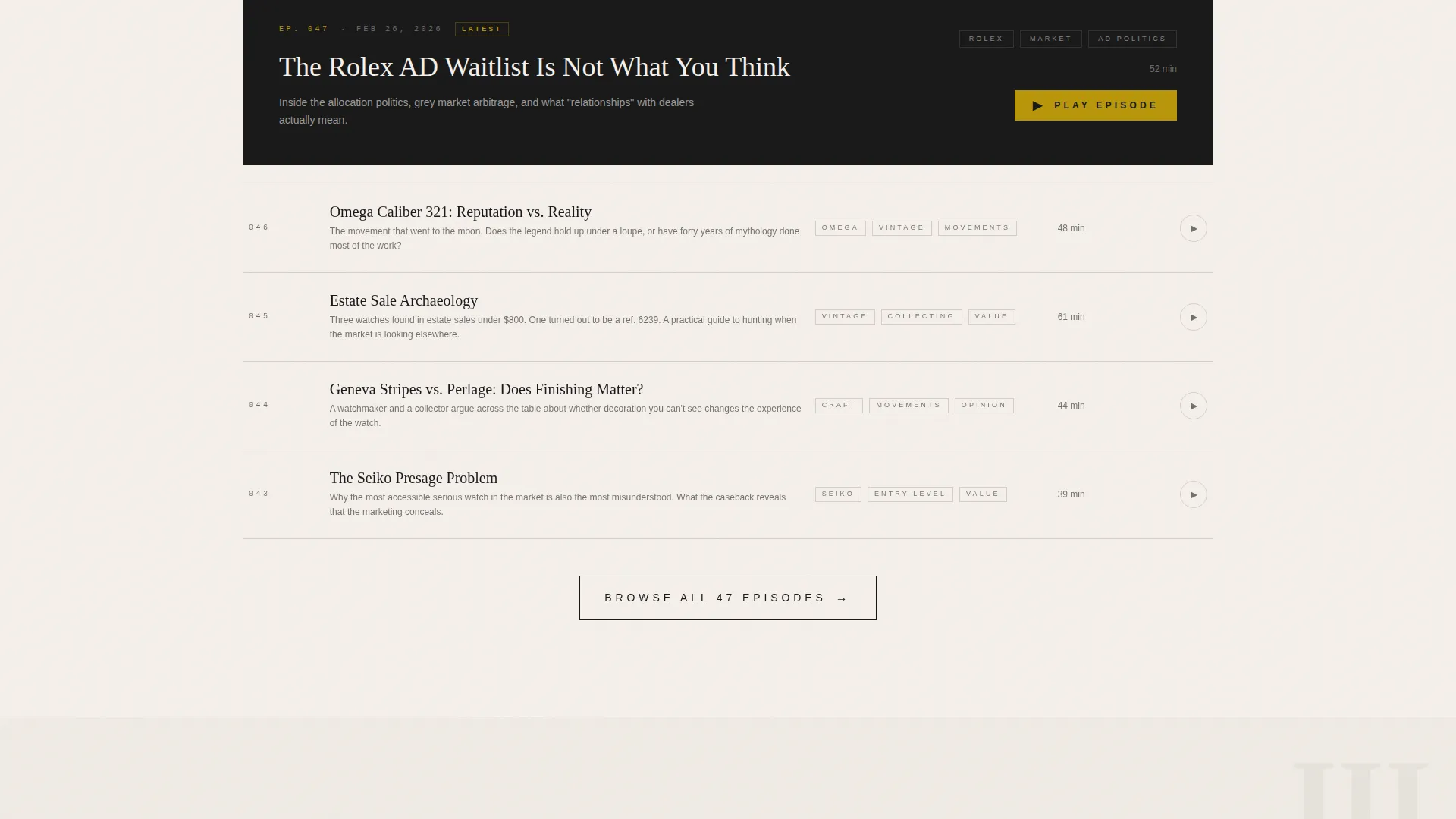
The episodes section presents recent episodes as editorial cards. Each card carries a gold play button, episode title set in the editorial serif, and a short thesis line. The layout echoes a newspaper section front, keeping the reading experience consistent with the rest of the page.
Hosts Section with Watch Disclosures
The hosts section is styled as publication bylines. Each host entry includes a name, a short editorial biography, and a transparent disclosure of the watches they personally own. This detail builds trust and signals the editorial integrity the show is built on.
Subscribe Dropdown with No Friction
A secondary call-to-action labeled "Subscribe on Your Player" opens a minimal dropdown. It offers direct links to Apple Podcasts, Spotify, and RSS. There is no form, no email capture, and no extra steps between the visitor and the subscription.
Page sections overview
| Section | Purpose |
|---|---|
| Newspaper Masthead Header | Sets editorial authority and surfaces the latest episode with a direct play call-to-action |
| Manifesto Declaration | States the show's beliefs in oversized type and draws the reader deeper into the page |
| Episodes Card Grid | Presents recent episodes as editorial cards with gold play buttons |
| Philosophy Pull Quotes | Argues why movements matter more than marketing using gold-accented pull quotes |
| Hosts Byline Section | Introduces hosts with publication-style bios and personal watch disclosures |
| Minimal Footer | Delivers horizontal flow links and subscribe options without visual noise |
Design & branding system
The visual identity follows a Luxe Minimal theme built on an Ink and Paper color system. Typography uses Fraunces for editorial serif headlines and DM Sans for body text and interface elements. The palette and type choices are constrained and deliberate, so every element feels purposeful.
- Colors: deep editorial black (#1A1A1A), warm cotton stock (#F5F0EB), aged newsprint gray (#D4CFC8), and watch-hand gold (#B8960C) reserved for links, play buttons, and the anchor nav indicator
- Illustration style: fine ink-line watch rendering with no photography and no additional color
- Animation: cinematic entrance transitions, scroll-linked section reveals, and staggered text entrances maintain momentum without distracting from the editorial tone
Mobile & speed optimization
The template is designed desktop-first to deliver the full broadsheet experience on wide screens. The layout remains fully responsive so the editorial hierarchy carries through to smaller viewports without breaking the reading experience.
- Server components handle static content to keep JavaScript minimal and page load lean
- Scroll-linked parallax and staggered text animations are scoped to avoid layout shift on mobile
- Typography scales fluidly so the Fraunces headlines retain their editorial weight on every screen size
How this template helps you convert
Every design decision on this page is aimed at lowering the distance between a first visit and a first listen. The page does not ask for anything from the visitor before delivering value.
- The masthead places the primary call-to-action, "Listen to the Latest Episode," in gold on black before the visitor has scrolled at all, then keeps it visible in the persistent anchor nav throughout the entire page
- The manifesto and philosophy sections build emotional investment, making the visitor feel they have already missed essential episodes before they reach the subscribe dropdown
- The frictionless subscribe dropdown for Apple Podcasts, Spotify, and RSS removes every barrier at the moment the visitor is ready to commit
Other information about this template
This template is part of the Blog and Editorial category and is specifically built for the watch collecting and horology podcast niche. It is a strong fit for any podcast that prioritizes editorial credibility over platform-driven design defaults.
- The template style is Hub and Spoke with anchor navigation, making it straightforward to customize each spoke section for a different show topic or episode theme
- The creative direction follows a Manifesto structure, meaning the scroll builds a persuasive argument rather than simply listing content
- The header concept is a Newspaper and Publication front page, which distinguishes the template from standard podcast landing pages that rely on photography or gradient backgrounds
- The landing page direction is Click-Through, meaning the entire page is structured to earn one action: pressing play or subscribing
Theme
Luxe Minimal
Creative direction
Manifesto
Color system
Ink & Paper
Style
Hub & Spoke (Anchor Nav)
Direction
Click-Through
Page Sections
Broadsheet Masthead Header
Manifesto Section with Oversized Type
Persistent Anchor Navigation
Episode Cards with Gold Play Buttons
Hosts Bylines with Watch Disclosures
Frictionless Subscribe Dropdown
Related questions
Can I customize the episode content and host details?
Does this template include audio playback functionality?
Is this template suitable for a new podcast with only a few episodes?
Can the anchor navigation links be changed or expanded?
What subscription platforms does the subscribe dropdown support?



