Horology TikTok Channel Landing Page Template
Calibre is a single-column landing page template built for horology-focused TikTok creators. It opens with a full-width embedded reel, flows through data-driven insight cards and inline video sections, and closes with a persistent follow prompt and email capture. The design draws from Japanese Zen minimalism, quiet, intentional, and built to convert watch enthusiasts into loyal followers.
by Rocket studio
Quick summary
Calibre is a landing page template for watch collecting and horology content creators. It combines an editorial Industry Report layout with short-form video embeds, market data cards, and a dual conversion path, a TikTok follow button and a weekly email digest signup. The result is a page that earns trust through visible expertise before it ever asks for a click.
Who this template is for
This template is designed for horology creators who take their content as seriously as their collection. It works particularly well for anyone building an audience through short-form video and wanting a web presence that matches their on-screen credibility.
- Watch collecting TikTok or short-form video creators looking to grow followers and an owned email list
- Mid-collection enthusiasts turned content creators who want their site to reflect genuine market knowledge
- Newcomers to horology content creation who need a professional, topic-specific starting point
What problem this template solves
Most content creator landing pages feel generic. They show a photo, a bio, and a follow button. For a horology channel built on technical depth and market intelligence, that approach loses the audience before the page even loads.
- Visitors arrive without context and leave without converting, because nothing on the page proves the creator's expertise
- There is no clear path for casual browsers who want more than a social follow but less than a full subscription commitment
- Editorial and data-driven channels have no template that matches their tone and content rhythm out of the box
What you get with this template
You get a fully structured single-column landing page that mirrors the pacing of a well-produced short-form feed. Every section serves a conversion purpose, and the design system holds the whole thing together without visual noise.
- A hero section with a full-width embedded reel, bold headline, primary call to action, and email capture field
- Data insight cards presenting market intelligence formatted as an Industry Report, plus inline reel embeds between sections
- A sentiment visualization section, a persistent bottom call-to-action bar, and a footer built for horizontal flow
Feature list
This template includes the following built-in capabilities derived directly from the source brief.
Full-Width Header Reel Embed
The page opens with a vertical short-form video embedded at full column width. The reel auto-displays at the top of the hero section, immediately signaling the channel's production quality and drawing the visitor into the content before any text is read.
Industry Report Data Cards
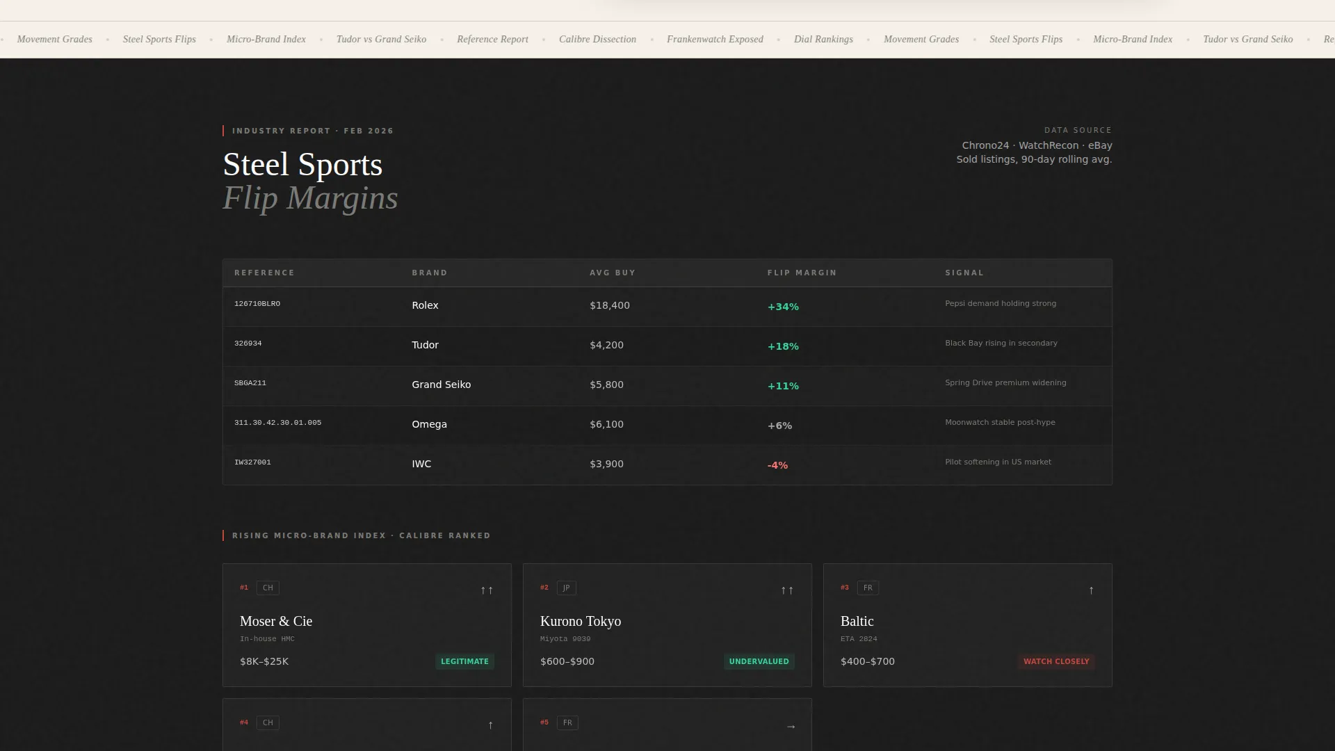
A dedicated section presents market insight cards formatted as a professional briefing. Cards cover topics such as steel sports watch flip margins, a ranked micro-brand index, and rising reference tracking, giving visitors immediate proof of the creator's analytical depth.
Inline Reel Sections Between Data
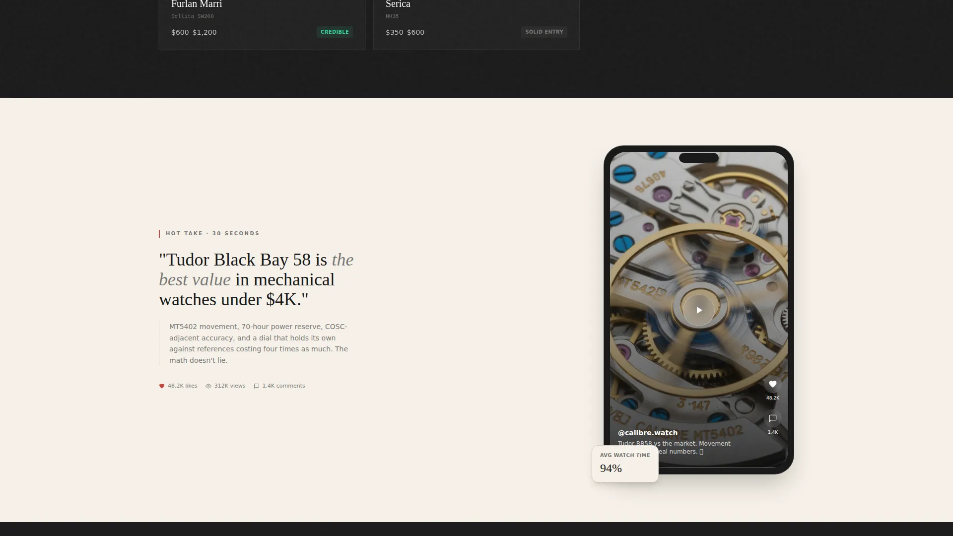
Thirty-second hot-take video embeds appear between data card sections. This rhythm alternates numbers with personality, building authority while keeping the scroll engaging and contextualizing the market data in the creator's own voice.
Recharts Sentiment Visualization
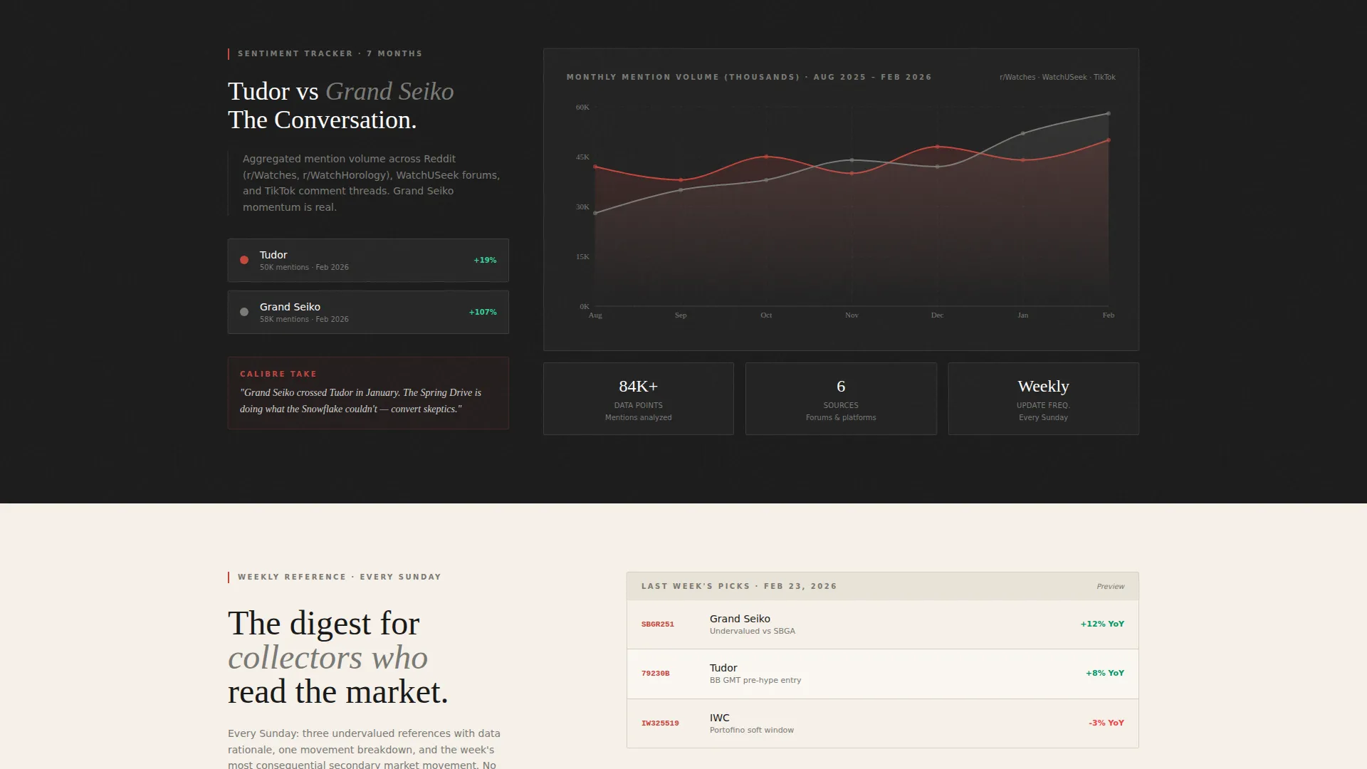
A dedicated section renders an interactive sentiment chart tracking conversation volume comparisons across watch communities. The chart is built with Recharts and animates on scroll, adding a data journalism quality to the page without requiring external tools.
Dual Conversion Path with Persistent Bar
The primary call to action links to the TikTok profile and appears first beneath the header reel. A persistent bottom bar slides in after the second scroll section, keeping the follow prompt visible throughout. A secondary email capture field with a single input and a vermillion submit button delivers a weekly reference digest.
Japanese Zen Design System
The full page uses a four-color palette of washi cream, lacquer black, stone garden gray, and torii vermillion reserved for accent links and call-to-action pulses. Typography pairs a serif display face with a clean sans-serif body font, and generous whitespace treats every element as intentional.
Page sections overview
| Section | Purpose |
|---|---|
| Hero Reel Header | Opens with embedded video, headline, and primary TikTok follow call to action |
| Email Capture Hero | Single-field email form beneath hero reel for weekly digest signup |
| Data Insight Cards | Industry Report cards showing market data and rising reference intelligence |
| Inline Reel One | Embedded thirty-second hot-take video to contextualize first data block |
| Sentiment Chart | Recharts visualization tracking watch community conversation volume |
| Inline Reel Two | Second embedded short-form video between data and email capture sections |
| Weekly Digest Capture | Value-proposition block with single email field and vermillion submit button |
| Persistent call to action Bar | Bottom bar that slides in after second scroll section and persists to footer |
| Footer | Horizontal flow pattern with channel links and supporting information |
Design & branding system
The design follows an Atelier Studio theme interpreted through a Japanese Zen color system. Every color decision is deliberate, and the single accent hue earns its prominence precisely because it appears nowhere else on the page.
- Four-color palette: washi paper cream (#F5F0E8), lacquer black (#1A1A1A), stone garden gray (#4A4A48), and torii vermillion (#C4453C) used only for accent links and call-to-action elements
- Alternating section backgrounds between washi cream and lacquer black, with text living in opposing tones for maximum contrast and readability
- Typography pairs Fraunces as the serif display face for headlines with DM Sans for body copy and interface elements, keeping the page both editorial and legible
Mobile & speed optimization
The template is built mobile-first to match the native behavior of a TikTok audience. Visitors arriving from a short-form video link are almost always on a phone, so the layout and interaction model prioritize that experience without sacrificing desktop quality.
- Single-column flow scales cleanly from small phone screens to wide desktop viewports without layout breakpoints disrupting the editorial rhythm
- Videos use lazy loading so inline reels do not block the initial page render, and images are optimized to keep perceived load time low
- Scroll-reveal animations, hover states, and the chart animation are implemented at medium intensity, providing visual feedback without overwhelming lower-powered mobile hardware
How this template helps you convert
The page is built around a credibility-first conversion model. Visitors learn something genuinely useful before they are ever asked to follow or subscribe, which means the call to action lands on a warmed audience rather than a cold one.
- The header reel immediately establishes production quality and topic authority, so visitors understand the channel's depth within the first few seconds of landing on the page
- Data cards and inline reels build layered proof of expertise across the scroll, so by the time the email capture appears, the visitor already trusts the source and has a reason to want the weekly digest
- The persistent bottom bar and repeated follow call to action catch visitors at multiple scroll depths, reducing the chance that a convinced visitor leaves before converting
Other information about this template
This template is part of the Blog and Editorial category and sits in the Watch Collecting and Horology Content subcategory. It is designed specifically for the intersection of short-form horology content and editorial market intelligence.
- The template uses a marquee animation element and scroll-reveal transitions at medium intensity across section entrances
- The footer follows a Vercel-style horizontal flow pattern, keeping the bottom of the page clean and functional
- Social proof elements including a subscriber count badge and view count indicators are built into the layout to reinforce channel credibility at a glance
- The email digest call to action uses the label "Get the Weekly Reference" with a submit button reading "Send Me the Ref," keeping the copy specific to the horology niche
- The page supports English-language copy with United States Dollar pricing references appropriate for the global watch market context
- This template is suitable for any short-form video creator in a collector or enthusiast niche who wants an editorial web presence beyond a standard link-in-bio page

Theme
Atelier Studio
Creative direction
Industry Report
Color system
Japanese Zen
Style
Single Column Flow
Direction
Click-Through
Page Sections
Full-width Header Reel Embed
Industry Report Data Cards
Inline Reel Embeds Between Sections
Recharts Sentiment Visualization
Dual Conversion Path with Persistent Bar
Japanese Zen Four-color Design System
Related questions
What type of creator is this template designed for?
How does the dual conversion path work?
Is the sentiment chart interactive?
Can I use this template if I am new to content creation?
Can I adapt this template to a different collector niche?



