Cannabis Blog & Media Pre-Launch Website Template
Sesh is a heritage-editorial cannabis podcast landing page built around a masonry gallery walk and a low-friction waitlist drawer. The full-bleed cinematic hero, era-shifting episode card grid, and persistent "Save Me a Seat" call to action combine to turn first-time visitors into early subscribers before a single episode drops.
by Rocket studio
Quick summary
Sesh is a coming-soon cannabis podcast landing page that frames the show as living cultural history. A cinematic full-bleed hero draws visitors in, a scrollable masonry gallery carries them through the storyline era by era, and a floating waitlist drawer converts curiosity into commitment. The template is built for a media brand that wants early listeners, not just page views.
Who this template is for
This template was designed for cannabis media creators who care as much about story as they do about audience growth. It suits founders who want to launch with presence and intention before their first episode goes live.
- Cannabis podcast hosts and media collectives building a pre-launch audience
- Legacy cultivators or industry insiders turning lived experience into editorial content
- Wellness-to-culture creators who want a visually distinctive coming-soon landing page
What problem this template solves
Most coming-soon pages do nothing. They sit there with a countdown and an email field, giving visitors no reason to stay or sign up. A cannabis podcast needs to communicate voice, era, and credibility before a single episode exists.
- Visitors leave without understanding what makes the show different or worth waiting for
- Generic waitlist pages collect emails but lose the collaborator energy that turns subscribers into advocates
- There is no single layout that combines editorial storytelling with a low-friction sign-up flow built for a podcast niche
What you get with this template
You get a complete single-page layout designed around a pre-launch podcast brand. Every section is purposeful, from the first frame of the hero down to the footer pattern.
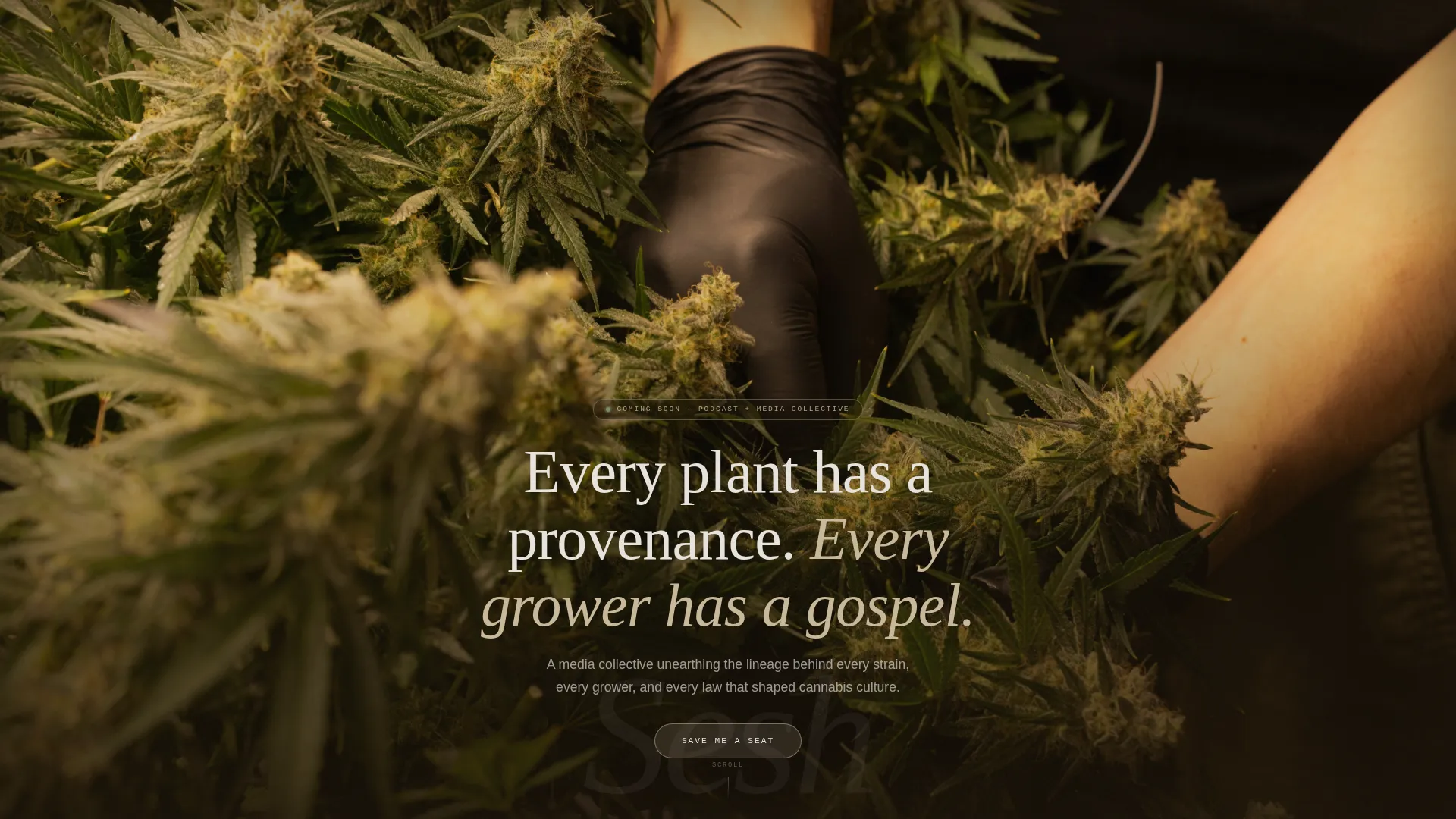
- A full-bleed cinematic hero with a hand-lettered title emergence animation and grain texture overlay
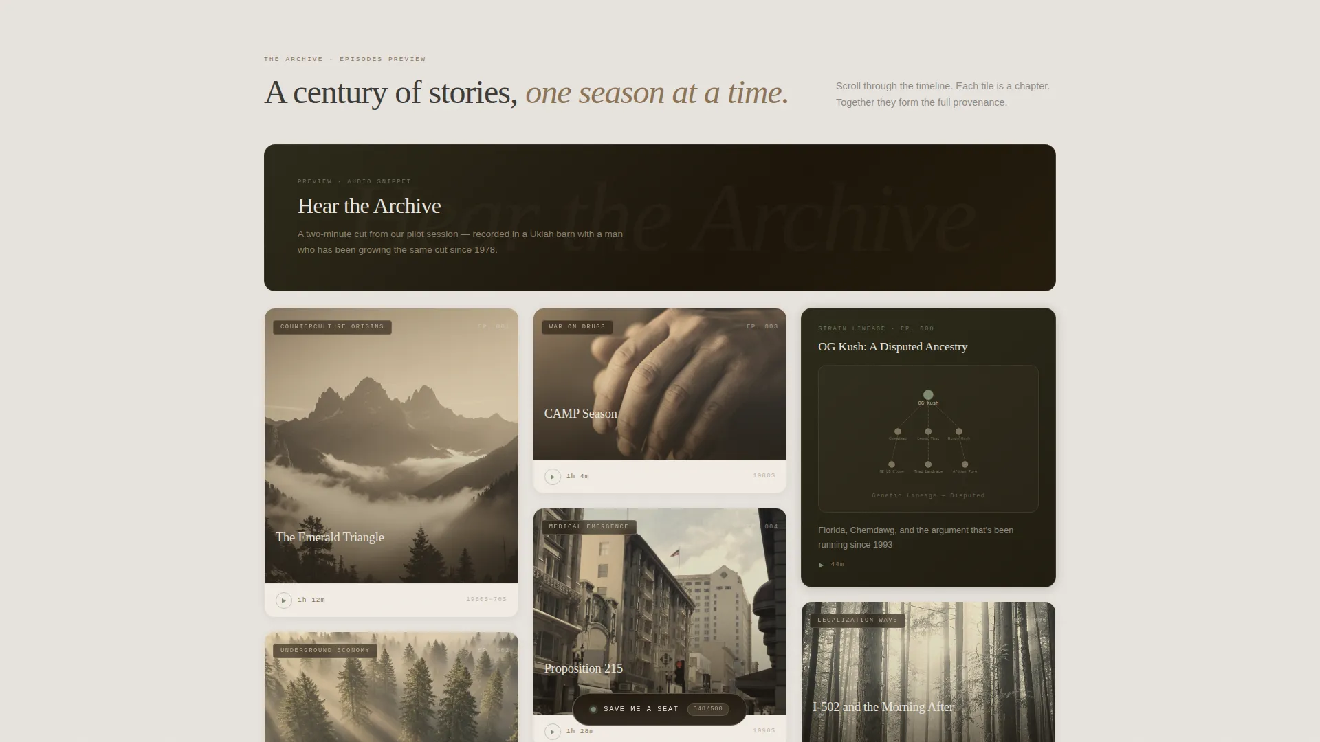
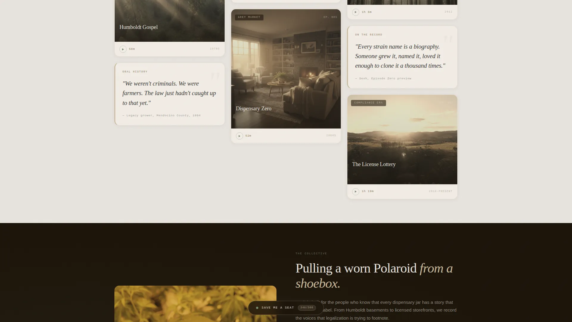
- A masonry episode card gallery with era-shifting scroll rhythm, pull-quote tiles, and hover audio preview interactivity
- A persistent floating call-to-action pill that opens a minimal email-capture drawer with a collaborator-framing question field
Feature list
This template includes a focused set of interactive and editorial features drawn directly from the design brief.
Full-Bleed Cinematic Hero
A grainy, warm-toned portrait fills the entire viewport. The background dissolves into amber darkness while a hand-lettered title slowly emerges from the film grain. No navigation and no logo compete for attention. The image holds the screen like a magazine cover before the copy appears.
Masonry Gallery Walk
The scrollable episode card grid uses varied tile heights and visual weights to create rhythm. Cards include sepia archival photos, illustrated strain genealogy trees, and pull-quotes set in typewriter serif. The feed shifts era by era from counterculture origins through legalization, so the layout itself tells the timeline.
Hover Audio Preview Cards
Full-width interstitial cards break the masonry grid at key scroll points. On hover, an audio snippet auto-previews, letting the podcast voice come through before the show officially launches. This feature creates an auditory first impression without requiring a full player.
Floating Waitlist Drawer
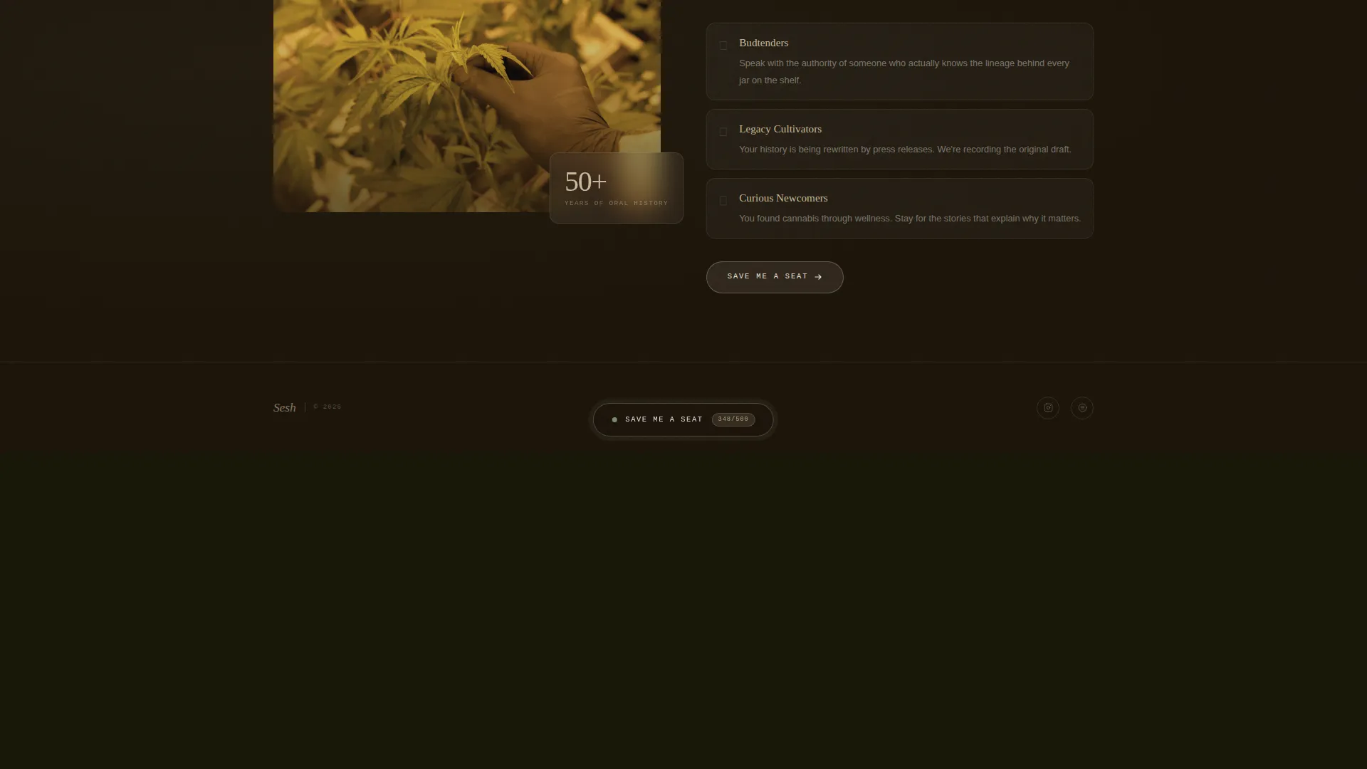
A persistent pill-shaped call-to-action button stays anchored at the bottom of the viewport as visitors scroll. Tapping it opens a minimal drawer with an email field and one optional free-text question asking which story the visitor most wants to hear. The drawer also shows a live counter of claimed seats and a scarcity line about Episode Zero access for the first 500 sign-ups.
Heritage Editorial Typography
The template uses Fraunces for serif display headings, DM Sans for body text, and IBM Plex Mono for labels and counters. Together they create a layered reading texture that feels hand-assembled rather than templated.
About the Collective Section
An asymmetric layout section introduces the brand voice and mission. It sits between the gallery and the footer, giving the show a human face and grounding the waitlist ask in real purpose.
Page sections overview
| Section | Purpose |
|---|---|
| Full-Bleed Hero | Cinematic first impression with grain and title emergence |
| Masonry Gallery Walk | Era-shifting episode card grid with audio hover previews |
| Interstitial Audio Cards | Full-width breaks surfacing audio snippets on hover |
| About the Collective | Asymmetric voice and mission statement layout |
| Floating Waitlist Drawer | Persistent call to action with email capture and seat counter |
| Ultra-Minimal Footer | Horizontal flow footer closing the page cleanly |
Design & branding system
The visual identity follows a Heritage & Story theme built on the Soft Mist color palette. Every design decision references a physical artifact: a worn field journal, a faded Polaroid, pages softened by morning moisture.
- Color palette: rolling fog white (#E8E4DF), sun-dried hemp (#C9B99A), faded journal ink (#3B3A36), and quiet sage (#7A8B6F) reserved for hover and active states
- Typography stack: Fraunces for display, DM Sans for readable body copy, IBM Plex Mono for data labels and counters
- Texture and animation: a CSS grain overlay using an SVG filter sits across the hero, text emergence is timed to feel discovered rather than loaded, and masonry tiles reveal with staggered scroll animations
Mobile & speed optimization
The template is built mobile-first, reflecting how most podcast listeners arrive: phone in hand, scrolling during a commute or a break. Desktop layouts add richness without rebuilding the experience from scratch.
- All images are lazy-loaded so the page feels fast even on a slower mobile connection
- The CSS grain effect is applied via an SVG filter rather than a heavy image asset, keeping visual texture lightweight
- The floating call-to-action drawer and masonry scroll reveals are built without heavy JavaScript libraries
How this template helps you convert
The entire page is designed to move a curious visitor toward a single action: claiming a seat on the waitlist. Each section removes a reason to leave and adds a reason to stay.
- The masonry gallery and audio hover previews answer the question "is this show for me?" before the visitor even reaches the call to action, making the sign-up feel like a natural next step
- The drawer's optional free-text question reframes the sign-up as collaboration, not subscription, which increases perceived value and genuine engagement
- The visible seat counter and Episode Zero scarcity line create honest urgency that motivates action without manufactured pressure
Other information about this template
This template is part of the Blog & Editorial category under the Cannabis Blog & Media subcategory, targeting the Cannabis Podcast & Media niche. It was purpose-built around a masonry Pinterest-style layout with a Gallery Walk creative direction, a Full-Bleed Photo header concept, and a Waitlist / Coming Soon landing-page direction.
- The template is US-centric in its editorial framing, referencing cannabis geography from Humboldt to licensed dispensaries, making it well-suited for domestic cannabis media brands
- The three-typeface stack and Soft Mist color system are intended to be swapped out to match any podcast brand identity without breaking the layout structure
- The footer follows a horizontal flow pattern, keeping the close of the page minimal and on-brand without adding unnecessary visual weight
Theme
Heritage & Story
Creative direction
Gallery Walk
Color system
Soft Mist
Style
Masonry/Pinterest
Direction
Waitlist/Coming Soon
Page Sections
Full-bleed Cinematic Hero
Era-shifting Masonry Gallery
Hover Audio Preview Interactivity
Persistent Floating Waitlist Drawer
Heritage Editorial Type System
Lightweight CSS Grain Texture
Related questions
Can I use this template for a podcast that is already live?
How does the audio hover preview work?
Can I change the colors and fonts to match my own brand?
Is the masonry grid hard to update with new episode cards?
Does this template suit a cannabis media brand that is not a podcast?



