Climate & Sustainability Newsletter Blog Website Template
Canopy is a climate and sustainability jobs newsletter landing page built on an asymmetric 60/40 grid. It pairs a broadsheet-style editorial masthead with a Gallery Walk scroll experience, letting visitors read curated green-economy roles before they ever see a subscription prompt. The design is Luxe Minimal, using parchment, graphite, sage, and solstice gold.
by Rocket studio
Quick summary
Canopy is a single-page editorial landing page for a weekly climate and sustainability jobs newsletter. It uses a 60/40 asymmetric grid, a broadsheet masthead, and a Gallery Walk scroll experience to showcase curated roles from carbon markets, regenerative agriculture, circular design, and climate policy. Visitors read before they subscribe.
Who this template is for
This template is built for newsletter operators, climate-focused editorial brands, and independent curators who need their landing page to prove editorial value up front. It suits anyone publishing a high-signal jobs or opportunities digest for sustainability professionals.
- Climate and sustainability newsletter publishers who want a content-first subscription page
- Independent curators building a paid or free dispatch for mid-career professionals or recent sustainability graduates
- ESG-focused media brands looking for a clean, authoritative single-page presence
What problem this template solves
Most newsletter landing pages ask for an email before they give anything back. For an audience of skeptical, well-read sustainability professionals, that approach fails fast. Canopy flips the order: the page delivers genuine editorial value first, then earns the subscription.
- Readers arrive and immediately see real, specific job listings, not vague category labels
- The inline edition preview lets visitors sample the full product before committing
- A persistent sidebar subscribe field stays available without interrupting the reading experience
What you get with this template
You get a fully structured single-page layout that functions as both an editorial destination and a subscription conversion tool. Every section is pre-wired with the right typographic hierarchy, grid logic, and interactive components described in the brief.
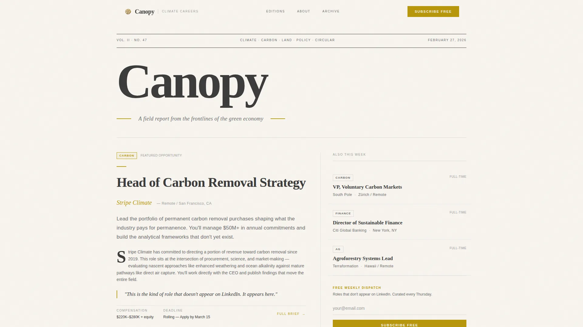
- A broadsheet masthead hero with a 60/40 featured job column and a secondary three-listing stack
- An expandable inline edition preview, a sector-filtered archive grid, and a full-width email capture section
- Fraunces display serif for headlines paired with DM Sans for body text, across every section
Feature list
This template includes the following built-in capabilities as described in the source brief.
Asymmetric 60/40 Editorial Grid
The layout divides every scroll section into a dominant 60-column and a supporting 40-column. The wider column carries the featured opportunity or essay excerpt with full typographic treatment. The narrower column holds metadata, sector tags, and a miniature table of contents.
Broadsheet Masthead Header
The header presents the Canopy wordmark as a high-contrast serif at broadsheet scale, flanked by a thin rule, a volume number, and the current date. Below it sits a single featured headline typeset as an editorial lede, with no imagery. Typography is the entire visual.
Inline Edition Preview
A primary call-to-action button labeled "Read This Week's Edition" sits directly beneath the masthead. Clicking it expands an inline preview of the latest issue so visitors experience the actual product before they decide to subscribe.
Persistent Sidebar Subscribe Field
The 40-column carries a persistent email capture field throughout the scroll. It asks only for an email address and uses the button label "Subscribe Free," keeping the ask minimal and non-intrusive alongside editorial content.
Sector-Filtered Archive Grid
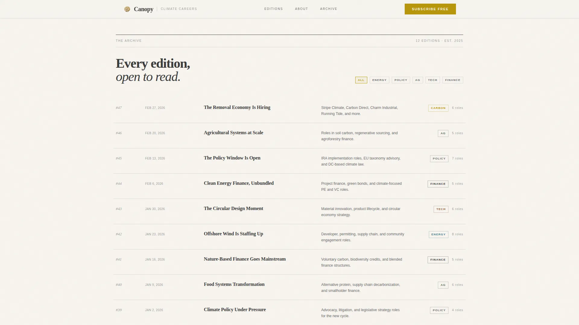
A full archive grid of past editions sits near the bottom of the page. Visitors can filter by sector tabs including Energy, Policy, Ag, Tech, and Finance. Each edition card links to a web-hosted back issue, demonstrating the depth and consistency of the curation.
GSAP ScrollTrigger Reveal Animations
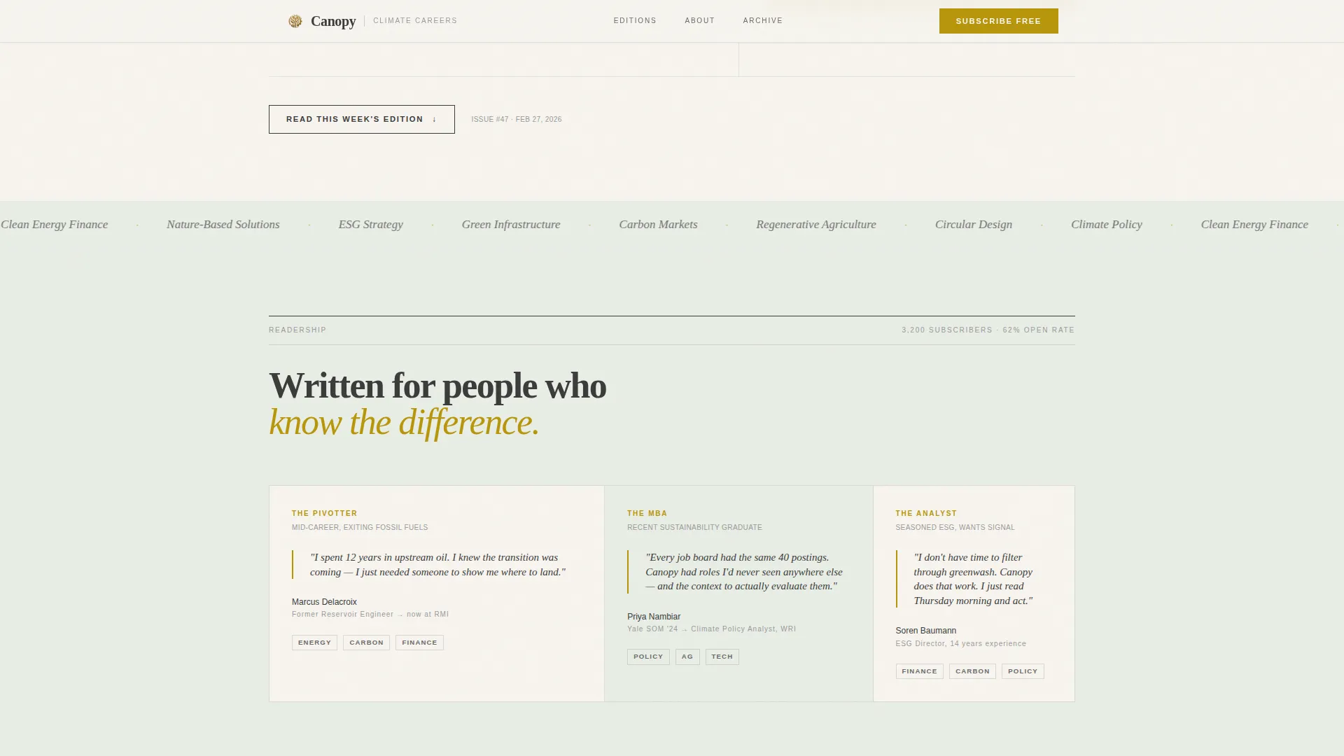
Sections animate in using GSAP ScrollTrigger reveals, clip-path transitions, and a marquee element. Each scroll section appears as a discrete edition frame, reinforcing the Gallery Walk pacing and giving the page a considered, unhurried rhythm.
Page sections overview
| Section | Purpose |
|---|---|
| Hero Masthead | Broadsheet header with 60/40 featured job and secondary listing stack |
| Inline Edition Preview | Expandable current issue preview to prove value before subscribe |
| Who Reads Canopy | Three reader archetypes, sector tags, persistent sidebar subscribe field |
| Archive Grid | Past editions with Energy, Policy, Ag, Tech, Finance sector filters |
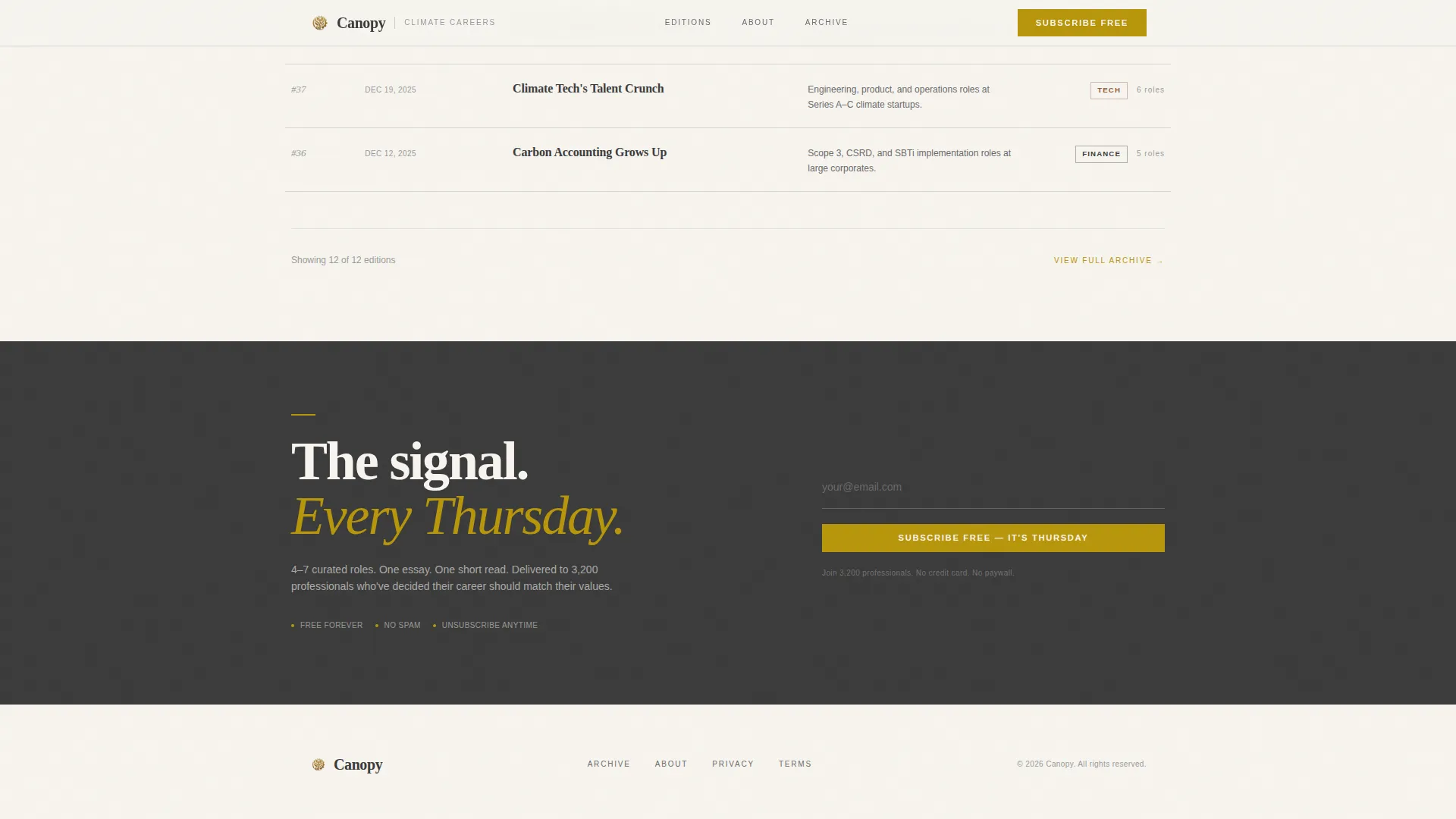
| Subscribe Section | Full-width minimal email capture with single field |
| Footer | Horizontal flow footer pattern with navigation and publication details |
Design & branding system
The visual identity follows a Luxe Minimal theme built on the Cloud Canvas color palette. Every color decision is deliberate and restrained, with gold used so sparingly that each instance reads as an accent rather than decoration.
- Colors: warm parchment white (#F7F4EF) as the primary background, soft graphite (#3B3B3B) for body text, misted sage (#C5CFC0) for alternating section washes, and deep solstice gold (#B8960C) reserved strictly for links, buttons, and pull-quote rules
- Typography: Fraunces display serif for all headlines and masthead text, DM Sans for body copy, with generous letter-spacing throughout
- Section backgrounds alternate between parchment and a faint sage wash to create visual rhythm without disruption
Mobile & speed optimization
The template is built desktop-first to honor the broadsheet aesthetic, and stacks gracefully into a single-column mobile layout without losing typographic hierarchy or editorial intent.
- The asymmetric grid collapses to a vertical single-column stack on smaller screens, keeping the featured content and sidebar field readable
- Server Components handle all static content sections to keep the page light; Client Components are used only for the interactive archive filters and inline edition expand behavior
How this template helps you convert
The conversion strategy is baked into the content flow itself. Visitors are never asked to commit before they have consumed enough value to feel the gap of not having the newsletter weekly.
- The inline edition preview immediately demonstrates the product quality, so the subscribe ask feels natural rather than speculative
- The persistent sidebar email field stays visible throughout the scroll without blocking content, reducing friction at the moment a visitor decides to act
- The archive grid with sector filters signals editorial depth and consistency, building the trust needed for a recurring subscription
Other information about this template
This template is purpose-built for the climate and sustainability jobs newsletter niche and carries strong editorial DNA throughout its structure and design decisions.
- The Gallery Walk creative direction treats each scroll section as a mounted exhibition frame, giving the page a contemplative pace suited to a thoughtful professional audience
- The Cloud Canvas color system and Luxe Minimal theme draw visual language from handmade Japanese stationery, making the design feel tactile and considered rather than generic
- The page is localized for an English-language audience with dates in US format and pricing context in USD where applicable
Theme
Luxe Minimal
Creative direction
Gallery Walk
Color system
Cloud Canvas
Style
Asymmetric Grid (60/40)
Direction
Content/Resource
Page Sections
Asymmetric 60/40 Editorial Grid
Broadsheet Masthead Header
Inline Edition Preview
Sector-filtered Archive Grid
Persistent Sidebar Subscribe Field
GSAP Scrolltrigger Reveal Animations
Related questions
Can I update the featured job listing shown in the masthead hero?
Does the archive grid filter system come included in the template?
What typography does this template use?
How does the inline edition preview work on the page?
Is this template designed for desktop or mobile use?



