Startup Homepage Directory Website Template
Canopy is a dynamic landing page template built for climate impact startup directories. It pairs a Feature Tab Switcher header with a modular card grid, animated stats, and an AI Iridescent color system to present real-time impact data with authority. Designed to drive app downloads, it guides impact investors, sustainability officers, and climate founders from discovery to sign-up.
by Rocket studio
Quick summary
Canopy is a single-page landing page template designed for climate impact startup directories. It leads with large animated numbers, surfaces startup cards with glowing impact badges, and funnels visitors toward an app download through a persistent bottom call-to-action bar. The layout balances data density with visual clarity, making every section feel purposeful and alive.
Who this template is for
This template speaks directly to founders and product teams launching a climate-focused startup directory or discovery platform. It is built for people who need to communicate scale, credibility, and data depth at a glance.
- Impact investors scanning for early-stage cleantech opportunities
- Corporate sustainability officers who benchmark against peer companies
- Climate tech founders seeking discovery by mission-aligned capital
What problem this template solves
Climate startup platforms carry a credibility problem. Visitors arrive skeptical, unsure whether the data is current, the coverage is meaningful, or the product is worth downloading. A generic layout cannot answer those doubts quickly enough.
- Visitors leave before trusting the data or understanding the platform's scope
- Abstract sustainability claims fail to communicate real-world impact metrics
- Standard hero layouts do not demonstrate product speed or capability before the call to action
What you get with this template
This template delivers a complete, section-led landing page ready to represent a climate startup directory. Every component is chosen to prove the platform's value before asking for a download.
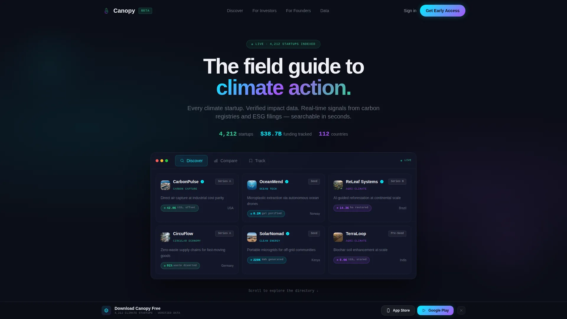
- A Feature Tab Switcher header with three interactive states: Discover, Compare, and Track
- A Stats-First Impact scroll flow with large animated numbers leading each section
- A persistent bottom call-to-action bar with App Store and Google Play badge placements
- A modular card grid with iridescent hover borders, startup logos, mission lines, and impact badges
- A taste-then-gate secondary conversion path that limits web preview access to three card views
Feature list
This template is structured around components that prove product value fast. Each feature earns visitor trust before asking for any commitment.
Feature Tab Switcher Header
The header panel contains three clickable tabs: Discover, Compare, and Track. The default Discover state shows a mosaic of startup cards with logos, one-line missions, and glowing impact badges. Switching to Compare animates two cards side-by-side with overlapping bar charts. Track reveals a portfolio-style watchlist with sparkline graphs. Each transition is instant and fluid.
Animated Stats-First Sections
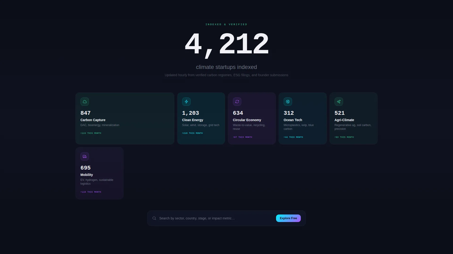
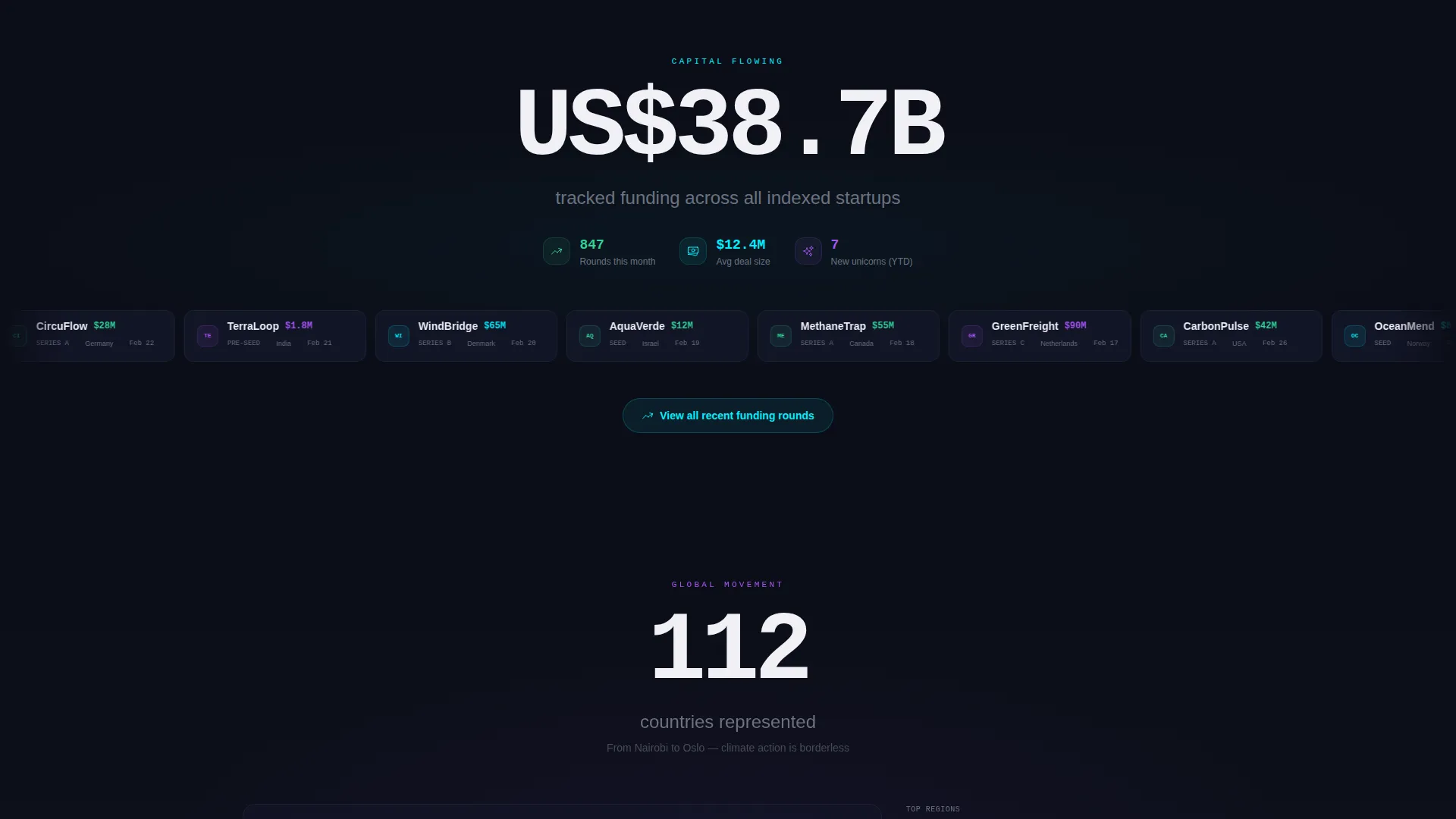
Each scroll section opens with a single large animated number before revealing its supporting content. Examples include "4,212 startups indexed," "US$38.7B tracked funding," and "112 countries represented." This approach escalates the platform's perceived scale with every scroll, moving from individual startup cards to a global movement.
Modular Startup Card Grid
The card grid is built from repeating modular units. Each card carries a startup logo, a one-line mission statement, and a glowing impact badge showing tonnes of carbon dioxide offset, gallons of water purified, or hectares restored. Cards surface against the void background with faint iridescent borders that shift on hover.
Persistent App Download Bar
After the first scroll, a slim bottom bar pins to the viewport. It carries the primary call to action "Download Canopy Free" alongside App Store and Google Play placement badges. The bar stays visible without interrupting the reading flow, keeping the download path accessible at any scroll depth.
Taste-Then-Gate Web Preview
The secondary conversion path opens a limited web directory preview. Visitors can browse freely for three card views before a sign-up prompt appears. This mechanic converts passive browsers into registered app users by letting them experience the product before committing.
Interactive Data Sections
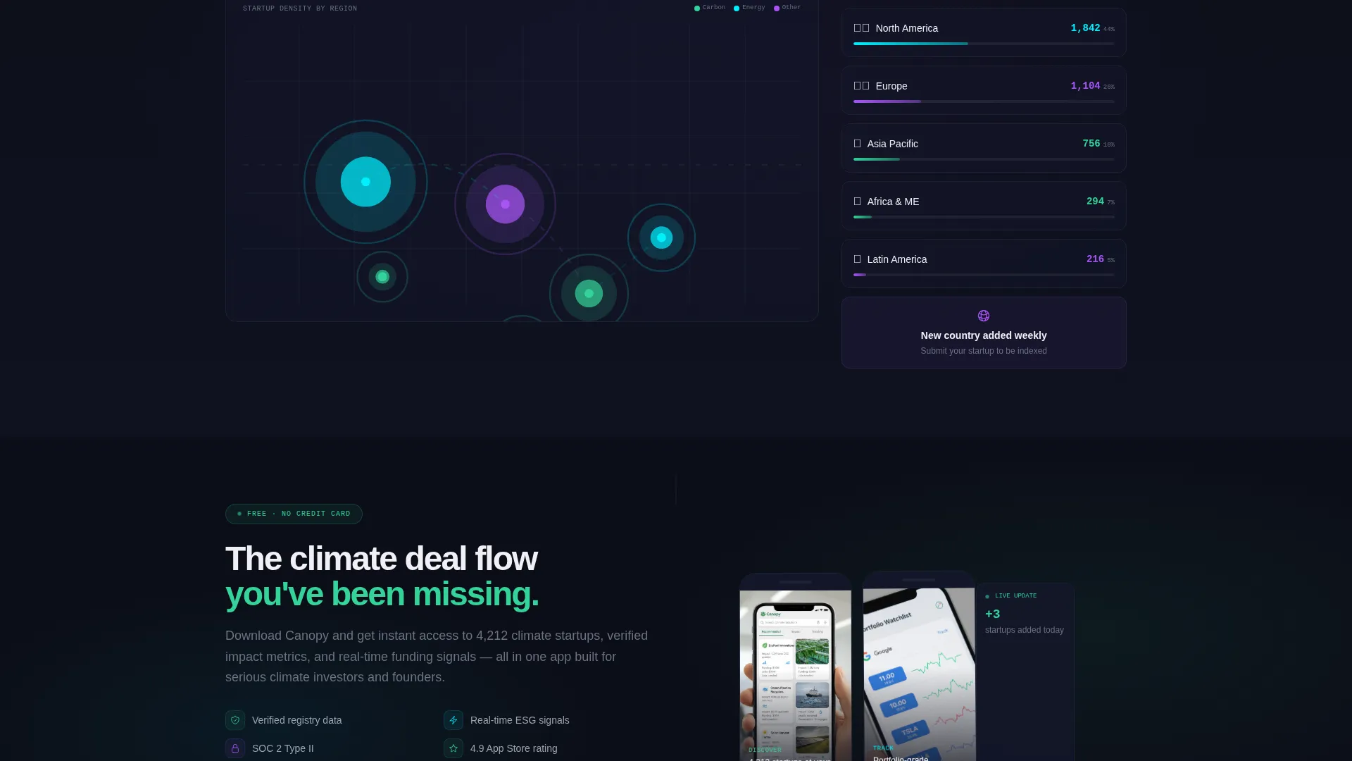
The funding section includes a horizontal scrolling ticker showing recent investment rounds. The geography section features an interactive dot map that clusters startups by regional density. These live-feeling components reinforce the platform's claim of real-time, verified data coverage across 112 countries.
Page sections overview
| Section | Purpose |
|---|---|
| Feature Tab Header | Demonstrates Discover, Compare, Track states interactively |
| Animated Stats Hero | Opens with "4,212 startups indexed" to establish scale |
| Category Card Grid | Tiles Carbon Capture, Circular Economy, Ocean Tech, Agri-Climate |
| Funding Ticker Strip | Scrolls recent investment rounds under the $38.7B stat |
| Interactive Dot Map | Clusters 112 countries by startup density |
| App Download Bar | Pins primary call to action after first scroll |
| Web Preview Gate | Limits free browsing to three cards, then prompts sign-up |
Design & branding system
The visual identity follows a Directory and Discovery theme built on an AI Iridescent color system. The palette is structured so every color encodes information rather than simply decorating the layout.
- Void black (#0B0D17) holds all backgrounds, keeping data and cards visually dominant
- Holographic teal (#00F0FF) and spectral violet (#A855F7) define interactive and structural elements
- Living-data green (#34D399) is reserved exclusively for positive-impact metric indicators trending upward
- Crisp white (#F0F0F5) text maintains legibility against the dark background at every scroll depth
- Card borders carry faint iridescent shifts on hover, mimicking light refracting through a prism
Mobile & speed optimization
The layout is designed to preserve the impact of large animated numbers and the card grid on smaller viewports. The modular card structure adapts naturally to narrower screens without losing the density that makes the directory feel authoritative.
- The persistent bottom bar remains anchored on mobile, keeping the download call to action accessible throughout scrolling
- The Feature Tab Switcher is built for touch interaction, with instant tab transitions that prove app responsiveness on the device the visitor is already holding
- Modular card units reflow into single or double columns on smaller screens without breaking the iridescent border hover behavior
How this template helps you convert
The page is engineered around a specific conversion sequence: demonstrate data credibility first, let visitors use the product second, then present the download ask third.
- The Feature Tab Switcher puts live-feeling product interaction in the header so visitors experience speed and depth before reading a single marketing claim.
- The Stats-First scroll sequence builds cumulative trust with each animated number, widening the perceived scope from individual startups to a global climate movement.
- The taste-then-gate web preview creates a natural moment of investment before the sign-up prompt, making the conversion feel earned rather than forced.
Other information about this template
This template sits within the Startup and Launch category, specifically designed for the climate and impact startup niche. It is a strong fit for teams building directory-style products where data credibility and platform speed are the core value propositions.
- The template style is a Card Grid (Modular) layout, making it straightforward to expand or reorder startup categories without rebuilding the page structure
- The landing page direction is optimized for app downloads, making it suitable for platforms that use a web presence to funnel users into a native mobile application
- The creative direction (Stats-First Impact) and header concept (Feature Tab Switcher) are matched intersection context fields, meaning they were validated together as a high-performing combination for this niche
- This template works well for cleantech directories, ESG (Environmental, Social, and Governance) data platforms, and impact investment discovery tools
Theme
Directory & Discovery
Creative direction
Stats-First Impact
Color system
AI Iridescent
Style
Card Grid (Modular)
Direction
App Download
Page Sections
Feature Tab Switcher Header
Stats-first Animated Scroll Sections
Modular Startup Card Grid
Persistent App Download Bar
Taste-then-gate Web Preview
Interactive Data Visualization Sections
Related questions
Who is the Canopy template designed for?
Can I adapt the card grid to show different startup categories?
How does the taste-then-gate mechanic work?
Does the template support both App Store and Google Play download paths?
Is this template suitable for a platform covering multiple climate sectors?



