Capture — Immersive Abandoned Places Podcast Landing Page Template
Shutter is a Luxe Minimal editorial podcast landing page template built for abandoned places content creators. It pairs a hand-drawn animated hallway illustration with full-spread episode layouts, a lead magnet email gate, and an embedded audio player. The result is a podcast website that feels like a magazine feature and converts curious visitors into loyal listeners.
by Rocket studio
Quick summary
Shutter is a single-page editorial podcast landing page template designed for the abandoned places photography niche. It opens with an animated ink illustration, flows through host and episode spotlights styled like magazine spreads, and closes with a gated Field Guide lead magnet. Every section is built to immerse visitors and move them toward subscribing.
Who this template is for
This template is made for podcast creators who need more than a basic podcast website. If your show lives at the intersection of atmosphere and storytelling, this landing page design was shaped around your audience.
- Urban explorers and urban exploration (UrbEx) community members who want location context and field-ready content
- Architecture students and decay aesthetics enthusiasts drawn to ruin photography and editorial visual design
- True-crime adjacent listeners who want atmosphere, narrative tension, and audio immersion without explicit content
What problem this template solves
Most podcast landing page templates look like generic audio directories. They list podcast episodes without any sense of why the show matters. Shutter solves the core tension: how do you make new listeners feel the atmosphere of a show before they press play?
- Visitors arrive with no context and leave without subscribing because nothing communicates the show's mood or value
- Podcast creators spend hours trying to adapt bland templates that were never built for editorial or niche storytelling shows
- A scattered podcast website with no clear call to action and no lead magnet fails to build an email list or grow subscribers
What you get with this template
This template delivers a complete, ready-to-customize podcast landing page with every section already structured. Users get a cohesive editorial experience that guides the audience from first impression to subscription.
- An animated SVG hero illustration, embedded audio player, and host spotlight editorial section
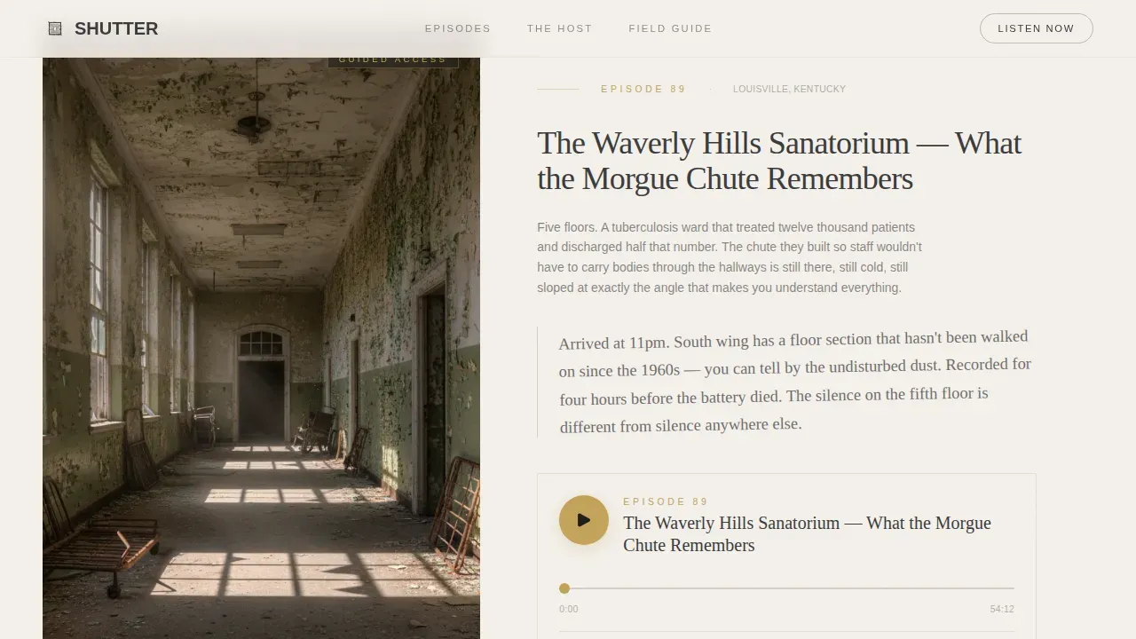
- Three full-spread episode feature layouts with embedded players, photo columns, and handwritten field notes overlay
- A gated Explorer's Field Guide section with a three-spread preview and an email capture form acting as the primary lead magnet
Feature list
This landing page template includes a carefully considered set of features. Each one is grounded in the source brief and serves a specific conversion or engagement purpose.
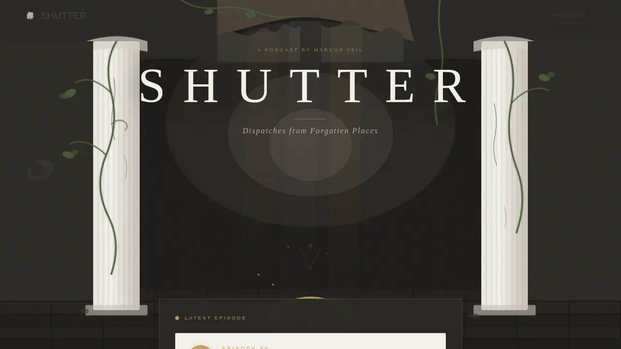
Animated SVG Hero Illustration
The header features a hand-drawn ink rendering of a decaying grand hallway. Vines slowly creep through cracked marble columns using CSS-only animation. Dust motes drift through light beams via Intersection Observer-triggered reveals. A single pair of headphones rests on the illustrated floor, drawing the eye toward the embedded player below.
Embedded Latest Episode Player
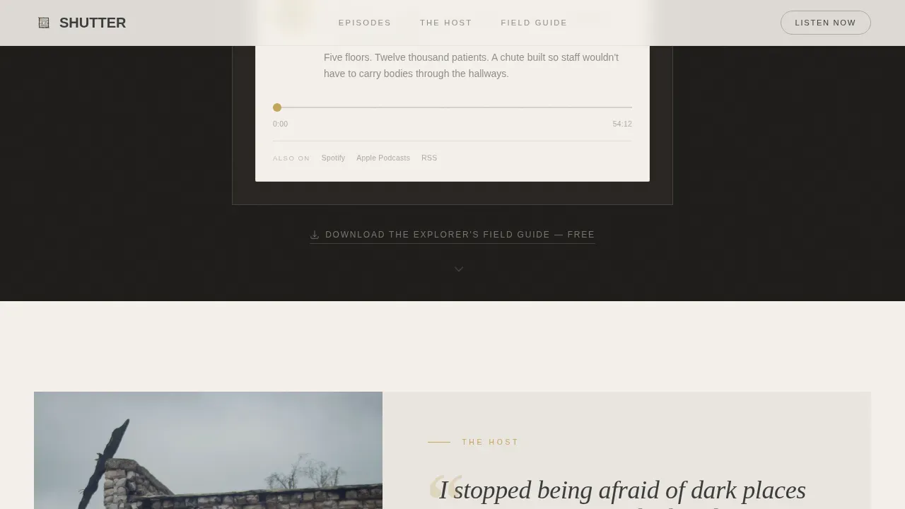
Directly beneath the hero illustration sits an embedded audio player that auto-loads the newest episode release. The primary call to action button is labeled "Listen to the Latest Episode." This gives new visitors an immediate, frictionless way to sample the show and start building the habit of returning for each new episode.
Full-Spread Editorial Episode Layouts
Each episode feature fills the full page width as a magazine-style spread. A large photograph dominates the left column. The episode description and embedded player sit on the right. The host's field notes appear as a handwritten script overlay, adding authenticity and editorial depth that typical podcast landing page templates cannot replicate.
Lead Magnet Field Guide with Email Gate
The Explorer's Field Guide is a free downloadable PDF of the host's favorite locations and photography settings. Three sample spreads from the guide are displayed on the landing page before the form appears, proving value before asking visitors to sign up. Users submit their first name and email address to unlock access, building the email list organically.
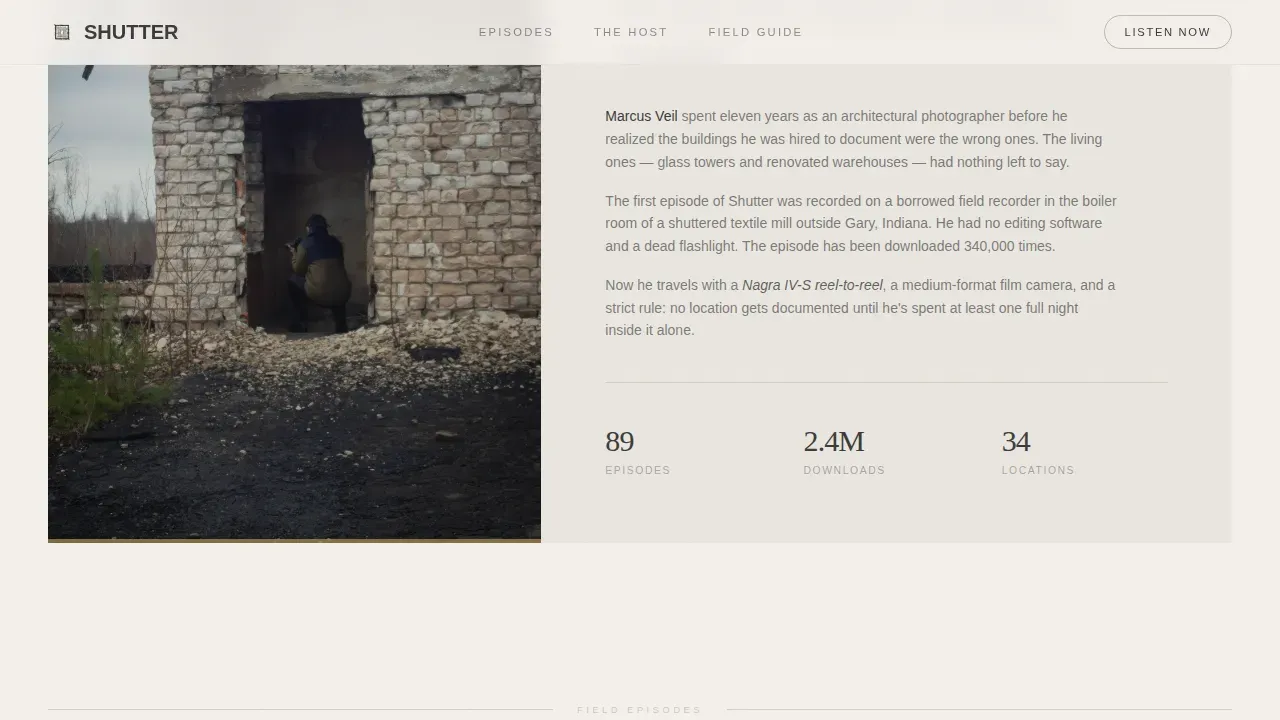
Creator Spotlight Host Section
A dedicated host spotlight section uses pull-quote typography styled like a print magazine feature. The host is shown mid-exploration, camera over shoulder, standing in a doorway framed by peeling paint. The origin story is told in editorial prose. This section helps establish a personal connection with the audience and builds trust before the listener has finished reading.
Social Proof Section and Navigation
The template includes a social proof section to feature listener metrics, episode count, and testimonials that encourage new visitors to subscribe. The site navigation menu includes "Episodes," "About," and "Subscribe" pages, keeping the podcast website clean and purposeful. Social sharing buttons can be placed to promote each episode across channels.
Page sections overview
| Section | Purpose |
|---|---|
| Animated Hero Illustration | Opens with atmosphere; auto-loads latest episode player |
| Host Spotlight Editorial | Introduces the host via pull-quote magazine feature writing |
| Episode Feature One | Full-spread layout with photo, embedded player, and field notes |
| Episode Feature Two | Second spread escalating to more restricted location content |
| Field Guide Preview | Three sample spreads proving lead magnet value before the gate |
| Email Capture Form | Collects first name and email to deliver the Explorer's Field Guide |
| Episode Feature Three | Final spread and subscription push with clear call to action |
| Footer Arc Split | Brand personality footer with links and subscribe prompt |
Design & branding system
The landing page design follows a Luxe Minimal editorial theme with a Cloud Canvas color palette. Every image, typographic choice, and animation reinforces the feeling of a Polaroid left on a windowsill for thirty years: bleached, quiet, and haunted by warmth.
- Colors: soft plaster white (#F4F0EB), faded graphite (#3B3B3B), morning fog gray (#D5CEC5), and tarnished gold (#C4A35A) reserved for episode play buttons and hover states
- Typography: Fraunces display serif for headlines with wide letter-spacing, DM Sans for body text, and a script font for handwritten field notes overlays
- The logo incorporates a simple font paired with a small camera aperture icon; imagery is high-contrast and minimalist in composition, referencing peeling paint and rusted metal textures
Mobile & speed optimization
This template is designed desktop-first to honor the full-width editorial magazine aesthetic. Full-spread episode layouts and the animated hero require a wide viewport to deliver their full impact. Mobile behavior is handled through graceful collapse so the experience remains clear on smaller screens.
- SVG vine and dust mote animations are CSS-only, keeping the animation layer lightweight without JavaScript dependencies
- Scroll-triggered section reveals use Intersection Observer, meaning content loads as users reach it rather than all at once
- Full-spread image columns reflow into stacked layouts on mobile, preserving readability of the episode description and embedded player
How this template helps you convert
A well-crafted landing page does more than display information. This template is structured to guide every visitor through a deliberate sequence that builds desire, establishes trust, and removes friction from the decision to subscribe.
- The animated hero and auto-loaded player give new listeners an immediate sensory experience, reducing the gap between arrival and first listen and turning new visitors into engaged prospects before they scroll past the fold.
- The Field Guide lead magnet and three-spread preview encourage visitors to sign up for the email list by demonstrating value first, then gating the download behind a simple form that collects names and addresses for future episode announcements.
- The social proof section, listener metrics, and testimonials signal credibility to skeptical new arrivals, while adding links to popular podcast platforms makes it easy for the audience to subscribe on their preferred service.
Other information about this template
This section covers additional context that helps podcasters and users determine whether this template fits their workflow and goals.
- The Shutter Luxe Minimal Abandoned Places Podcast Landing Page Template is the full product name; the sub-headline on the landing page reads "Shutter explores the quiet minimalism hidden within abandoned places" and the hero headline is "Beauty in Decay. Simplicity in Silence." with the secondary line "Less is Forgotten."
- Adding links to platforms such as Spotify and Apple Podcasts is built into the template structure, giving the podcast audience one-click access to subscribe on their preferred app; Twitter and other social sharing buttons can be added to promote each episode
- The template can serve as a practical reference among podcast landing page examples for editorial and niche shows, demonstrating how landing page design can carry a strong narrative identity rather than relying on generic layouts
- Actionable tips for using this template: swap the placeholder episode image and description for your own content, replace the Field Guide spreads with your actual PDF pages, and update the email gate form with your mailing list provider details to start capturing new subscribers immediately
- Key takeaways for podcasters evaluating this template: the lead magnet section goes the extra mile by previewing three guide pages before the gate, the social proof section supports testimonials and reviews from loyal listeners, and the host spotlight section encourages people to connect with the creator on a personal level before they decide to subscribe
- Templates for podcast landing pages work best when the podcast description clearly communicates the show's title, theme, and target audience; this template provides a dedicated description block beneath the hero for exactly that purpose
- Podcast creators who want exclusive content delivery should use the email gate form to deliver the Field Guide and follow up with new episode alerts, helping convert new subscribers into a long-term community
- The podcast website navigation includes "Episodes," "About," and "Subscribe" making it straightforward for new visitors to discover popular episodes and find key information about the show
Theme
Luxe Minimal
Creative direction
Creator Spotlight
Color system
Cloud Canvas
Style
Editorial/Magazine
Direction
Content/Resource
Page Sections
Animated SVG Hero with Embedded Player
Full-spread Editorial Episode Layouts
Lead Magnet Email Gate with Preview Spreads
Creator Spotlight Host Section
Social Proof and Navigation System
Cloud Canvas Color and Typography System
Related questions
Can I use this template even if I am not a designer?
How does the lead magnet email gate work?
Does this template include links to podcast platforms like Spotify and Apple Podcasts?
Is this template desktop-first only, or does it work on mobile?
What social proof elements does the template support?



