Capture — Urban Exploration Photography Landing Page Template
Ruin is a single-column lead generation landing page built for an abandoned places photography account. It guides visitors through a slow, deliberate gallery walk of forgotten buildings, using a daguerreotype-inspired Ink and Paper aesthetic. A torn-paper email opt-in card captures subscribers at the end, offering GPS coordinates, gear lists, and unpublished field dispatches.
by Rocket studio
Quick summary
Ruin is a single-column flow landing page template designed for an abandoned places photography account. It moves visitors through a curated gallery walk, from a typographic manifesto hero to a torn-paper email opt-in, earning the subscriber click by proving the eye first. The Soft Mist color palette and Ink and Paper theme make every section feel like a recovered field journal entry.
Who this template is for
This landing page template is built for photographers and creators who document forgotten spaces. It suits anyone running an abandoned places photography account who wants to convert passive followers into active email subscribers. The design language is specific, intentional, and ready for a niche audience that values atmosphere over polish.
- Urban explorers who want access to GPS coordinates, gear lists, and location intelligence for their next trip into a forgotten building
- Interior designers and filmmakers who actively walk through texture references and scout location routes for productions
- Photography creators ready to build an email list without a complex multi-page website
What problem this template solves
Most photography websites try to show everything at once. Grids, thumbnails, carousels, and menus compete for attention and train the visitor to skim rather than feel. This landing page removes that noise entirely. It makes every image earn its own moment, and it withholds the ask until the visitor has already walked through a dozen rooms they want to revisit.
- There is no clear route from discovery to subscription on a typical photography site, so potential subscribers leave without converting
- Photography creators spend hours building pages that look busy but fail to hold attention past the first scroll, driving a high bounce rate
- The gap between a compelling Instagram post and a functioning email capture landing page stays wide for most solo creators who lack design or coding experience
What you get with this template
You get a complete, single-column lead generation landing page that is ready to customize and publish. Every section follows a deliberate sequence, from the towering manifesto header to the image-and-caption gallery walk and the final email opt-in card. The design is done; you bring the photographs and copy.
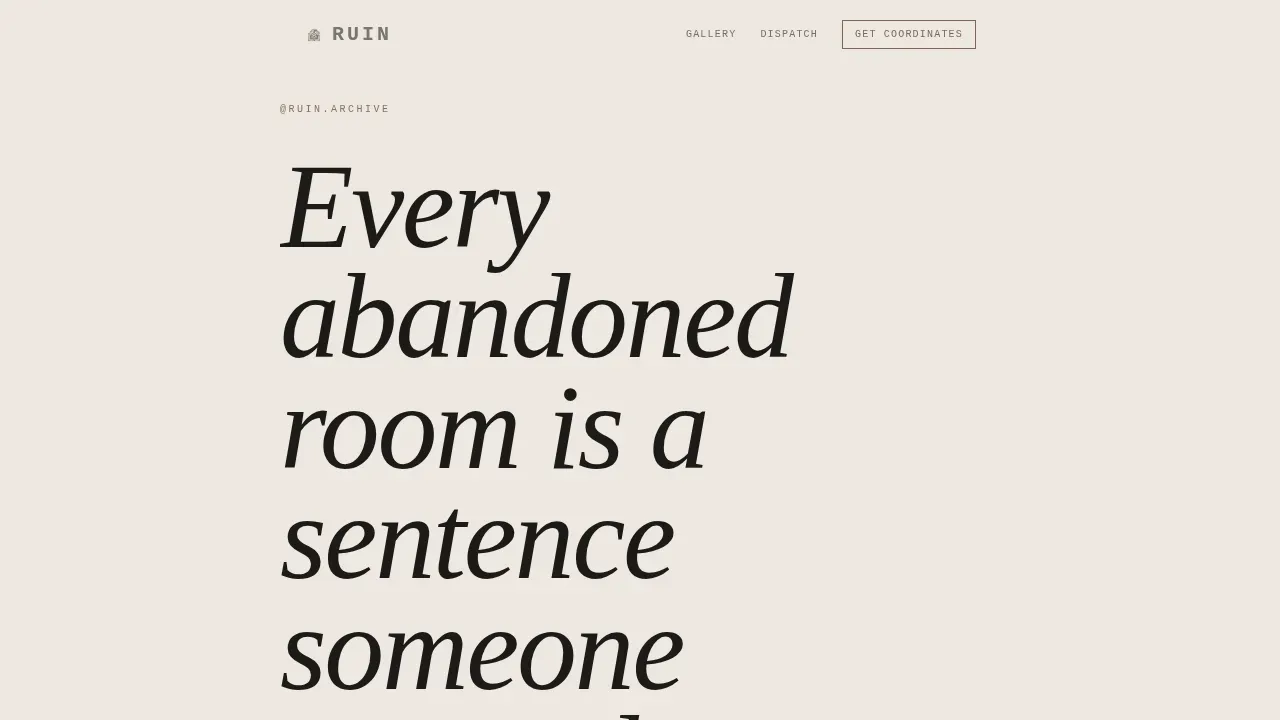
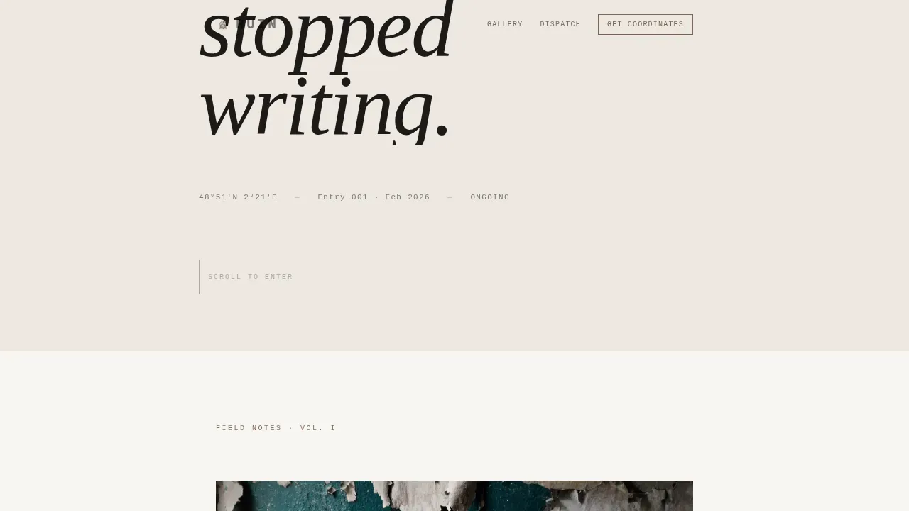
- A typographic hero section built around an enormous serif manifesto headline, followed by a date and location stamp set in monospaced type, the way a field notebook would mark an entry
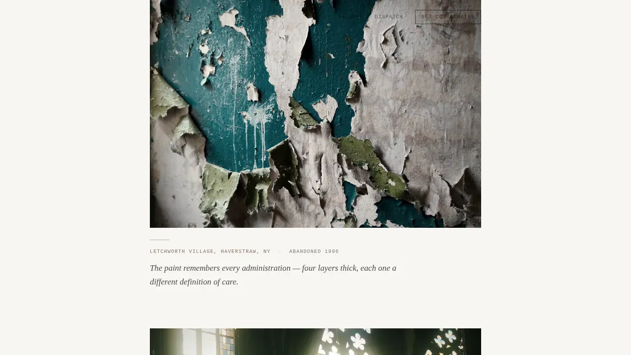
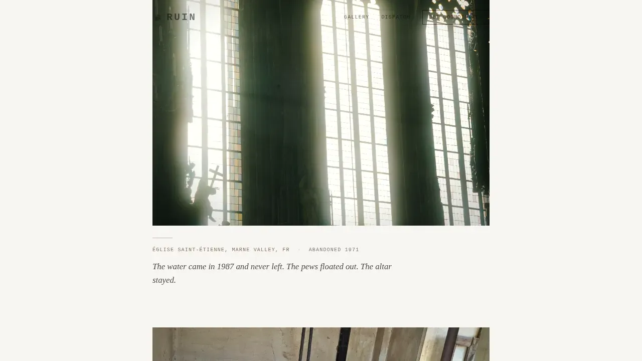
- Three sequential gallery walk sections, each holding two to three full-column images with museum-placard captions and a handwritten-style pull quote after every third photograph
- A torn-paper-card email opt-in form asking only for a first name and email, styled to float over the final image, plus a secondary "Pitch a Location" text link for collaboration inquiries
Feature list
This section describes the key functional and design features built into the Ruin landing page template. Each one reflects a deliberate choice from the source brief, not a generic add-on.
Typographic Manifesto Hero
The hero section centers on one enormous Fraunces display serif headline set in graphite wash on aged parchment. No image competes with it. Below the headline sits a thin graphite rule and a monospaced date-location stamp. The pacing is deliberate: the visitor reads before they scroll, which sets the emotional register for everything that follows.
Full-Column Gallery Walk Layout
Images fill the column edge to edge with generous white space between them. Each photograph is paired with a museum-placard caption showing location, year abandoned, and one sentence of observation. There are no grids and no thumbnails. Every image in the gallery walk demands its own moment, giving urban explorers and filmmakers the visual proof they need before the ask.
Handwritten Pull Quote Rhythm
Between every third photograph, a handwritten-style pull quote breaks the visual trail. This creates a predictable rhythm: image, image, image, breath. The pull quote sections slow the scroll and provide the kind of intimate detail that makes the hiking and exploration community feel seen, the way a field journal does after a long night in a forgotten building.
Torn-Paper Email Opt-In Card
The call-to-action section displays a torn-paper card floating over the final photograph. It asks only for a first name and email. The headline reads "Get the Coordinates" and the offer describes a monthly field dispatch with GPS coordinates of accessible locations, gear lists, and unpublished shots. The form is styled to feel like a note slipped under a door, not a marketing popup.
Scroll-Reveal Animation System
The template uses medium-intensity scroll-reveal entrance sequences and subtle float animations. Elements appear as the visitor scrolls, mimicking the experience of walking through a building and discovering each room. Hover states on images use iron oxide as an accent, the same faded rust color that appears sparingly throughout the palette like rust bleeding through a plaster wall.
Mobile-First Single Column Flow
The entire layout is built as a single-column flow, which means the mobile experience is the primary experience. This matters because the core audience follows the account on Instagram and arrives on a phone. Every section stacks cleanly, images lazy-load for faster delivery, and CSS-only scroll effects keep the page performing without heavy scripts.
Page sections overview
| Section | Purpose |
|---|---|
| Hero Manifesto Header | Display the typographic quote at enormous scale to set tone and slow the visitor down before the first scroll |
| Gallery Walk I | Present images one through three with museum-placard captions and a pull quote to begin the emotional trail |
| Gallery Walk II | Continue the curated sequence with images four through six, deepening the atmosphere with another pull quote |
| Gallery Walk III | Complete the full gallery walk with images seven through nine and a final pull quote before the ask |
| Get the Coordinates | Capture email leads through a torn-paper opt-in card floating over the closing photograph |
| Footer Social Bar | Store social media links and copyright notice, keeping the exit path clean and minimal |
Design & branding system
The visual identity follows an Ink and Paper theme using the Soft Mist color system. The palette was chosen to evoke a daguerreotype left on a windowsill for decades: bleached, tender, and carrying the weight of something that used to be vivid. Colors and typography work together to make the landing page feel like a recovered artifact, not a modern website.
- Four-color palette: aged parchment (#EDE8E0) for primary backgrounds, graphite wash (#4A4A4A) for body text with generous leading, fog white (#F7F5F2) for alternating section backgrounds, and faded iron oxide (#8B6F5E) for accent borders and hover states
- Typography pairing: Fraunces tall spindly serif for display headlines and pull quotes, IBM Plex Mono for captions, date stamps, and location markers to simulate field-notebook handwriting
- Visual logic: backgrounds alternate between parchment and fog white; iron oxide appears sparingly, the way rust bleeds through a wall; no decorative elements compete with the photographs
Mobile & speed optimization
The template is designed mobile-first because the target audience discovers the account on Instagram and opens links on a phone. Every layout decision supports a smooth, fast, focused scroll on a small screen without sacrificing the atmospheric weight of the design.
- Single-column flow means no reflow or grid collapse is needed between screen sizes; the layout on a phone is the intended layout, not a fallback
- Images are lazy-loaded so the page does not request all assets at once; the visitor sees each photograph as they arrive at it, which also reinforces the pacing of the gallery walk
- Scroll effects use CSS-only techniques to keep animation smooth on mobile devices without adding heavy JavaScript dependencies
How this template helps you convert
This landing page earns the conversion by proving value through experience before making the ask. The visitor does not encounter a form until they have walked through roughly a dozen forgotten rooms. By that point, the offer feels like a natural next step, not an interruption.
- The typographic hero sets an emotional anchor immediately; the visitor understands the tone and subject in seconds, which filters for exactly the right audience and reduces wasted traffic
- The sequential gallery walk with museum-placard captions and pull quote rhythms builds trust and desire; by the time visitors reach the form, they already want the coordinates, so the opt-in feels like a reward rather than a request
- The torn-paper "Get the Coordinates" card presents a low-friction ask: first name and email only, with a clear and specific promise of a monthly field dispatch including GPS coordinates, gear lists, and unpublished shots
Other information about this template
This section covers additional context that can help creators plan their build and understand how the template fits into a broader creative and technical ecosystem.
- This template is built for a photography creator who wants to grow an email list without managing a full multi-page website; the single landing page format keeps the focus entirely on conversion
- The "Pitch a Location" secondary text link beneath the main form provides a quieter collaboration route for filmmakers, location scouts, and designers who want to propose a shoot, not just subscribe
- The page design draws deliberate parallels to the experience of guided walking tours and trail documentation: both use a sequential route, a curated description at each point of interest, and a final destination that rewards the journey
- Effective travel landing pages and exploration-focused pages share a common principle: a story-first hero section that evokes historical significance through compelling headlines and high-quality images drives deeper engagement before the call to action
- Abandoned places photography sits at the intersection of nature, history, and urban exploration; the template honors all three by treating each building as a subject with its own location stamp, year, and observation, the way trail guides document stops along a route
- For creators who plan to track how visitors interact with the page over time, tools like Google Analytics can connect to the published site to monitor traffic source data, unique visitors, and bounce rate, helping build a clearer site's analytics report without the need for complex campaign data setups
- Google Analytics also uses analytics analytical cookies that cookie stores information anonymously, assigning each session a randomly generated number rather than collecting personally identifiable data; creators should be aware of this when setting up third party features and other third party features on their published site, as certain functionalities may have their own preferences for how they handle user data, especially those related to social media platforms
- Key performance indexes like scroll depth and form submission rate are useful metrics to review in the site's analytics report; a low bounce rate on a gallery-heavy landing page like this one often reflects genuine audience alignment rather than accidental traffic
- The trek walk where the empire walked landing page template concept and the roman empire of guided walking tours both prove that historical storytelling through a sequential route is one of the most durable structures in travel landing page design; the Ruin template applies the same logic to forgotten spaces, treating each building the way a tour guide treats a historic site along Hadrian's Wall in northern England, which was constructed in 122 AD and remains a celebrated 135km walk through rugged moorland to this day
- Walking tours in a city like New York include stops at the Empire State Building and Grand Central Terminal, landmark buildings that reward the walk with a sense of scale and history; the Ruin template gives abandoned places that same weight through careful description and full-column imagery
- Creators can use the template on a platform like Unicorn Platform, which offers a drag and drop builder, newsletter sign-up form tools, and an integrated email marketing suite; it allows users to launch a landing page in just 3 minutes and provides affordable monthly plans; all pages built on the platform automatically adapt to any device, and the templates are fully customizable for colors, fonts, spacing, and layout
- The town of origin for each photographed site can appear in the location stamp; creators who document history across west, middle, and east regions of a country can use the stamp format to give each image its own sense of place, whether the subject is a derelict john the Baptist church in rural England or a rusted factory on the outskirts of a city
- The page does not include restaurants, food stops, or town hall listings; it is focused entirely on the photography and the email capture, keeping the route from first impression to form submission clean and complete
Theme
Ink & Paper
Creative direction
Gallery Walk
Color system
Soft Mist
Style
Single Column Flow
Direction
Lead Generation
Page Sections
Typographic Manifesto Hero Section
Full-column Sequential Gallery Walk
Pull Quote Rhythm Between Images
Torn-paper Email Opt-in Card
Scroll-reveal and Hover Animation System
Related questions
Who is the Ruin landing page template designed for?
Can I customize the colors and typography in this template?
What does the Get the Coordinates form collect?
Does this template work well on mobile devices?
Is there a secondary contact option beyond the email form?



