True Crime Analysis Landing Page Template
Casefile is a cinematic dark landing page template built for true crime analysis Instagram accounts. It uses a 60/40 asymmetric grid, Ink and Paper visual identity, and a day-in-the-life scroll structure to showcase sourcing, timelines, and annotated evidence carousels. A gated archive section converts visitors into email subscribers before they realize they want the rest.
by Rocket studio
Quick summary
Casefile is a single-page landing page template designed for cold case analysis content creators. It pairs a cinematic dark evidence-room aesthetic with a structured research narrative. The 60/40 asymmetric grid puts visual evidence front and left while methodical copy narrates from the right, mimicking how a real analyst works through a case.
Who this template is for
This template is built for content creators who take true crime seriously and want a home base that proves it. It works especially well for accounts that go beyond surface-level storytelling and invest in primary sources, document research, and narrative structure.
- True crime Instagram accounts that use FOIA documents, archived clippings, and annotated evidence photos
- Armchair detective communities and podcast-adjacent creators who want to build an email list around in-depth case breakdowns
- Journalism students or narrative nonfiction writers building a portfolio around public records research
What problem this template solves
Most true crime content online leans on speculation and entertainment rather than evidence. Creators who do real research have no natural way to show that depth at a glance. Visitors arrive, skim, and leave without understanding what makes the account different.
- Visitors cannot tell the difference between sensationalized content and evidence-grade analysis before they follow or subscribe
- A generic link-in-bio page wastes the trust built through months of careful research by offering no proof of depth upfront
- Email conversion suffers when the call to action appears before the visitor has experienced any of the actual work
What you get with this template
You get a fully structured landing page that earns attention before it asks for anything. Every section is designed to deepen the visitor's respect for the craft, section by section, the way a case file builds toward a conclusion.
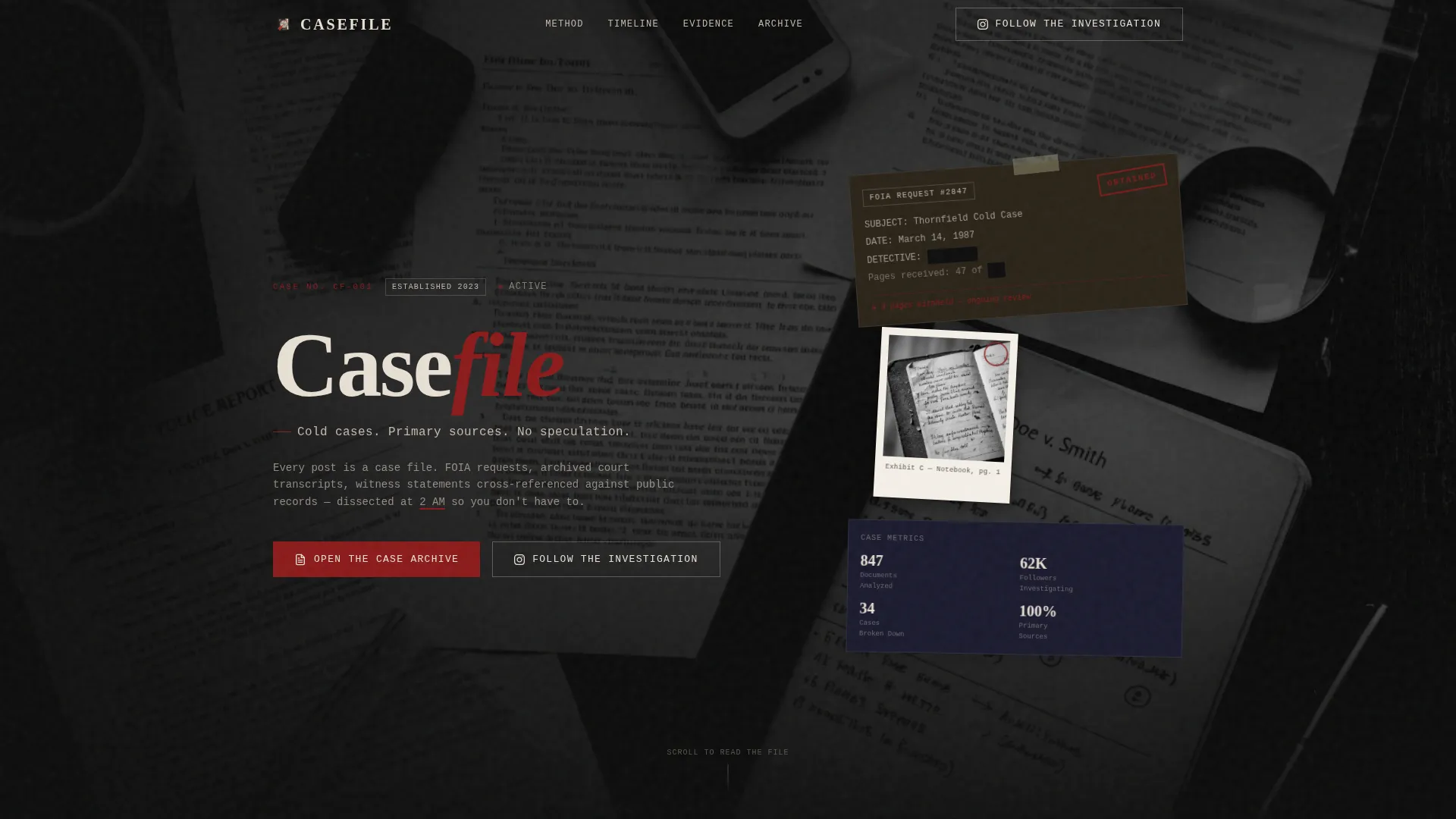
- A hero section with a type-over-image header, grain animation, floating evidence cards, and a heavy serif headline over a grainy flat-lay photograph of case documents
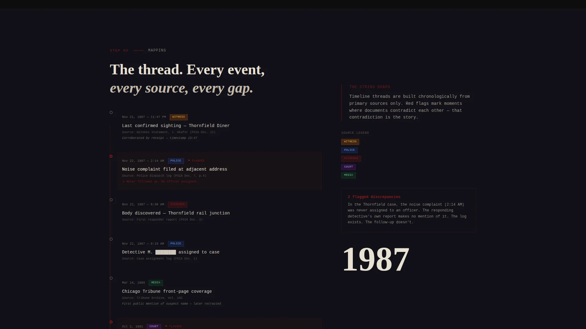
- A chronological case timeline section, an annotated evidence carousel section, and a sourcing process panel showing how content is built from primary records
- A gated archive section with three complete mini-analyses visible above the call to action, proving depth before asking for an email address
Feature list
This template delivers a specific set of built-in sections and design behaviors drawn directly from the Casefile brief.
Type Over Image Hero with Grain Animation
The hero places the account name in a heavy serif typeface over a high-contrast flat-lay photograph of scattered case documents. A monospaced descriptor sits beneath it like a typewriter addendum. A subtle grain animation runs over the image, giving it the feel of a photograph still developing under a desk lamp.
60/40 Asymmetric Research Grid
The layout splits the screen with a 60 percent visual column on the left and a 40 percent copy column on the right. Dense evidence imagery, carousels, and document panels dominate the left. Tight, methodical prose narrates the right. The split mirrors the dual-focus attention of real case research.
Day-in-the-Life Scroll Narrative
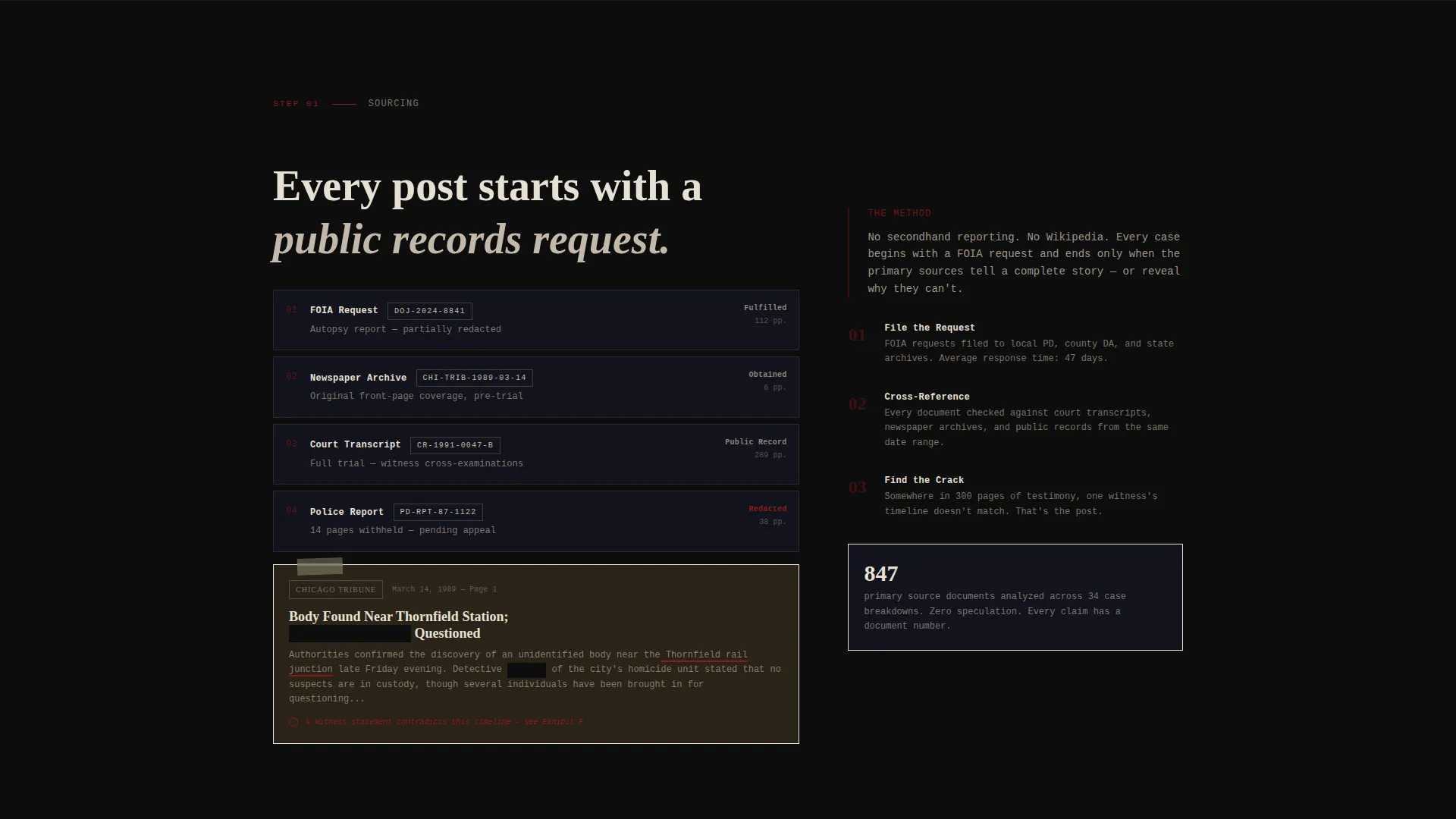
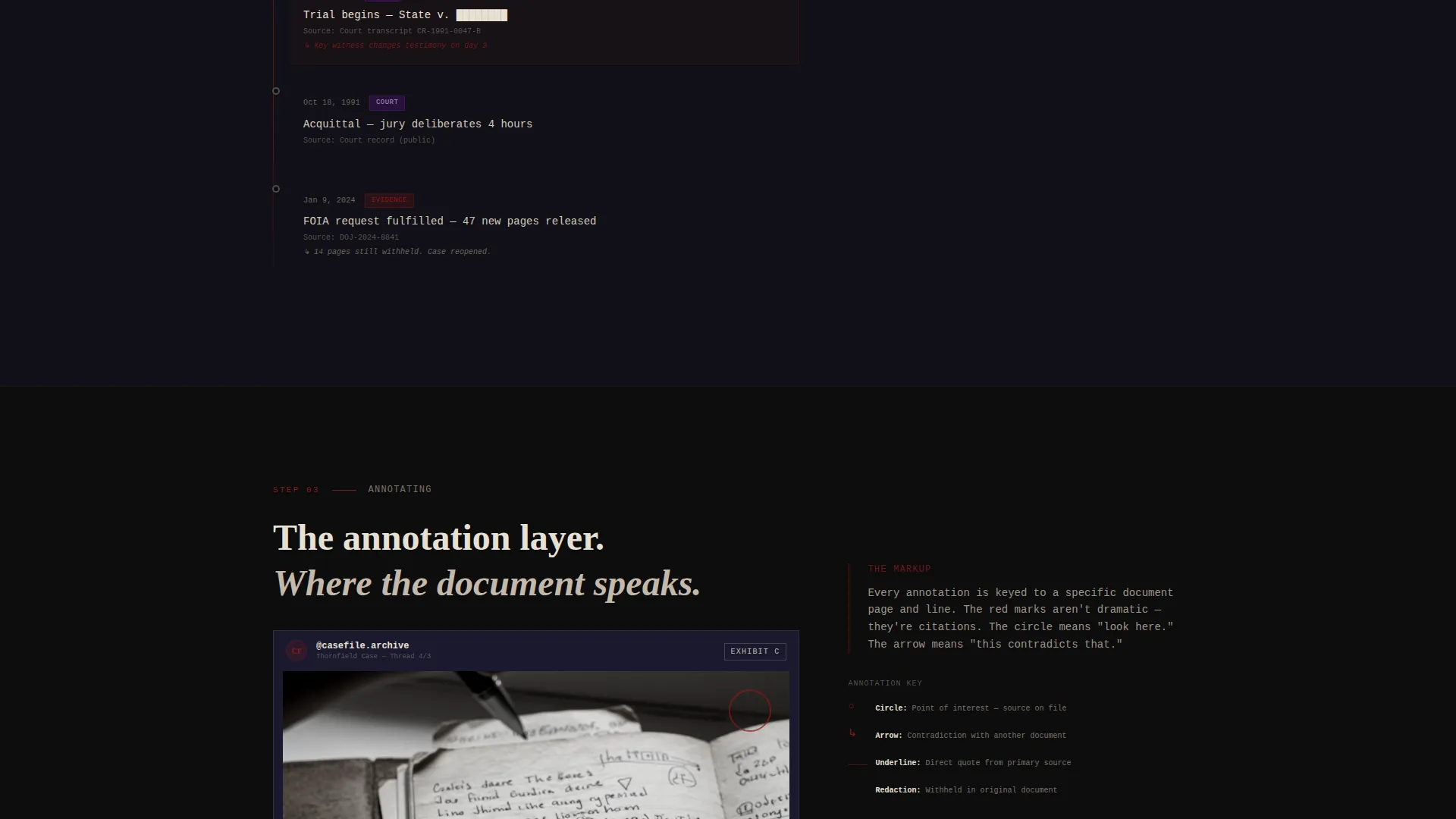
The page follows the actual process of building a case analysis post. It moves from sourcing (FOIA request screenshots and archived newspaper clippings) to mapping (a chronological timeline grid) to annotating (Instagram-style carousels with handwritten-style markup overlaid on evidence photos).
Gated Archive Call to Action
The primary call to action reads "Open the Case Archive" and links to a free downloadable PDF of the account's most comprehensive case breakdown. It is gated behind an email input field styled as a lined notebook. Three mini-analyses appear above the gate, so the visitor has already read half a case before the form appears.
Floating Evidence Card Interactions
Evidence cards include hover states and a floating card wobble animation. Scroll-linked opacity and Intersection Observer reveals add motion as the visitor moves through the page. All animations run on CSS only, with no heavy external libraries required.
Social Proof Through Case Depth
Rather than testimonials, the template uses case depth as proof. A follower count metric and document count display alongside the mini-analyses, showing the scale of the archive before the visitor commits to anything.
Page sections overview
| Section | Purpose |
|---|---|
| Hero Header | Establish visual identity and account tone with type-over-image layout and grain animation |
| The Method Panel | Show the sourcing process using FOIA screenshots and archived newspaper clippings |
| Case Timeline Grid | Map events chronologically in a stacked timeline thread layout |
| Evidence Carousels | Display annotated Instagram-style sample breakdowns with handwritten-style markup |
| Archive Call to Action | Convert visitors to email subscribers with three mini-analyses and a gated PDF |
| Footer | Close with a linear single-row footer pattern |
Design & branding system
The visual identity follows an Ink and Paper theme rendered through a cinematic dark color system. Every design decision reinforces the tension between aged paper and heavy ink, the same contrast that makes a photocopied police report feel urgent under a single lamp.
- Color palette: evidence-room black (#0D0D0D) for backgrounds, redaction-strip charcoal (#1A1A2E) for secondary surfaces, witness-statement cream (#E8E0D4) for long-form text panels, and detective's-pen red (#8B1A1A) reserved for annotations, underlines, and hover states
- Typography: Fraunces serif for headlines (newspaper-weight authority) paired with IBM Plex Mono for body labels and descriptors (typewriter precision)
- Red appears sparingly throughout, the way a detective circles a name only once, keeping the accent color meaningful every time it appears
Mobile & speed optimization
This template is built desktop-first to support its dense research layouts and evidence-grid structure. Mobile fallback is included so visitors on smaller screens can still navigate and access the archive call to action.
- All animations run on CSS only, with no heavy external libraries, keeping the page light regardless of device
- Scroll-linked opacity and Intersection Observer reveals are used for motion rather than JavaScript-heavy animation frameworks
- The asymmetric 60/40 grid and evidence carousels reflow on smaller screens so the core content hierarchy remains readable on mobile
How this template helps you convert
The conversion strategy is built on proof before ask. Visitors experience real case content before the email gate ever appears, making the ask feel like a natural next step rather than a barrier.
- Three complete mini-analyses appear above the archive call to action, so visitors are already engaged with a real case breakdown before they see the email field
- The "Open the Case Archive" primary call to action leads to a free downloadable PDF, reducing friction by offering something tangible in exchange for an email address
- A secondary path, "Follow the Investigation," directs visitors to the Instagram profile, giving non-subscribers a low-commitment conversion option that keeps them in the audience
Other information about this template
This template is built specifically for the true crime analysis niche within the broader blog and editorial category. A few additional details are worth noting for anyone evaluating it.
- The template is designed as a content and resource hub, making it well-suited for creators who produce long-form case content and want to build a dedicated archive
- Device priority is desktop-first, reflecting the research-aesthetic and dense layout needs of the niche, with mobile fallback included
- The page is localized in English (US) with no currency elements, keeping it clean for international audiences who read in English
- The footer follows a linear single-row pattern, keeping the close of the page uncluttered and consistent with the spare, evidence-room design language
Theme
Ink & Paper
Creative direction
Day-in-the-Life
Color system
Cinematic Dark
Style
Asymmetric Grid (60/40)
Direction
Content/Resource
Page Sections
Type Over Image Hero with Grain Animation
60/40 Asymmetric Research Grid
Day-in-the-life Scroll Narrative
Gated Archive with Proof-first Design
Floating Evidence Card Interactions
Social Proof Through Case Depth
Related questions
Who is this landing page template designed for?
Can I use this template to grow an email list?
Does this template include animation and interactive elements?
Is this template suitable for both desktop and mobile?
Can I adapt the colors and typography to my own brand?



