Catalyst - Flexible Family Landing Page Template
Catalyst is a bento grid landing page template designed for family mobile plan providers. It opens with a live Family Plan Calculator, walks visitors through an industry-report-style scroll comparing carrier costs and hidden fees, and closes leads with a three-step progressive disclosure form. The Tech Glass visual identity makes every interaction feel polished and trustworthy.
by Rocket studio
Quick summary
Catalyst is a single-page bento grid template built for family mobile plan marketing. It leads with a real-time cost calculator, builds trust through data-dense carrier comparison tiles, and captures leads via a smooth three-step form. The Teal Catalyst color system and Tech Glass theme give it the look of a premium dark-mode app.
Who this template is for
This template is built for telecom brands and mobile network operators that want to convert families onto a shared wireless plan. It speaks directly to the people managing multiple lines and monthly bills.
- Parents managing four to six devices who dread opening the monthly statement
- Couples merging onto one shared account after moving in together
- Sandwich-generation adults paying for both their own lines and their parents' lines
What problem this template solves
Family mobile plan shoppers are overwhelmed by confusing pricing, hidden fees, and carrier lock-in. A generic landing page does not address those anxieties head-on. Catalyst fixes that by leading with a personalized cost number, then backing it up with data.
- Visitors leave standard telecom pages before understanding the actual price for their household
- Hidden fees like activation charges and overage costs erode trust before a form is ever reached
- Generic lead forms feel premature when the visitor has not yet been persuaded
What you get with this template
Catalyst delivers a complete, conversion-focused landing page layout built specifically for the family mobile plan niche. Every section serves a purpose in moving a skeptical visitor toward submitting their information.
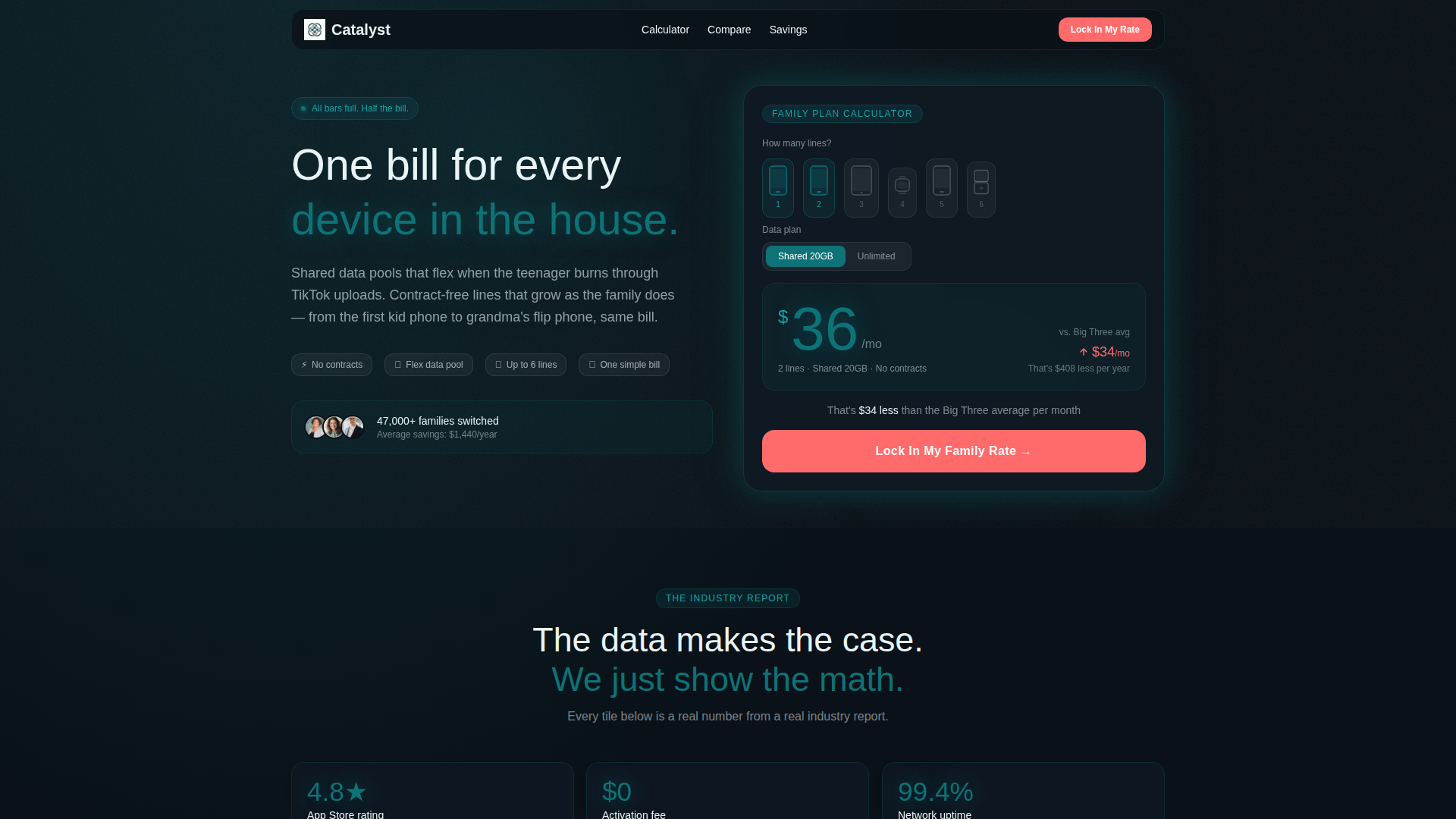
- A frosted-glass calculator card that recalculates estimated monthly cost in real time as visitors select lines and data type
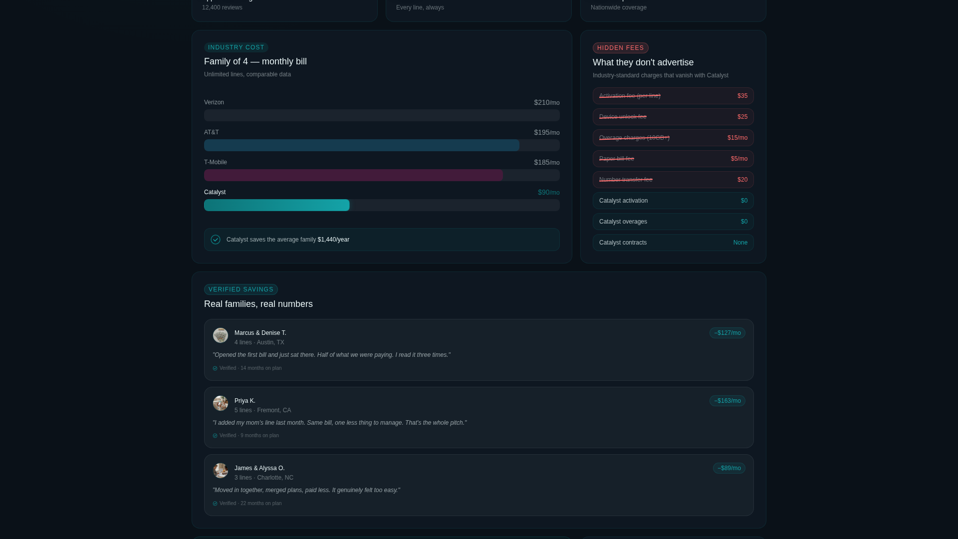
- A bento grid scroll sequence structured like a consumer industry report, with carrier comparison charts, hidden fee breakdowns, and customer savings pull quotes
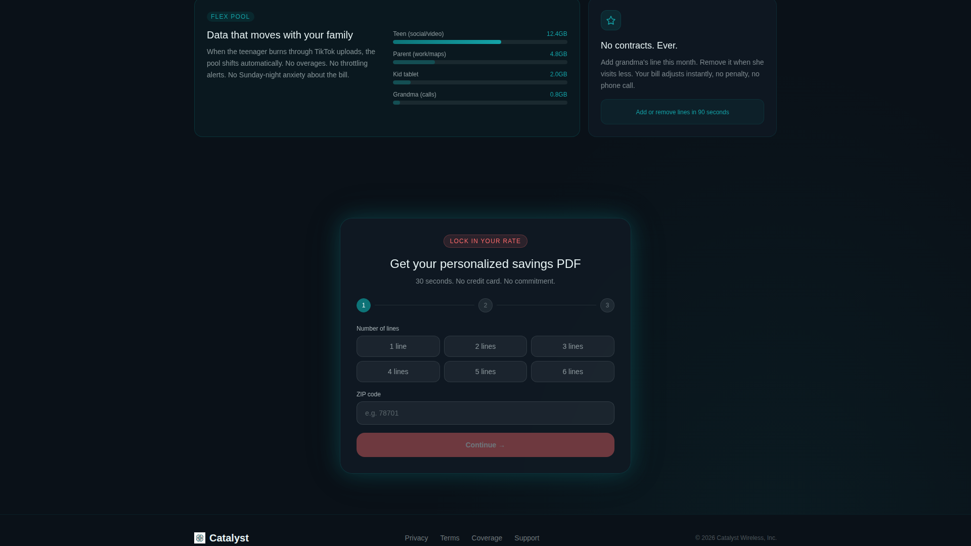
- A three-step progressive disclosure lead form that collects lines and zip code first, then carrier and spend, then name and email last
Feature list
This section covers the core built-in components that make Catalyst ready to deploy for a family mobile plan campaign.
Real-Time Family Plan Calculator
The header card lets visitors tap the number of lines, illustrated as small device silhouettes populating left to right, and toggle between unlimited and shared data. The estimated monthly cost updates instantly with a smooth counter animation. A single comparison line below the number reads how much less it is than the big carrier average.
Bento Grid Industry Report Layout
The scroll section is organized as data-dense bento tiles that build a logical case row by row. One tile shows a bar chart comparing average family plan costs across carriers. Another highlights hidden fee line items with crossed-out formatting. A third tile presents customer-reported savings as pull quotes with verified months-on-plan badges.
Three-Step Progressive Disclosure Form
The lead capture form unfolds across three steps so it never feels intrusive. Step one asks for number of lines and zip code. Step two asks for current carrier and approximate monthly spend. Step three requests name and email in exchange for a personalized savings document.
Sticky Bottom Bar Call to Action
After the visitor scrolls past the second section, a sticky bottom bar appears with the primary call to action. This keeps the conversion prompt visible without interrupting the reading experience. It reinforces the offer at exactly the moment the visitor has seen the supporting evidence.
Tech Glass Visual System
The template uses a dark gradient base, frosted glass card surfaces, and deep teal as the primary color anchor. Reactive coral is reserved exclusively for calls to action and alert-state accents. The result is a user interface that feels like a flagship phone in dark mode.
Device Silhouette Line Selector
The calculator uses illustrated device silhouettes, including smartphones, a tablet, and a smartwatch, to represent each line selected. They populate from left to right as the visitor increases the line count. This makes the interaction tactile and immediately relatable for a household shopping scenario.
Page sections overview
| Section | Purpose |
|---|---|
| Calculator Header Card | Hook visitors with a personalized estimated monthly cost |
| Carrier Cost Comparison | Show a bar chart comparing average plan prices across carriers |
| Hidden Fee Breakdown | Expose activation, overage, and device lock fees with crossed-out line items |
| Customer Savings Quotes | Build social proof with pull quotes and verified months-on-plan badges |
| Progressive Lead Form | Capture lead details across three low-friction steps |
| Sticky call to action Bar | Keep the primary call to action visible after the second scroll section |
Design & branding system
Catalyst uses the Teal Catalyst color system inside a Tech Glass visual theme. The palette is designed to feel like a flagship device in dark mode: cool, backlit, and frictionless.
- Deep digital teal (#0D7377) anchors the brand and appears on the large cost figure inside the calculator
- Midnight panel (#0F1923) fills card backgrounds to create depth and contrast across the bento grid
- Frosted glass white (#E8F4F5) is used on surfaces and text to maintain legibility against dark backgrounds
- Reactive coral (#FF6B6B) is reserved exclusively for call-to-action buttons and alert-state accents
Mobile & speed optimization
The bento grid layout is structured to remain readable and interactive on smaller screens. The calculator interaction is designed with tap-friendly device silhouette selectors rather than complex dropdowns.
- Device silhouette selectors and toggle controls are sized for touch input on mobile screens
- The sticky bottom bar keeps the call to action accessible without requiring the visitor to scroll back to the top
- The frosted glass card aesthetic maintains visual clarity at any viewport width without relying on heavy image assets
How this template helps you convert
Catalyst is built around a deliberate persuasion sequence. The visitor never feels pressured because the layout does the convincing before the form ever appears.
- The calculator personalizes the value proposition immediately by showing a specific cost estimate and a concrete savings comparison, so the visitor has a reason to keep reading before a single claim is made
- The industry report bento grid converts skepticism into confidence by presenting carrier comparisons, fee breakdowns, and real customer savings in a format that feels researched rather than promotional
- The three-step form collects information in stages that feel natural, starting with practical details the visitor already knows and ending with contact information only after trust has been established
Other information about this template
Catalyst is built as a standalone landing page in the Telecom and Connectivity category, specifically targeting the Mobile and Network Operator subcategory and the family mobile plan niche. It is designed for teams that want a ready-to-deploy layout without starting from scratch.
- The template style is Bento Grid, which allows each data tile to be updated independently without restructuring the full page layout
- The header concept is a Calculator and Estimator, a format that performs well for plan-based offers where pricing depends on household size
- The creative direction follows an Industry Report format, which positions the brand as an informed, trustworthy source rather than a typical sales page
- The landing page direction is Lead Generation, so every design decision from the sticky bar to the progressive form is oriented toward collecting a qualified contact

Theme
Tech Glass
Creative direction
Industry Report
Color system
Teal Catalyst
Style
Bento Grid
Direction
Lead Generation
Page Sections
Real-time Family Plan Calculator
Bento Grid Industry Report Layout
Three-step Progressive Disclosure Form
Sticky Bottom Bar Call to Action
Tech Glass Visual System
Device Silhouette Line Selector
Related questions
Who is this template designed for?
What does the calculator in the header actually do?
How does the three-step lead form work?
Can the calculator handle different household sizes?
What makes the bento grid layout effective for a telecom landing page?