D2C Brand Launch Landing Page Template
Catalyst is a dashboard-style direct-to-consumer brand landing page built for founders who need a complete operational picture at a glance. With a Tech Glass visual identity, a Feature Matrix scroll experience, and a three-step lead capture flow, it turns a product idea into a shipping brand story, fast, credible, and ready to convert from the first scroll.
by Rocket studio
Quick summary
Catalyst is a single-page, dashboard-driven landing page template built for direct-to-consumer brand launches. It uses a dark command-center aesthetic, a teal-and-coral color system, and a Feature Matrix scroll structure. The page opens with a full-width platform screenshot and closes with a progressive three-step lead capture form, showing the machine working before asking anyone to commit.
Who this template is for
This template is built for founders who are ready to move fast and need a page that reflects operational seriousness. It speaks to people who already have a product and need a credible launchpad, not a brochure.
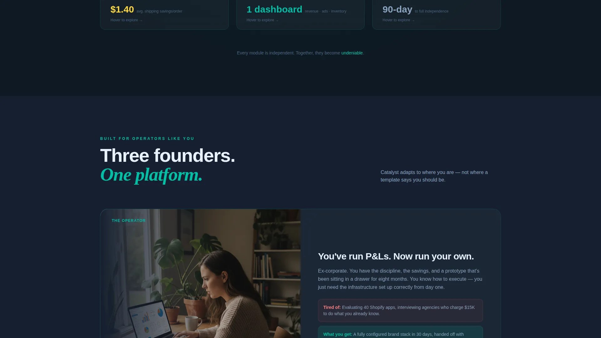
- Ex-corporate operators sitting on a prototype who need a clear, professional front door for their brand
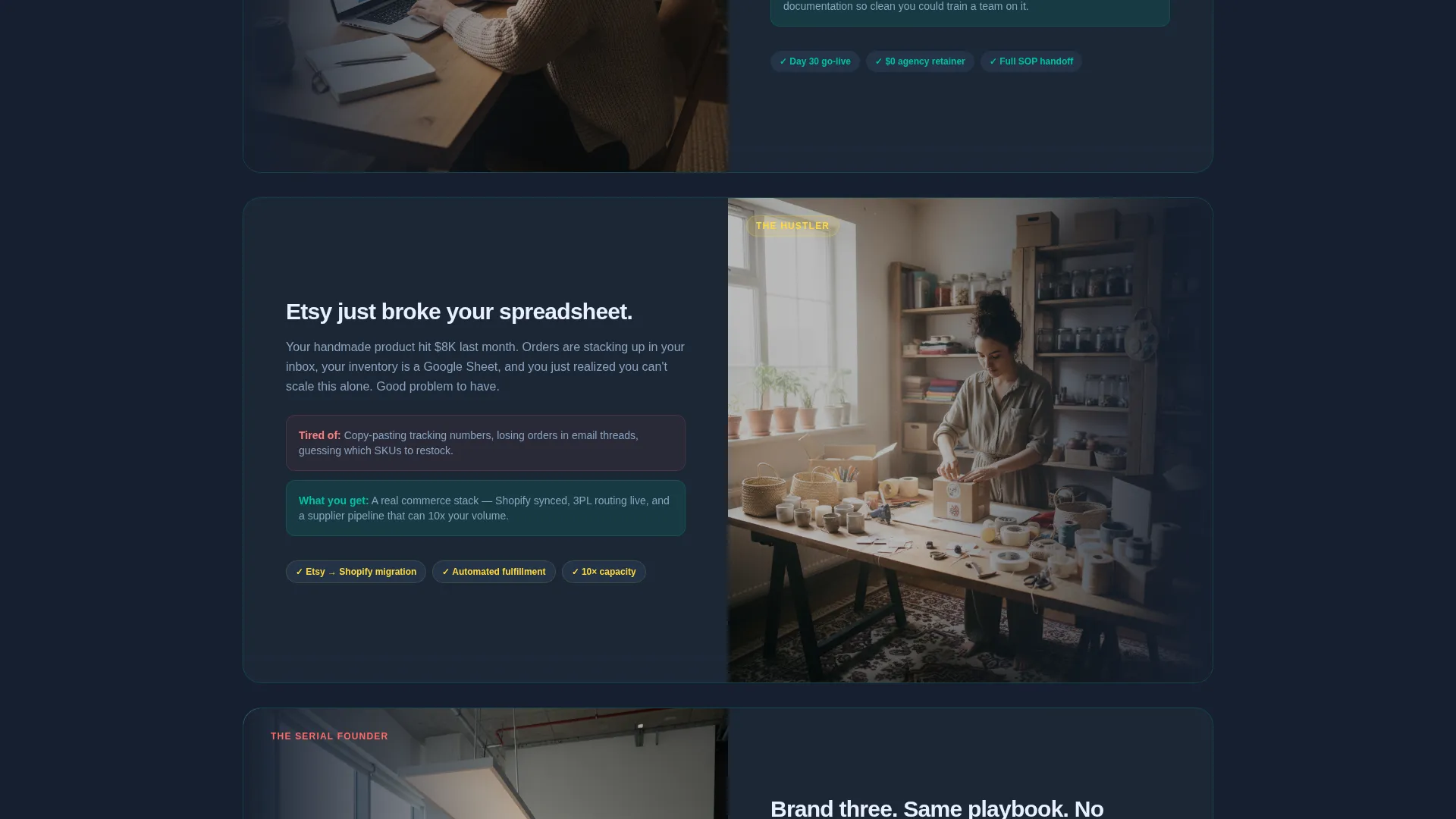
- Side-hustlers whose sales volume has outgrown spreadsheets and who are ready to present a real operational story
- Serial entrepreneurs launching a new brand who want a proven page structure without rebuilding from scratch
What problem this template solves
Most early-stage direct-to-consumer founders struggle to communicate the full scope of their operation in a single page. Generic templates with lifestyle imagery and vague benefit lists fail to earn trust from buyers who think in systems.
- Founders have no visual way to show investors or early customers that their backend actually works
- The gap between "product idea" and "shipping brand" feels invisible on most landing pages
- Scattered feature descriptions fail to show how storefront, supplier, ads, and fulfillment connect into one working system
What you get with this template
You get a fully structured, single-page landing page that leads with proof and closes with a conversion path. Every section is designed to accumulate trust through visible operational detail rather than abstract claims.
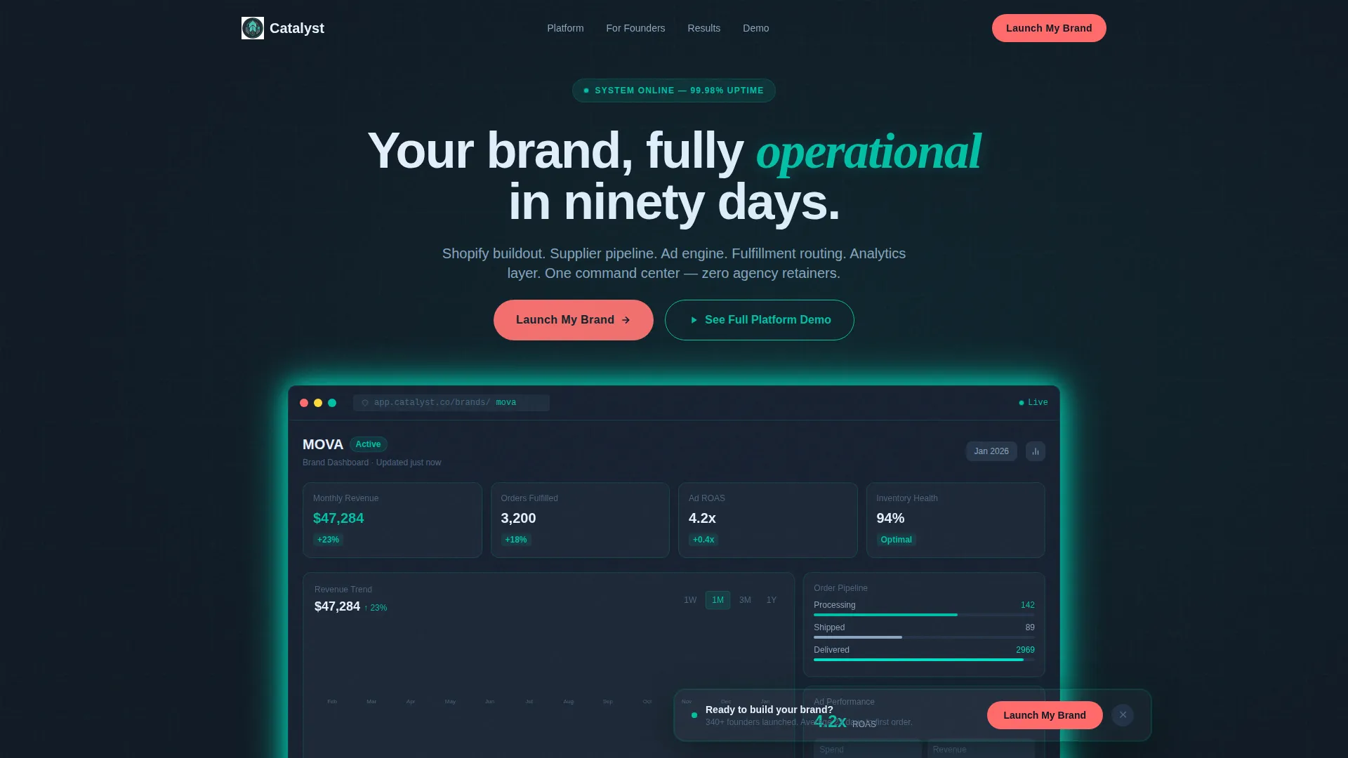
- A full-width product screenshot header showing a fictional live dashboard with real data labels, revenue graphs, order counts, and ad return metrics
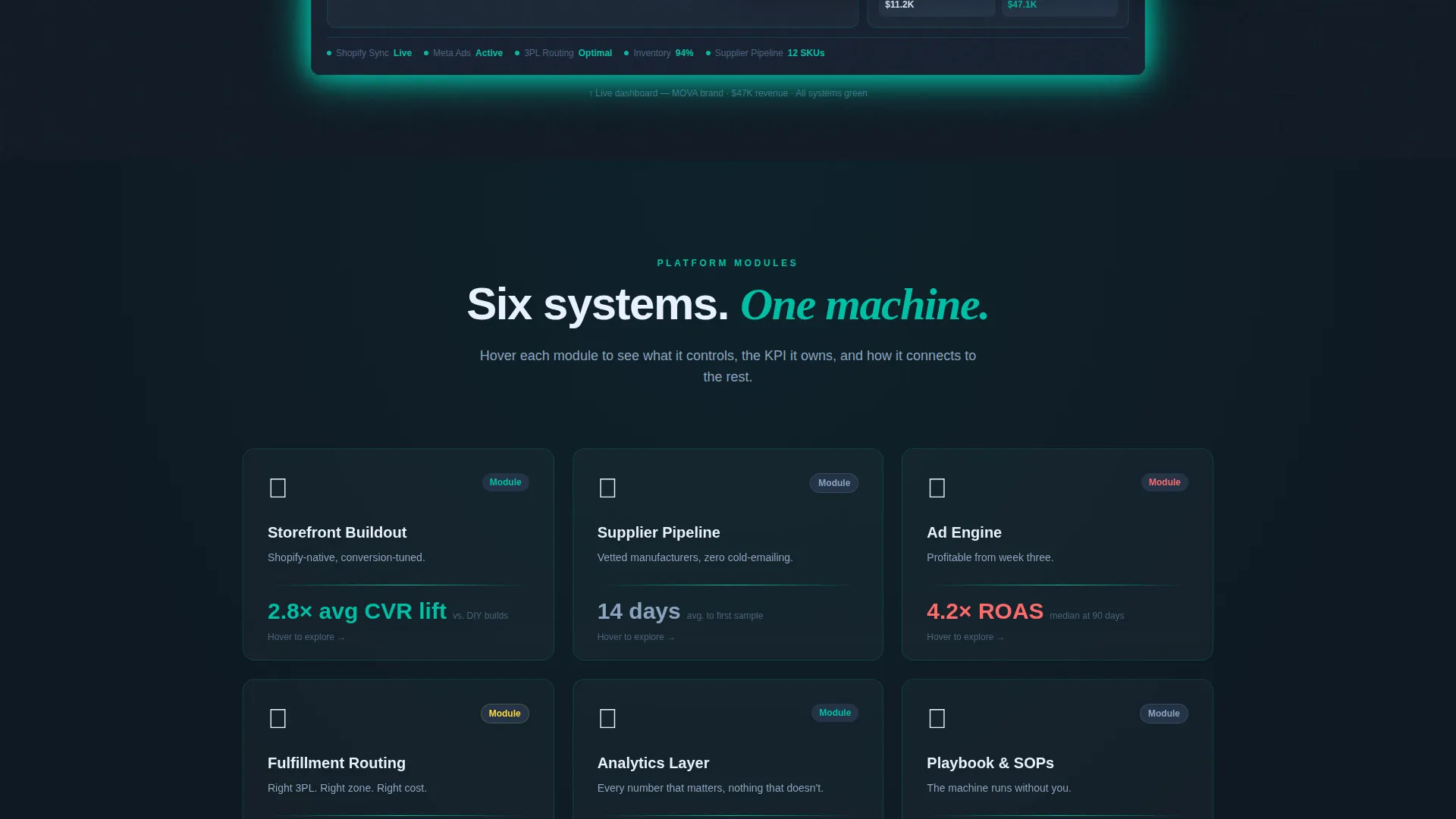
- A Feature Matrix scroll section that breaks the dashboard into individual data cards, each revealing a micro-screenshot, one key performance indicator, and one line of copy on hover
- A three-step progressive lead capture form covering brand name, revenue range, tech stack, email, and preferred launch window, plus a secondary ghost-button path to a gated platform demo
Feature list
This template is built around five distinct functional systems that work together across the scroll experience.
Full-Width Dashboard Screenshot Header
The page opens with a pixel-perfect render of a fictional brand mid-operation. The dashboard shows a revenue graph climbing to a monthly figure, fulfilled order counts, ad return on ad spend at 4.2x, and inventory health at 94 percent. A thin teal scan-line animates across the render once on load, signaling a live system refresh. No stock photography, no lifestyle imagery.
Feature Matrix Data Card Grid
After the header lands, the scroll experience breaks the dashboard into its component systems. Each system gets its own data card on a grid layout. Cards flip or expand on hover to reveal a micro-screenshot, a single key performance indicator, and one sentence of copy. The grid tightens as the visitor scrolls, with cards snapping together until the full dashboard reassembles in the final section.
Three-Step Progressive Lead Capture
The primary conversion path is a staged form sequence. Step one collects brand name and product category. Step two asks for monthly revenue range and current tech stack, including options for Shopify, WooCommerce, or no existing stack. Step three captures email and preferred launch window. This structure reduces friction and qualifies the lead before the final ask.
Floating call to action Bar
A persistent bottom bar appears after the visitor passes the second grid row. It displays the primary call-to-action button in hot coral against deep charcoal. The bar stays visible during scroll, keeping the conversion path accessible without interrupting the reading experience.
Gated Demo Embed Path
A secondary conversion route offers a ghost-button labeled "See the Full Platform Demo." Clicking it triggers an embedded video walkthrough. An email gate appears before playback begins, capturing a second conversion path for visitors who prefer to watch before they commit.
Page sections overview
| Section | Purpose |
|---|---|
| Dashboard Screenshot Header | Opens the page with a full-width fictional brand dashboard render |
| Teal Scan-Line Animation | Signals a live system refresh on page load |
| Feature Matrix Grid | Breaks the dashboard into individual component data cards |
| Card Hover Reveals | Shows micro-screenshots, KPIs, and copy on interaction |
| Grid Reassembly Section | Reconstructs the full dashboard with the visitor's brand name |
| Floating call to action Bar | Keeps the primary conversion button accessible during scroll |
| Three-Step Lead Form | Captures brand details, tech stack, and contact info progressively |
| Demo Ghost Button | Offers a secondary path to a gated embedded video walkthrough |
Design & branding system
The visual identity uses a Tech Glass theme built on a deep command-center palette. Every surface is designed to feel like a control room reflected in a glass monitor at night.
- Deep charcoal (#0F1923) as the base background, primary teal (#00BFA6) as the active system color across status indicators and data panels, frosted glass white (#E8F0FE) for card surfaces
- Hot coral (#FF6B6B) reserved exclusively for call-to-action buttons and alert-state accents, ensuring the conversion path is always visually distinct
- Teal light treated as a design element bleeding across card edges and hover states, giving the grid a terminal-cursor quality that feels alive and data-rich
Mobile & speed optimization
The layout is built to remain readable and functional as screen width decreases. The data card grid adapts to narrower viewports without losing the structural logic of the Feature Matrix experience.
- Data cards reflow into a stacked single-column layout on smaller screens, preserving the hover-reveal interaction where touch behavior allows
- The floating call to action bar remains pinned at the bottom of the viewport on mobile, keeping the primary conversion path visible throughout the scroll
- The three-step form is designed for linear progression, making it easy to complete on a phone without toggling between fields or losing step context
How this template helps you convert
The page earns its conversion by showing the product working before it asks for anything. Every structural decision builds toward the moment the visitor sees their own brand name in the dashboard header.
- The full-width dashboard screenshot leads with proof, not persuasion, giving technically minded founders immediate evidence that the system is real and operational
- The Feature Matrix grid accumulates trust incrementally, so each module the visitor reviews makes the complete picture feel more inevitable and worth pursuing
- The three-step form and ghost-button demo path offer two distinct commitment levels, letting cautious visitors self-select into the lower-friction option while still entering the conversion funnel
Other information about this template
This template is designed for the direct-to-consumer brand startup category, where founders need to signal operational credibility to early customers, partners, and potential investors. The fictional brand "MOVA" used in the dashboard header is a placeholder, and the reassembly section is structured so that the visitor's own brand name appears in the header bar as they reach the final section.
- The template style is Dashboard and Data Grid, making it well suited for founders whose audience thinks in metrics and system outputs rather than lifestyle benefits
- The lead generation flow supports both high-intent visitors ready to book a launch and lower-intent visitors who want to explore the platform demo first
- The Catalyst color system, the Tech Glass theme, and the Feature Matrix creative direction are designed to work as a cohesive visual language across the full scroll experience
Theme
Tech Glass
Creative direction
Feature Matrix
Color system
Teal Catalyst
Style
Dashboard/Data Grid
Direction
Lead Generation
Page Sections
Dashboard Screenshot Header with Scan-line Animation
Feature Matrix Data Card Grid
Three-step Progressive Lead Capture Form
Floating Coral Call to Action Bar
Gated Demo Embed with Email Capture
Related questions
Who is this landing page template built for?
What does the three-step lead form collect?
Can I replace the fictional dashboard content with my own brand details?
What is the secondary conversion path in this template?
Does this template require a specific platform or tech stack to use?



