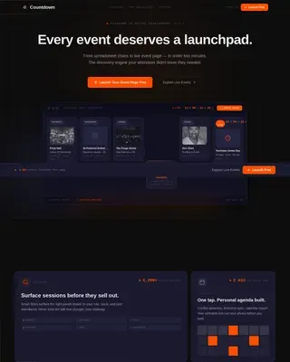
Product Launch & Pre-Launch Reviews Website Template
Catalyst is a dark-themed, card grid feature announcement landing page built for SaaS teams. It follows a Problem→Solution arc, opens with an isometric dashboard preview, and drives early-access signups through a sticky coral call to action bar. Every section earns the scroll: pain-point cards, solution cards with micro-animations, a comparison table, and a gated demo path.
by Rocket studio
Quick summary
Catalyst is a single-page feature announcement template designed for SaaS product and engineering teams. It opens with a browser-framed dashboard preview, walks visitors through a Problem→Solution arc using modular card grids, and closes with a sticky lead-capture bar. The goal is to show the feature working before asking for anything.
Who this template is for
Catalyst is built for teams launching a new product feature who need more than a changelog entry. It speaks directly to decision-makers who evaluate tools on evidence, not marketing copy.
- SaaS product managers who need a polished, fast-to-deploy announcement page
- Engineering leads assessing integration complexity before committing to a new tool
- CTOs who must justify tooling spend to a board with something concrete and persuasive
What problem this template solves
Most feature announcements live in a changelog or a generic email blast. They describe the feature without showing it, and they ask for a signup before earning the trust to do so. Catalyst fixes that sequence.
- Prospects see the feature in a realistic dashboard context before any form appears
- Pain points are stated with real stats, making the value case immediately tangible
- The lead-capture flow only surfaces after the solution has been demonstrated section by section
What you get with this template
You get a fully structured, single-page layout built around a deliberate content arc. Every section is modular, so you can swap in your own copy, stats, and screenshots without rebuilding the structure.
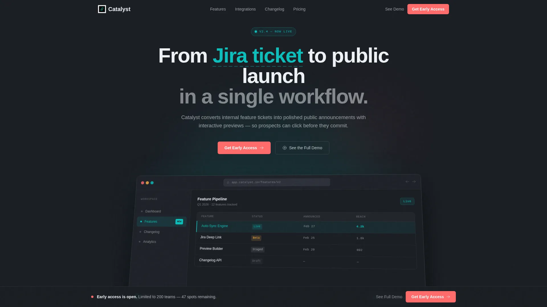
- A browser-chrome-framed isometric dashboard header with a radial glow effect
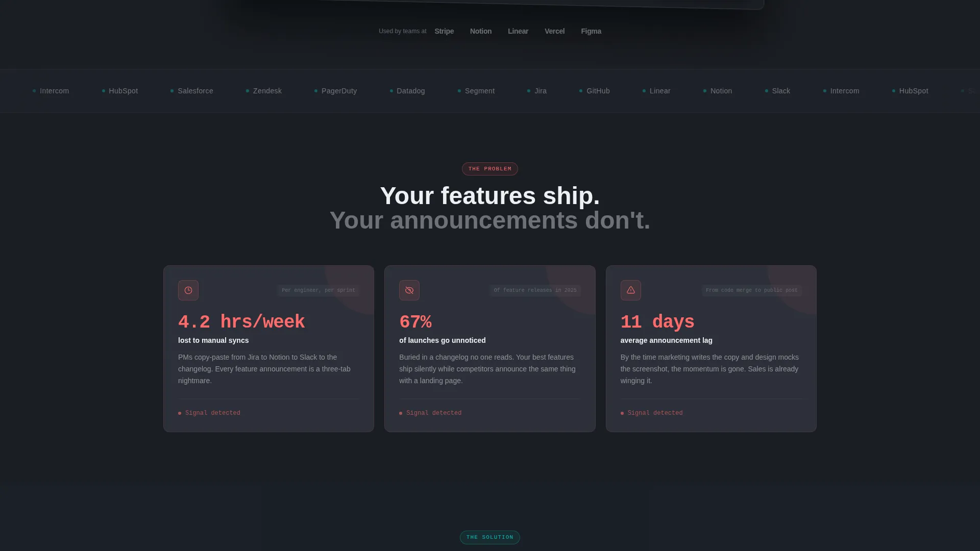
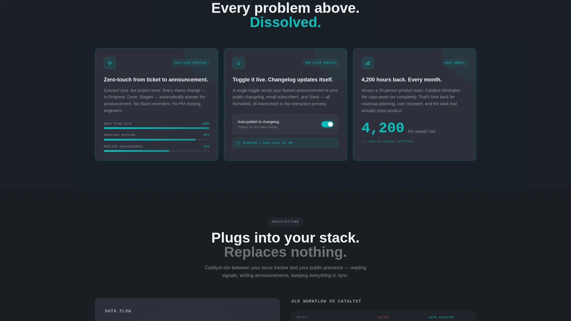
- A three-card pain-point row with coral warning icons and supporting stats, followed by a mirrored teal solution card row with embedded micro-animations
- A sticky bottom call to action bar, an inline three-field lead form, and a secondary gated video demo path
Feature list
This template ships with a set of purpose-built components. Each one does a specific job in the announcement flow.
Isometric Dashboard Header
The header renders a browser-chrome-framed product screenshot at a slight isometric tilt. It shows a live-feeling data table, a sidebar with a pulsing new-module indicator, and a "Feature enabled" toast notification. The charcoal background uses a faint radial glow so the screen appears to be its own light source.
Problem and Solution Card Grid
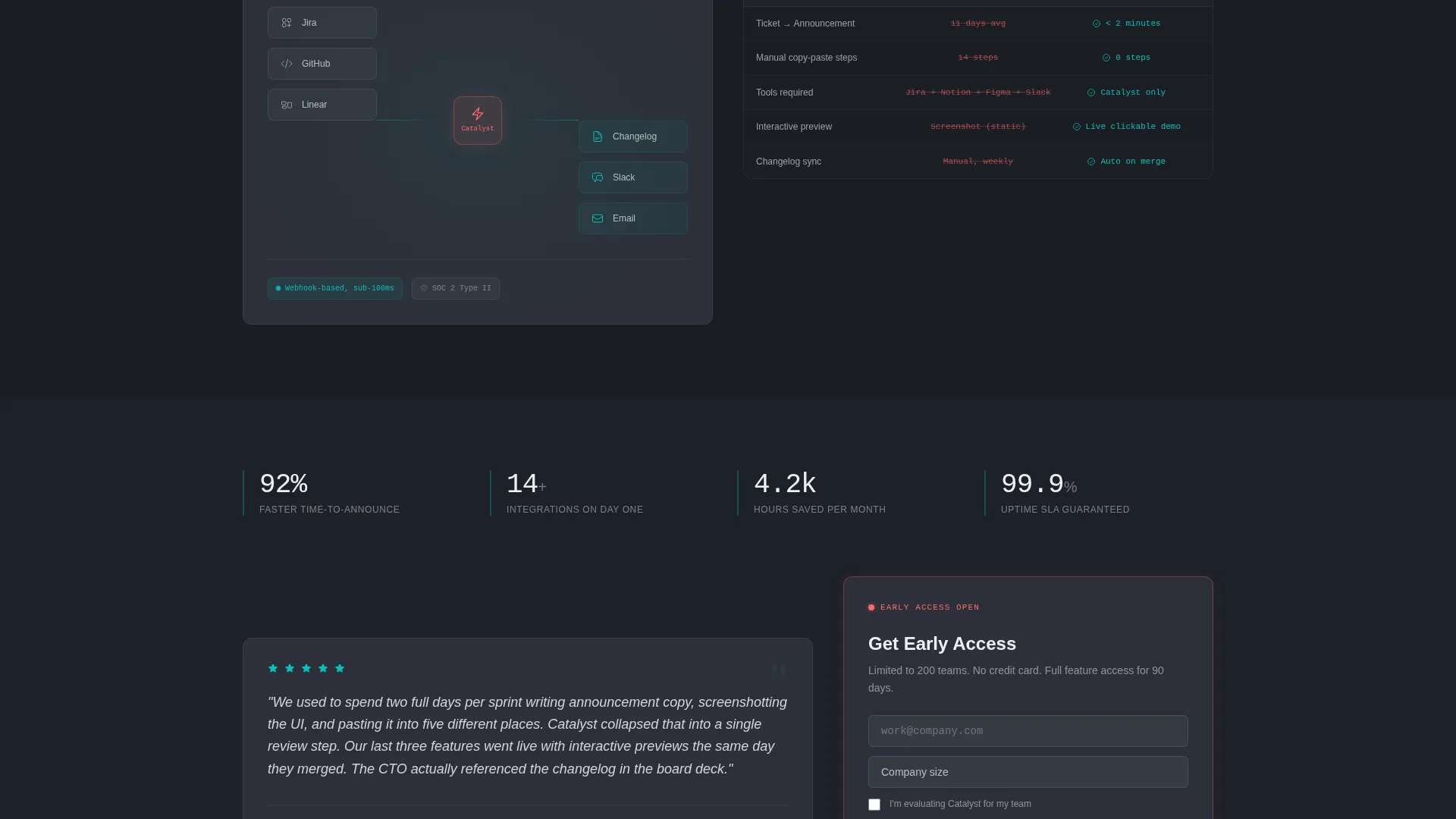
Two mirrored three-card rows form the core of the page. The first row uses slate cards with coral warning icons and single-stat callouts to surface real pain points. The second row answers each pain point with a teal-accented card containing a micro-animation, such as a progress bar completing or a number ticking upward.
Sticky Lead Capture Bar
A bottom bar appears after the problem cards scroll into view. It holds a coral "Get Early Access" button against the charcoal field. Clicking the button expands an inline form with three fields: work email, company size dropdown, and a single intent checkbox.
Gated Demo Video Path
A secondary call to action labeled "See the Full Demo" links to a gated video. Visitors who prefer to watch before signing up are captured through the same email gate, giving the page two parallel conversion paths.
Integration Architecture Diagram
A dedicated section displays the feature's integration architecture visually. This gives engineering leads and technical evaluators a clear picture of how the new module connects to existing systems.
Beta User Testimonial Card
A single testimonial card features a quote from a beta user, complete with their job title and company name. Placing a real identity behind the endorsement adds credibility at the moment visitors are deciding whether to sign up.
Page sections overview
| Section | Purpose |
|---|---|
| Dashboard header preview | Anchors the page with a realistic product screenshot in isometric frame |
| Pain point cards | States three specific problems with supporting stats and coral warning icons |
| Solution feature cards | Mirrors the pain-point grid with teal cards and micro-animations showing resolution |
| Architecture diagram | Gives technical evaluators a clear view of integration structure |
| Workflow comparison table | Contrasts the old manual process with the new feature side by side |
| Beta user testimonial | Provides social proof with a named, titled quote from a real beta tester |
| Sticky call to action bar | Persists on scroll and expands into the inline lead capture form |
Design & branding system
The Teal Catalyst color system is built around a mission-control aesthetic. Every color choice has a functional reason: backgrounds recede, interactive elements advance, and alerts are impossible to miss.
- Deep charcoal (#1A1D23) as the primary background, muted slate (#2C3039) for card surfaces, and signal white (#EDF1F5) for all body text and iconography
- Active teal (#0ABFBC) reserved for interactive states, data highlights, and solution card accents to signal positive resolution
- Accent coral (#FF6B6B) used exclusively on alert icons, warning states, and the primary call to action button so it always commands attention
Mobile & speed optimization
The card grid layout is modular by design. Each row and card block is structured to reflow cleanly at smaller viewport widths without breaking the visual hierarchy.
- Card rows stack vertically on mobile so the Problem→Solution arc reads correctly from top to bottom
- The sticky call to action bar remains anchored at the bottom of the viewport on all screen sizes, keeping the primary conversion action accessible throughout the scroll
How this template helps you convert
Catalyst is structured so that every scroll deepens trust before the page asks for a commitment. The sequence is intentional.
- The dashboard header and pain-point cards establish credibility and relevance in the first viewport, giving visitors a reason to keep scrolling.
- The solution cards, architecture diagram, comparison table, and testimonial collectively build the case so that by the time the lead form is visible, the visitor has already mentally evaluated the feature.
- Two parallel conversion paths, early access via the sticky form and the gated demo video, capture visitors at different stages of readiness without forcing a single action.
Other information about this template
Catalyst sits in the Startup and Launch category, specifically within the Product Launch and Pre-Launch subcategory. It is designed for the Feature Announcement Page niche, where the primary goal is qualified lead generation rather than broad awareness.
- The template follows the Dashboard Pro theme with the Teal Catalyst color system, making it a strong fit for SaaS tools, developer platforms, and data-driven product teams
- The Card Grid (Modular) template style means individual sections can be reordered or removed to match a specific release scope or team preference
- The creative direction is a Problem→Solution Arc, a narrative structure that mirrors how technical buyers naturally evaluate new software before agreeing to try it
Theme
Dashboard Pro
Creative direction
Problem→Solution Arc
Color system
Teal Catalyst
Style
Card Grid (Modular)
Direction
Lead Generation
Page Sections
Isometric Dashboard Header
Problem and Solution Card Grid
Sticky Lead Capture Bar
Gated Demo Video Path
Integration Architecture Diagram
Beta User Testimonial Card
Related questions
Can I edit the copy, stats, and screenshots myself?
Do I need design or development experience to use this template?
How does the two-path lead capture work?
Is this template suitable for a product update or only a first-time launch?
Can the card grid sections be reordered or removed?