Catalyst - Transparent Insurtech Landing Page Template
Catalyst is a split-screen insurtech waitlist landing page template built for digital insurance marketplaces. It leads with a live coverage estimator, a carrier comparison panel, and an interactive explorer that rewards curiosity. The design uses a Teal Catalyst color system to project clinical trust and guided clarity, turning a confusing purchase into a confident decision.
by Rocket studio
Quick summary
Catalyst is a single-page, split-screen landing page template for insurtech startups and digital insurance platforms. It opens with a functional coverage estimator that compares anonymized carrier quotes in real time. Every scroll below reveals an interactive layer, a carrier directory, a coverage-type explorer, and a conversion-focused sticky call-to-action bar, all designed to replace confusion with clarity before a visitor clicks anything.
Who this template is for
This template is built for founders and product teams launching an insurtech platform or insurance marketplace. It speaks directly to the people most frustrated by opaque quoting processes and outdated broker experiences.
- Insurtech startups building a waitlist before their full platform launches
- Digital insurance marketplaces that want to demonstrate comparison tools before sign-up
- Insurance-adjacent SaaS teams that need a high-trust, low-friction landing page to capture early interest
What problem this template solves
Most insurance landing pages either bury visitors in jargon or rush them into a form before they have any reason to trust the product. The Catalyst template solves this trust gap by letting the tool do the persuading.
- Visitors receive useful, personalized estimate data before they are asked to click anything
- The interactive explorer format replaces passive reading with active discovery, reducing the sense of being sold to
- The waitlist-first structure captures intent from visitors who are interested but not yet ready to commit
What you get with this template
You get a fully designed, single-page landing page template with structured sections and a clear visual system. Every component maps to a specific moment in the visitor's decision journey.
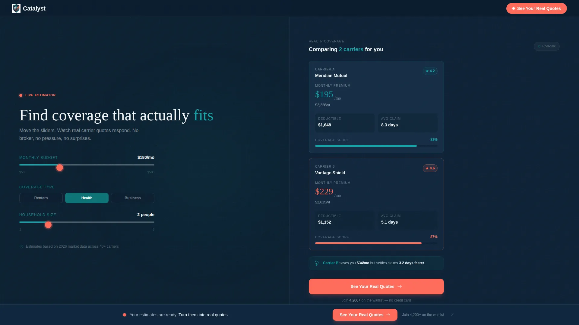
- A 50/50 split-screen header with a three-slider coverage estimator on the left and a live-updating carrier comparison card on the right
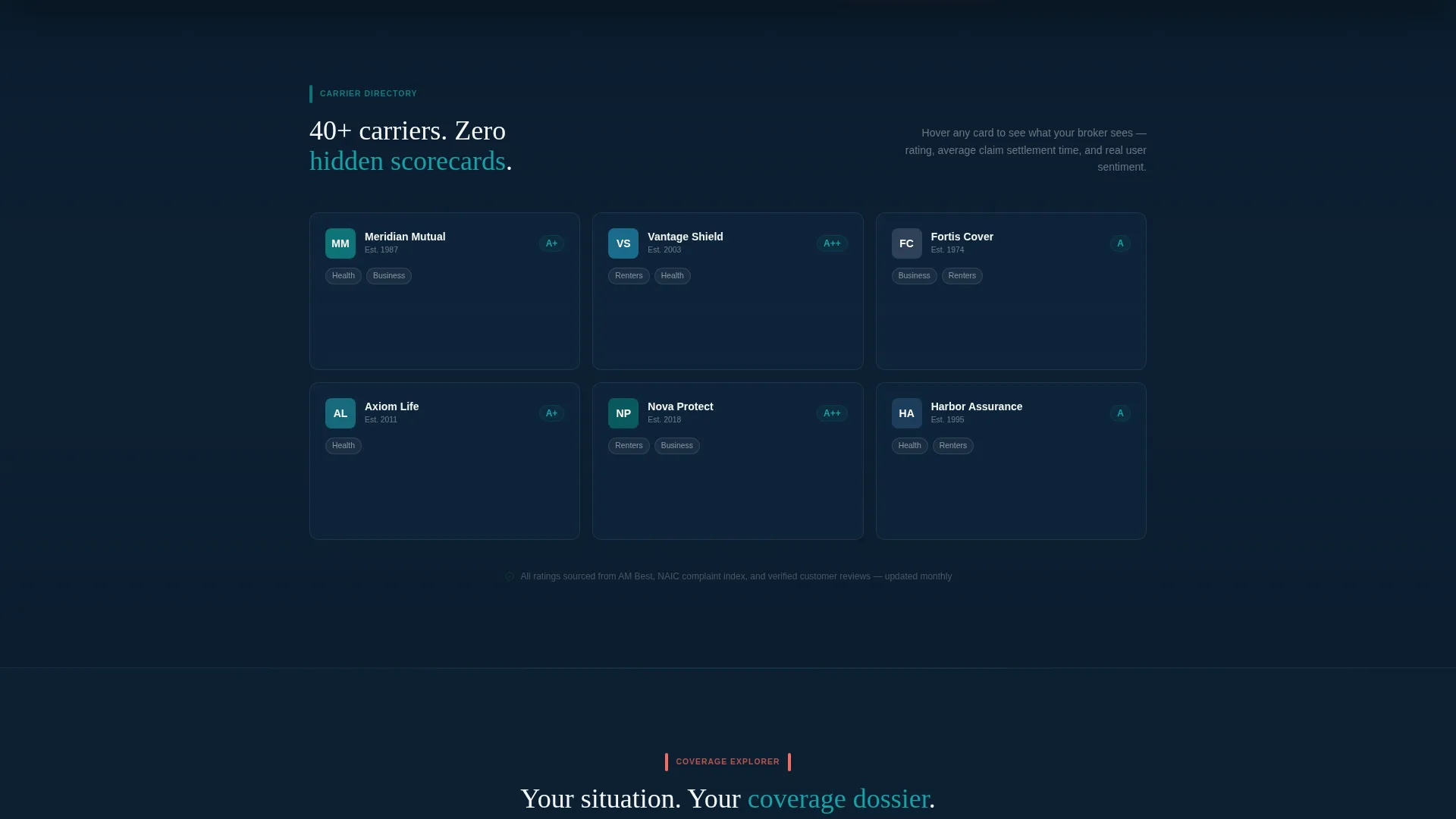
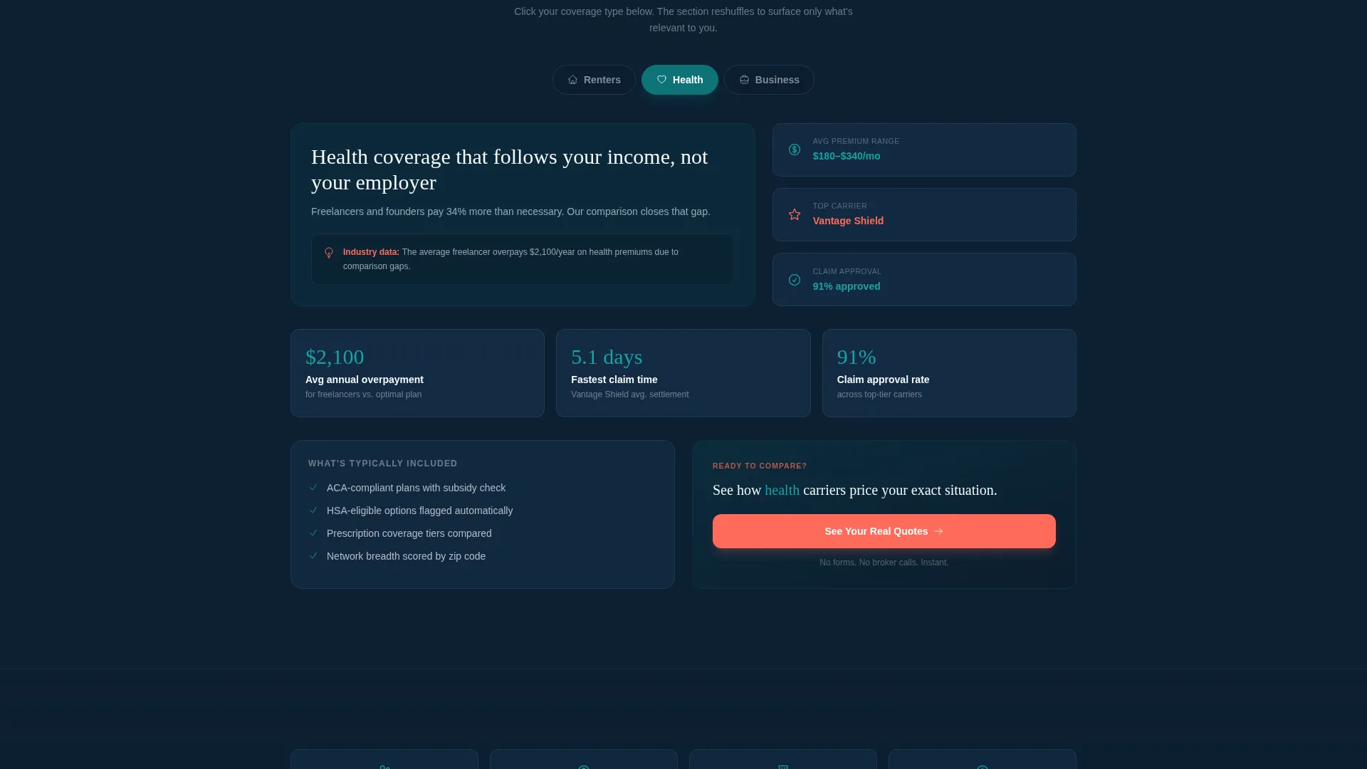
- A carrier directory grid with hover-reveal details, a coverage-type explorer with reshuffling section layouts, and a sticky call-to-action bar that activates after estimator interaction
- A complete Teal Catalyst color system with defined roles for every shade, plus a reactive coral reserved exclusively for interactive hotspots and primary call-to-action elements
Feature list
This template includes purpose-built components designed specifically for an insurtech waitlist landing page. Each feature plays a defined role in building visitor trust and earning the click.
Live Coverage Estimator Header
The header is a working split-screen tool, not a static hero image. The left panel contains three sliders, monthly budget, coverage type, and household size, rendered in deep decision teal with coral drag handles. The right panel updates a simplified comparison card in real time as the sliders move, with numbers animating like an exchange board.
Carrier Directory Grid
Below the fold, a carrier directory grid lets visitors hover over carrier logos to reveal rating, average claim time, and user sentiment score. This section surfaces the kind of information seasoned brokers keep to themselves, giving visitors a genuine head start on their research.
Coverage-Type Explorer
A tabbed coverage-type explorer lets visitors click "Renters," "Health," or "Business" to reshuffle the entire section layout. Each selection surfaces relevant insights for that coverage category, making the page feel responsive to individual needs rather than generic.
Sticky Call-to-Action Bar
A sticky bar reading "See Your Real Quotes" in reactive coral appears after the visitor interacts with the estimator. It stays anchored as they scroll, reinforcing that the calculator was the preview and the full quoting engine is one click away. A secondary text link beneath reads "Join 4,200+ on the waitlist" for visitors not yet ready to commit.
No-Form Conversion Flow
The page captures intent through interaction, not form fields. The only inputs are the estimator sliders. This lowers friction significantly and lets the template earn the click through demonstrated competence rather than a gate.
Teal Catalyst Color System
The color system assigns a precise role to each shade. Deep decision teal anchors information surfaces. Midnight data navy grounds backgrounds and typographic weight. Catalyst white provides breathing room on card surfaces. Reactive coral appears exclusively on interactive hotspots and call-to-action elements, creating a visual hierarchy that guides the eye without explanation.
Page sections overview
| Section | Purpose |
|---|---|
| Split-Screen Estimator Header | Opens the page with a live, functional coverage and carrier comparison tool |
| Carrier Directory Grid | Lets visitors explore carrier ratings and claim data on hover |
| Coverage-Type Explorer | Reshuffles section content when visitors select Renters, Health, or Business |
| Sticky call to action Bar | Anchors the primary call-to-action after estimator interaction |
| Waitlist Secondary Link | Captures softer intent with a lower-commitment sign-up path |
Design & branding system
The Catalyst template uses a Directory and Discovery theme expressed through the Teal Catalyst color system. Every color has a functional role, and nothing is decorative for its own sake.
- Deep decision teal (#0D7377) dominates left-panel information surfaces; midnight data navy (#0B1D2E) grounds right-panel action areas and body typography; catalyst white (#F4F7F8) fills card surfaces and open space
- Reactive coral (#FF6B5A) is reserved exclusively for drag handles, interactive hotspots, and call-to-action buttons, it never appears in passive content
- The overall palette is described as clinical enough to trust and alive enough to feel urgent, with no stock photography or illustrations used anywhere on the page
Mobile & speed optimization
The template is structured for a clean experience across screen sizes. The split-screen layout is designed to adapt without losing the functional integrity of the estimator or the interactive explorer sections.
- The 50/50 split-screen header is built to reflow gracefully so the estimator and comparison card remain usable on smaller viewports
- Interactive sections such as the carrier grid and coverage-type explorer are designed to maintain their hover and click behaviors in touch-friendly contexts
- No external media assets such as stock photos or illustrations are used, which keeps the visual weight of the page low by design
How this template helps you convert
The page is structured around earning the click rather than demanding it. Every section is sequenced to increase visitor confidence before the call-to-action is reinforced.
- The estimator header delivers immediate, personalized value, visitors see real comparison data within seconds of landing, before any commitment is requested
- The interactive explorer layers below the fold reward curiosity and build a sense of informed agency, so by the time the sticky call-to-action bar appears, the visitor has already experienced the product's core value proposition
Other information about this template
This template is part of the Startup and Launch category, specifically designed for the InsurTech Waitlist Landing Page niche. It follows the Interactive Explorer creative direction paired with the Calculator and Estimator header concept.
- The template style is Split Screen (50/50), and the landing page direction is Click-Through, meaning the primary goal is a single outbound click to the full quoting engine
- The Directory and Discovery theme informs the layout logic, information is organized for exploration, not passive consumption
- This template works well for teams building early traction before a full product launch, particularly those targeting freelancers, small business owners, and young families navigating coverage decisions
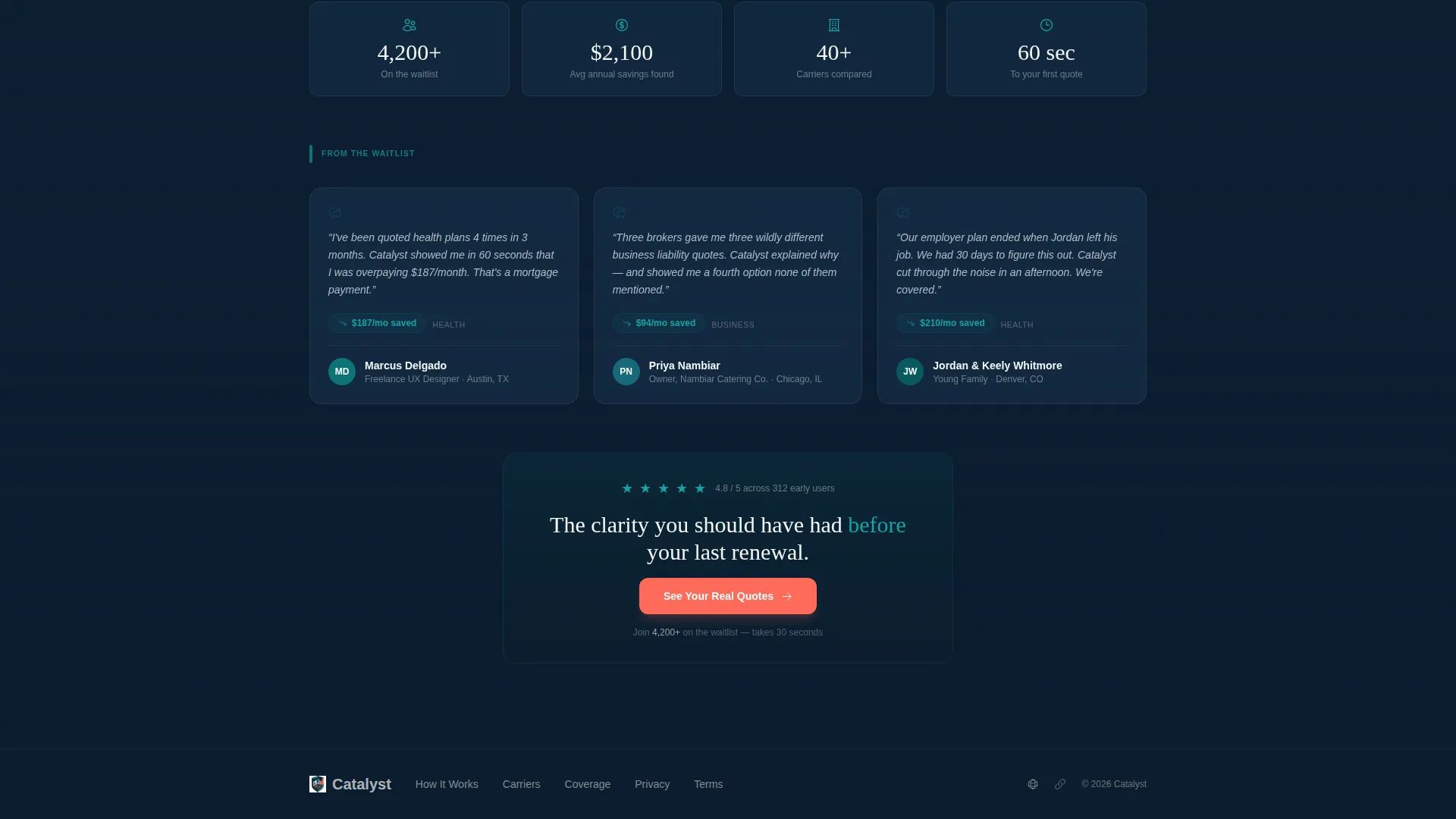
- The waitlist social proof element ("Join 4,200+ on the waitlist") is a built-in secondary conversion anchor for visitors who need more time before committing
Theme
Directory & Discovery
Creative direction
Interactive Explorer
Color system
Teal Catalyst
Style
Split Screen (50/50)
Direction
Click-Through
Page Sections
Live Split-screen Coverage Estimator
Hover-reveal Carrier Directory
Coverage-type Explorer with Reshuffling Layout
Sticky Coral Call-to-action Bar
No-form Frictionless Conversion Flow
Teal Catalyst Color System
Related questions
Does the estimator in the header actually function as a tool?
Are there any form fields on this landing page?
Who is the target visitor for this template?
Can I use this template without a full insurance platform ready to launch?
What makes the color system different from a typical startup template?



