Film Analysis Community Landing Page Template
Celluloid is an editorial landing page template built for film and cinema analysis communities. It combines a manifesto-style hero, a three-act origin story, magazine-spread analysis sections, and a low-friction sign-up form into one cinematic scroll. The design uses a warm, monochrome palette and serif typography to feel like a repertory cinema lobby brought online.
by Rocket studio
Quick summary
Celluloid is a single-page editorial template designed for serious film analysis communities. It guides visitors through an emotional three-act narrative, from the community's origin to an open invitation to join. The template pairs a typographic manifesto hero with magazine-style content sections, member voices, and a minimal sign-up form that asks only for an email and one meaningful question.
Who this template is for
This template is built for communities and creators who take cinema seriously. It speaks to people who want their online presence to feel as considered as the films they discuss.
- Film and cinema analysis communities launching or refreshing a membership platform
- Independent critics, cinephile collectives, and editorial film publications seeking a home base
- Film students and working editors who want to host deep-reading conversations beyond social media
What problem this template solves
Most community landing pages feel transactional. They push sign-ups before earning trust. For a film analysis community, that approach kills the mood before the conversation starts.
- Visitors arrive without context and leave before feeling the community's depth and voice
- Generic templates cannot convey the intellectual warmth that makes a cinephile community distinct
- Standard sign-up flows treat registration as data capture rather than a moment of self-expression
What you get with this template
You get a fully structured, editorial landing page that tells your community's story in three acts and converts curious visitors into members through emotional resonance rather than hard selling.
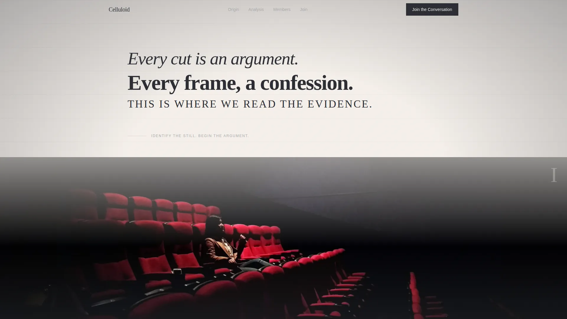
- A clause-by-clause animated manifesto hero with an uncaptioned classic film still
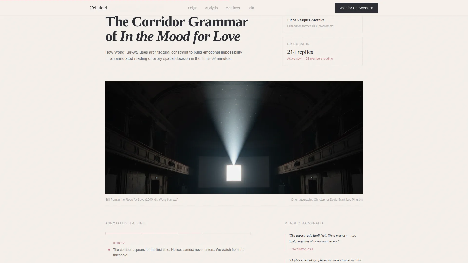
- A three-act origin story section, a featured analysis spread with frame grabs and marginalia commentary, a member voices section, and a low-friction call-to-action form
- A cohesive Soft Mist color system and Fraunces serif display typography ready to use as built
Feature list
This template includes carefully considered components that serve the editorial and community focus of a film analysis landing page.
Clause-by-Clause Manifesto Hero
The header opens with a large serifed manifesto quote that reveals one clause at a time. Each line is typeset differently, cycling through italic, roman, and small caps, to feel hand-composed. An uncaptioned film still sits below, inviting visitors to identify it before they scroll.
Three-Act Origin Story Scroll
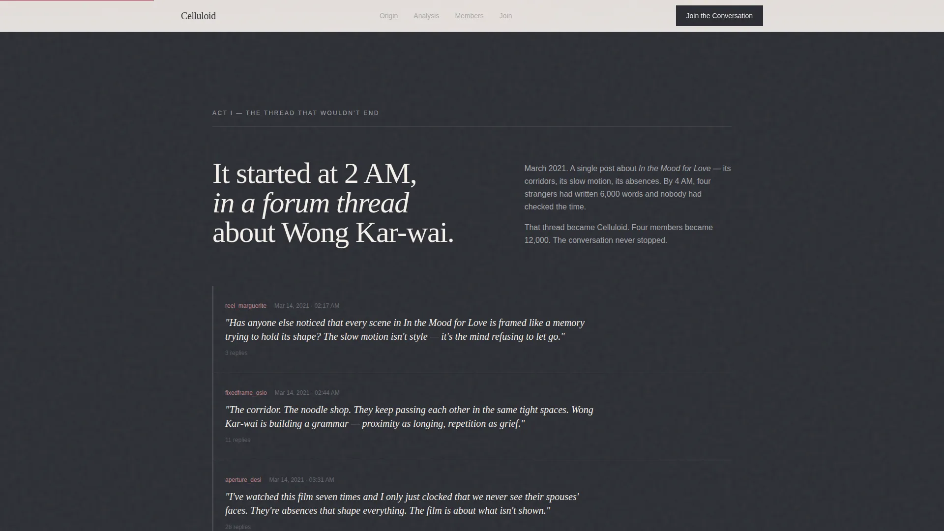
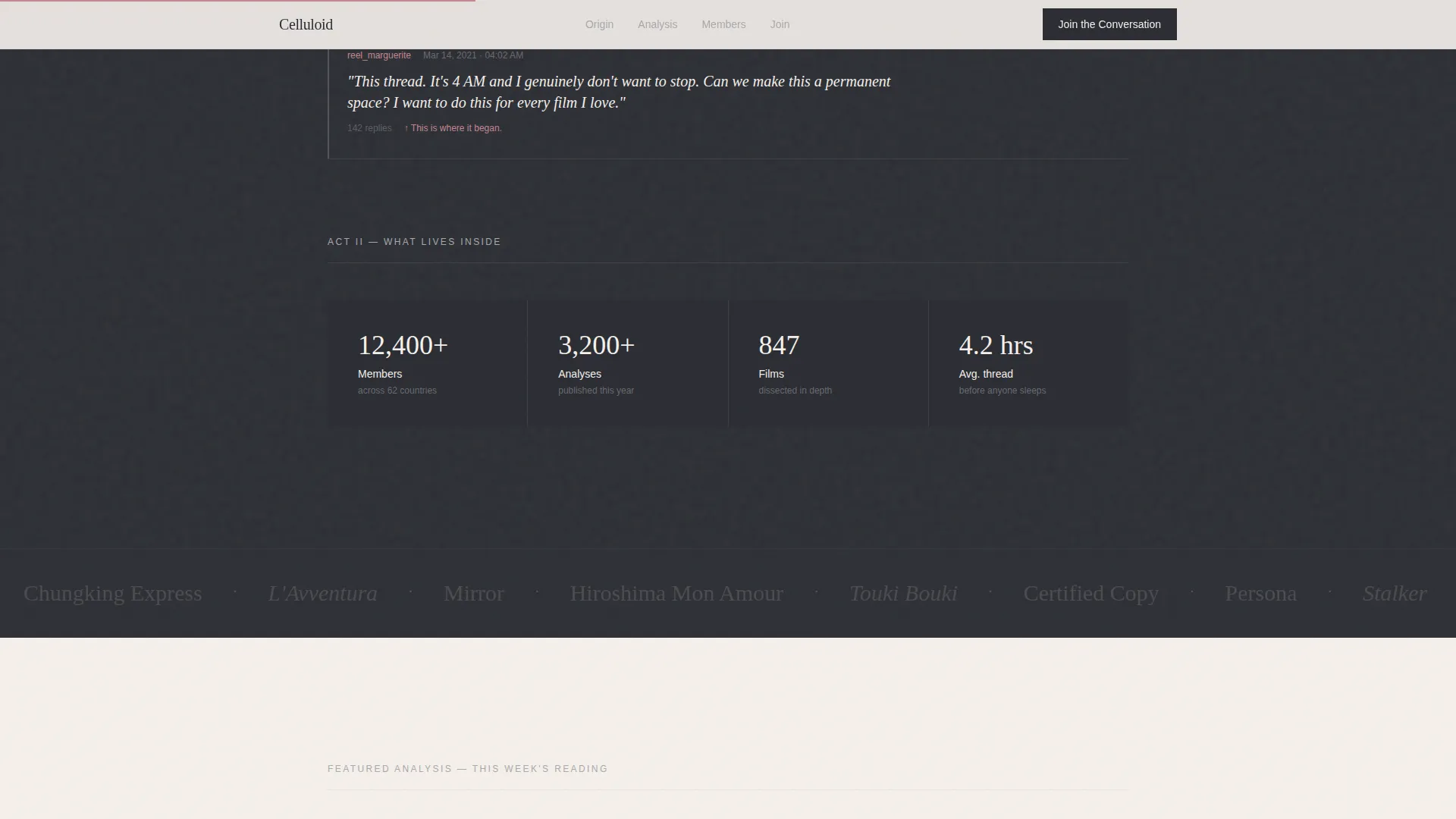
The origin story section carries the scroll like a film's own structure. It moves from the community's beginnings through a quoted forum thread to what happens inside the community today. The pacing builds from reflective to immediate, ending in a natural invitation to join.
Magazine-Spread Analysis Section
Featured analyses appear as full editorial spreads with frame grabs, annotated timelines, and marginalia-style member commentary. This section gives first-time visitors a real taste of the community's critical depth before they commit to signing up.
Member Voices and Reading Lists
Pull-quote testimonials, curated reading lists, and the current week's discussion topic appear together in a section that makes the community feel alive and present. Social proof here feels editorial, not promotional.
Intentional Sign-Up Form
The call-to-action form asks only for an email address and one open-text field: "the film that changed how you see." This turns registration into a personal act rather than a data transaction.
Scroll-Linked Animation and Interactivity
Staggered section entries, scroll-linked parallax, film still hover states, and a testimonial scroll keep the page kinetic without distracting from reading. An FAQ accordion is also included for any supporting content.
Page sections overview
| Section | Purpose |
|---|---|
| Hero Manifesto | Opens with animated quote and uncaptioned film still |
| Origin Story | Three-act narrative from forum thread to community |
| Featured Analysis | Magazine spread with frame grabs and marginalia |
| Member Voices | Pull quotes, reading lists, weekly discussion topic |
| Join Call to Action | Email form with "film that changed you" field |
| Footer | Horizontal flow footer pattern |
Design & branding system
The visual identity follows an Atelier Studio editorial approach using the Soft Mist color system. Every color decision reinforces the feeling of a repertory cinema lobby: intellectual but warm, monochrome but touchable.
- Four-color palette: projection-room charcoal (#2B2D33), silver nitrate gray (#A8A9AD), unbleached cotton (#F5F0EB), and dried rose (#C4878E) reserved for links, pull quotes, and hover states
- Typography pairing of Fraunces for serifed display headings and DM Sans for body text, with backgrounds alternating between cotton and charcoal across sections
- Generous whitespace treats every frame grab like a gallery print, keeping the reading experience unhurried and focused
Mobile & speed optimization
The template is built desktop-first to serve the editorial reading experience, and it scales responsively to mobile viewports without losing its visual character.
- Static-first build approach avoids heavy external libraries, relying only on a scroll observer for animation triggers
- Scroll-linked parallax and staggered entry animations are lightweight and designed to run without performance-heavy dependencies
- Mobile layouts preserve the typographic hierarchy and section pacing so the three-act narrative reads cleanly on smaller screens
How this template helps you convert
Conversion here is not about urgency tactics. It is about earning trust through depth, then making the next step feel natural and personal.
- The manifesto hero and uncaptioned film still create immediate emotional participation, priming visitors to feel they already belong before reading a single word about the community.
- The three-act origin story builds trust progressively, moving from community history to present-day activity, so the primary call to action ("Join the Conversation") arrives at exactly the right emotional moment.
- A secondary path lets guests browse the current week's featured essay without signing up, reducing friction and letting the quality of the analysis do the convincing.
Other information about this template
This template is part of the broader Celluloid editorial suite and reflects the Atelier Studio theme's approach to content-first design. A few additional details worth knowing before you use it:
- The footer uses a horizontal flow layout pattern suited to editorial and community pages
- The template is built for English-language, international cinephile audiences with no commerce layer
- Forum-style social proof elements, including quoted posts with timestamps and active discussion counts, are included to reinforce community credibility
- The design language draws from the visual culture of print film criticism, making it a natural fit for communities inspired by publications in that tradition
Theme
Atelier Studio
Creative direction
Origin Story
Color system
Soft Mist
Style
Editorial/Magazine
Direction
Content/Resource
Page Sections
Animated Manifesto Hero
Three-act Origin Story
Magazine Analysis Spread
Member Voices Section
Intentional Sign-up Form
Scroll-linked Interactivity
Related questions
Can I use this template without a film analysis focus?
Does the sign-up form connect to an email platform?
Is this template desktop-only?
Can I update the colors and typefaces?
How is the featured analysis section built?



