Luminous WordPress | Free Website Template | Rocket
A dark, glassmorphic WordPress landing page built for changelog and release notes publishing. Designed for core contributors, agency developers, and plugin authors, it combines a modular card grid layout with luminous cyan and lavender accents, staggered scroll animations, and a clear app download call to action. Every section earns visitor trust before asking for the conversion.
by Rocket studio
Quick summary
This template is a single-page WordPress changelog hub built on a Dashboard Pro theme with a glassmorphic visual system. It uses a dark void background, frosted card surfaces, electric cyan version tags, and staggered card animations to present release history in a fast, scannable format. The primary call to action drives app downloads, with an email opt-in as a secondary path.
Who this template is for
This template is built for people who live inside version control and release cycles. It speaks directly to the developers and contributors who need changelog data fast, without friction.
- Core contributors and plugin authors who track WordPress release history closely
- Agency developers who need to check what changed before a client site breaks
- Technical teams maintaining WordPress-based products across multiple release cycles
What problem this template solves
Changelog information is often scattered, visually flat, or buried in dense documentation pages. Developers waste time hunting for version details, severity levels, and linked tickets. This template solves that by giving release data a clear, structured home.
- No centralized visual format for surfacing version history with context
- Generic documentation layouts that slow down developers in time-sensitive moments
- No clear path from reading the changelog to staying updated via app or email
What you get with this template
You get a complete, single-page layout purpose-built for WordPress release documentation. Every section is designed to move a technical visitor from orientation to action without detours.
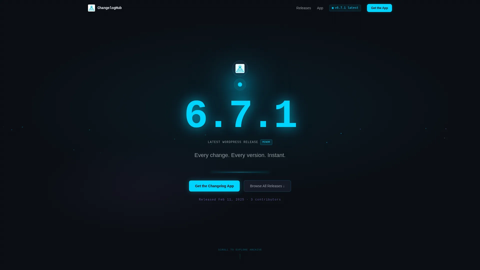
- A full-bleed dark header with a glowing cyan orb, monospace version number, and typewriter headline animation
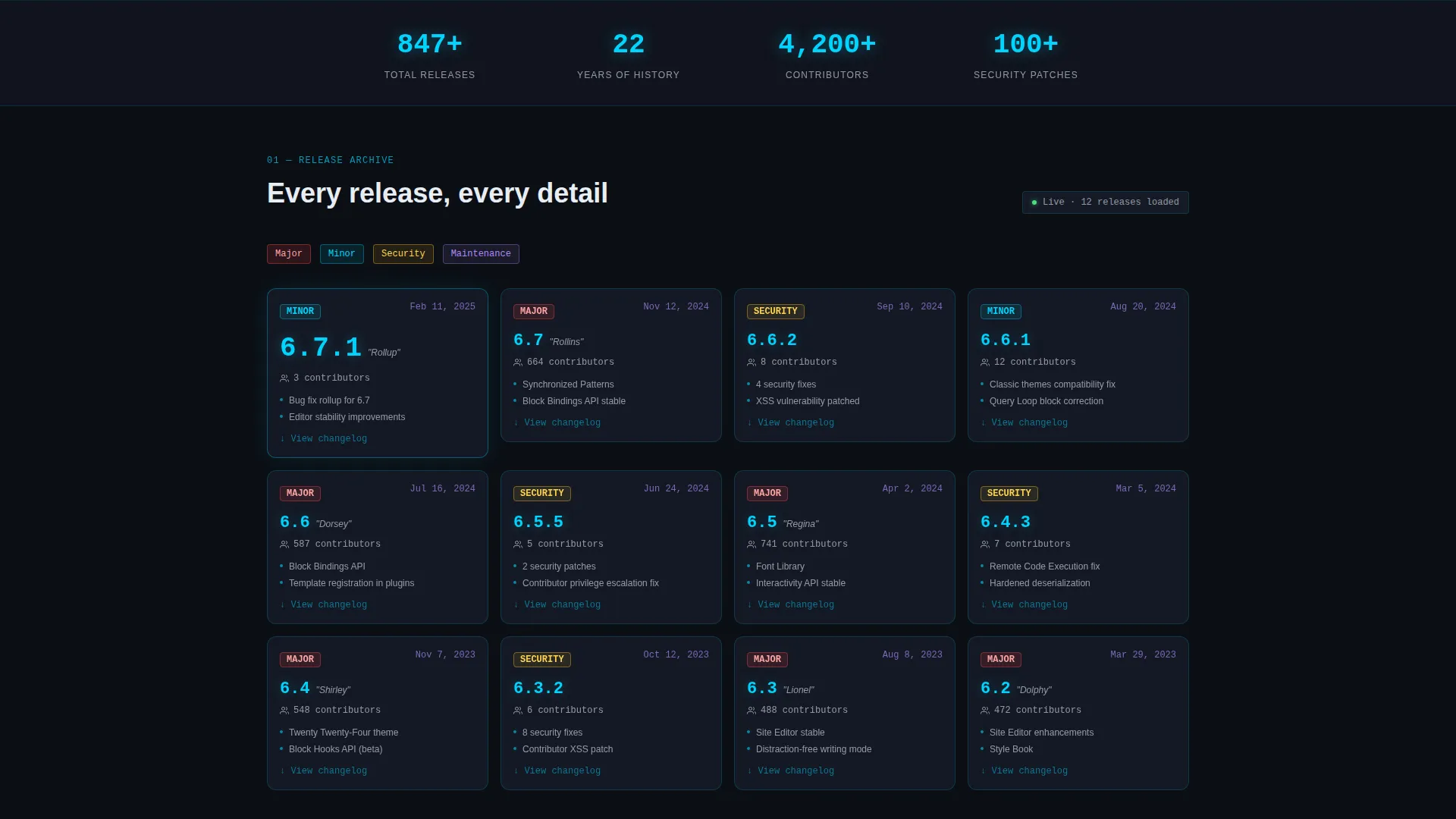
- A modular card grid showing version number, release date, contributor count, and severity badge per release
- An expandable card interaction that reveals full changelogs with syntax-highlighted code diffs and linked Trac tickets
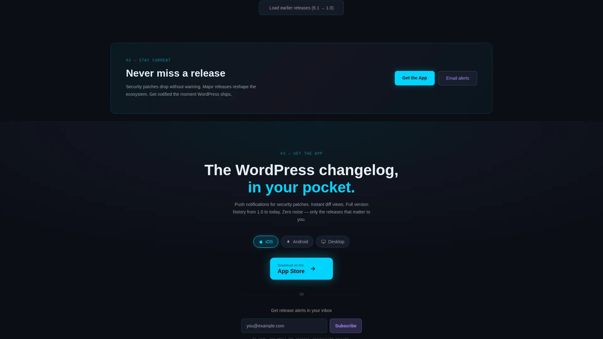
- A mid-page conversion break card reading "Never miss a release" leading into an app download call to action with platform toggle pills for iOS, Android, and Desktop
- A secondary single-field email input for release alert opt-ins below the primary call to action
Feature list
This template ships with a tightly considered set of interactive and visual components. Each one is grounded in the workflow of a developer who needs information quickly and reliably.
Glassmorphic Card Grid Layout
Each release card uses a frosted panel surface at 60 percent opacity with a 1px cyan-glow border. Cards display version number, release date, contributor count, and a severity badge. The grid is modular, so new cards slot in without breaking the layout.
Staggered Scroll Animation
As the visitor scrolls, release cards cascade into view with staggered timing. The newest release appears first, and the rhythm accelerates downward through quarterly milestones and point releases. This creates the sensation of version history unspooling in reverse.
Expandable Release Detail View
Each card expands on click to reveal the full changelog entry. The expanded view includes syntax-highlighted code diffs and linked Trac tickets, giving developers the exact reference depth they need without leaving the page.
Dark Full-Bleed Header with Glow Animation
The header spans edge to edge in void black with a softly pulsing cyan orb at center. The latest version number renders in large monospace type with a particle trail effect. The headline fades in with a typewriter animation.
App Download call to action with Platform Toggle
The primary conversion section features platform toggle pills for iOS, Android, and Desktop. Each selection renders the appropriate store badge. A single-field email input sits below as a secondary opt-in path for release alerts.
Mid-Page Conversion Break Card
A full-width horizontal card interrupts the release grid midway through the page. It carries the line "Never miss a release" and anchors the conversion beat at the exact moment visitors have absorbed enough depth to act.
Page sections overview
| Section | Purpose |
|---|---|
| Dark header hero | Introduces the changelog with version number, pulsing orb, and typewriter headline |
| Latest release card | Deep-dive into the current WordPress release with expanded changelog detail |
| Modular release grid | Scrollable card grid of all releases, newest first, with staggered animation |
| Quarterly milestone row | Visual break highlighting major version milestones within the timeline |
| Point release timeline | Rapid-fire sequence of every minor and patch release in reverse order |
| Conversion break card | Full-width "Never miss a release" card anchoring the mid-page call to action beat |
| App download section | Platform toggle pills, store badges, and email opt-in for release alerts |
Design & branding system
The visual system is built around a mission-control aesthetic. Information floats on translucent layers, and every interactive element responds with controlled luminosity.
- Color palette: void black (#0B0E14) base, frosted panel (#1A1F2E at 60% opacity) for card surfaces, electric cyan (#00D4FF) for version tags and active states, soft lavender (#A78BFA) for secondary labels and timestamps
- Typography: monospace type for version numbers, clean sans-serif for body labels, with a typewriter animation on the hero headline
- Interactive states: hover intensifies card luminosity, borders glow at 1px with rgba cyan, and backgrounds blur the layers beneath each frosted panel
Mobile & speed optimization
The layout is designed to remain scannable and functional on smaller screens. The card grid reflows cleanly, and the core interactions stay accessible at any viewport width.
- Card grid adapts to single-column layout on mobile without losing the frosted glass visual treatment
- Staggered animations are scoped to scroll position so they trigger correctly on touch devices
- The app download call to action and platform toggle pills remain tap-friendly and clearly sized at mobile breakpoints
How this template helps you convert
The page earns its conversion by demonstrating value before asking for anything. Visitors arrive for reference information and leave with a reason to stay connected.
- The release card grid functions as a live reference tool, so visitors engage deeply with the content before reaching the call to action
- The mid-page break card ("Never miss a release") surfaces the conversion ask at the moment visitors have already found the page useful
- The dual call to action structure (app download plus email opt-in) gives two low-friction paths for visitors to stay updated on their own terms
Other information about this template
This template is part of the Dashboard Pro theme family and uses a glassmorphic color system applied consistently across all components. It is designed specifically for the WordPress changelog and release notes niche within the broader Documentation and Support category.
- Template style: Card Grid (Modular), single landing page
- Creative direction: Launch Energy, with scroll-triggered animations building momentum from hero to call to action
- Header concept: Dark Full-Bleed with glow, particle trail, and typewriter headline fade-in
- Primary call-to-action direction: App Download with platform-specific badge rendering
- Suitable for publishing WordPress core release notes, plugin version histories, or any developer-facing changelog hub
Theme
Dashboard Pro
Creative direction
Launch Energy
Color system
Glassmorphic
Style
Card Grid (Modular)
Direction
App Download
Page Sections
Glassmorphic Card Grid Layout
Staggered Scroll Animation
Expandable Release Detail View
Dark Full-bleed Header with Glow Animation
App Download Call to Action with Platform Toggle
Mid-page Conversion Break Card
Related questions
Who is this landing page template designed for?
Can I use this template for plugin changelogs, not just WordPress core releases?
What does the app download call to action section include?
How does the staggered scroll animation work?
Is the glassmorphic color system easy to customize?


