Premium Education Insights Landing Page Template
The Syllabus Luxe Minimal Editorial Education Blog Landing Page Template is a refined, single-page editorial landing page built for education how-to blogs. It combines a curated library aesthetic with a clean, conversion-aware layout. Warm parchment tones, serif headlines, and chapter-structured navigation create an experience that feels like a private reading room, not a content feed.
by Rocket studio
Quick summary
Syllabus is a landing page template designed for education how-to blogs that want to feel authoritative without feeling academic. It presents content as a curated library: chapter-indexed collections, editorial article cards, and a persistent newsletter form that earns its ask. Every section is built to guide visitors deeper into the archive, one thoughtful scroll at a time.
Who this template is for
This template serves self-directed learners and the educators who publish for them. It fits any creator or organization running a content-first educational landing page where depth matters more than flash.
- Graduate students, career-switchers preparing for certification courses, and homeschooling parents who publish or consume structured learning content
- Educators, curriculum designers, and academic writers who want a landing page that matches the quality of their writing
- Independent content creators building an online course library or thought-leadership platform with a newsletter at its core
What problem this template solves
Most educational landing page templates look like generic course catalogs. They overwhelm visitors with too many sections, weak visual hierarchy, and marketing copy that sounds transactional rather than trustworthy. Prospective students and readers feel lost before they even read the first paragraph.
This template solves that by giving the page a clear editorial identity from the first scroll.
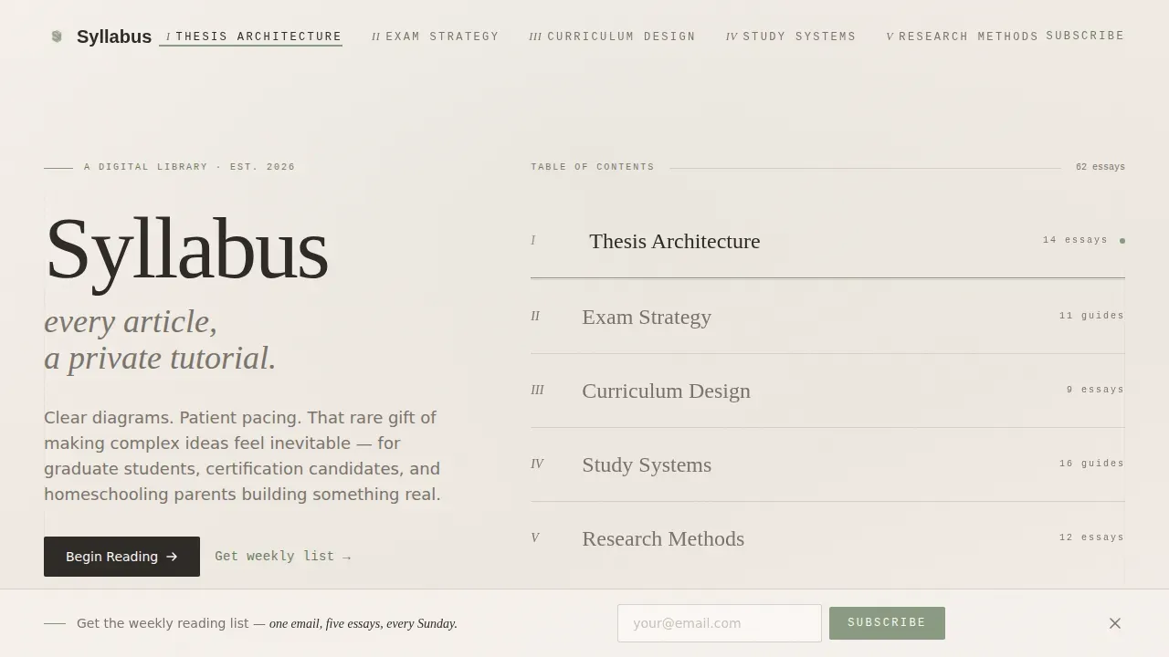
- Readers land on a hero section that feels like opening a book, not loading a dashboard, so visitor's attention is captured immediately
- Content is organized into themed collections with increasing depth, so users never feel lost or feeling overwhelmed by a flat archive
- The value proposition is communicated through the content itself, not through aggressive calls to action, which builds trust naturally before any sign-up is requested
What you get with this template
You get a fully structured, visually appealing editorial landing page with every section pre-designed and ready to customize. The layout is clean, intentional, and built around the reading habits of serious learners.
- A chapter-indexed hero section, three editorial collection sections, a social proof section styled as reader marginalia, and a minimal footer
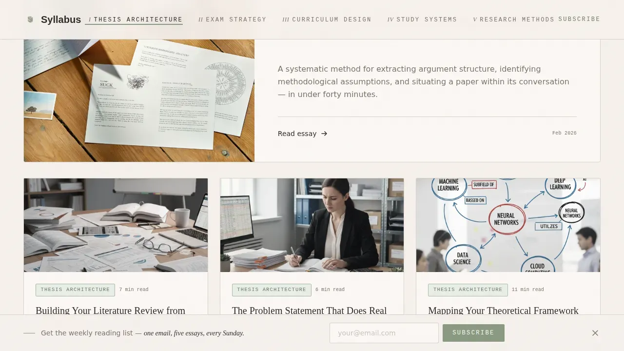
- Pre-designed editorial article cards with pull-quote typography, muted line art thumbnail placeholders, and read-time metadata labels
- A persistent floating newsletter form with a single email field and a sage-colored call to action button, placed without interrupting the reading flow
Feature list
This landing page template ships with a precise set of features drawn from its editorial-first brief. Each one serves a specific purpose in the learning experience it creates.
Chapter-Index Hero Section
The hero section opens with a book-spine concept. The blog name is set in a refined serif typeface at the top, followed by five Roman-numeral chapter headings representing curated topic collections. A thin sage rule underlines the active collection. Generous negative space and large type give the landing page an immediate, compelling headline presence that captures attention before a single article card loads.
Editorial Article Cards
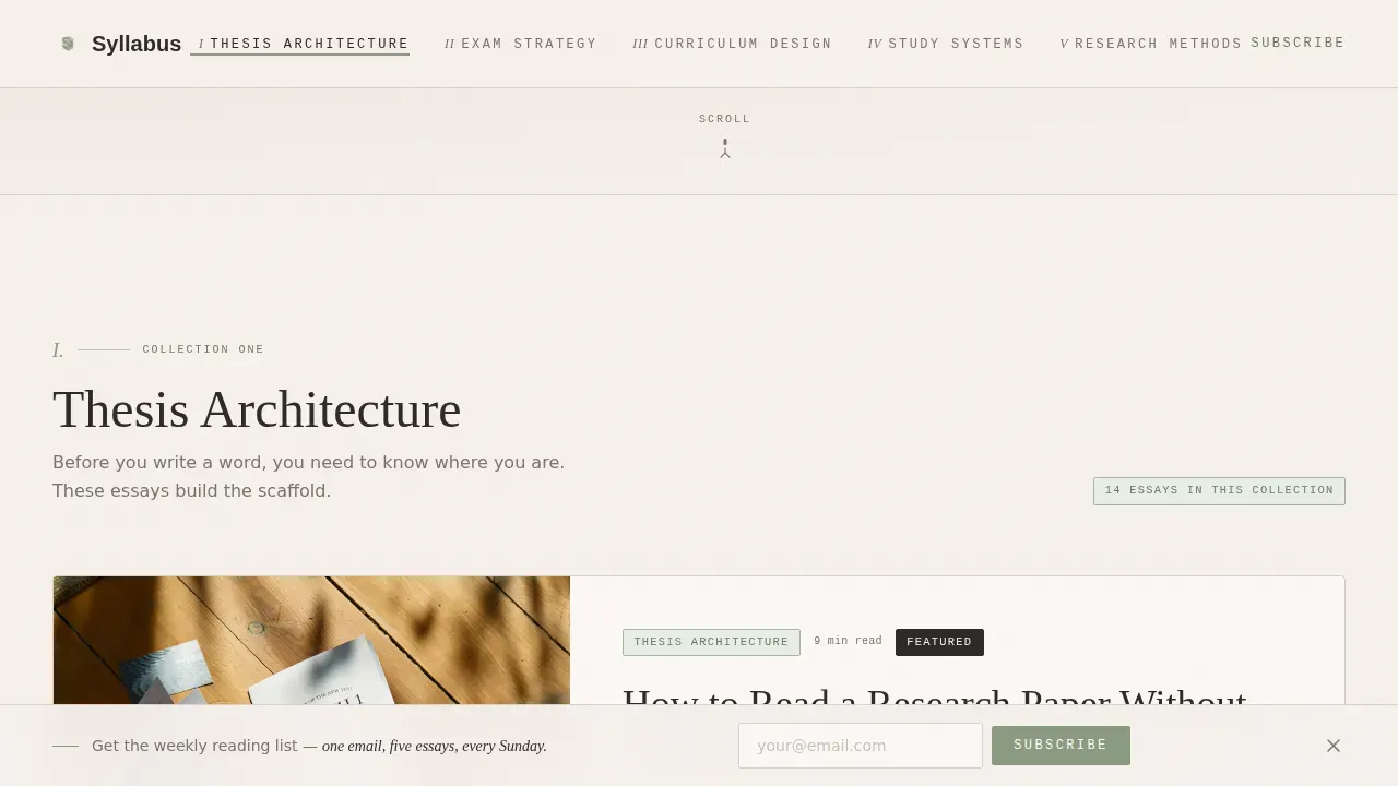
Each collection section displays three to five article cards. Cards feature oversized pull-quote typography, muted line art thumbnail illustrations, and estimated read-time metadata. The course interface feel is intentional: readers get a clear sense of what each piece covers before clicking. These eye catching cards use hover states to signal interactivity without breaking the page's calm, clean design.
Editor's Bridge Notes
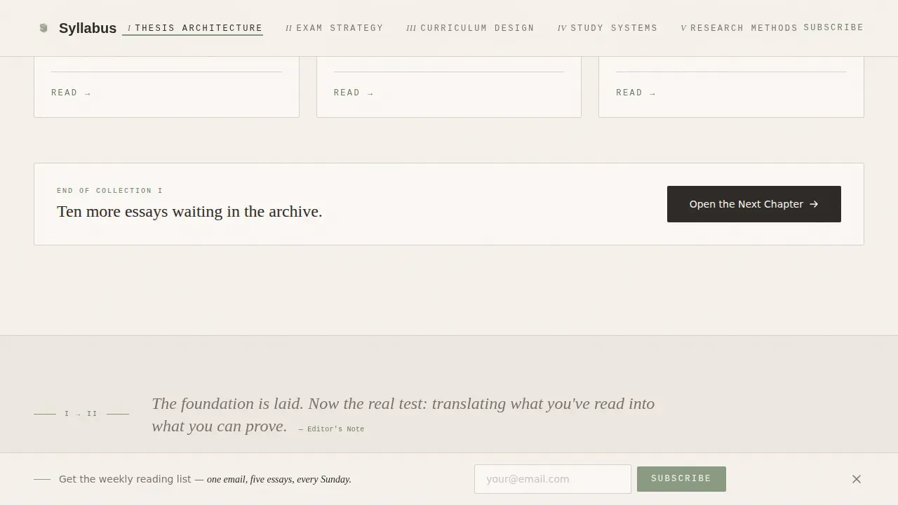
Between each collection, a single italic sentence acts as an editorial bridge. This note connects topics with the voice of a thoughtful guide rather than an algorithm. It gives the landing page a clear narrative arc from foundational articles to advanced ones, rewarding the scroll and keeping users engaged through every section.
Reader Marginalia Social Proof
Testimonials are styled as handwritten notebook margin annotations rather than standard review cards. This approach treats student testimonials as part of the page's visual language, not an interruption. Read-count badges appear alongside, offering a lightweight but effective form of social proof that communicates popularity without requiring a separate section.
Floating Newsletter Form
A persistent but unobtrusive subscription bar floats at the bottom of the landing page. It contains a single email input field and a sage-green cta button reading "Subscribe." It does not use pop-ups or content gates. The form earns the click by letting readers experience full content value before ever asking them to sign up.
GSAP Scroll Reveal Animations
The landing page uses medium-weight GSAP scroll reveal animations, including staggered chapter index reveals and parallax depth layers between collection sections. These animations add editorial polish without sacrificing page performance or distracting from the content. Interactivity remains purposeful and restrained throughout.
Page sections overview
| Section | Purpose |
|---|---|
| Hero Chapter Index | Introduces blog identity and chapter navigation |
| Collection I Cards | Displays foundational Thesis Architecture articles |
| Editor's Bridge I | Italic transition note connecting collections |
| Collection II Cards | Presents Exam Strategy articles as editorial cards |
| Reader Marginalia | Shows student testimonials as margin annotations |
| Collection III Cards | Covers Study Systems with advanced article depth |
| Open Chapter call to action | Clear call to action linking deeper into the archive |
| Floating Newsletter Bar | Persistent email form for weekly reading list sign-up |
| Minimal Footer | Clean footer using horizontal layout pattern |
Design & branding system
The design system is built around a Soft Mist color palette that feels unhurried and tactile. It pairs two typeface roles with a monospace third for metadata labels, giving the page layout a clear typographic hierarchy that guides visitors without effort.
- Color system: warm parchment (#F5F0EB) dominates the background; deep graphite (#2E2A27) anchors all headlines and body text; whisper gray (#D6D1CB) separates sections like chapter breaks; muted sage (#8A9A82) marks interactive elements and category tags using a contrasting color that draws the eye without disrupting the palette
- Typography: Fraunces serif for headlines creates editorial authority; DM Sans handles body text with clean lines and readable weight; JetBrains Mono labels metadata such as read times and collection tags, giving the course description details a visually distinct treatment
- Visual style: Luxe Minimal, modeled on a linen-bound journal on a marble desk; illustrations are muted line art; negative space is generous; the overall page layout avoids clutter at every level
Mobile & speed optimization
The landing page is built desktop-first for graduate students and serious learners working on laptops, but it is fully responsive and delivers a smooth experience for mobile users across all screen sizes.
- The layout adapts cleanly for mobile devices, stacking editorial cards and collection sections without losing the page's typographic hierarchy or visual identity
- Floating newsletter form, chapter navigation, and cta button elements remain fully functional and accessible to mobile users on smartphones and tablets
- Server Components handle static content sections, while Client Components are kept minimal, keeping the interactive GSAP animations from becoming a burden on smaller devices
How this template helps you convert
This educational landing page is designed to convert visitors through demonstrated value, not pressure. Every structural decision supports a natural path from reading to subscribing, without multiple ctas competing for attention at once.
- The chapter-index hero section gives visitors an immediate, clear call to explore organized collections, which keeps users on the page longer and builds a clear sense of what the library offers before any action is requested
- Social proof through reader marginalia and read-count badges is positioned near the collection calls to action, reinforcing trust at the moment of decision-making so that potential students feel confident enough to go deeper or sign up
- The "Open the Next Chapter" cta at the end of each collection acts as a natural guide visitors forward through the archive, and the floating newsletter form captures emails from readers who are already convinced of the value proposition before reaching the bottom of the page
Other information about this template
This template is well-suited for educators and content creators who want a landing page that works as both a content destination and a lead-generation tool. It is especially useful for those studying effective landing page examples in the education space, or those who want to improve on generic education landing page templates that sacrifice editorial quality for cookie-cutter layouts.
- The Syllabus Luxe Minimal Editorial Education Blog Landing Page Template draws from best practices for course landing page design, including clear sections, strong social proof placement, and instructor profiles that can be adapted to showcase contributor bios and author credibility
- Compared with standard website templates and education landing page examples, this template prioritizes a polished design that blends high-end aesthetic appeal with clear, functional structure, making it a strong reference among editorial education landing page templates
- It is suitable for creators who publish downloadable resources, online course outlines, or curated reading lists alongside long-form articles, and who want one page that serves as a complete content hub
- The template supports clean messaging with short paragraphs and bullet points organized by theme, giving the effective education blog landing page format a structure that is easy to adapt without starting from scratch
- For anyone exploring education landing page examples or looking to build an effective landing page for an online marketing course, a certification prep platform, or a graduate-level study guide, this template provides a ready-made editorial foundation
Theme
Luxe Minimal
Creative direction
Curated Collection
Color system
Soft Mist
Style
Editorial/Magazine
Direction
Content/Resource
Page Sections
Chapter-index Hero Section
Curated Editorial Article Cards
Reader Marginalia Social Proof
Floating Newsletter Subscription Form
Editor's Bridge Transition Notes
GSAP Scroll Reveal Animations
Related questions
Can this template support an online course or educational program?
How does the social proof section work in this template?
Is this landing page template suitable for mobile devices?
Does this template include downloadable resources or gated content?
How do I customize the typography and color system?



