Authentic Fitness Journey Blog Landing Page Template
Chronicle is a masonry-style fitness journey landing page built for authentic, process-first health and wellness blogs. It features a dramatic serif hero, a Pinterest-style artifact grid of blog cards, an embedded five-question personalized quiz, and a featured reader story section. The warm Heritage and Story design turns honest fitness content into a curated, trust-building reading experience.
by Rocket studio
Quick summary
Chronicle is a single-page fitness journey blog template styled as a living training journal. The masonry grid, personalized quiz modal, and rotating reader testimonials work together to convert casual visitors into subscribed readers. It suits bloggers who lead with process, not perfection, and need a landing page that earns trust before asking for an email.
Who this template is for
Chronicle is built for independent fitness bloggers who want their content to feel earned rather than polished. It works best when the story behind the blog is just as compelling as the workouts themselves.
- Fitness bloggers documenting a real, ongoing personal journey with honest setbacks and wins
- Health and wellness writers whose audience includes night-shift workers, new parents, or skeptical readers in their forties
- Content creators moving away from influencer aesthetics toward a relatable, process-driven editorial identity
What problem this template solves
Most fitness blog landing pages either look like a gym brand or a generic magazine. Neither builds the kind of trust that turns a first-time visitor into a loyal reader. Chronicle solves the credibility gap by making imperfection visible and organized.
- Visitors leave without subscribing because nothing on the page matches where they actually are in their journey
- Generic grid layouts hide the depth and timeline of a blog, making years of useful content feel flat and undiscoverable
- One-size call-to-action buttons push an email opt-in before the reader feels any reason to trust the writer
What you get with this template
You get a fully designed, single-page layout with every section ready to populate with your own content, copy, and quiz logic. The template ships with a clear visual hierarchy and interaction pattern so you are not starting from scratch.
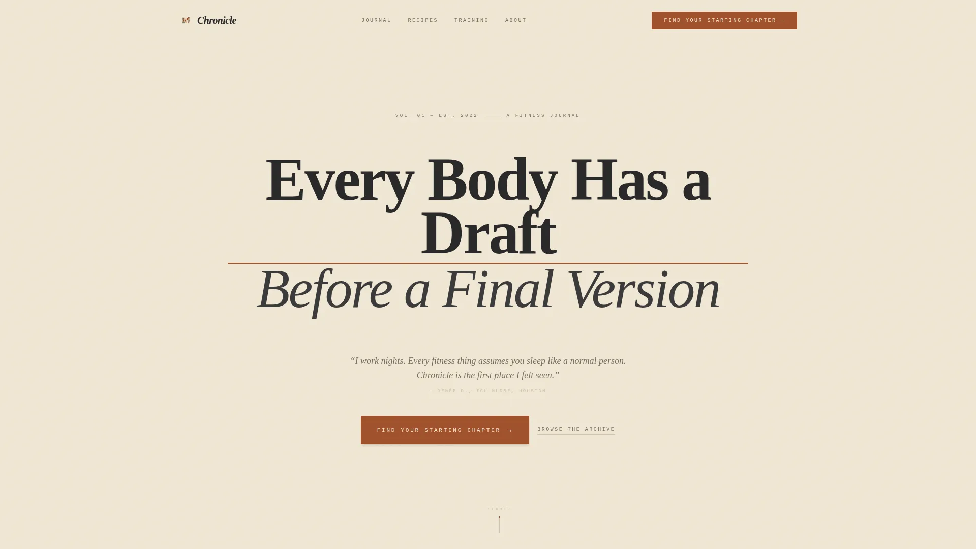
- A hero section with a large serif headline, animated hairline underline, and rotating reader testimonial display
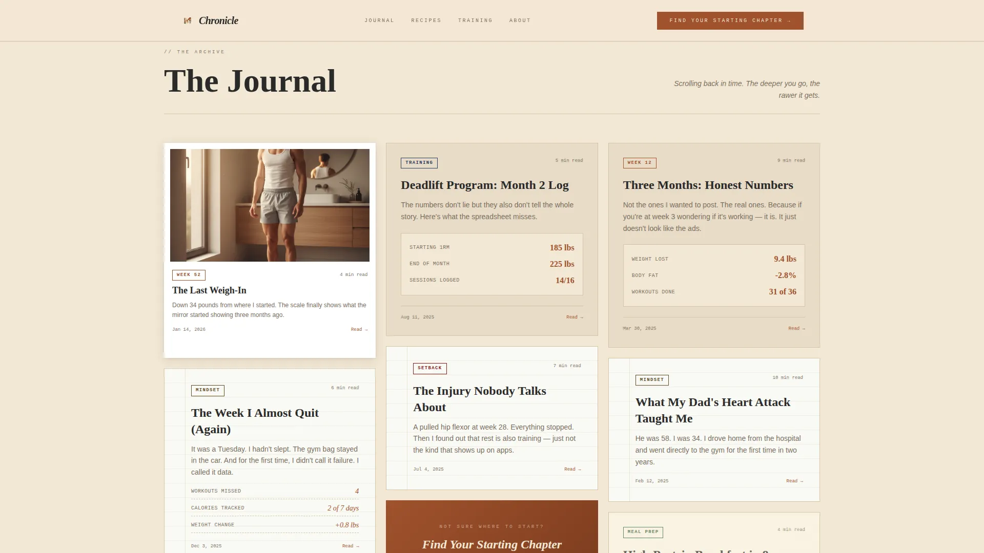
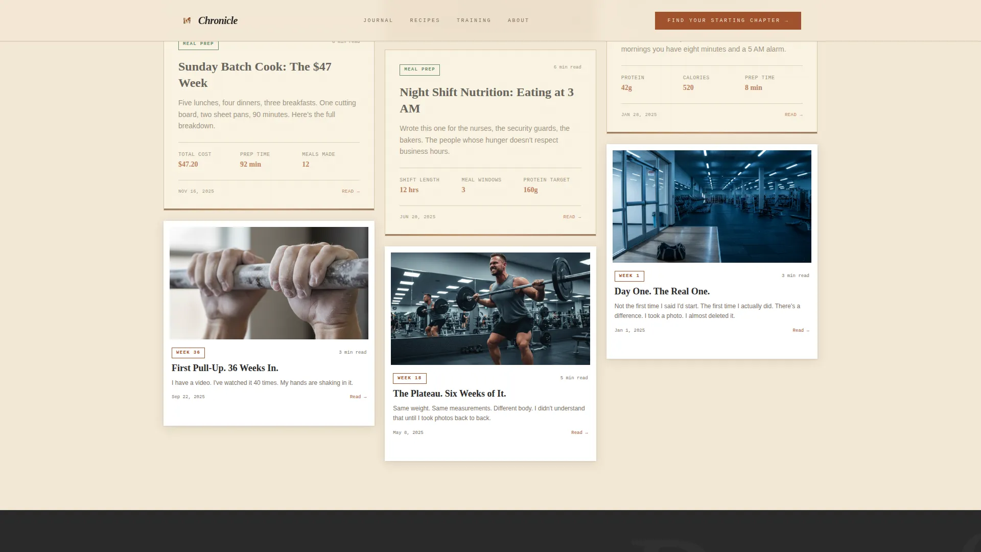
- A masonry blog card grid styled as physical artifacts, with a call-to-action card inserted after every sixth entry
- A five-step illustrated quiz modal that delivers a personalized reading path to each subscriber
Feature list
Chronicle delivers a focused set of purpose-built features. Each one serves the core goal: turning an honest fitness blog into a high-trust, high-conversion reading destination.
Artifact-Style Masonry Grid
Blog entries are styled as physical objects: recipe cards with burnt edges, workout logs on lined paper, progress photos in Polaroid frames, and mindset essays on torn notebook pages. Each card carries a taxonomy tag such as "Week 12," "Meal Prep," or "Setback" so the grid reads like a life organized into chapters.
Five-Step Personalized Quiz Modal
The quiz opens as an overlay on a parchment-toned card. It walks readers through five questions covering activity level, biggest obstacle, preferred training style, cooking willingness, and email. Results deliver a curated reading path sent directly to their inbox.
Animated Hero Section
The hero centers a heavy serif headline on a parchment field with letter-spacing wide enough to breathe. A hairline rust underline draws itself on page load. A rotating testimonial snippet below the headline adds live social proof without cluttering the design.
Featured Reader Story Block
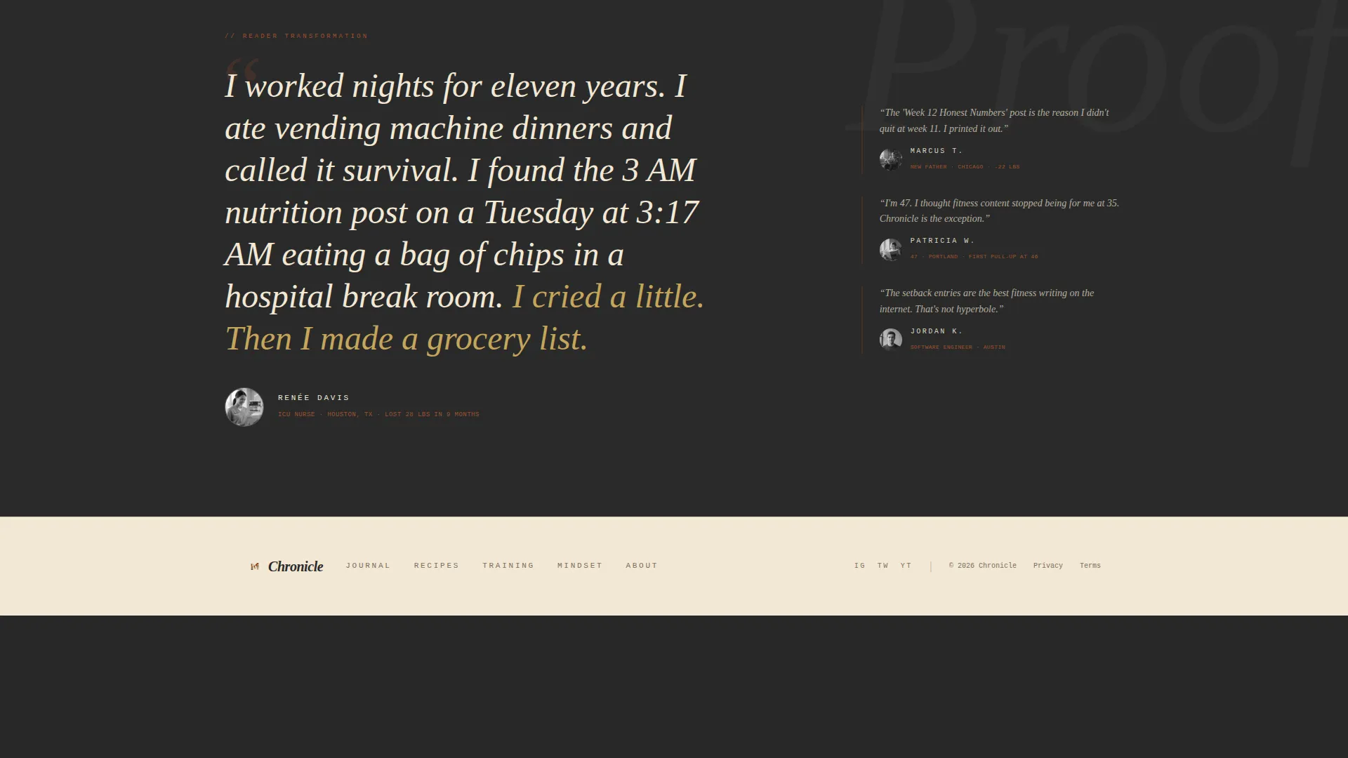
A full-bleed charcoal section displays a large italic quote pulled from a real reader transformation. It provides a strong emotional anchor mid-scroll, reinforcing trust before the next call-to-action appears.
Taxonomy Tag System
Every masonry card carries a small category label formatted in a monospaced tag style. Tags organize content into recognizable chapters so readers can orient themselves within someone else's timeline at a glance.
Persistent Quiz Call-to-Action
A rust-colored "Find Your Starting Chapter" button is pinned in the top-right corner of the navigation and repeated after every sixth masonry card. This placement keeps the conversion prompt visible throughout the entire scroll without interrupting the reading experience.
Page sections overview
| Section | Purpose |
|---|---|
| Hero Headline | Sets tone with a bold serif headline, animated rust underline, and rotating reader testimonials |
| Masonry Blog Grid | Displays blog entries as physical artifacts with taxonomy tags and embedded call-to-action cards |
| Featured Reader Story | Full-bleed charcoal quote block providing mid-page emotional social proof |
| Quiz Modal Overlay | Five-question illustrated quiz delivering a personalized blog reading path to new subscribers |
| Single-Row Footer | Compact linear footer closing the page with essential links |
Design & branding system
The visual identity follows a Heritage and Story theme. Every color, typeface, and texture choice reinforces the idea that this content was earned over time, not assembled from a trend board.
- Color palette: aged parchment (#F2E8D5) for backgrounds, deep iron rust (#A0522D) for primary accents, charcoal graphite (#3B3B3B) for body text, faded linen (#E8DCC8) for card surfaces, and muted gold (#C5A55A) reserved for hover and active states
- Typography: Fraunces serif for headlines, JetBrains Mono for labels and taxonomy tags, and DM Sans for all body copy
- Texture and mood: card designs simulate physical media including lined paper, burnt edges, and Polaroid framing to reinforce the training journal aesthetic
Mobile & speed optimization
The template is built mobile-first because its target readers are most often on their phones during commutes, gym sessions, or early morning routines. Layout decisions prioritize thumb-friendly interaction and readable type at smaller sizes.
- The masonry grid reflows cleanly for smaller screens so artifact cards remain legible and well-spaced on mobile viewports
- The quiz modal is designed as a step-by-step card flow, which works naturally on a phone screen without requiring horizontal scrolling
- Server-side rendering handles the blog grid while client-side components manage the quiz modal and animations, keeping the interactive layer snappy
How this template helps you convert
Chronicle is structured so that every scroll action moves a reader closer to subscribing. The conversion path is layered, not abrupt.
- The hero testimonial rotation shows real reader results immediately, reducing skepticism before the reader has scrolled a single card
- The reverse-chronological masonry grid builds emotional trust as readers scroll deeper, revealing the blog's rawest and most relatable early entries
- The quiz modal matches each subscriber to specific posts, giving them a personal reason to open the first email and return to the blog
Other information about this template
Chronicle is part of a growing library of editorial and content-led landing page templates designed for independent creators. A few additional details worth knowing before you build:
- The template is localized for English-speaking audiences in the United States, using imperial measurements and 12-hour time formatting throughout
- Animation intensity is set to medium: the hairline underline draws on load, cards reveal on scroll, and the quiz modal transitions between steps smoothly
- Interactivity is rated high, covering the five-step quiz flow, rotating testimonials in the hero, and masonry card hover states with gold accent activation
- The footer follows a linear single-row pattern, keeping the page close cleanly without adding visual weight at the bottom
- The overall creative direction is Curated Collection, meaning content is presented as a selection of meaningful artifacts rather than a reverse-chronological feed
Theme
Heritage & Story
Creative direction
Curated Collection
Color system
Parchment & Rust
Style
Masonry/Pinterest
Direction
Quiz/Assessment
Page Sections
Artifact-style Masonry Blog Grid
Five-step Personalized Quiz Modal
Animated Serif Hero Section
Featured Reader Story Section
Persistent Quiz Call-to-action
Taxonomy Tag Navigation System
Related questions
Who is this landing page template designed for?
How does the quiz feature work?
Can I use this template if my blog covers more than just workouts?
Does the template include the blog content or just the layout?
Is this template suitable for a mobile audience?



