Cannabis Blog & Media Blog Website Template
Chronicle is a masonry-style cannabis news landing page built for digital newsrooms that serve industry professionals. It combines an editorial broadsheet aesthetic with two lead-generation paths: a sticky newsletter bar and an inline gated content card. The layout uses varied-height article cards, thematic editorial columns, and bold serif typography to earn reader trust before asking for anything.
by Rocket studio
Quick summary
Chronicle is a single-page cannabis news landing page built around editorial authority and lead generation. It opens with a giant serif masthead, flows into a masonry article grid with three ungated previews, and converts readers through a sticky newsletter bar and a gated weekly dossier card. The design draws from vintage broadsheet aesthetics to serve dispensary owners, investors, and policy professionals.
Who this template is for
This template is built for cannabis media publishers, content-driven brands, and industry intelligence operations that need to attract and convert professional readers. It suits anyone running a B2B cannabis publication where the content itself is the product.
- Dispensary owners and compliance officers who need regulatory updates fast
- Cannabis investors and policy lobbyists who rely on sourced, actionable industry reporting
- Independent cannabis journalists and editorial teams launching a professional news outlet
What problem this template solves
Most blog templates are built for casual reading. They do not communicate credibility, they bury the newsletter signup, and they offer no structured way to segment or gate content for professional audiences. Chronicle is built specifically to solve that gap.
- A generic blog layout fails to signal editorial authority to skeptical B2B readers
- Scattered calls to action mean visitors leave without subscribing or downloading anything
- No thematic structure makes it hard to surface beats like legislation, science, and markets as distinct editorial verticals
What you get with this template
You get a complete, professionally designed cannabis news landing page that functions like a focused editorial operation. Every section has a job: attract, inform, and convert without interrupting the reading experience.
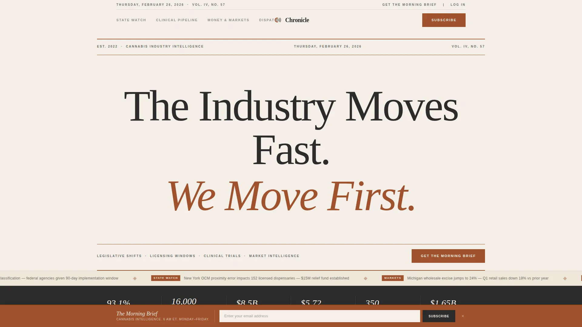
- A hero section built on giant masthead typography with rust rules and a dateline
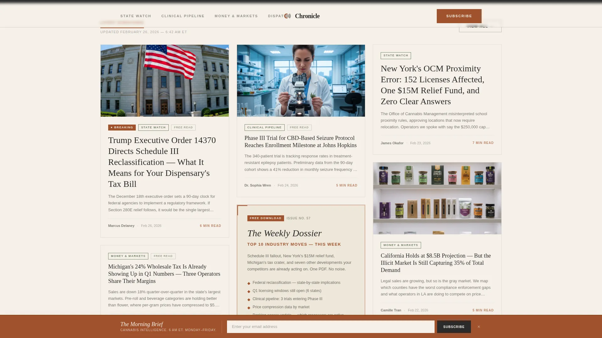
- A masonry article grid with mixed-height cards, olive category tags, rust read-time accents, and three ungated article previews
- Two built-in lead generation paths: a sticky newsletter bar and an inline gated dossier card with role dropdown
Feature list
Every feature in Chronicle is drawn directly from the editorial and conversion brief. Together, they create a landing page that earns trust through content before it asks for anything.
Giant Masthead Hero
The hero section sets authority immediately. An enormous centered serif headline in deep charcoal sits against a parchment field, framed by thin rust-colored rules above and below. A small-caps dateline completes the broadsheet impression with no images or illustrations needed.
Masonry Article Grid
The core content area uses a Pinterest-style masonry layout. Cards vary in height to reflect article depth, ranging from long-form investigations to quick regulatory briefs. Each card carries an olive category tag, a rust-accented read-time estimate, and a charcoal serif headline.
Thematic Editorial Columns
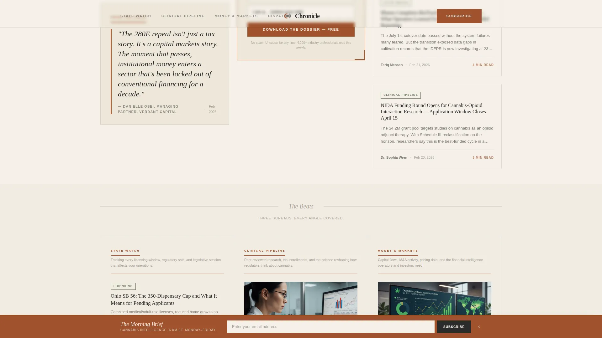
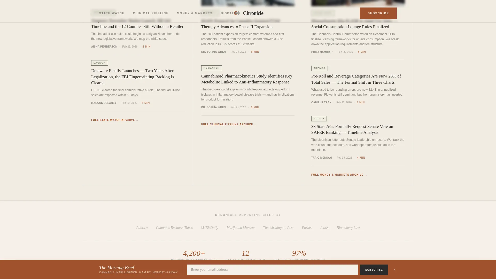
Below the main grid, the layout shifts into three named verticals: State Watch, Clinical Pipeline, and Money and Markets. This structure gives the page the feel of a full editorial operation with distinct beats, not just a list of posts.
Sticky Newsletter Bar
After two scroll depths, a rust-colored sticky bar appears at the bottom of the viewport. It asks for a single email address in a cream input field under the call to action "Get the Morning Brief." It is persistent but unobtrusive.
Inline Gated Dossier Card
Midway through the article grid, a card styled like a standard article item is headlined "The Weekly Dossier." It gates a free downloadable PDF of the top ten industry moves behind an email address and a single role dropdown with four options: investor, operator, advocate, and journalist.
Scroll-Reveal Animations and Marquee Ticker
The template includes medium-weight scroll-reveal animations, spotlight card effects, and a marquee ticker. These motion elements maintain editorial energy as the visitor moves down the page without distracting from the content.
Page sections overview
| Section | Purpose |
|---|---|
| Hero Masthead | Establishes editorial authority with giant centered serif typography and rust rules |
| Masonry Article Grid | Displays mixed-height article cards with category tags and three ungated previews |
| Editorial Column Clusters | Groups content into State Watch, Clinical Pipeline, and Money and Markets verticals |
| Weekly Dossier Card | Inline gated lead magnet requiring email and role selection for PDF download |
| Sticky Newsletter Bar | Persistent post-scroll call to action capturing email signups for morning brief |
| Minimal Editorial Footer | Horizontal flow footer with clean, editorial styling |
Design & branding system
Chronicle uses an Editorial Magazine theme grounded in a Parchment and Rust color system. Every color choice references the texture of aged print media, giving the page visual credibility before a word is read.
- Parchment cream (#F5F0E8) dominates backgrounds, rust (#A0522D) marks pull quotes and breaking-news flags, deep charcoal (#2B2B2B) carries all headlines and body text, and faded olive (#6B7C5E) separates category verticals
- Fraunces is used for all serif display headlines to deliver broadsheet authority, while DM Sans handles body text and interface elements for clarity
- The overall visual tone is vintage broadsheet authority: yellowed, ink-stained at the edges, and deliberate in every typographic choice
Mobile & speed optimization
Chronicle is designed desktop-first to serve professionals reading at their desks, but the layout is built to respond cleanly across screen sizes.
- The masonry grid and editorial columns reflow for tablet and mobile viewports without losing the card structure
- Images are lazy-loaded and the page follows a static-first build approach, keeping initial load lean even with animation layers active
How this template helps you convert
Chronicle earns conversion by giving readers real value before asking for anything. The sequencing is deliberate and mirrors how editorial trust actually works.
- Three ungated article previews let visitors judge the reporting quality on their own terms before a single form appears, making the email ask feel earned rather than demanded.
- The sticky newsletter bar activates only after two scroll depths, appearing when the reader has already demonstrated interest, which increases the likelihood of a genuine signup.
- The inline dossier card adds a second conversion path mid-grid, segmenting leads by role with a single dropdown so follow-up communication can be tailored from the first interaction.
Other information about this template
Chronicle is well-suited for cannabis media brands that want to position themselves as the go-to intelligence source for industry professionals. A few additional details worth knowing before you use this template:
- The template is built for English-language, US-centric editorial coverage using MM/DD/YYYY date formatting and USD references
- Social proof elements including subscriber counts, publication bylines, and sourced article excerpts are included as layout placeholders to reinforce credibility
- The footer uses a horizontal flow pattern styled minimally to keep the editorial feel consistent from top to bottom
- The template style is Masonry and Pinterest-inspired, which means content depth is communicated visually through card height before a reader clicks anything
- Animation intensity is set to medium: scroll reveals, spotlight cards, and a marquee ticker are included without overwhelming the editorial tone
Theme
Editorial Magazine
Creative direction
Industry Report
Color system
Parchment & Rust
Style
Masonry/Pinterest
Direction
Lead Generation
Page Sections
Giant Masthead Hero Section
Masonry Article Card Grid
Thematic Editorial Column Layout
Sticky Newsletter Signup Bar
Gated Weekly Dossier Card
Scroll Animations and Marquee Ticker
Related questions
Who is this landing page template designed for?
How does the lead generation work in this template?
Can visitors read content before they are asked to sign up?
What thematic editorial columns are included in the template?
What typography and colors does this template use?



