Energy News Blog Landing Page Template
Chronicle is a hub-and-spoke anchor nav landing page built for an energy news blog. It combines a broadsheet-style front page, three editorial chapters, and a five-question personalized briefing quiz. The Ink and Paper visual identity uses parchment, ink black, sandstone, and editorial red to project authoritative credibility before a reader subscribes.
by Rocket studio
Quick summary
Chronicle is a single landing page designed for a serious energy newsroom. It opens with a full-viewport broadsheet front page, walks readers through three editorial chapters that build credibility layer by layer, and closes with a personalized quiz that matches each visitor to a newsletter tier. The design is deliberate, still, and typographically precise.
Who this template is for
This template is built for energy media publishers, independent newsrooms, and editorial teams who need a credible online presence that earns trust before asking for an email. It suits projects where the audience is sophisticated and skepticism is high.
- Utility executives and energy traders who scan morning briefings before board calls or position sizing
- Policy researchers and think tank analysts who need sourced reporting they can cite in white papers
- Independent energy journalists or editorial teams launching a paid newsletter or briefing product
What problem this template solves
Generic blog templates cannot communicate editorial authority at a glance. Energy professionals distrust aggregators, and a plain subscription page rarely convinces a utility executive to hand over their inbox. Chronicle solves the credibility gap by building the case for the newsroom before making any ask.
- Shallow, visually noisy layouts undermine trust with high-value professional readers
- Standard call-to-action pages offer no proof of editorial rigor or reporter expertise
- One-size newsletters fail because different readers need different depths and sectors
What you get with this template
Chronicle delivers a complete single landing page structured as a hub and spoke with left-margin anchor navigation. Every section is a chapter, and every chapter stacks a new layer of credibility. The quiz at the end converts by demonstrating intelligence, not by demanding an email up front.
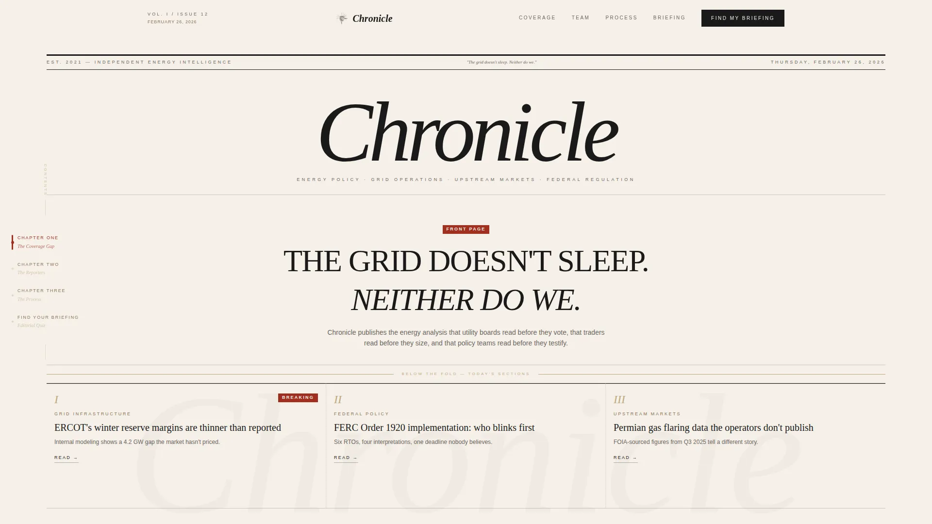
- A broadsheet hero section with a bold serif masthead, typeset date, full-width lead headline, and three column teasers
- Three editorial chapters covering the problem with mainstream energy coverage, the reporting team and their bylines, and the step-by-step reporting process
- A five-question editorial quiz that builds a personalized reading profile and recommends a newsletter tier with sample headlines
Feature list
Chronicle's capabilities come directly from its structure, design system, and interactive quiz component.
Broadsheet Front Page Hero
The hero fills the full viewport like a newspaper front page. It includes a bold serif masthead, a typeset date in the US format, a full-width lead headline in large editorial type, and three column teasers below the fold line. There is no animation. The stillness communicates considered authority.
Hub and Spoke Anchor Navigation
A persistent left-margin table of contents lists each chapter title in sandstone serif. The active chapter turns editorial red as the reader scrolls. This keeps orientation clear on a long desktop page without interrupting reading flow.
Three-Chapter Origin Story Structure
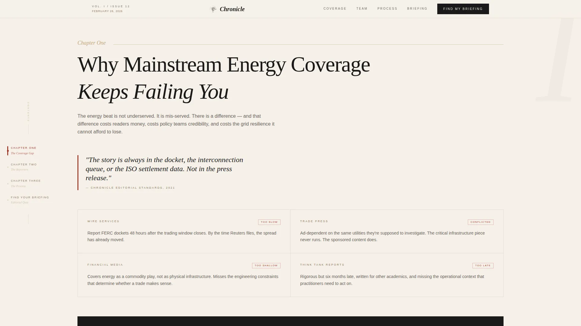
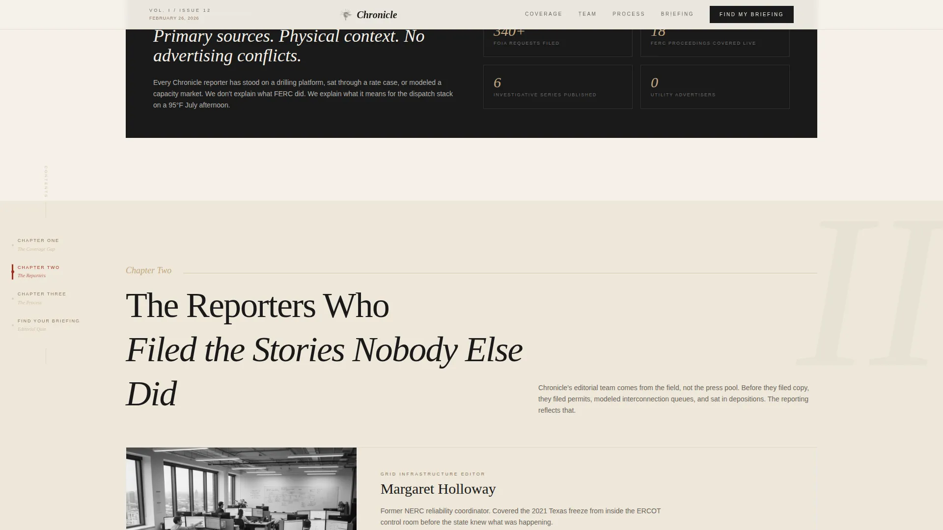
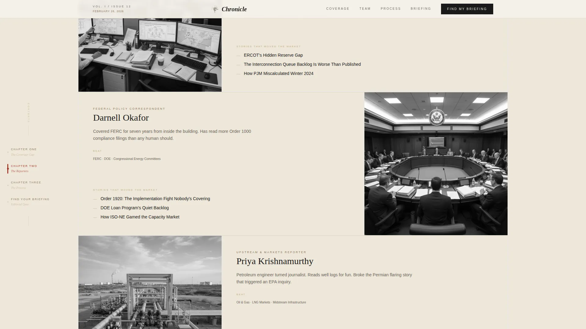
Chapter One frames why mainstream energy coverage falls short. Chapter Two introduces the editorial team through specific stories they broke. Chapter Three walks through the reporting process from a Freedom of Information Act request to published analysis. Each chapter deepens reader trust before the quiz appears.
Five-Question Personalized Briefing Quiz
The quiz asks about sector focus, update frequency, professional role, region, and what the reader missed last quarter. Answers build a reading profile that recommends a newsletter tier. The result page shows three sample headlines tailored to that profile alongside a low-friction signup.
Ink and Paper Typography System
Headlines use DM Serif Display for an editorial print feel. Body text uses Plus Jakarta Sans for clean on-screen readability. The combination keeps the page feeling like a letterpress broadsheet without sacrificing legibility on a workstation monitor.
Editorial Red Accent System
Editorial red (#A03020) appears only on breaking tags, active anchor nav items, and pull-quote borders. Its sparing use means every appearance signals importance. Readers trained by the layout snap to red the same way they would to a wax seal on a formal envelope.
Page sections overview
| Section | Purpose |
|---|---|
| Broadsheet Hero | Opens with masthead, typeset date, full-width lead headline, and three column teasers |
| Chapter One | Frames the failure of mainstream energy coverage as the reader's unsolved problem |
| Chapter Two | Introduces the editorial team through bylines and specific stories they broke |
| Chapter Three | Walks through the reporting process from FOIA request to published analysis |
| Briefing Quiz | Five-question assessment that builds a personalized newsletter recommendation |
| Minimal Footer | Provides copyright notice, essential links, and social handles |
Design & branding system
The Warm Stone color system and Ink and Paper theme create a letterpress broadsheet feel that is warm, tactile, and authoritative without visual noise. The palette is disciplined: only four colors, each with a specific role, and editorial red used sparingly enough to retain full stopping power.
- Colors: aged parchment (#F5F0E8) for background, pressed ink black (#1A1A1A) for body text, sandstone tan (#C4A882) for dividers and chapter labels, editorial red (#A03020) for breaking tags, active nav, and pull-quote borders
- Typography: DM Serif Display for all headlines, Plus Jakarta Sans for body and interface text, no Inter or Roboto used
- Section dividers use thin sandstone rules, and the overall composition avoids tickers, animations, and floating elements in favor of deliberate stillness
Mobile & speed optimization
The template is designed desktop-first, matching the morning briefing context of its primary audience: utility executives on workstations before board calls. The static sections use server-side rendering to stay fast, while the quiz component handles interactivity on the client side.
- Static broadsheet and chapter sections are built with Server Components to minimize load overhead
- The quiz runs as a Client Component, managing five-question state and result rendering without a full page reload
- Low animation policy means no ticker feeds, no floating elements, and only subtle scroll reveals where needed
How this template helps you convert
Chronicle converts by proving editorial value before making any ask. The quiz is the primary conversion mechanism, and it earns trust through the quality of its questions rather than through urgency or pressure.
- The three-chapter origin story stacks credibility through named reporters, specific broken stories, and a transparent reporting process, so readers arrive at the quiz already convinced of the newsroom's authority.
- The five-question quiz demonstrates that the newsroom understands the reader's specific world, sector, role, and region, making the resulting newsletter recommendation feel earned rather than generic. The result page then shows sample headlines and a single low-friction signup step.
Other information about this template
This template is a strong fit for energy media launches, newsletter rebrand pages, and editorial teams building a direct subscriber base outside a larger platform. Its hub-and-spoke structure also makes it practical for A/B testing different chapter sequences or quiz entry points.
- The footer follows a minimal pattern with copyright, essential links, and social handles, keeping the exit experience clean
- The template is localized for English-language US audiences, using USD references and US date format (for example, February 26, 2026)
- Intersection context: the template sits at the crossroads of Blog and Editorial category, Energy Blog and Media subcategory, and Energy News Blog niche, making it a precise fit for B2B media and energy intelligence newsletter products
Theme
Ink & Paper
Creative direction
Origin Story
Color system
Warm Stone
Style
Hub & Spoke (Anchor Nav)
Direction
Quiz/Assessment
Page Sections
Broadsheet Hero with Typeset Front Page
Hub and Spoke Anchor Navigation
Three-chapter Origin Story
Five-question Personalized Briefing Quiz
Ink and Paper Typography Pairing
Sparing Editorial Red Accent System
Related questions
Who is this landing page template designed for?
What does the five-question quiz actually do?
Is this template designed for desktop or mobile?
Can I customize the chapter content and quiz questions?
What makes this different from a standard blog homepage?



