Healthcare Industry Report Blog Landing Page Template
Chronicle is a heritage-editorial landing page template built for healthcare industry report publications. It uses an asymmetric 60/40 grid, a warm parchment-and-oxblood color system, and a scroll-driven narrative layout to move serious readers, health system executives, policy analysts, and pharma strategists, toward a registration-gated full report.
by Rocket studio
Quick summary
Chronicle is a single-page, desktop-first template designed for healthcare investigative journalism and policy intelligence publishing. It pairs a massive centered serif headline with a 60/40 asymmetric grid, a scroll-linked archive timeline, and a deferred call-to-action button to build reader trust and drive registrations for gated reports.
Who this template is for
This template is built for publishers, editors, and content teams who produce serious, long-form healthcare reporting. It serves organizations that need to convert informed, skeptical readers into registered subscribers rather than casual browsers.
- Health system media teams and independent healthcare policy publications
- Pharma intelligence platforms and industry research outlets
- B2B editorial brands targeting CFOs, policy analysts, and strategic decision-makers
What problem this template solves
Most editorial templates are built for lifestyle blogs or marketing content. They lack the visual authority and narrative structure that healthcare industry readers expect from credible, investigation-grade reporting.
- Generic blog layouts undercut trust with audiences who need sourced, detailed analysis
- Standard call-to-action patterns feel promotional, which pushes skeptical professional readers away
- Single-column, image-heavy layouts fail to communicate depth before the reader reaches the first scroll
What you get with this template
You get a fully structured landing page that earns reader trust before it asks for anything. Every section is sequenced to deepen engagement, from the opening headline finding through the methodology teaser to the archive browse grid.
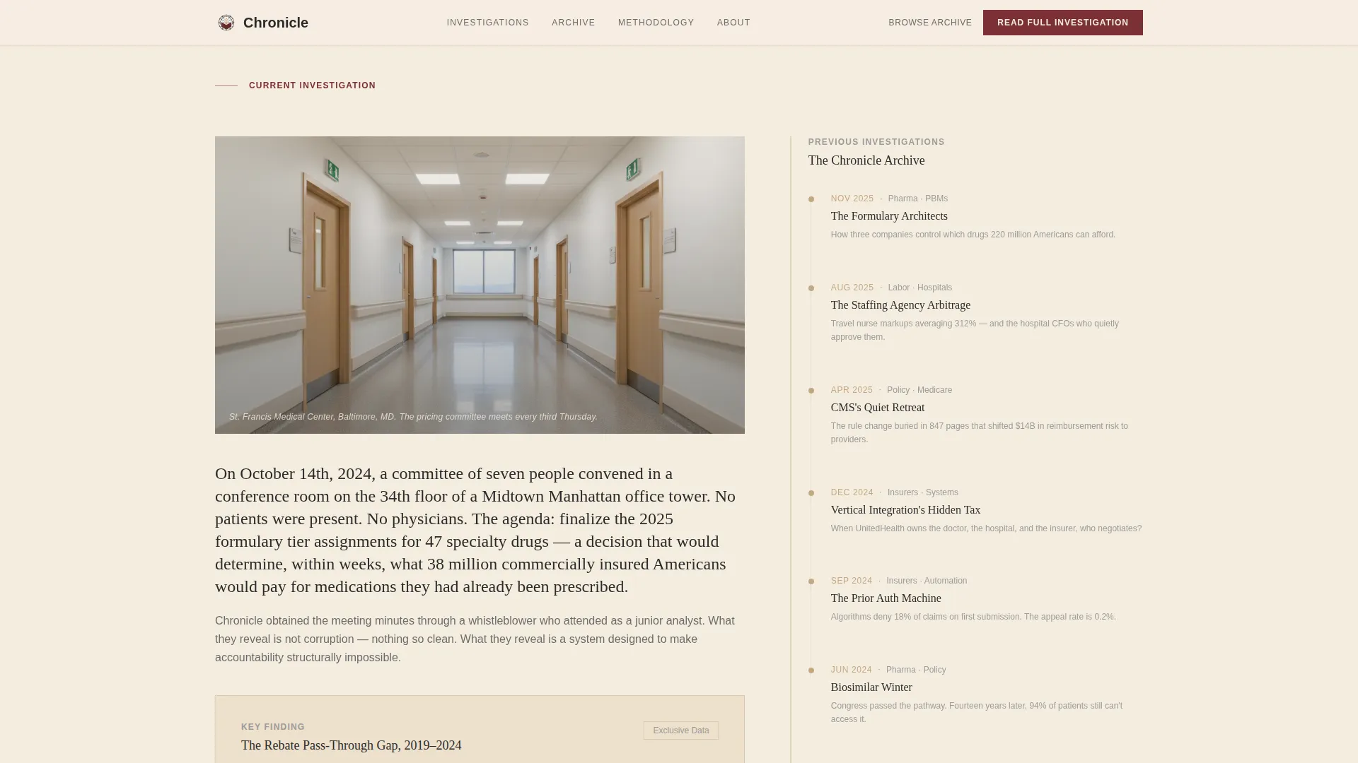
- A 60/40 asymmetric grid pairing the flagship investigation with a vertical archive timeline
- A two-path conversion system: an embedded text link and a deferred fixed call-to-action button
- Five distinct page sections plus a footer, each serving a specific editorial and conversion role
Feature list
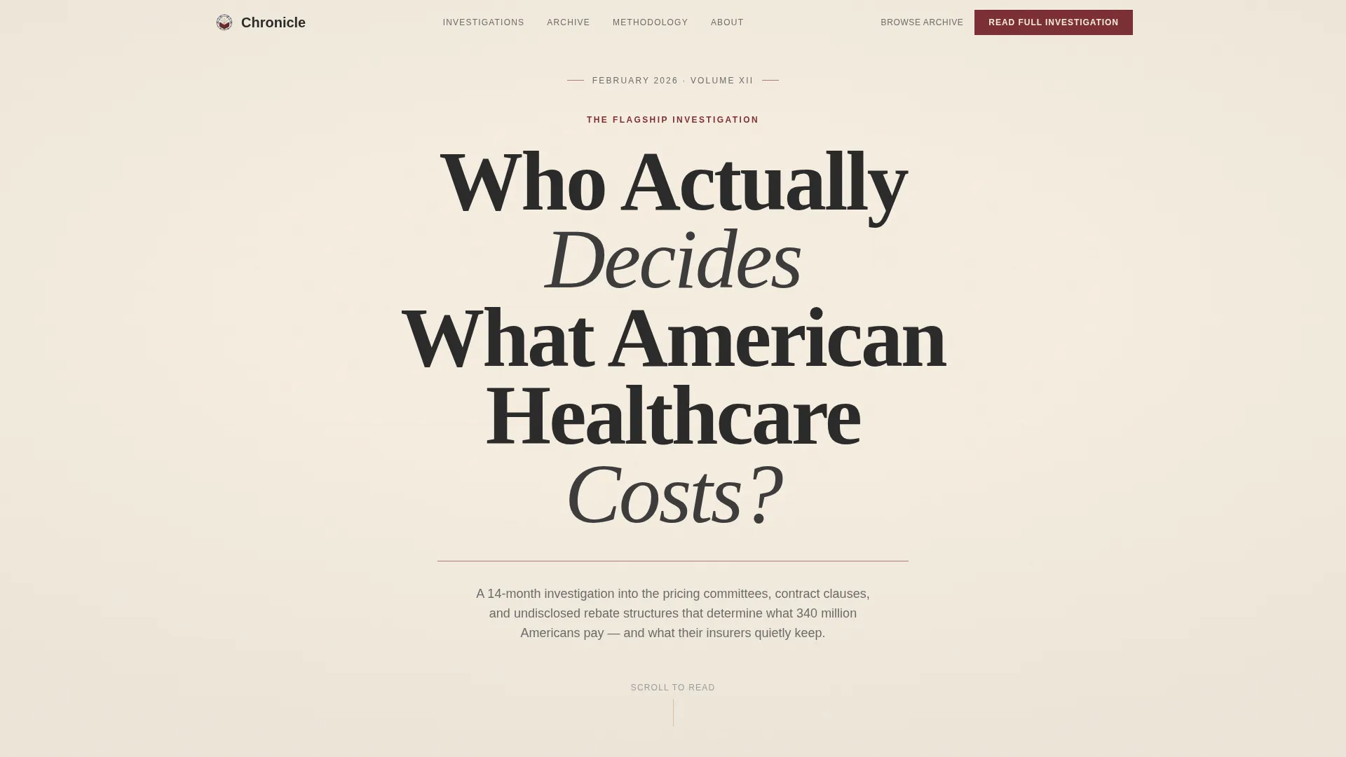
Giant Headline Centered Hero
The hero section uses enormous Fraunces serif typography set in deep editorial charcoal on aged parchment. No image is used. The headline breaks across three lines, each word carrying the visual weight of a chapter title. A thin oxblood rule and a small-caps dateline complete the opening without distraction.
Asymmetric 60/40 Investigation Grid
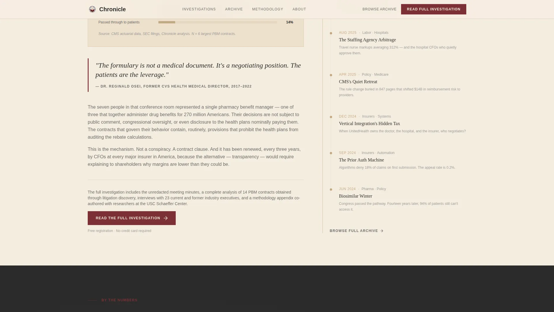
The flagship investigation occupies the wider 60-column side with an opening anecdote, a key data visualization slot, and a named pull quote. The 40-column side runs a vertical timeline of related reports, each node a clickable entry point into the archive. The layout creates editorial hierarchy at a glance.
Scroll-Linked Narrative Flow
As the reader scrolls, sections reveal sequentially: headline finding first, then methodology, then historical context, then implications. Scroll-linked animations activate timeline nodes and surface the sticky call-to-action button after 40 percent scroll depth. The pacing mirrors reading a printed investigation, not browsing a feed.
Deferred Fixed Call-to-Action Button
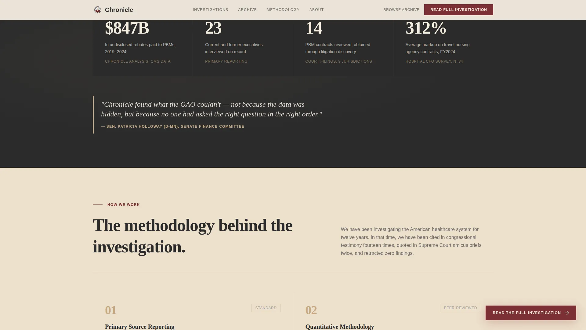
The primary call to action, labeled "Read the Full Investigation," first appears as an embedded text link at the end of the opening excerpt. After 40 percent scroll depth, a fixed oxblood button materializes on screen. No form appears on this page; the click routes to a separate registration screen.
Archive Browse Grid
A recent investigations grid displays past reports with category tags. It serves returning visitors who already have access and gives new readers a sense of publication depth. The grid layout uses sandstone card backgrounds to separate entries from the parchment page background.
Heritage Editorial Typography System
Fraunces handles all serif display headlines. DM Sans covers body text, navigation labels, and interface elements. The pairing keeps long-form copy readable without losing the weight and authority that the Heritage and Story theme requires.
Page sections overview
| Section | Purpose |
|---|---|
| Hero Headline | Anchors authority with a massive serif headline, oxblood rule, and dateline |
| Flagship Investigation | Presents the lead report in a 60/40 grid with data visualization and archive timeline |
| Key Finding | Delivers the pull quote, data callout, and embedded text call to action |
| Methodology Teaser | Signals investigative credibility and sourcing standards |
| Archive Browse | Lets readers explore past reports via a tagged grid |
| Footer | Provides horizontal navigation flow and secondary site links |
Design & branding system
The visual identity follows a Heritage and Story theme built around a Warm Stone color palette. Every color choice is deliberate: parchment dominates backgrounds, charcoal anchors reading text, sandstone warms dividers and card surfaces, and oxblood appears only where it must earn attention.
- Aged parchment (#F5EDE0) as the primary background, deep editorial charcoal (#2B2B2B) for body text and navigation
- Quarried sandstone (#C4A882) for section dividers, card backgrounds, and warm accent details
- Muted oxblood (#7B3034) reserved for links, pull quotes, hover states, and the fixed call-to-action button
Mobile & speed optimization
The template is designed desktop-first, matching the primary audience of executives and analysts reading long-form content at a workstation. It remains responsive to tablet viewports for readers moving between devices.
- Server Components handle static content delivery; JavaScript is kept minimal to support scroll-linked interactivity without bloat
- Timeline node activation and sticky call-to-action materialization are the primary interactive behaviors, keeping the overall motion budget controlled
How this template helps you convert
Chronicle earns the registration click by giving readers the most compelling finding before asking for anything. The conversion path is intentional and sequential, not interruptive.
- The embedded text call to action at the end of the opening excerpt captures readers who are already convinced, without breaking the reading experience with a modal or banner.
- The deferred fixed oxblood button appears only after 40 percent scroll depth, targeting readers who are engaged enough to have read past the first section, making the ask feel earned rather than forced.
Other information about this template
Chronicle is a strong fit for healthcare editorial teams evaluating templates on platforms like Webflow, Framer, or similar no-code and low-code publishing tools. Its structure also suits teams building a healthcare blog or media site that needs to position itself against established industry publications.
- The template supports a single-page landing flow; multi-page archive and registration screens are separate builds
- The footer uses a horizontal flow pattern suited to editorial publications with multiple report categories
- The two-call to action path design separates new visitors from returning subscribers without requiring logged-in state on the landing page itself
- The Heritage and Story theme makes this template well suited for organizations that want their publication to feel peer-reviewed and institutional rather than startup-branded
Theme
Heritage & Story
Creative direction
Origin Story
Color system
Warm Stone
Style
Asymmetric Grid (60/40)
Direction
Click-Through
Page Sections
Giant Centered Hero Headline
Asymmetric 60/40 Investigation Grid
Scroll-linked Narrative Reveal
Two-path Conversion System
Archive Browse Grid
Heritage Editorial Type Pairing
Related questions
Is this template designed for gated content and registration-wall publishing?
Can this template work for a healthcare newsletter or subscription report series?
What makes the 60/40 asymmetric grid useful for editorial publishing?
Does the template include the registration or paywall screen?
How is the scroll-linked animation behavior structured?



