Product Management Editorial Landing Page Template
Chronicle is a masonry-layout landing page template built for product management editorial publications. It presents your monthly deep-dive series with the authority of a broadsheet publication, drawing senior product leaders in through archive browsing, a persistent read banner, and a frictionless email subscribe form, all wrapped in a warm, heritage editorial visual identity.
by Rocket studio
Quick summary
Chronicle is a single-page editorial landing page template for product management publications. It combines a broadsheet masthead header, a staggered masonry archive gallery, a pull quote interstitial, and a slim subscribe form. The Heritage and Story design system uses parchment, charcoal, and aged burgundy to give every section the weight of a well-produced quarterly journal.
Who this template is for
This template is built for product leaders and editorial teams who publish serious long-form content. It suits anyone running a monthly product management deep dive who needs a page that earns trust before asking for anything.
- Senior product managers at growth-stage and public companies who want a publication home that matches their editorial ambitions
- Heads of product running newsletters or content series aimed at experienced product audiences
- Aspiring product leaders building a personal editorial brand around rigorous, case-study-style writing
What problem this template solves
Most editorial landing pages look like marketing pages in disguise. They lead with a signup gate before the reader has seen a single word of content. That approach fails with experienced product audiences who can spot shallow content quickly.
- Readers arrive to a full broadsheet hero with visible editorial content, not a form wall
- The masonry archive proves depth and consistency before any subscription is requested
- The subscribe form appears only after the visitor has already browsed the body of work
What you get with this template
Chronicle gives you a complete editorial landing page ready to represent a product management monthly publication. Every section serves the reader's browsing experience first and the subscription goal second.
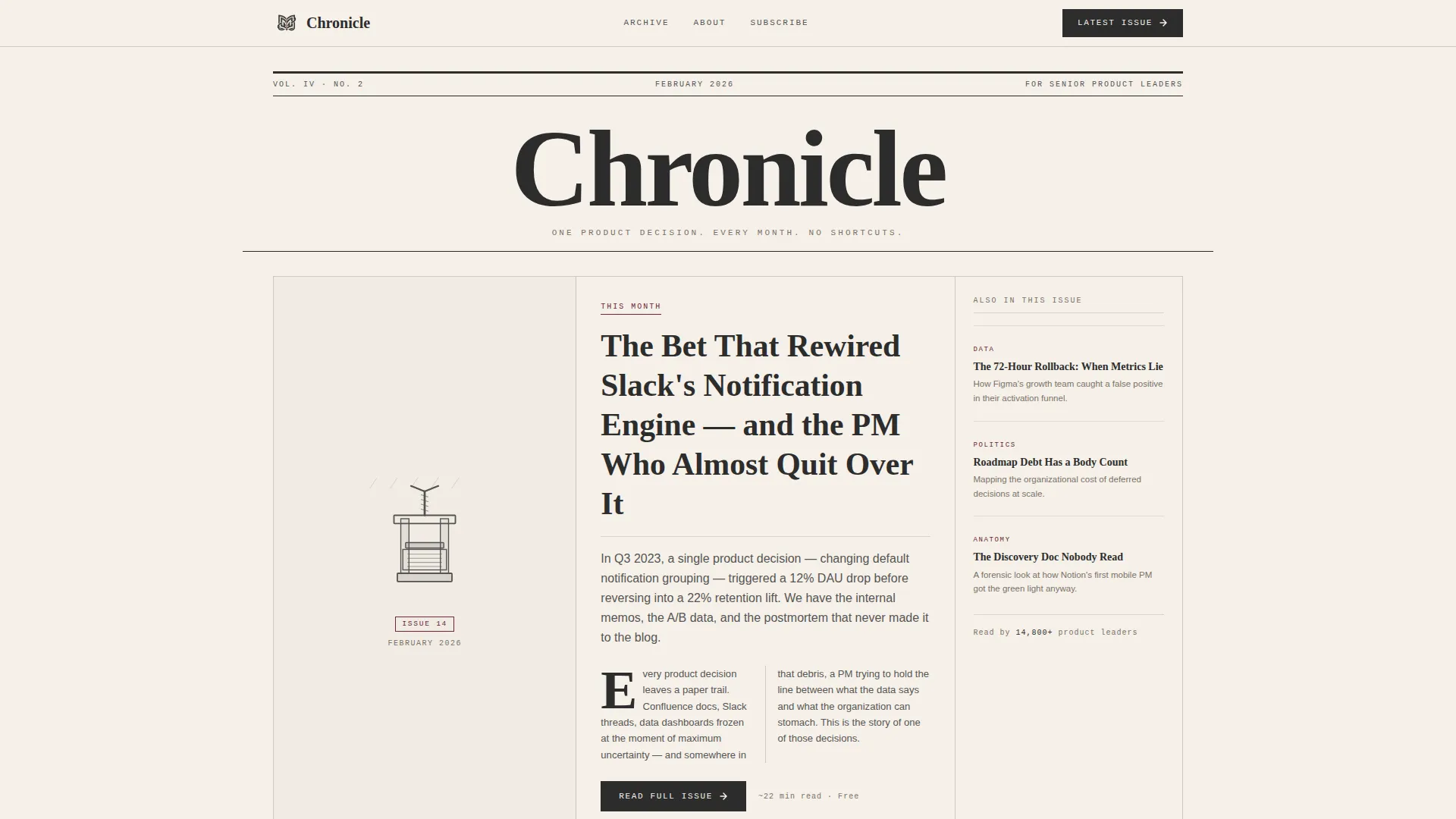
- A broadsheet masthead header with a woodcut-style illustration, dateline, and two-column lead paragraph
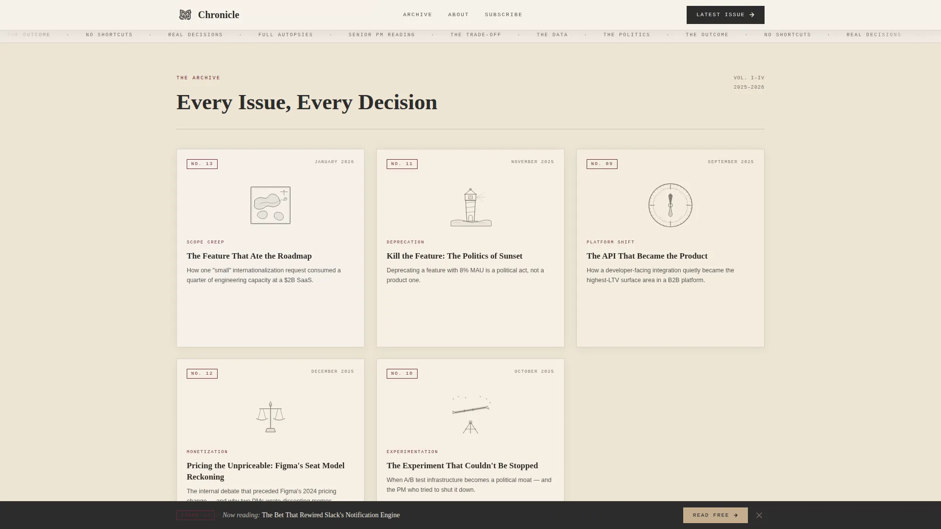
- A staggered masonry archive grid where each card renders as a magazine cover with hover-reveal abstracts
- A persistent sticky read banner, a full-width pull quote interstitial, and an inline email subscribe form
Feature list
This template includes a tightly considered set of editorial components. Each one contributes to the reading-room atmosphere and the gradual trust-building that converts casual browsers into subscribers.
Broadsheet Masthead Header
The header presents "Chronicle" in a high-contrast serif at newspaper scale. A dateline sits beneath it, followed by the current issue's headline typeset as a front-page story. A two-column lead paragraph is visible above the fold alongside a woodcut-style illustration, establishing editorial authority from the first glance.
Masonry Archive Gallery
Past issues render as staggered magazine-cover cards at varying widths and heights. Each card shows its issue number, title, and a single-sentence thesis. Hovering on a card reveals a three-line abstract and reading time. As the visitor scrolls deeper, cards shift to slightly warmer tones and softer edges, giving the archive a sense of growing history.
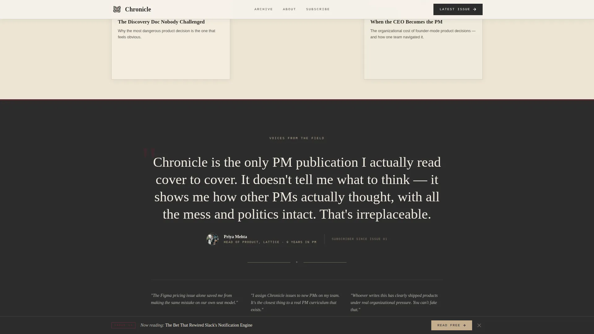
Pull Quote Interstitial
A full-width section breaks the masonry grid at the midpoint. It highlights a pull quote from a named product management voice, set in the aged ink burgundy accent. This section grounds the archive in real perspectives and adds social proof without disrupting the reading flow.
Sticky Read Banner
After one scroll depth, a persistent banner fades into view and stays pinned. It carries the primary call to action: "Read This Month's Issue." The banner links directly to the latest deep dive with no content gate, reinforcing the template's read-first philosophy.
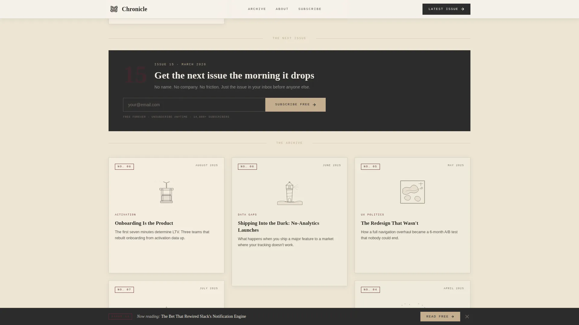
Inline Subscribe Form
A slim email capture form sits between masonry rows. It asks only for an email address, with a button labeled "Subscribe Free." No name field, no company field, no extra friction. The form earns conversions because the surrounding content has already done the convincing.
Heritage Editorial Typography System
The template uses three typefaces in concert. A high-contrast serif handles display headings and masthead text. A humanist sans-serif carries body copy. A monospaced typeface labels issue numbers and dateline metadata. Together they replicate the typographic rhythm of a well-edited print publication on screen.
Page sections overview
| Section | Purpose |
|---|---|
| Broadsheet Masthead Header | Establishes editorial identity with headline, dateline, woodcut illustration, and two-column lead |
| Masonry Archive Gallery | Displays past issues as staggered magazine-cover cards with hover-reveal details |
| Pull Quote Interstitial | Full-width social proof break featuring a named PM voice in burgundy accent |
| Inline Subscribe Form | Frictionless email capture between masonry rows with a single field and free subscribe button |
| Sticky Read Banner | Persistent call-to-action banner that fades in after one scroll depth |
| Single-Row Footer | Clean linear footer row completing the publication layout |
Design & branding system
Chronicle's visual identity is built around a Warm Stone color system that evokes a university library reading room. Every color and typographic choice reinforces the feeling that this publication has editorial standards and a defined point of view.
- Colors: parchment cream (#F5F0E8) and deep editorial charcoal (#2C2C2C) alternate as section backgrounds, sandstone tan (#C4AD8F) adds mid-tone warmth, and aged ink burgundy (#6B2737) appears sparingly on pull quotes, issue numbers, and hover states
- Typography: a high-contrast serif for display and masthead text, a humanist sans-serif for body paragraphs, and a monospaced face for labels and metadata
- Scroll-reveal animations bring each masonry card into view as the visitor reads deeper, and hover states on cards use the burgundy accent to signal interactivity without breaking the editorial calm
Mobile & speed optimization
Chronicle is built desktop-first to serve its senior product audience, who typically read on larger screens in focused sessions. The layout adapts gracefully to smaller viewports so the content remains accessible on any device.
- The masonry grid reflows into a single-column stack on mobile, preserving card legibility and hover-reveal content as tap interactions
- Static content is handled with server components and minimal client-side JavaScript, keeping the page light and the reading experience uninterrupted
How this template helps you convert
Chronicle is designed around a read-first conversion model. Visitors earn trust in the publication before they are ever asked to subscribe. That sequencing produces higher-quality subscribers who already understand the content's depth.
- The broadsheet hero and visible two-column lead give new visitors an immediate sense of editorial quality, making them want to read further before bouncing
- The masonry archive builds proof of consistency and depth as the visitor scrolls, so by the time the inline subscribe form appears, the value of the newsletter is already demonstrated
Other information about this template
Chronicle fits naturally into the broader ecosystem of editorial tools and publishing platforms used by product management content creators. It is a standalone landing page template that works as the public-facing front for any subscription-based product management newsletter or deep-dive series.
- The template is categorized under Blog and Editorial with a Product Management Newsletter subcategory, making it directly relevant to product management monthly deep-dive publications
- Design choices such as alternating parchment and charcoal backgrounds and sparingly used burgundy accents are intentional brand decisions, not decorative defaults
- The footer follows a linear single-row pattern, keeping the closing section minimal and on-brand with the publication's deliberate typographic restraint
- The template supports a US date format (February 2026 style) and English-language editorial content out of the box
Theme
Heritage & Story
Creative direction
Gallery Walk
Color system
Warm Stone
Style
Masonry/Pinterest
Direction
Content/Resource
Page Sections
Broadsheet Masthead Header
Staggered Masonry Archive Grid
Pull Quote Interstitial Section
Persistent Sticky Read Banner
Frictionless Inline Subscribe Form
Heritage Editorial Typography System
Related questions
Does the subscribe form require more than an email address?
Can I display a live archive of past issues on this landing page?
Is this template optimized for a desktop reading audience?
How does the sticky read banner behave on scroll?
Can I customize the color palette and typefaces for my own publication?



