Nonprofit Thought Leadership Landing Page Template
Chronicle is a heritage-editorial landing page template built for nonprofit thought leadership publishing. It pairs a collage-style hero with an asymmetric 60/40 grid, a five-step impact assessment quiz, and an evidence-then-witness scroll rhythm. The warm parchment palette and Fraunces display type give long-form narratives the weight and credibility they deserve.
by Rocket studio
Quick summary
Chronicle is a single-page, desktop-first landing page template designed for nonprofit thought leadership journals and editorial publishers. It combines a scrapbook collage hero, an asymmetric 60/40 content grid, and a five-question impact assessment that delivers a personalized Reflection Brief to each reader. The result is a page that reads like a living annual report and converts like a trusted research tool.
Who this template is for
Chronicle is built for organizations that publish long-form narrative journalism at the intersection of evidence and community voice. It serves teams who need their content to feel authoritative without feeling cold.
- Program officers at mid-size foundations looking for evidence-based frameworks they can share with colleagues
- Doctoral students and independent researchers who need citable, narrative-rich sources
- Executive directors who forward articles to their boards and want a publication that matches their voice
What problem this template solves
Most nonprofit editorial pages look like stretched-out blog archives. They fail to signal the depth of the work behind each piece, and they give funders no obvious next step beyond reading one article. Chronicle solves that problem with a structured, argument-driven scroll that builds a case rather than just listing content.
- Readers arrive and leave without a sense of the publication's full body of work or intellectual authority
- There is no mechanism to turn a compelling read into a personalized, actionable follow-up for the organization
- Generic layouts undercut scholarly credibility for the audiences who matter most
What you get with this template
Chronicle delivers a fully structured, single-page layout with every section pre-built and ready to customize. The template handles the editorial hierarchy, visual rhythm, and interactive quiz flow so your team can focus on the content itself.
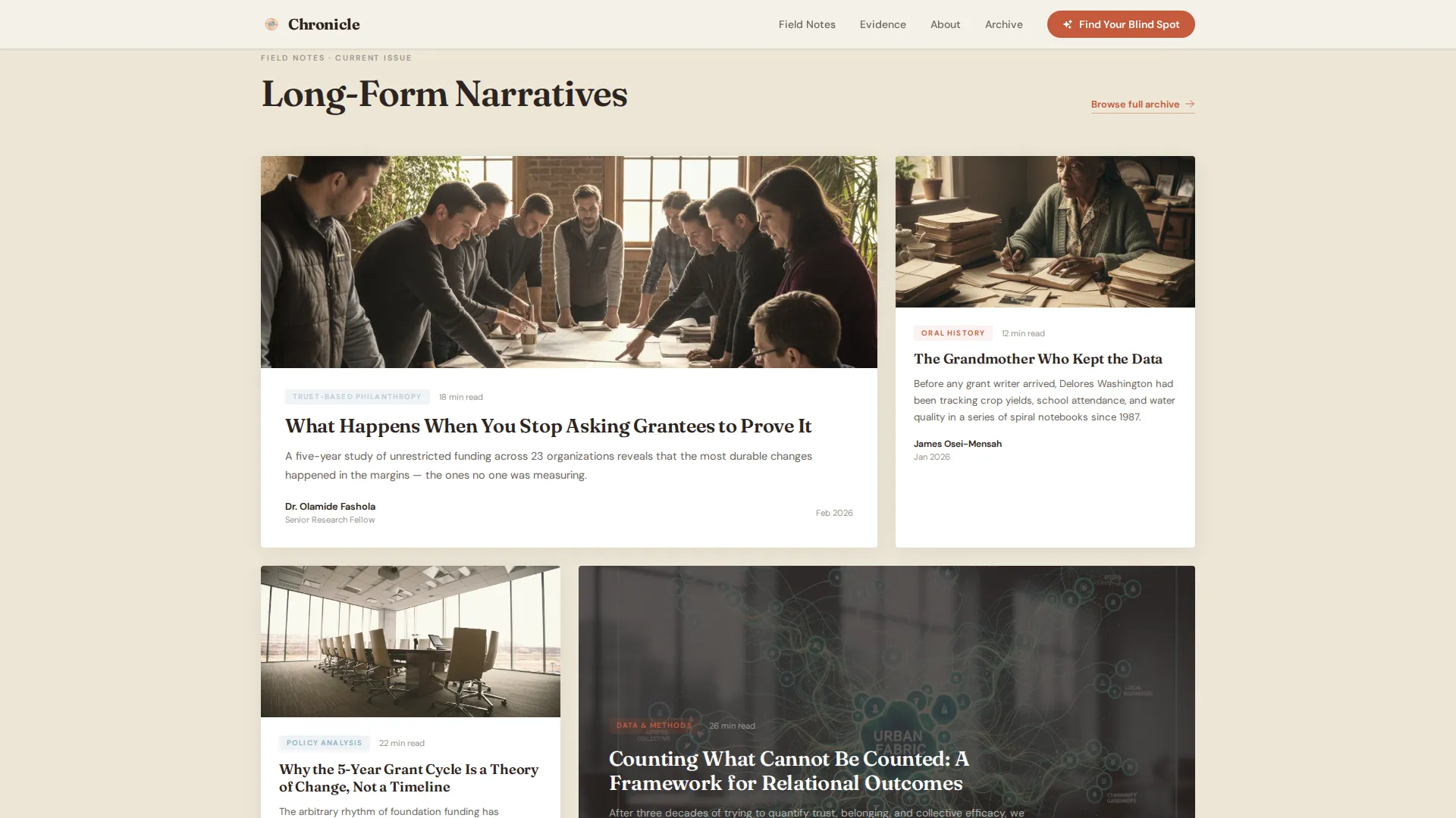
- A collage-style hero section, a 60/40 key-finding module, a featured narratives bento grid, a cloud-blue evidence section, reader portrait testimonials, and a five-step assessment call-to-action anchor
- A five-question quiz component with one-at-a-time step reveals and a personalized Reflection Brief delivered by email on completion
- A Heritage and Story visual identity using Fraunces display type, DM Sans body text, and the Cloud Canvas color palette throughout
Feature list
Chronicle's built-in features are drawn directly from its editorial and interactive design brief. Each one serves a specific audience need.
Collage Scrapbook Hero
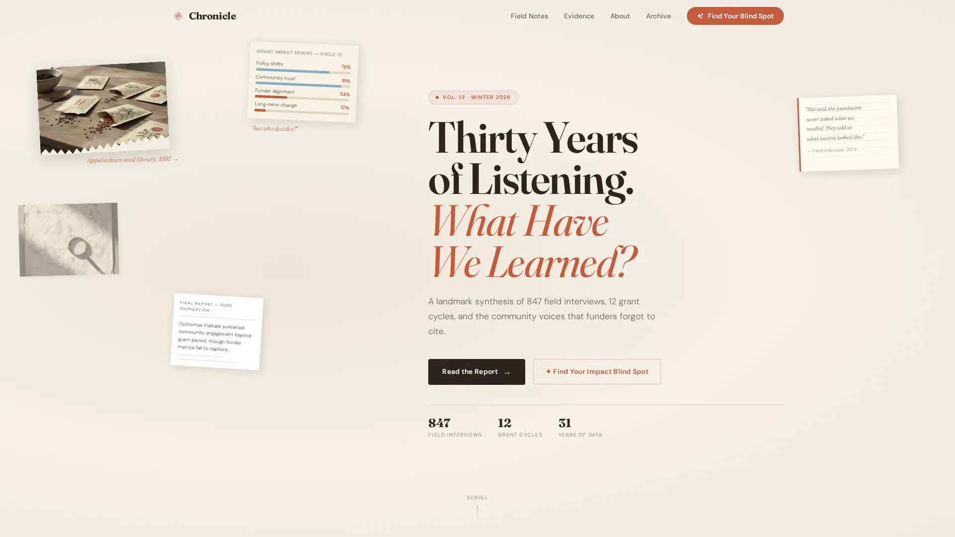
The hero section layers torn photograph fragments, a bar chart on yellowed paper, a handwritten margin note, and a faded map as though pinned to a corkboard. Nothing is perfectly aligned. A parallax scroll effect animates the fragments as the reader enters the page, and the headline "Thirty Years of Listening. What Have We Learned?" fades in over the composition.
Asymmetric 60/40 Grid Layout
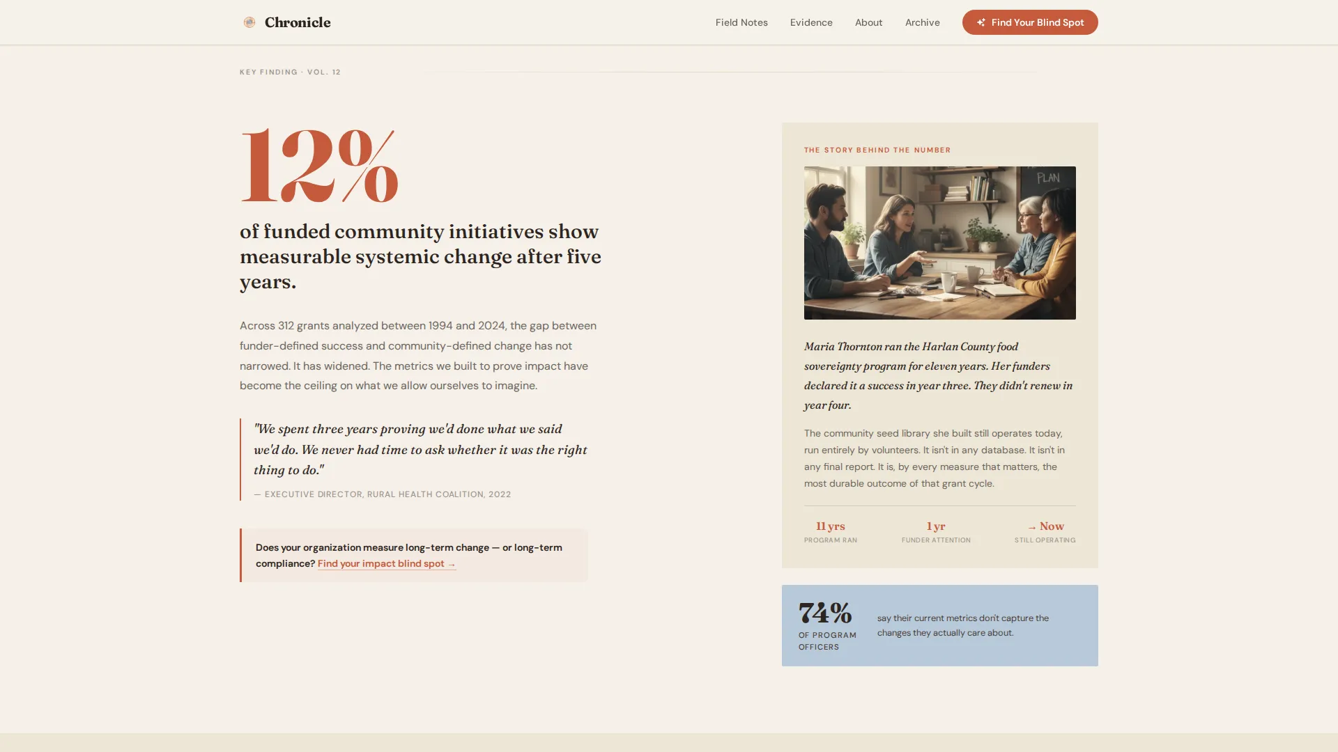
Every content section uses a deliberate 60/40 column split. The wider column carries the data, statistic, or policy argument. The narrower column holds the human story, oral history excerpt, or contextual note. This structure creates an evidence-then-witness rhythm that builds a persuasive case across the full scroll.
Five-Step Impact Assessment Quiz
The "Find Your Impact Blind Spot" assessment appears first as a subtle inline prompt after the third scroll section, then anchors the page close. Five questions are revealed one at a time, covering organizational age, funding model, outcome measurement approach, absent stakeholder voice, and trust-based funding priorities. Results are emailed as a narrative Reflection Brief, not a score.
Evidence and Witness Scroll Cadence
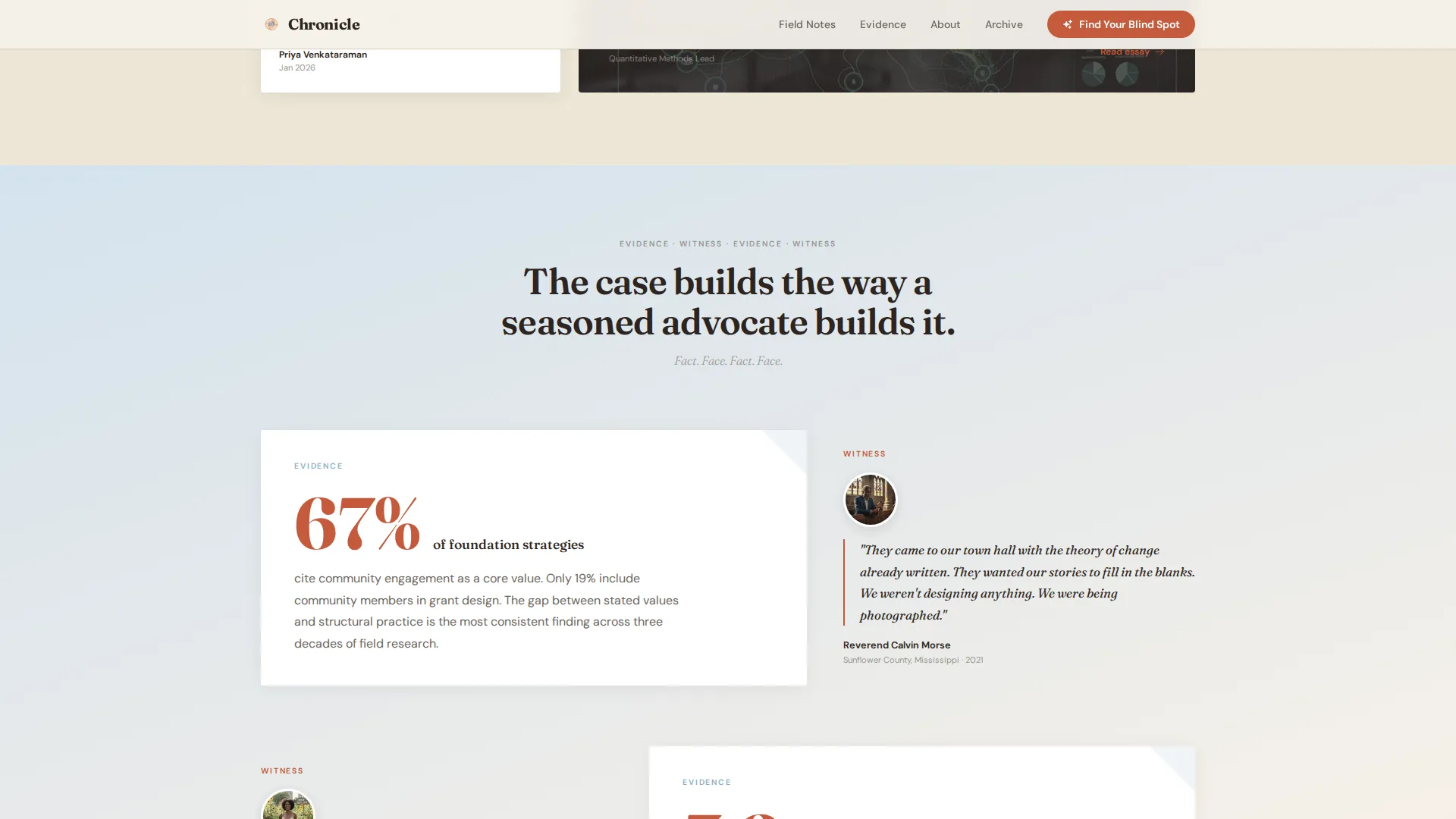
The page alternates between large cinnabar statistics and oral history excerpts in a repeating pattern. Each data visualization gives way to a witness account, which gives way to a policy recommendation, which gives way to another reframing statistic. The scroll feels like a congressional hearing built in print.
Reader Portrait Testimonials
The testimonial section features portraits tied to specific archetypes: a program officer, a researcher, and an executive director. Each quote is specific and job-title attributed, and includes context about how the reader shared or acted on the content. This gives prospective readers an immediate sense of who else trusts the publication.
Heritage Editorial Typography System
Fraunces handles all display headlines and pull quotes. DM Sans carries body copy and interface labels. The pairing delivers scholarly weight without sterility, and supports the long-form reading experience the template is built for.
Page sections overview
| Section | Purpose |
|---|---|
| Collage Hero | Establish editorial authority and introduce the headline narrative |
| Key Finding Module | Present a devastating statistic alongside its human story in a 60/40 split |
| Featured Narratives Grid | Showcase long-form articles in an asymmetric bento layout |
| Evidence and Witness | Alternate data visualizations with oral history excerpts in cloud blue |
| Reader Portraits | Build trust through job-titled testimonials from recognizable archetypes |
| Assessment Call to Action | Anchor the five-question quiz and drive Reflection Brief completions |
| Footer | Display logo and tagline on the left with navigation links on the right |
Design & branding system
The Cloud Canvas color system anchors every design decision in Chronicle. It is built to feel like a stack of field notebooks left on a windowsill where afternoon light has softened every edge.
- Warm parchment (#F5F0E8) dominates backgrounds; pencil-sketch gray (#6B6560) carries all body text; soft cloud blue (#B8C9D9) washes over data sections; muted cinnabar (#C45A3C) appears only on pull quotes, data callouts, and interactive elements
- Fraunces is used for all display headlines and section titles; DM Sans handles body copy, captions, and quiz interface labels
- The Heritage and Story theme keeps the visual tone scholarly without sterility, aged without decay, and warm without sentiment
Mobile & speed optimization
Chronicle is designed desktop-first, reflecting the primary audience of program officers reading at their desks. A mobile fallback layout is included for readers on smaller screens.
- The collage hero, 60/40 grid, and bento article layout each adapt to a single-column stack on mobile without losing the editorial hierarchy
- Scroll reveal animations and quiz step transitions are handled by client-side components, while static editorial sections use server-side rendering to keep initial load weight low
How this template helps you convert
Chronicle earns its conversion by making the reader feel seen in the content before asking anything of them. The assessment call-to-action is introduced only after the reader has moved through three full scroll sections.
- The evidence-then-witness scroll rhythm builds intellectual trust and emotional recognition across each section, so by the time the inline quiz prompt appears after the third section, the reader already feels the content is speaking to their specific situation.
- The five-question Reflection Brief mechanism transforms a passive reading experience into a personalized, named deliverable sent to the reader's inbox, giving program officers and executive directors a concrete artifact to share with colleagues or boards.
Other information about this template
Chronicle sits at the intersection of several publishing and editorial design patterns. A few practical notes for teams evaluating this template:
- The template is categorized under Blog and Editorial, with a specific focus on the Nonprofit Blog and Media subcategory and the Nonprofit Thought Leadership Blog niche
- The footer follows an Arc Browser Split pattern, with logo and tagline anchored left and navigation links grouped right
- Animation intensity is set at medium-high: the collage hero uses fragment parallax, editorial sections use scroll reveals, and the quiz uses step transition animations
- The Reflection Brief email is triggered on quiz completion and is delivered as a narrative document, not a numerical score or generic result page
- The template is built for English-language publishing in the United States nonprofit sector context
Theme
Heritage & Story
Creative direction
Industry Report
Color system
Cloud Canvas
Style
Asymmetric Grid (60/40)
Direction
Quiz/Assessment
Page Sections
Collage Scrapbook Hero with Parallax
Asymmetric 60/40 Content Grid
Five-step Impact Assessment Quiz
Evidence and Witness Scroll Rhythm
Reader Portrait Testimonials
Heritage Editorial Typography Pairing
Related questions
Who is the primary audience for this template?
What does the 'Find Your Impact Blind Spot' quiz deliver to readers?
Can this template support a multi-article publication or journal?
Is this landing page template suitable for both desktop and mobile readers?
How many pre-built sections does this template include?



