Restaurant Review Blog Landing Page Template
Chronicle is a hub-and-spoke landing page template built for restaurant review blogs with a strong editorial voice. It opens with a newspaper-style masthead, pins a five-spoke anchor navigation to the top, and moves readers through philosophy, story cards, city guides, and a curated dish list, all styled in a warm parchment-and-graphite broadsheet aesthetic designed to earn clicks into full reviews.
by Rocket studio
Quick summary
Chronicle is a single-page, anchor-nav template for restaurant review blogs. It leads with a bold editorial masthead, guides readers through five content spokes, and converts with story-card calls to action and an inline email subscription. The Heritage and Story visual system makes the writing feel as considered as the restaurants it covers.
Who this template is for
This template suits writers and publishers who believe restaurant criticism deserves the same depth as literary or film criticism. It is designed for independent voices, not aggregator platforms.
- Food journalists and independent restaurant critics building a content-first blog
- Traveling professionals and home cooks who want to publish editorial dining guides
- Local writers tired of algorithmic ranking lists who need a credible editorial home
What problem this template solves
Most blog templates treat food content like a product feed. Chronicle solves the problem of editorial voice getting buried under generic layouts. It gives restaurant writing a format that matches its ambition.
- Generic templates make every food blog look the same, killing the sense of a distinct publication
- Readers leave quickly when design fails to signal editorial quality before the first sentence loads
- Story-driven restaurant content needs a hub structure to show range without overwhelming visitors on arrival
What you get with this template
You get a fully structured, single-page editorial hub built around five navigable content spokes. Every section is designed to deepen reader trust before asking for a click.
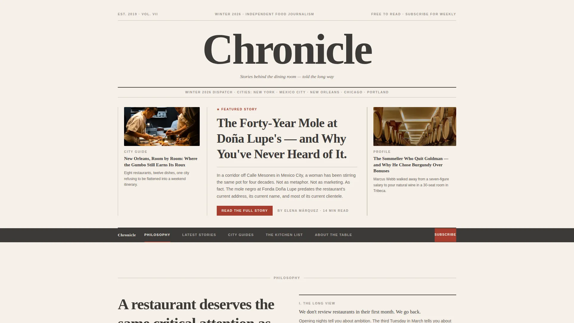
- A newspaper-style masthead with dateline, featured headline, and two flanking column teasers
- A sticky anchor navigation bar with five labeled spokes: Philosophy, Latest Stories, City Guides, The Kitchen List, and About the Table
- Story cards with editorial photography placeholders, excerpts, and red call-to-action buttons, plus an inline email subscription field in the Philosophy section
Feature list
A brief overview of the features that make Chronicle work as a restaurant review landing page.
Newspaper Masthead Header
The header presents the blog name in a large serif typeface across the full width, anchored by a thin rule and a dateline showing the current season and city. Below sits a bold featured headline and two smaller column teasers with story thumbnails. No hero image is used; the typography carries all visual weight.
Sticky Five-Spoke Anchor Navigation
A persistent navigation bar pins to the top of the viewport as readers scroll. The five spokes, Philosophy, Latest Stories, City Guides, The Kitchen List, and About the Table, are highlighted in editorial red on hover or active state, letting readers jump directly to the section they want.
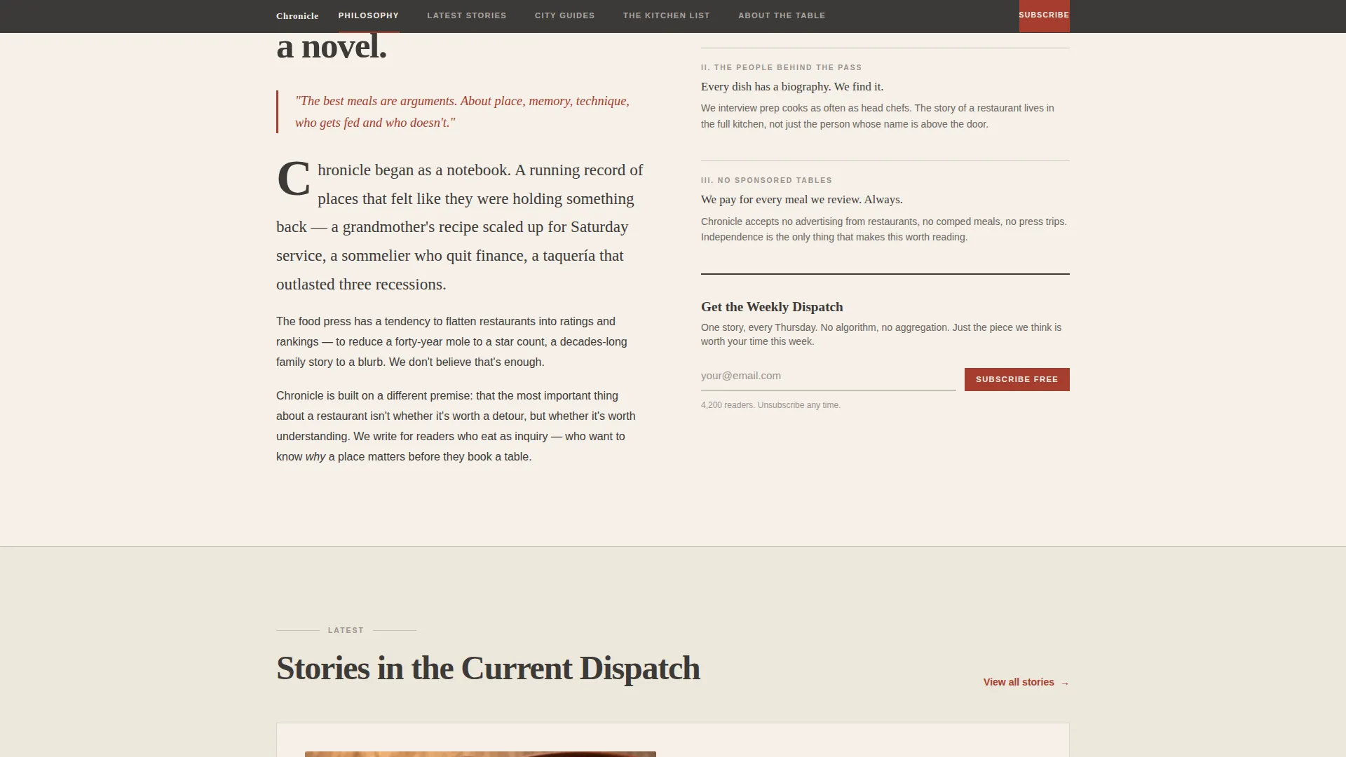
Philosophy Manifesto with Email Subscription
The Philosophy spoke opens with a short written manifesto explaining why restaurants deserve serious critical attention. At the base of this section, a single-field email input and a "Subscribe Free" button invite readers to join the weekly dispatch, converting the most engaged visitors before they reach the story cards.
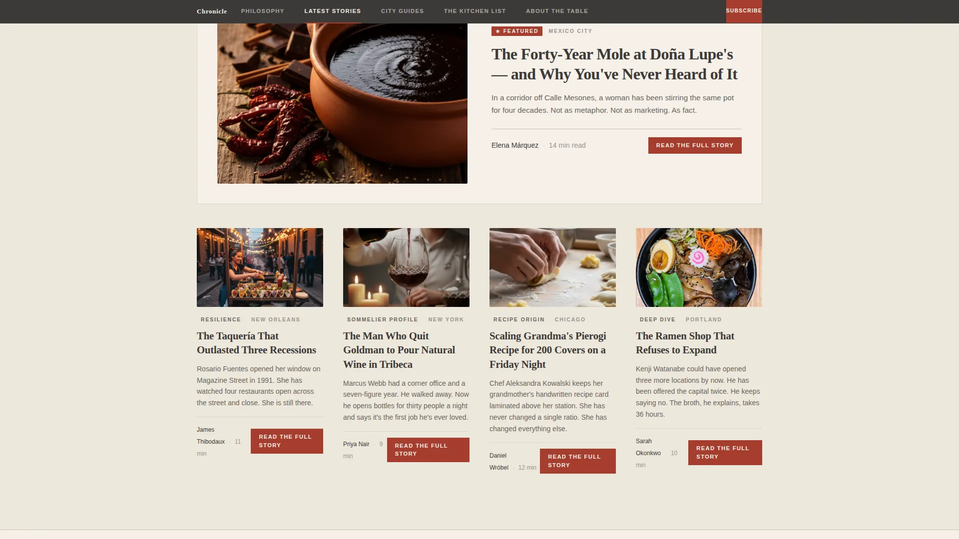
Editorial Story Cards
The Latest Stories section surfaces story cards that include hand-cropped photography placeholders, short excerpts, bylines, publication dates, and city tags. Each card carries a "Read the Full Story" button in editorial red, directing readers into the full article.
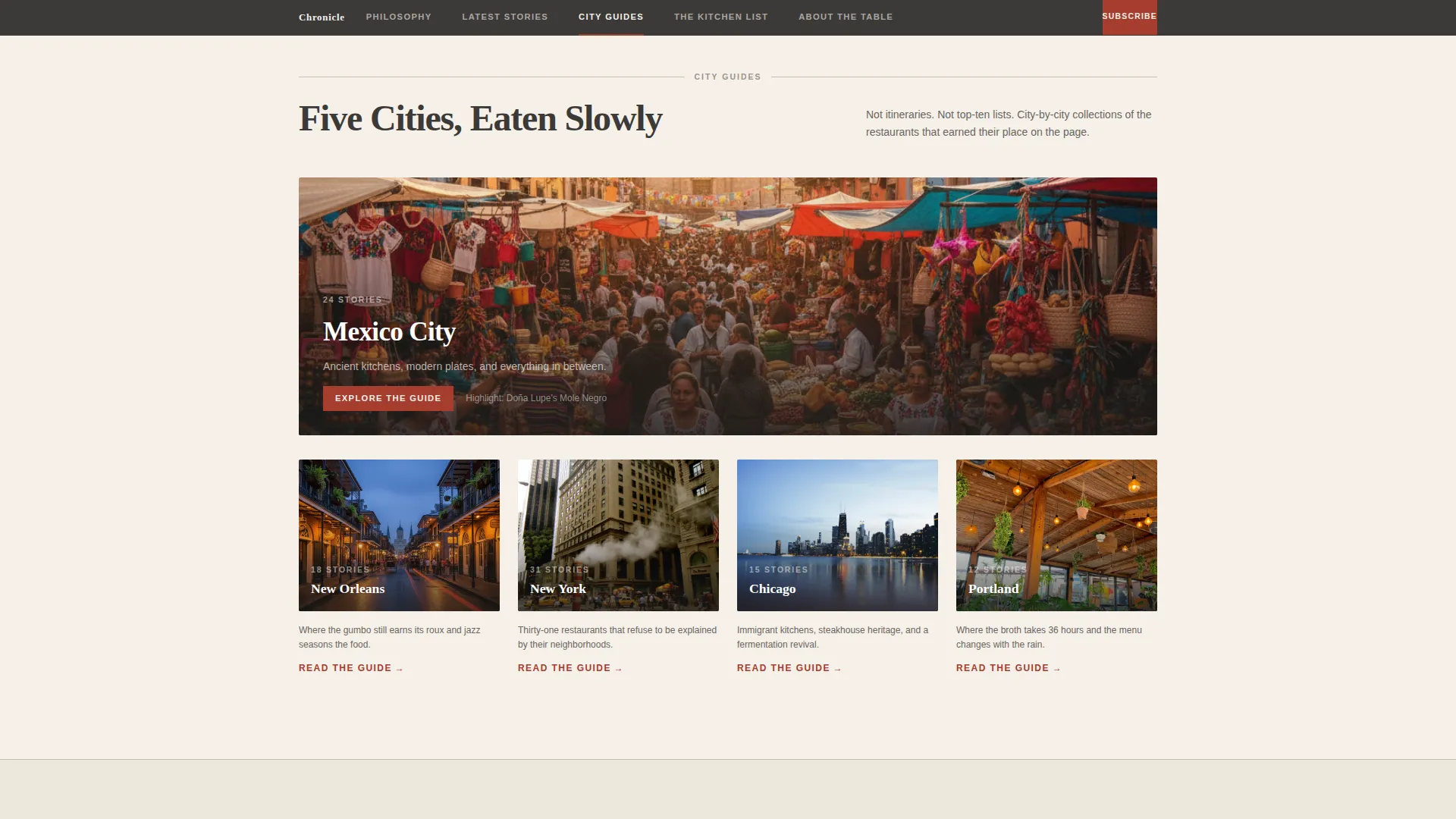
City Guides Section
A dedicated City Guides spoke presents dining content organized by city. Cards or map-style layouts group stories geographically, making the template useful for traveling readers who navigate by destination.
Scroll-Linked Animation and Stagger Effects
Sections reveal on scroll and story cards stagger into view. The sticky navigation and scroll-linked reveals create a reading rhythm that mirrors a long-form magazine feature, pulling readers from one section to the next.
Page sections overview
| Section | Purpose |
|---|---|
| Masthead Header | Sets editorial identity with blog name, dateline, featured headline, and two column teasers |
| Sticky Anchor Nav | Lets readers jump to any of five content spokes; highlights active spoke in editorial red |
| Philosophy Spoke | Delivers the blog manifesto and hosts the email subscription call to action |
| Latest Stories | Shows story cards with photography, excerpts, bylines, and red click-through buttons |
| City Guides | Organizes dining content by city for location-based reader navigation |
| The Kitchen List | Presents a ranked or curated list of essential dishes across covered restaurants |
| About the Table | Introduces the publication's background and editorial perspective |
| Footer | Single-row linear footer with standard publication-style links |
Design & branding system
The visual system is built on a Cloud Canvas palette that evokes a sun-faded broadsheet left on a café table. Every color choice is intentional and restrained.
- Backgrounds cycle through warm parchment (#F5F0E8) and muted cream (#EDE7DB); body text sits in soft graphite (#3D3A38) for high legibility against both tones
- Editorial red (#A63D2F) appears only on anchor nav highlights, pull quotes, and primary call-to-action buttons, giving every red instance deliberate visual weight
- Fraunces serif handles display headings and the masthead; DM Sans handles body text and captions, pairing broadsheet authority with clean reading comfort
Mobile & speed optimization
Chronicle is built desktop-first to honor the broadsheet aesthetic, but it includes a mobile-responsive fallback so the editorial experience holds on smaller screens.
- The sticky anchor navigation adapts to narrower viewports without losing spoke labels or active-state highlights
- Scroll-linked reveals and stagger card animations use minimal JavaScript, keeping the interaction layer light and the static content fast to load
How this template helps you convert
Chronicle earns the click before it asks for one. Readers experience the writing voice first, which makes every call to action feel like a natural next step rather than an interruption.
- The masthead and Philosophy spoke establish editorial authority early, so readers arrive at story cards already trusting the publication's voice and wanting more
- Every story card carries a "Read the Full Story" button in high-contrast editorial red, creating a clear and repeated path into full reviews across the Latest Stories section
- The Philosophy spoke closes with a low-friction email capture, "Get the Weekly Dispatch" with a "Subscribe Free" button, converting engaged readers through a secondary path that does not compete with the primary click-through goal
Other information about this template
Chronicle is a strong fit for any food journalism project that prioritizes voice and editorial design over generic blogging layouts. A few additional details worth knowing before you start building.
- The template uses Fraunces for display type and DM Sans for body copy, both of which are available as web fonts and easy to swap if your publication uses a different typeface family
- The Hub and Spoke structure means new spokes or content sections can be added to the anchor nav as your publication grows without redesigning the overall page layout
- The Heritage and Story theme and Cloud Canvas color system are pre-configured, so brand customization primarily involves swapping the palette values and typefaces rather than rebuilding design decisions from scratch
- This template is categorized under Blog and Editorial, Restaurant Blog and Media, and the Restaurant Review Blog niche, making it a purpose-built starting point rather than a generic blog theme adapted for food content
Theme
Heritage & Story
Creative direction
Vision & Mission
Color system
Cloud Canvas
Style
Hub & Spoke (Anchor Nav)
Direction
Click-Through
Page Sections
Newspaper Masthead Header
Sticky Five-spoke Anchor Navigation
Philosophy Manifesto with Email Capture
Editorial Story Cards with Click-through Ctas
City Guides Section
Scroll-linked Reveals and Card Stagger
Related questions
Can I add more spokes to the anchor navigation?
Does the template include a working email subscription form?
Is this template suitable for a multi-author publication?
How much of the editorial copy needs to be replaced?
Can the editorial red accent color be changed to match a different brand palette?



