Veterinary Review Blog Landing Page Template
Chronicle is a hub-and-spoke landing page template built for a veterinary equipment review blog. It combines an editorial chapter-style header, a category anchor navigation, review card galleries, a featured breakout section, contributor profiles, and a five-question quiz that delivers a personalized product shortlist and captures visitor emails.
by Rocket studio
Quick summary
Chronicle is a single-page editorial template for a veterinary equipment review blog. It opens with a typographic chapter header, flows into five anchor-linked category galleries, and closes with a diagnostic quiz that matches visitors to reviewed products. The design borrows from the language of reference books, restrained, considered, and immediately credible.
Who this template is for
This template is built for publishers and editors running a professional veterinary content platform. The primary readers are working clinicians who need fast, trustworthy equipment comparisons, not vendor brochures.
- Veterinary review blogs operated by practicing DVMs or editorial teams with clinical contributors
- Practice owners and managers researching capital equipment purchases across diagnostics, dental, surgical, and monitoring categories
- Vet techs and associate veterinarians comparing specific instruments between appointments or during planning sessions
What problem this template solves
Most veterinary equipment content online reads like a sales sheet. Clinicians need peer-written assessments organized by category, filterable by practice type, and free of vendor spin. Chronicle replaces that gap with a structured, credibility-first reading experience.
- No clean way to organize multi-category review content into a navigable single-page structure
- No built-in mechanism to match individual readers to relevant products based on their practice profile
- No editorial layout that signals authority without relying on stock photography or busy design
What you get with this template
Chronicle delivers a complete hub-and-spoke landing page layout designed specifically for veterinary editorial publishing. Every section is structured to build reader trust before asking for anything in return.
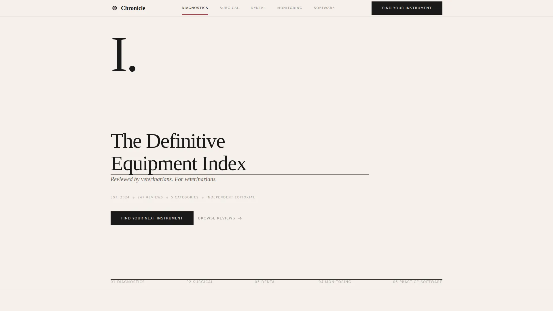
- A chapter-style hero section with serif typography, a thin rule, and an italic premise statement, no imagery required
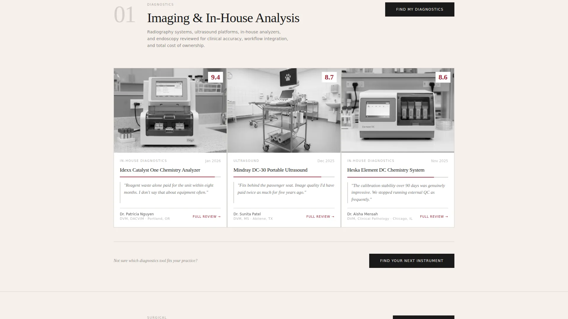
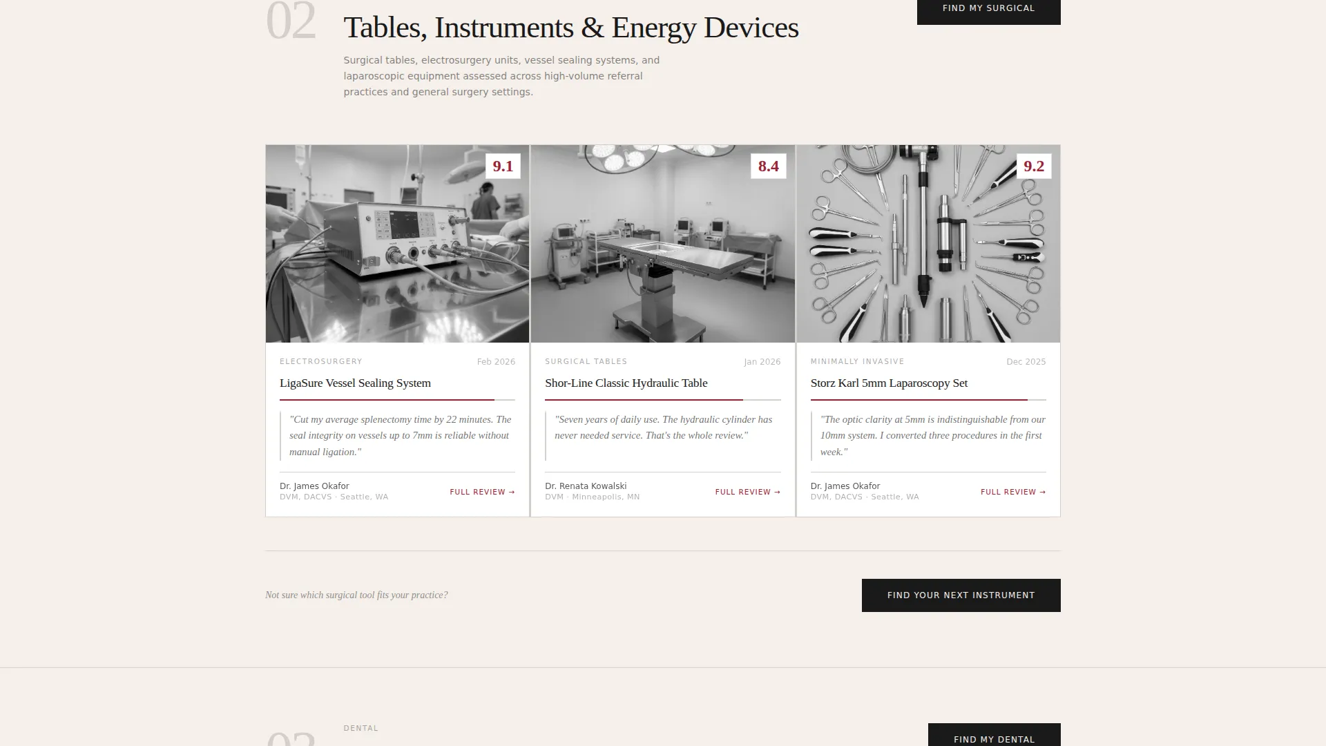
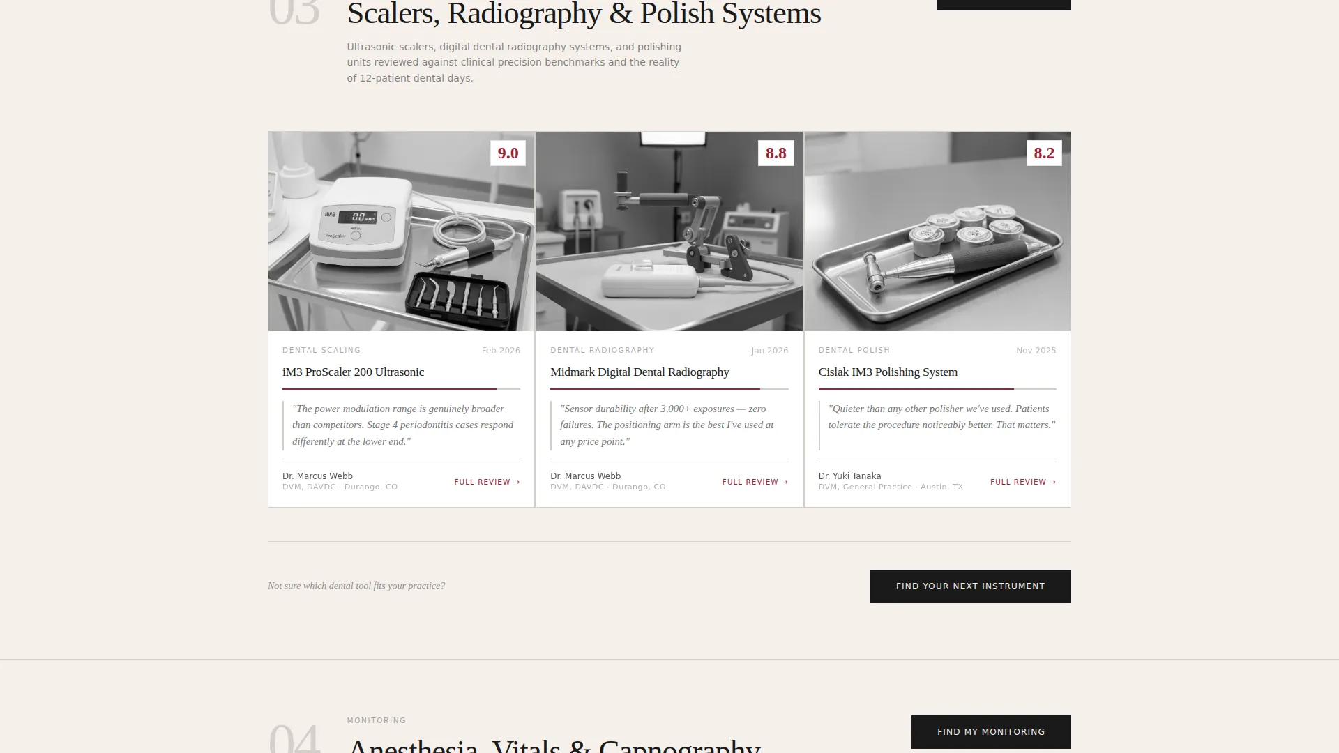
- Five anchor-linked category galleries (Diagnostics, Surgical, Dental, Monitoring, Practice Software) with review card grids and full-width editorial breakouts
- A five-step quiz modal that collects practice profile data and delivers a personalized product shortlist with email capture
Feature list
This section covers the core functional and design capabilities built into Chronicle as described in the source brief.
Chapter-Style Hero Header
The header presents as a single cream-toned page with a large serif chapter number, an editorial headline, a thin black rule, and a one-sentence italic premise. No photography is used. Typography alone establishes authority and sets the reading register for everything that follows.
Hub-and-Spoke Anchor Navigation
A fixed or vertical table-of-contents navigation links to five category spokes: Diagnostics, Surgical, Dental, Monitoring, and Practice Software. Clicking any spoke scrolls the visitor into that category's review gallery. Jumping between spokes replicates the experience of flipping between chapters in a bound reference manual.
Review Card Galleries with Editorial Breakouts
Each category spoke contains a grid of minimal review cards. Every card shows the product name, a clinical photograph, a crimson numerical score, and a pull-quote from the reviewing DVM. The card grid alternates with full-width editorial breakouts featuring longer review excerpts, maintaining a well-edited journal rhythm.
Contributor DVM Profiles
A dedicated credibility section presents the reviewer profiles. Each profile surfaces the contributor's credentials, specialty, and years of practice, giving readers confidence that assessments come from clinicians who use this equipment professionally.
Five-Step Diagnostic Quiz
The "Find Your Next Instrument" quiz opens as a modal and asks five sequential questions: practice type, category of need, budget range, must-have feature, and current equipment frustration. Questions appear one at a time on clean cream cards. Results deliver a personalized shortlist with links to full reviews, and email capture is framed as "Send My Results and Future Reviews."
Scroll-Linked Progress and Staggered Reveals
The template uses scroll-linked chapter progress indicators, staggered card reveal animations, and low-to-medium page-turn transitions to reinforce the editorial reading experience without overwhelming the content.
Page sections overview
| Section | Purpose |
|---|---|
| Chapter Hero Header | Opens with editorial typography, serif chapter number, thin rule, and italic premise statement |
| Category Anchor Navigation | Fixed table-of-contents nav linking to five review category spokes |
| Category Gallery Grids | Review card grids per spoke: product name, photo, crimson score, DVM pull-quote |
| Featured Review Breakout | Full-width editorial excerpt with long-form review content and pull-quote |
| Contributor DVM Profiles | Reviewer credentials, specialty badges, and practice type to establish trust |
| Quiz Call to Action | "Find Your Next Instrument" five-step assessment with personalized results and email capture |
| Footer | Horizontal flow footer pattern with navigation and publication links |
Design & branding system
Chronicle uses a Luxe Minimal theme with an Ink and Paper color palette. The visual language is drawn directly from archival print publishing, uncoated stock textures, generous whitespace, and editorial typography that does the heavy lifting.
- Color palette: Archival Black (#1A1A1A) for body text, Cotton Stock (#F5F0EB) for backgrounds, Margin Gray (#D4CFC9) for thin rule dividers, and Review-Score Crimson (#9B2335) reserved exclusively for ratings, highlights, and interactive anchor elements
- Typography: Fraunces serif for display headings and chapter numbers; DM Sans for body text and user interface elements
- Layout logic: whitespace acts as a primary design element; crimson appears sparingly so that every instance commands immediate attention
Mobile & speed optimization
Chronicle is designed desktop-first, reflecting how its primary audience works. Vet techs at workstations and practice owners at desks are the default context, with a mobile fallback ensuring the experience holds on smaller screens.
- Desktop-first layout with a responsive mobile fallback for readers accessing content from phones or tablets
- Static review content is handled via Server Components for fast initial loads; the quiz modal and anchor navigation run as client-side interactive elements
- Low-to-medium animation intensity keeps transitions smooth without adding unnecessary rendering overhead
How this template helps you convert
Chronicle earns engagement by proving editorial depth before asking for anything. The conversion path is deliberate and sequenced to match how clinicians actually make decisions.
- The chapter-style header and category galleries establish immediate credibility, giving visitors a reason to read before any call to action appears
- The "Find Your Next Instrument" quiz translates that credibility into a personalized product match, making the email capture feel like a useful next step rather than a gate
- The repeated quiz call to action at the end of each category spoke catches readers at the moment of highest subject-matter interest, increasing the likelihood that they complete the assessment
Other information about this template
Chronicle is built for a professional niche where trust is everything. A few additional details are worth noting for anyone evaluating this template for their veterinary publishing project.
- Review date formatting follows MM/YYYY convention for clear publication dating, with no currency display in the default layout
- The footer uses a horizontal flow pattern suited to editorial publishing contexts
- The FAQ accordion component is included as an interactive element alongside the quiz modal and anchor navigation
- The template is scoped to English (US) content by default
- Social proof elements include reviewer credential labels, practice type badges, and the numerical crimson scoring system visible on every review card
Theme
Luxe Minimal
Creative direction
Gallery Walk
Color system
Ink & Paper
Style
Hub & Spoke (Anchor Nav)
Direction
Quiz/Assessment
Page Sections
Chapter-style Editorial Header
Hub-and-spoke Anchor Navigation
Review Card Galleries and Editorial Breakouts
Contributor DVM Credential Profiles
Five-step Diagnostic Quiz Modal
Scroll-linked Progress and Staggered Card Reveals
Related questions
Who is the Chronicle template designed for?
How does the five-step quiz work?
Does the hero section require images or photography?
What review categories does the anchor navigation include?
What color is used for review scores and interactive elements?



