Dynamic Startup Insights Landing Page Template
Byline is a bold editorial startup blog landing page built for digital newsrooms covering the real side of company building. With a masonry grid layout, full-bleed photo header, and an Ink & Paper color system, this landing page template converts curious visitors into engaged readers and email subscribers through focused, magazine-quality design.
by Rocket studio
Quick summary
Byline is a single landing page template designed for startup-focused editorial publications. It pairs a cinematic full-bleed header with a staggered masonry grid to deliver a premium reading experience. The page is focused on one clear goal: convert visitors into readers and leads through sharp messaging, restrained visuals, and strategic conversion elements.
Who this template is for
This landing page template is built for editorial teams who take startup journalism seriously. The design and structure align with the needs of publishers who want their page to stand and speak with authority from the first scroll.
- First-time founders bootstrapping from co-working spaces who want pattern recognition from real stories
- Venture associates and deal-flow researchers who need a trusted source of unfiltered company intelligence
- Product managers at growth-stage companies scanning for career and market signals
What problem this template solves
Most blog landing page templates prioritize volume over voice. They deliver a database-style feed that flattens every article into the same visual weight. That approach fails publications whose value proposition is editorial judgment, not just content output.
- Visitors leave before engaging because the page feels generic and offers no clear reason to stay
- Pain points like cluttered navigation and weak calls to action reduce conversions before readers find the best content
- A lack of focused messaging means the brand's editorial identity never comes through
What you get with this template
This landing page template gives you a fully structured, one page editorial layout ready to showcase your publication's voice. Every section is designed to capture attention, hold it, and guide visitors toward a single action.
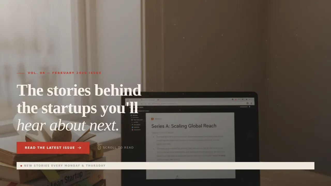
- A full-bleed photo hero with a serif magazine cover headline and a hidden scroll-reveal navigation
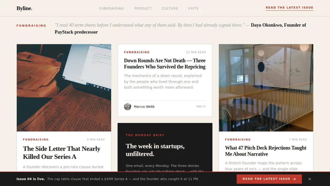
- A themed masonry grid with category clusters, pull quote dividers, and hover states that reveal opening sentences
- An inline email capture form midway through the grid to convert engaged readers into subscribers
Feature list
This landing page template includes the following built-in design features and functionalities, all grounded in the source brief.
Full-Bleed Editorial Hero
The header is an edge-to-edge photo section at golden hour, featuring a low-left serif headline under ten words. It sets the tone instantly, echoing the immersive hero section approach where a large, high-quality image captures the page's mood before a single article is read. Navigation remains hidden until scroll, keeping visitors focused on the headline.
Masonry Grid with Theme Clusters
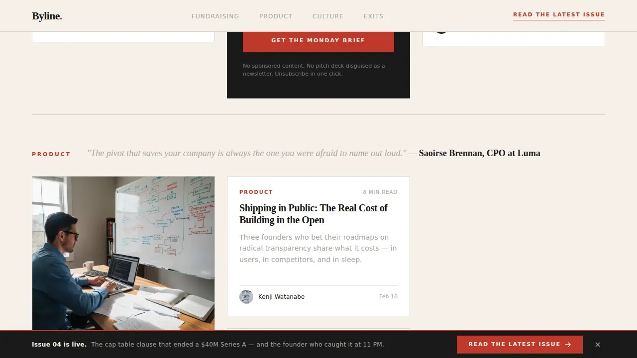
The masonry grid arranges article cards of varying heights across columns in an asymmetrical layout inspired by print media. Cards include a red category tag, bold serif title, gray one-line deck, and estimated read time. Each cluster is introduced by a pull quote from a founder, keeping the scroll editorial rather than algorithmic.
Sticky Bottom Call to Action Bar
A sticky bar remains visible as users scroll, repeating the primary call to action: "Read the Latest Issue." This fixed element keeps the conversion goal in view without adding distractions to the main layout. It supports the principle that one main call to action per landing page reduces decision paralysis.
Inline Email Capture Form
A minimal email capture form is embedded mid-grid after enough content to demonstrate editorial value. The form contains a single email field and a button reading "Get the Monday Brief." This placement allows the page to convert both impulse visitors and deliberate prospects who need proof before subscribing.
Vision and Mission Typographic Block
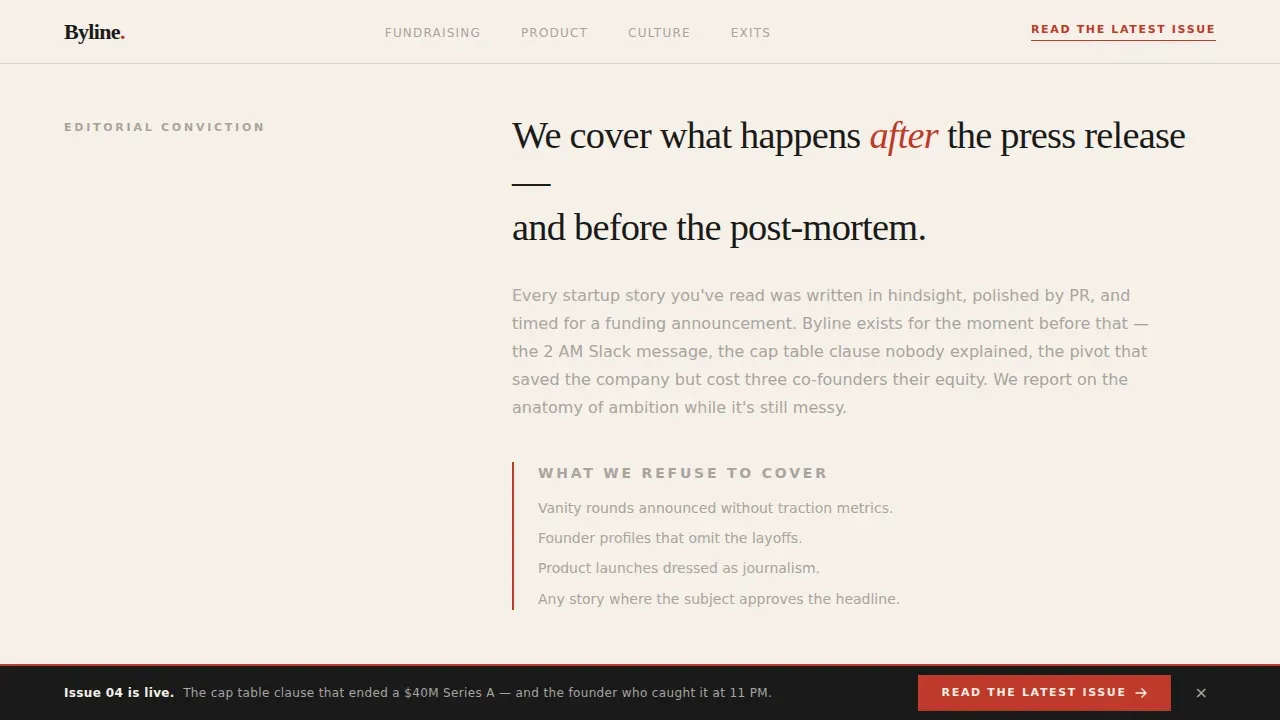
Below the hero, a generous whitespace typographic section states the publication's editorial conviction. This functions like a "Letter from the Editor," introducing the brand voice and explaining what the publication refuses to cover. Long-form readability here is achieved through clean typography and a broadsheet-style layout.
Hover State Interactions
Each masonry card lifts on hover and reveals the article's opening sentence. These interactive elements enhance the premium feel of the page without overwhelming the minimalist design. Card animations and scroll reveals add motion depth while keeping the overall experience optimized for reading comfort.
Page sections overview
| Section | Purpose |
|---|---|
| Full-Bleed Hero | Set editorial tone with cinematic photo and cover headline |
| Vision Block | State brand mission with typographic conviction |
| Masonry Grid | Showcase clustered articles by theme with hover interactions |
| Email Capture Form | Capture mid-scroll leads with a minimal subscription field |
| Pull Quote Clusters | Introduce theme sections with founder interview excerpts |
| Sticky call to action Bar | Keep the primary conversion action visible throughout scroll |
| Minimal Footer | Deliver essential links without adding visual distractions |
Design & branding system
The visual identity follows an Editorial Magazine theme using an Ink & Paper color system. Every color and type decision is deliberate, referencing the restrained, literate feel of premium print publications. The palette and typography work together to protect the editorial voice across every section.
- Colors: cream canvas (#F5F0E8), editorial black (#1A1A1A) for headlines, marginal gray (#A8A4A0) for secondary text, and red-pen accent (#C0392B) for category tags and hover states
- Typography: Fraunces serif for headlines and pull quotes, DM Sans for body text and interface elements
- High contrast between cream background and black headlines makes key elements pop and reinforces the modern design language
Mobile & speed optimization
The template is built desktop-first to support the immersive reading experience, with mobile responsiveness applied so the bold look remains effective on smaller screens. Mobile-first optimization ensures the layout stacks vertically with large tap targets for buttons and form fields.
- The masonry grid reconfigures for mobile, stacking cards into a single readable column
- Images are lazy-loaded to support page performance on slower connections
- The sticky call to action bar and email form remain accessible and usable on mobile without additional effort
How this template helps you convert
This landing page is optimized to drive conversions along a clear inverted triangle flow. The most critical information appears at the top, guiding the eye down toward the final call to action. Every element on the page serves a purpose, addressing objections before they form.
- The full-bleed hero with a benefit-driven headline captures attention immediately, while the hidden navigation removes distractions and keeps visitors focused on reading
- Social proof elements such as pull quotes from featured founders and publication metrics build credibility near key conversion points, converting curious visitors into leads
- The inline form and sticky bar work as a dual-path system: the form captures deliberate email subscribers mid-grid, while the sticky bar converts impulse readers at any scroll depth
Other information about this template
This template is a strong fit for editorial businesses across media and startup-adjacent industries. It can support a range of marketing goals beyond the initial launch, including audience growth campaigns, newsletter efforts, and curated content offerings.
- The collection of sections can align with ongoing editorial cycles, making it easy to refresh the page around new thematic issues or featured article packages
- Users can test headline variants and thumbnail images to optimize the page over time based on visitor data
- The template's functionalities are structured to let teams create landing page examples they can demo to partners or investors as proof of editorial brand value
- The landing page design can help businesses showcase their offerings without requiring teams to build from scratch
- Canva offers free landing page templates for early-stage teams, while Unicorn Platform provides customizable landing page templates that enable startups to build high converting landing pages quickly without technical hurdles
Theme
Editorial Magazine
Creative direction
Vision & Mission
Color system
Ink & Paper
Style
Masonry/Pinterest
Direction
Click-Through
Page Sections
Full-bleed Editorial Hero Section
Themed Masonry Article Grid
Sticky Conversion Bar
Inline Email Capture Form
Hover State Card Interactions
Vision and Mission Block
Related questions
Can I use this template without a developer?
Does the masonry grid work on mobile?
How does the inline email capture form work?
Can I add video to the hero section?
Is this template focused on one conversion goal?



