Elegant Wedding Editorial Landing Page Template
Chronicle is an elegant wedding landing page template built as an asymmetric 60/40 editorial grid. It reads like a linen-bound journal, combining long-form feature cards, dispatch streams, and a gatefold-style full-bleed image break. The Warm Stone color palette and Fraunces display serif give every scroll the feel of a curated print publication.
by Rocket studio
Quick summary
Chronicle is a single-page wedding editorial template designed around a 60/40 asymmetric grid. It presents wedding stories the way a literary journal presents essays, with considered typography, editorial photography, and a reading rhythm that earns trust before it ever asks for an email address.
Who this template is for
Chronicle is built for anyone who wants to present wedding content as genuine storytelling rather than a scrollable product catalog. It suits both personal publications and professional editorial brands.
- Newly engaged couples searching for planning inspiration and real wedding stories
- Wedding photographers and creatives looking for a styled-shoot showcase or editorial portfolio
- Wedding media editors and blog owners who want a publication-grade content destination
What problem this template solves
Most wedding content online feels like a feed, endless cards in a uniform grid with no sense of editorial intention. Chronicle solves the problem of content that looks the same as everything else.
- Couples in planning mode face visual overload and cannot tell which sources have genuine taste
- Photographers and contributors need a presentation format that matches the quality of their work
- Blog owners struggle to convert casual visitors into loyal subscribers without feeling pushy
What you get with this template
Chronicle delivers a complete single-page editorial layout with every section pre-designed and ready to populate with real content. Nothing requires invention on your part.
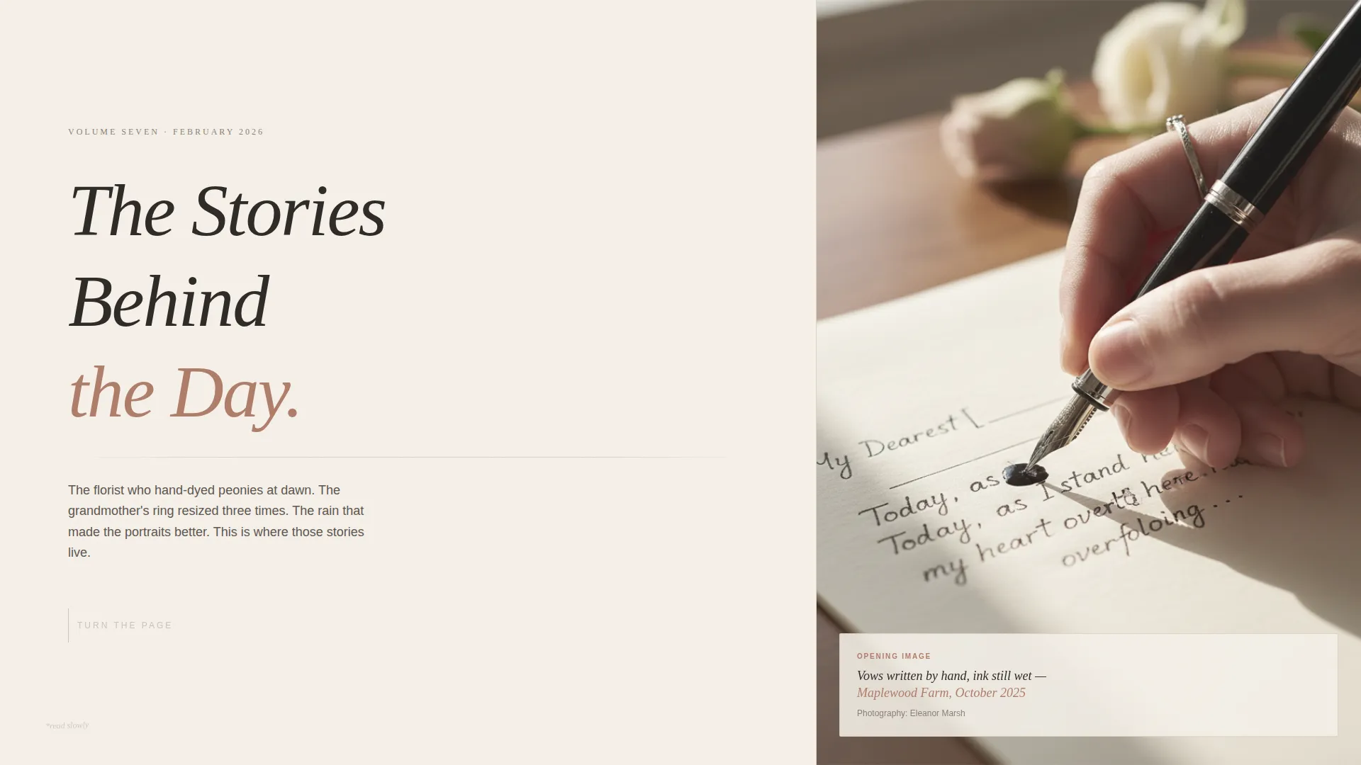
- A full hero spread styled as a chapter opener, with a display-type headline and an editorial photograph
- Two themed editorial clusters in a 60/40 asymmetric grid, each grouping content by theme such as Ceremonies, Tablescapes, and The Dress
- A subscription card, gatefold image break, bookmark mechanic, and a footer using a horizontal dot-separator pattern
Feature list
Chronicle is built around a set of deliberate design and interaction decisions. Each one serves the editorial experience directly.
Asymmetric 60/40 Editorial Grid
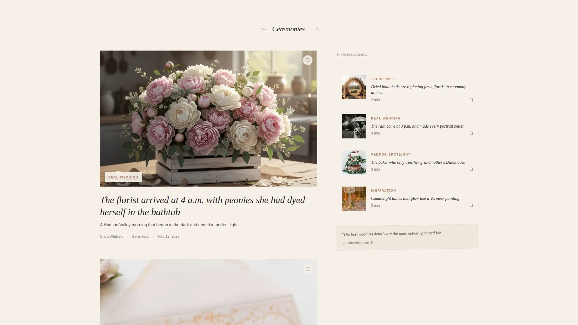
The page divides into a 60-column feature lane and a 40-column dispatch lane. Long-form feature cards with large editorial photography sit in the wide lane, while shorter trend notes and vendor spotlights run in the narrow lane. The rhythm shifts every three rows with a full-bleed gatefold break.
Chapter-Opener Hero Section
The hero presents the full viewport as an oversized journal spread. The left side carries a serif chapter label, "Vol. 7," and a display headline. The right side holds a softly desaturated editorial photograph. A thin ruled line divides headline from subhead. Navigation is hidden until the visitor scrolls.
Themed Editorial Clusters with Divider Illustrations
Content is grouped into loose editorial themes such as Ceremonies, Tablescapes, The Dress, and After Dark. Each cluster is separated by hand-drawn margin illustrations that feel sketched rather than digital. The result is a browsing experience that feels like a table of contents, not an infinite feed.
Earn-First Subscription Card
A single email field styled as a handwritten subscription card appears in the lower-right 40-column after the third editorial cluster. It surfaces only after the reader has moved through two or three stories, meaning the ask arrives after trust is already established.
Save This Story Bookmark Mechanic
Every editorial card carries a bookmark icon. Clicking it surfaces a registration drawer that gently prompts a free account. The mechanic creates a second conversion path without interrupting the reading experience.
GSAP ScrollTrigger Animations and Parallax
Scroll-driven reveals powered by GSAP ScrollTrigger bring each section into view with measured motion. A marquee ticker handles the dispatch stream, and subtle parallax separates the editorial photography from surrounding type, adding depth without distraction.
Page sections overview
| Section | Purpose |
|---|---|
| Hero Journal Spread | Sets editorial tone, presents chapter opener with display headline and photograph |
| Ceremonies Editorial Cluster | First 60/40 grid block grouping feature cards and short dispatches by ceremony theme |
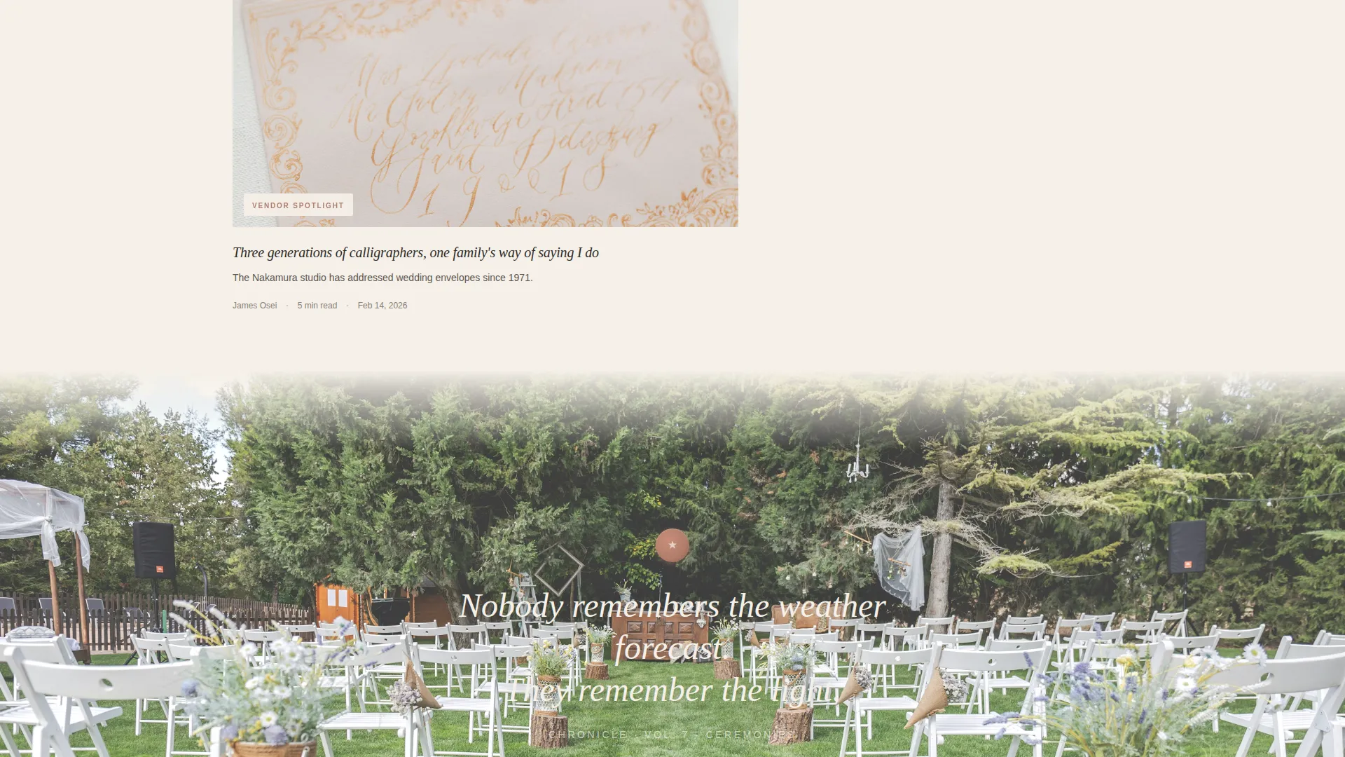
| Gatefold Image Break | Full-bleed editorial photograph with pull quote, resets reading rhythm between clusters |
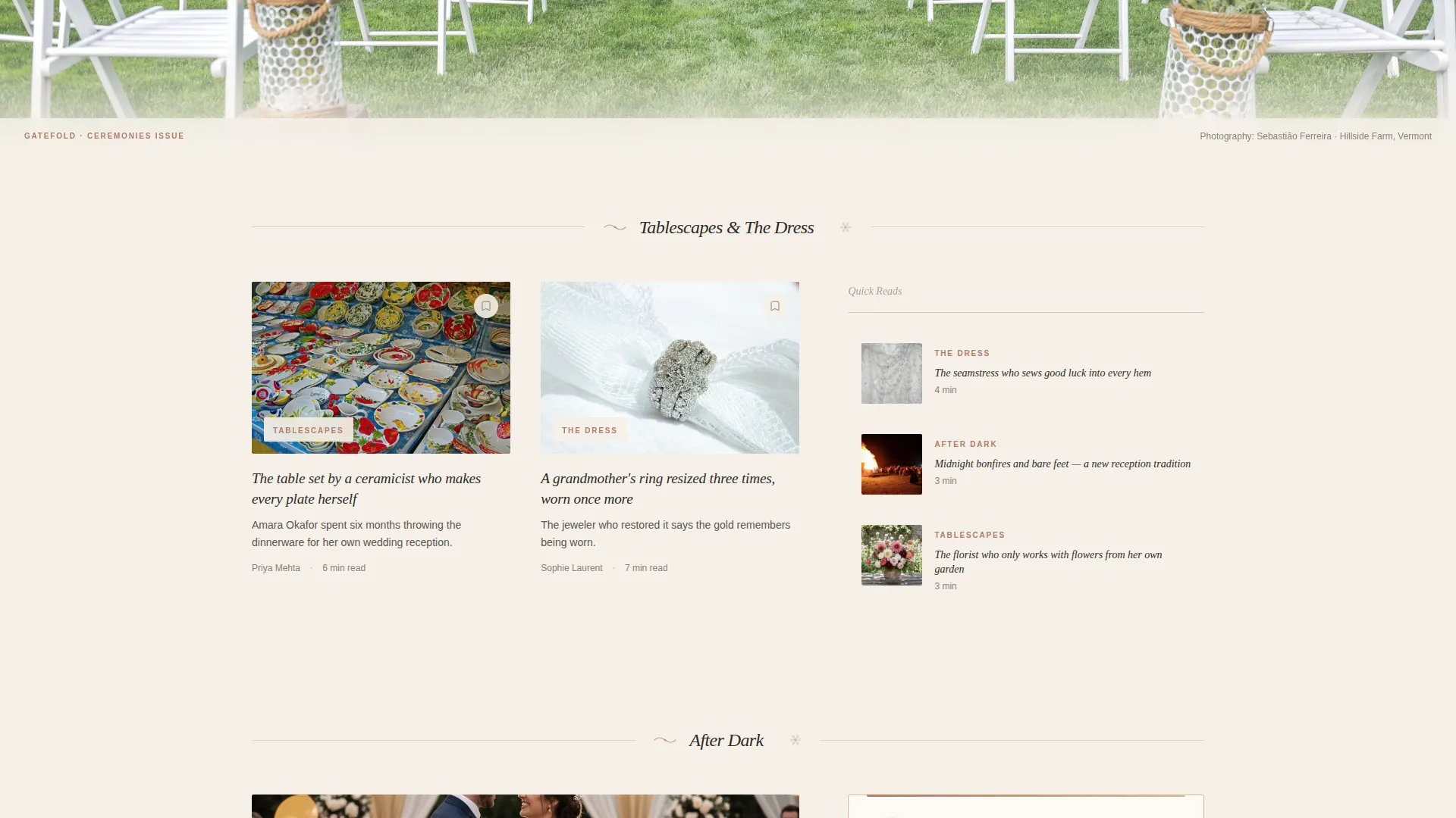
| Tablescapes and Dress Cluster | Second asymmetric grid block covering tablescapes and bridal fashion editorial themes |
| Subscription Card | Handwritten-style email field in the 40-column, timed after reader engagement |
| Footer Pattern | Horizontal footer with dot separators carrying publication links |
Design & branding system
Chronicle uses a Warm Stone color system built from four specific values. Every color has an assigned role, and no value is used arbitrarily.
- Parchment cream (#F5F0E8) covers the dominant canvas, sandstone blush (#D4B9A0) washes behind featured image blocks, and fountain-pen charcoal (#2E2A27) carries all body text
- Dried-rose (#B07D6A) marks interactive moments including links, pull quotes, and hover states, functioning like a wax seal drawing the eye to points of action
- Fraunces serves as the display serif for headlines and chapter labels, while DM Sans handles body text and user interface labels at comfortable reading weight
Mobile & speed optimization
Chronicle is designed desktop-first, reflecting the late-night browsing habits of its primary audience. The layout still adapts cleanly to tablet viewports.
- The 60/40 asymmetric grid collapses gracefully on tablet, preserving the editorial hierarchy without losing the feature-versus-dispatch distinction
- Server Components handle the static editorial content sections, keeping the initial page load lean before interactive elements like the bookmark drawer initialize
- Animation intensity scales down on smaller screens so motion supports reading rather than competing with it
How this template helps you convert
Chronicle treats conversion as a consequence of editorial quality rather than a goal imposed on the reader. Every structural decision delays the ask until the reader is already invested.
- The subscription card appears only after the third editorial cluster, so the reader has already spent meaningful time with the content before seeing the email field, making the signup feel like a natural next step
- The Save This Story bookmark icon on every card creates a low-commitment interaction that leads to a free account registration, building a subscriber list through genuine content interest rather than interstitial prompts
Other information about this template
Chronicle was designed with a specific editorial philosophy in mind. A few practical notes help clarify scope and intended use.
- The template is a single landing page, not a multi-page site or a connected content management system
- Typography relies on Fraunces for display-weight headlines and DM Sans for body copy, both available as web fonts
- The Ink and Paper visual theme and the Warm Stone palette were developed together as a unified identity system, not interchangeable parts
- The hand-drawn divider illustrations are baked into the template design and mark transitions between editorial clusters
- The accordion-style navigation reveal means the primary navigation stays hidden on first load, reinforcing the publication-first impression
Theme
Ink & Paper
Creative direction
Curated Collection
Color system
Warm Stone
Style
Asymmetric Grid (60/40)
Direction
Content/Resource
Page Sections
Asymmetric 60/40 Editorial Grid
Chapter-opener Hero Section
Themed Clusters with Margin Illustrations
Earn-first Subscription Card
Save This Story Bookmark Mechanic
GSAP Scrolltrigger and Parallax Motion
Related questions
Is Chronicle a single page or a full multi-page website?
Can I change the editorial themes used in the grid clusters?
How does the Save This Story bookmark mechanic work?
Does the subscription card connect to an email platform automatically?
What skill level is needed to customize Chronicle?



