Parenting & Family Blog Blog Website Template
Chronicle is a single-page landing page template built for literary single-parent blogs. It uses a 60/40 asymmetric grid, a full-viewport manifesto header, and a Gallery Walk scroll experience to present essay-style writing with warmth and restraint. The Ink and Paper visual theme and a simple Sunday email subscription path make it a quietly persuasive content destination.
by Rocket studio
Quick summary
Chronicle is a landing page template designed for intimate, essay-driven single-parent blogs. It pairs a bold manifesto header with a deliberate Gallery Walk layout, moving readers through six curated essay excerpts before inviting them to subscribe. The Soft Mist color palette and editorial typography keep the focus where it belongs: on the writing.
Who this template is for
Chronicle is built for writers who lead with voice rather than visibility. It suits anyone running a personal parenting blog where the writing itself is the product.
- Single parents sharing honest, essay-style stories about custody, divorce, rebuilding, or daily survival
- Grandparents raising grandchildren who want a warm, literary home for their perspective
- Parent writers who want a content-first landing page that earns an email subscription through storytelling
What problem this template solves
Most blog landing pages ask for the subscribe before they have earned it. Chronicle flips that sequence. The page gives readers three full essay excerpts first, letting the writing prove its value before a subscription prompt ever appears.
- Readers arrive feeling unseen; the template's tone and structure make them feel immediately recognized
- Generic blog layouts fragment attention with sidebars, ads, and noise; Chronicle removes all of that in favor of deliberate, gallery-paced reading
- Standard email capture forms feel transactional; the "A new letter, every Sunday night" framing feels like a personal promise
What you get with this template
You get a complete single-page landing page layout structured to welcome a reader, hold their attention through six essay windows, and convert them into a loyal email subscriber. Every section is intentional and pre-arranged.
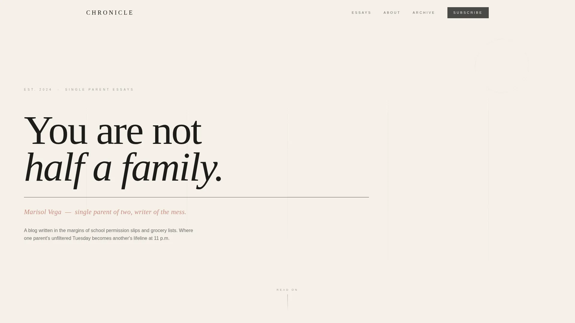
- A full-viewport manifesto hero with large serif type, a graphite rule, and a rose-accent byline line
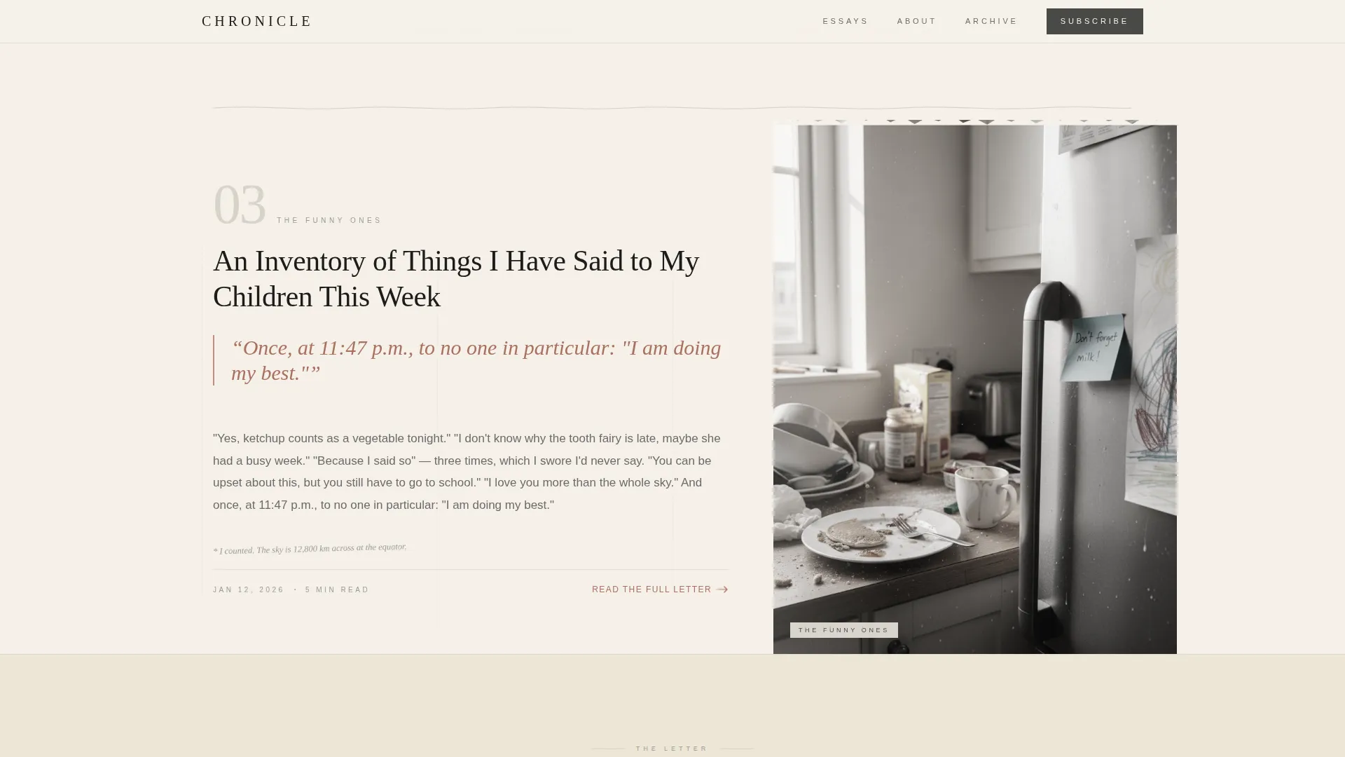
- A 60/40 asymmetric essay gallery with pull quotes, torn-paper texture columns, and hand-drawn divider lines between sections
- Two soft email subscription prompts placed at the page midpoint and footer, each using a single email field and a clear, low-pressure invitation
Feature list
Chronicle delivers a focused set of layout and design features drawn directly from its editorial brief.
Full-Viewport Manifesto Header
The hero section fills the entire screen with a single bold serif sentence set in large display type. A thin graphite rule sits beneath it, and a rose-accent line below that carries the author's name and voice. There are no images, no decoration, and no competing elements.
60/40 Asymmetric Essay Grid
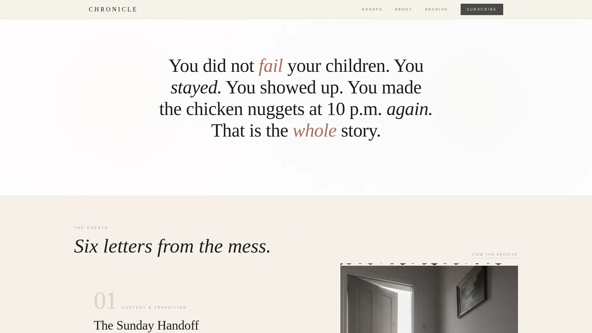
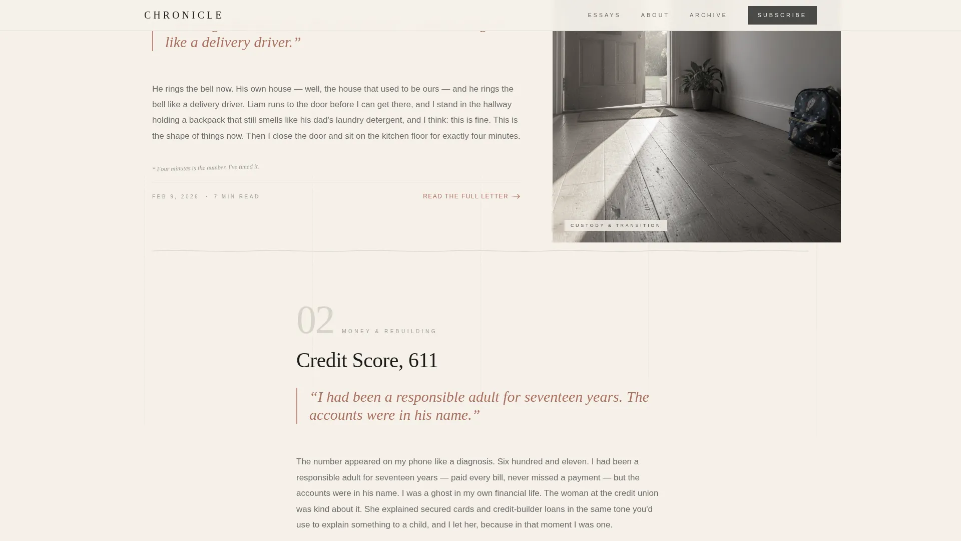
The main content area uses a two-column asymmetric layout. The wider 60% column holds the essay excerpt and oversized italic pull quotes, while the narrower 40% column displays a torn-paper-textured illustration or a candid black-and-white photograph. This structure gives each essay room to breathe.
Gallery Walk Scroll Pacing
Six essay sections are laid out like framed pieces in a quiet exhibition. Hand-drawn divider lines separate each entry. The pacing is deliberately unhurried, designed to slow readers down and keep them present rather than scrolling past content.
Low-Pressure Email Subscription Strip
A gentle subscription prompt appears twice: once at the page midpoint and once at the footer. It uses a single email field, no last name, no survey, and the line "A new letter, every Sunday night." The button reads "Send It to Me."
About and Byline Strip
A compact author section delivers one intimate sentence of author voice without requiring a photo. It grounds the page in a real person without shifting focus away from the essays.
Ink and Paper Typography System
The template pairs Cormorant Garamond for all display and pull-quote type with DM Sans for body text and interface elements. This combination gives the page its literary journal quality while keeping body copy comfortable to read.
Page sections overview
| Section | Purpose |
|---|---|
| Hero Manifesto Header | Opens with a bold, full-viewport serif statement that sets the emotional tone |
| Essay Gallery One | Presents the first three essay excerpts in the 60/40 asymmetric grid |
| Mid-Page Subscribe Strip | Invites email signup with a single field and a low-pressure Sunday letter promise |
| Essay Gallery Two | Continues the gallery with essays four through six, moving from humor to wisdom |
| About and Byline | Introduces the author with one intimate sentence, no photo required |
| Footer Arc Split | Displays logo and tagline on the left with navigation links on the right |
Design & branding system
Chronicle uses the Soft Mist color system, a palette that feels like a handwritten letter on heavyweight stationery. Every color choice is deliberate and restrained, keeping the reader's eye on the text.
- Warm parchment (#F5F0E8) as the page background, pencil-graphite gray (#4A4A48) for all body and display text, and morning fog (#D6D2C9) as a soft mid-tone surface
- A single muted rose (#C48B7C) reserved exclusively for links, pull quotes, and hover states, used sparingly so it carries genuine weight when it appears
- Cormorant Garamond for headlines, pull quotes, and the manifesto display; DM Sans for all body paragraphs, labels, and the email form
Mobile & speed optimization
Chronicle is built mobile-first, reflecting the reality that its readers are most often on a phone at 11 p.m. The layout adapts cleanly from a wide asymmetric desktop grid to a single stacked column on smaller screens.
- Images are lazy-loaded so the page text arrives first, keeping the reading experience immediate even on slower connections
- Animations are set to low-to-medium intensity: scroll-reveal word entrance, image fade-in on load, and hover states on essay cards, none of which interrupt the reading flow
- The subscription form is a single input field with no additional required fields, reducing friction for a tired reader filling it out on a phone
How this template helps you convert
Chronicle's conversion logic is built into the content structure itself. The page does not ask for anything until it has already given something of value.
- Three full essay excerpts appear before the first subscription prompt, so readers arrive at the email field already engaged and trusting the voice they have just read.
- The subscription copy, "A new letter, every Sunday night," frames the ask as a personal commitment rather than a marketing list, which lowers the emotional barrier to signing up.
- A second gentle prompt at the footer catches readers who scrolled all the way through, offering one final, unhurried invitation at the moment of highest engagement.
Other information about this template
Chronicle is part of the Blog and Editorial template category under the Parenting and Family Blog subcategory. It is specifically designed for the single parent blog niche, where emotional resonance and voice-led content matter more than feature density.
- The template is a single landing page, not a multi-page site; it is designed to serve as a content destination and email capture hub for an existing or launching blog
- The Gallery Walk creative direction and Quote/Manifesto header concept are built into the layout structure, so the visual storytelling approach is ready to use without additional configuration
- The footer uses an Arc Browser Split pattern, placing the logo and tagline on the left and navigation links on the right for a clean, editorial close
- Scroll-linked word reveal and hover-reveal interactions on essay cards are included in the animation layer at a low-to-medium intensity level, keeping the experience calm rather than showy
Theme
Ink & Paper
Creative direction
Gallery Walk
Color system
Soft Mist
Style
Asymmetric Grid (60/40)
Direction
Content/Resource
Page Sections
Full-viewport Manifesto Header
60/40 Asymmetric Essay Grid
Gallery Walk Scroll Layout
Low-pressure Email Subscription Strip
Ink and Paper Typography Pairing
About and Byline Strip
Related questions
Can I use this template if I am just starting my blog?
Does this template include an email subscription form?
Can I replace the placeholder images with my own photos?
Is Chronicle suitable for a grandparent raising grandchildren?
How does the page convert readers without feeling pushy?



