Health & Wellness Blog Blog Website Template
Chronicle is a masonry-layout landing page template built for chronic illness bloggers and wellness writers. It pairs a Heritage and Story visual identity with a Manifesto creative direction, guiding visitors through honest content cards, full-width declaration lines, and a segmented email signup. The result feels like a well-loved journal, not a clinical resource site.
by Rocket studio
Quick summary
Chronicle is a single-page masonry landing page template designed for chronic illness blogs. It opens with a parchment-style chapter header, flows through alternating content cards and full-width manifesto lines, and closes with a segmented email signup. The layout earns reader trust before asking for anything, making it a strong foundation for a heartfelt wellness content hub.
Who this template is for
This template is built for writers and creators who document life with chronic illness. It suits anyone who leads with honesty over polish and wants their blog to feel like a conversation, not a pamphlet.
- Newly diagnosed writers who want a space that feels personal and welcoming from the first scroll
- Long-term bloggers and spoonies who need a structured hub for practical tools like trackers and recipe cards
- Caregiving partners building a resource for others who are learning to support a loved one
What problem this template solves
Most health and wellness blog templates feel sterile. They borrow layouts from medical information sites and signal professionalism at the expense of warmth. Chronicle solves that mismatch directly.
- Visitors scrolling at 2 a.m. for connection bounce from cold, clinical layouts before reading a single sentence
- Content creators lose trust when their page design contradicts the vulnerability of their writing
- Without a smart signup flow, bloggers collect emails without knowing why a reader showed up
What you get with this template
Chronicle delivers a complete single-page layout with every section pre-designed and ready to fill with your voice. Nothing needs to be built from scratch.
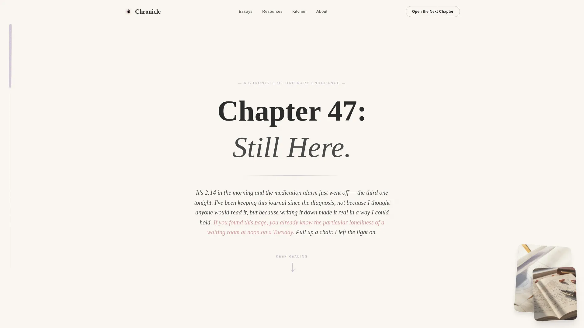
- A textured parchment hero section with a hand-lettered chapter title, memoir-style opening paragraph, and animated bookmark ribbon
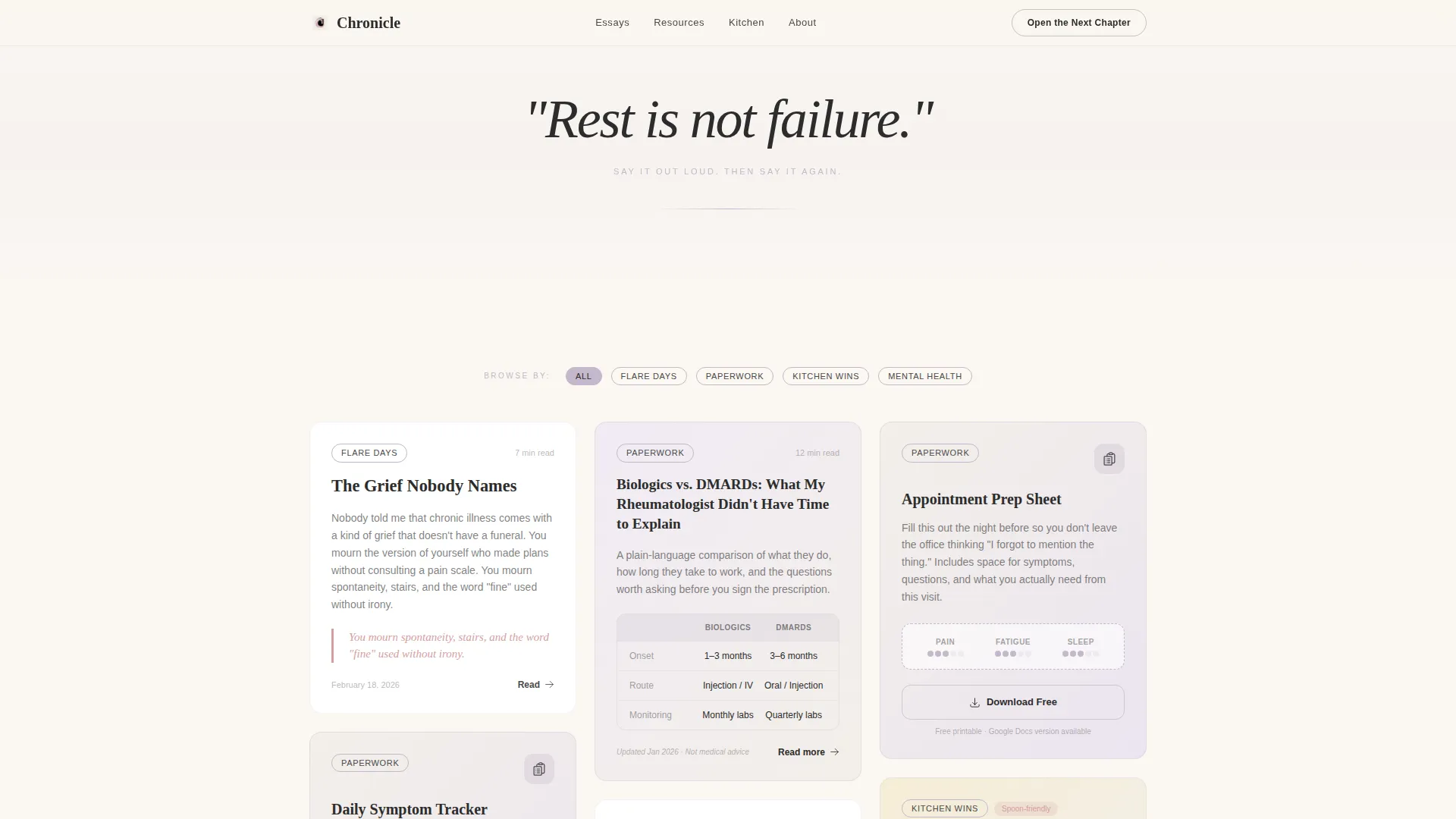
- A two-row masonry grid that holds mixed content cards including essay excerpts, symptom log printables, recipe cards, and medication comparison charts
- Full-width manifesto lines between grid rows, each with a share icon so readers can distribute your words as standalone graphics
- A segmented email call to action that asks for a first name and one question: "I'm here for myself" or "I'm here for someone I love"
- Tag-filter navigation across the masonry grid covering categories such as flare days, paperwork, kitchen wins, and mental health
- A minimal horizontal footer
Feature list
The Chronicle template ships with a focused set of interactive and visual features, each grounded in the needs of a chronic illness content community.
Chapter-Style Hero Section
The hero fills the full viewport with a textured parchment background. A hand-lettered chapter number sits at the top, followed by a short memoir-style paragraph in serif type. A bookmark ribbon SVG runs down the left margin with a subtle scroll animation, drawing the eye downward naturally.
Masonry Content Grid
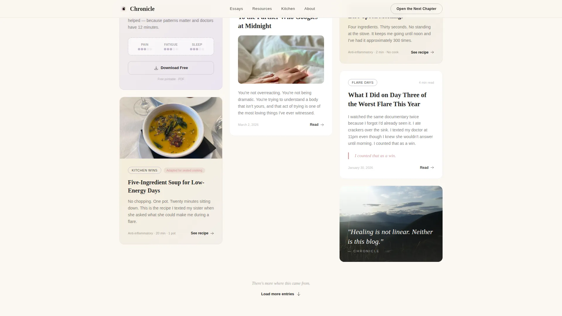
The page uses a masonry layout across two grid rows. Each card holds a different content type, such as an essay excerpt, a printable symptom log, a recipe card, or a medication comparison chart. The grid tightens and loosens visually to mirror a breathing rhythm as the reader scrolls.
Full-Width Manifesto Lines
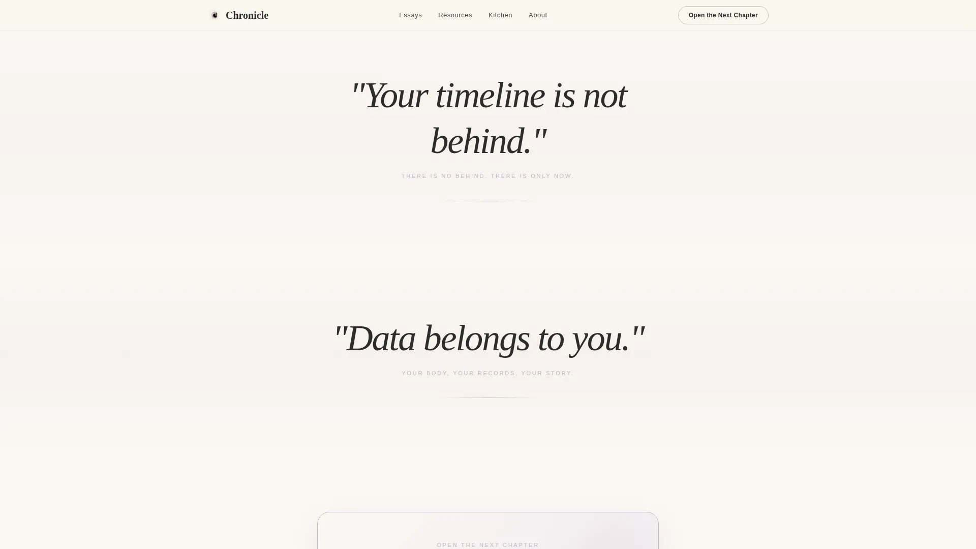
Between the masonry rows, full-width lines in large serif italic interrupt the scroll. Phrases like "Rest is not failure." and "Your timeline is not behind." each carry a quiet share icon. Readers can share these declarations as individual graphics, turning every visitor into a potential distributor.
Segmented Email Signup
The primary call to action, labeled "Open the Next Chapter," collects only a first name and one binary choice. The reader selects "I'm here for myself" or "I'm here for someone I love." This single answer segments the nurture sequence without requiring a long form.
Tag-Filter Masonry Navigation
Visitors can browse the grid by tag without signing up. Tag pills in faded lavender mark categories across the grid. This browse-first path lets readers find relevant content and build trust before committing to anything.
Scroll-Triggered Reveal Animations
Manifesto lines use scroll-triggered reveal animations so each declaration appears at the right moment in the reading experience. Masonry cards include hover states that respond with the quiet rose accent color, adding warmth without distraction.
Page sections overview
| Section | Purpose |
|---|---|
| Chapter Hero | Opens the page with a full-viewport parchment spread, chapter title, memoir paragraph, and animated bookmark ribbon |
| Manifesto Line 1 | Delivers the first full-width declaration with a share icon to slow the scroll and set the tone |
| Masonry Grid Row 1 | Displays mixed content cards including essay excerpts, symptom logs, and recipe cards |
| Manifesto Line 2 | Delivers the second full-width declaration, continuing the argument for why the space exists |
| Masonry Grid Row 2 | Continues the mixed content grid and leads into the email call to action |
| Email Signup Block | Presents the segmented "Open the Next Chapter" form with first name and audience-choice fields |
| Minimal Footer | Closes the page with a horizontal minimal footer pattern |
Design & branding system
Chronicle uses a Soft Mist color system built around four values that feel like watercolor bleeding into handmade paper. Every color choice reduces clinical sharpness and keeps the page gentle on the eye.
- Linen white (#FAF7F2) and soft mist tones form all backgrounds, keeping the page warm and paper-like
- Pencil graphite (#4A4A4A) carries body text at a deliberately low contrast to reduce eye strain during long reading sessions
- Faded lavender (#C4B7CB) marks category borders and tag pills so the grid breathes without competing for attention, and quiet rose (#D4A0A0) appears on hover states and pull-quotes only
- Typography pairs Fraunces serif headings with DM Sans body text, giving the page a memoir-on-the-shelf quality
Mobile & speed optimization
Chronicle is built mobile-first because the primary audience scrolls on phones late at night. Every layout decision starts at the smallest screen and expands outward.
- The masonry grid reflows cleanly for mobile viewports, keeping cards readable without horizontal scrolling
- Static grid sections use Server Components for faster initial load, while the tag filter and email form run as isolated Client Components
- Scroll-triggered animations are kept at a medium intensity so they feel purposeful on mobile without causing layout shifts
How this template helps you convert
Chronicle does not ask for trust before it has been earned. The page structure is designed to give first and ask second.
- The browse-first masonry grid lets visitors explore content by tag with no signup required, building genuine familiarity before the email call to action appears
- The segmented "Open the Next Chapter" signup form collects a meaningful audience signal in a single extra tap, allowing the nurture sequence to speak directly to each reader's reason for being there
- Shareable manifesto lines extend reach organically by letting readers post individual declarations as graphics, bringing new visitors back to the page without paid promotion
Other information about this template
Chronicle belongs to the Blog and Editorial category under the Health and Wellness Blog subcategory, with a specific focus on the chronic illness blog niche. It is built as a content and resource hub landing page rather than a multi-page site.
- The template style is Masonry and Pinterest layout, suited to blogs that mix content types within a single scrollable page
- The creative direction is Manifesto, meaning the scroll itself makes the case for why the space exists rather than relying on a traditional pitch section
- The header concept follows a Chapter and Book pattern, giving the page a literary personality that separates it from standard wellness blog templates
- The Heritage and Story visual theme is consistent across every section, from the parchment hero texture to the serif italic manifesto lines
- Localization is English (United States) with no currency references, making it straightforward to adapt for any English-speaking chronic illness community
Theme
Heritage & Story
Creative direction
Manifesto
Color system
Soft Mist
Style
Masonry/Pinterest
Direction
Content/Resource
Page Sections
Chapter-style Hero Section
Two-row Masonry Content Grid
Full-width Manifesto Lines with Share Icons
Segmented Email Signup Form
Tag-filter Grid Navigation
Scroll-triggered Reveal Animations
Related questions
Can I use this template without any coding experience?
How does the segmented email signup work?
Can visitors browse the content without signing up first?
What content types does the masonry grid support?
Does the manifesto share feature need extra social media setup?



