Science & Research Blog Reviews Website Template
Stratum is a single-column landing page template built for archaeology and paleontology blogs that want to read like a quarterly field journal. It combines an editorial newspaper masthead, longform article previews, stratigraphic data visualization, and a focused email capture section into one deliberate, scroll-driven page that earns reader trust before asking for anything.
by Rocket studio
Quick summary
Stratum is a landing page template designed for deep-time science blogs. It follows an Industry Report creative direction, opening with a full-width newspaper masthead and moving readers through field dispatch metrics, three longform article previews, a data visualization section, and a focused email capture. The result is a page that feels like a field journal and works like a lead generation engine.
Who this template is for
This template was created for writers and researchers who treat longform science storytelling as a serious practice. It fits people who spend a week in the field and then another week turning notes into narrative. The page speaks to readers who demand accuracy and rewards publishers who can deliver it.
- Graduate students and early-career researchers who need a professional publication home for fieldwork dispatches and primary source analysis
- Amateur fossil hunters and weekend creek-bed walkers who want a community and reading list that respects their depth of knowledge
- Museum educators building a resource that gives teachers, curators, and curious parents a narrative framework for deep-time science
What problem this template solves
Science blogs that focus on archaeology and paleontology often face the same tension: the work is dense and the stories are long, but most landing page templates were built for product launches or service pitches. The result is a page that either undersells the research or buries the reader in jargon before they find a reason to stay. Stratum solves that mismatch directly.
- It gives the page an editorial identity that signals credibility the moment a visitor arrives, so a graduate student cross-referencing site reports at 2 a.m. trusts the source immediately
- It sequences content so that three substantial article previews are displayed before any subscription request appears, proving the writing is worth returning for
- It provides a structured conversion path that leads readers from narrative storytelling into a simple email form, without breaking the reading experience
What you get with this template
Every section of this template was built with a specific editorial purpose. The design and layout work together so that the page feels like opening a well-loved field journal rather than loading a website. You get a complete single-column flow that a science publisher can adapt to their own voice without starting from zero.
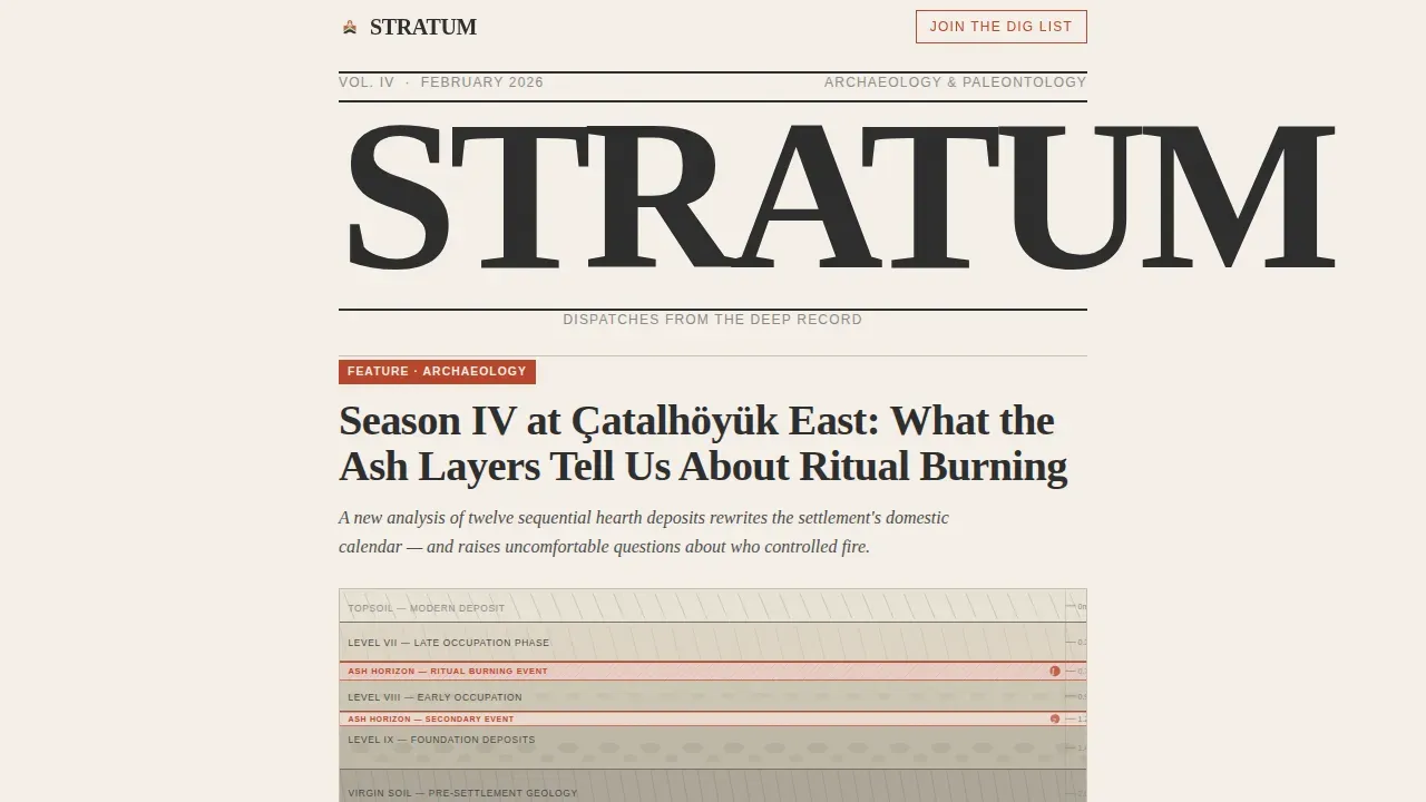
- A full newspaper masthead section with a condensed serif headline, a thin rule, a dateline, a featured article title, a woodcut-style stratigraphic illustration, and a single-sentence deck
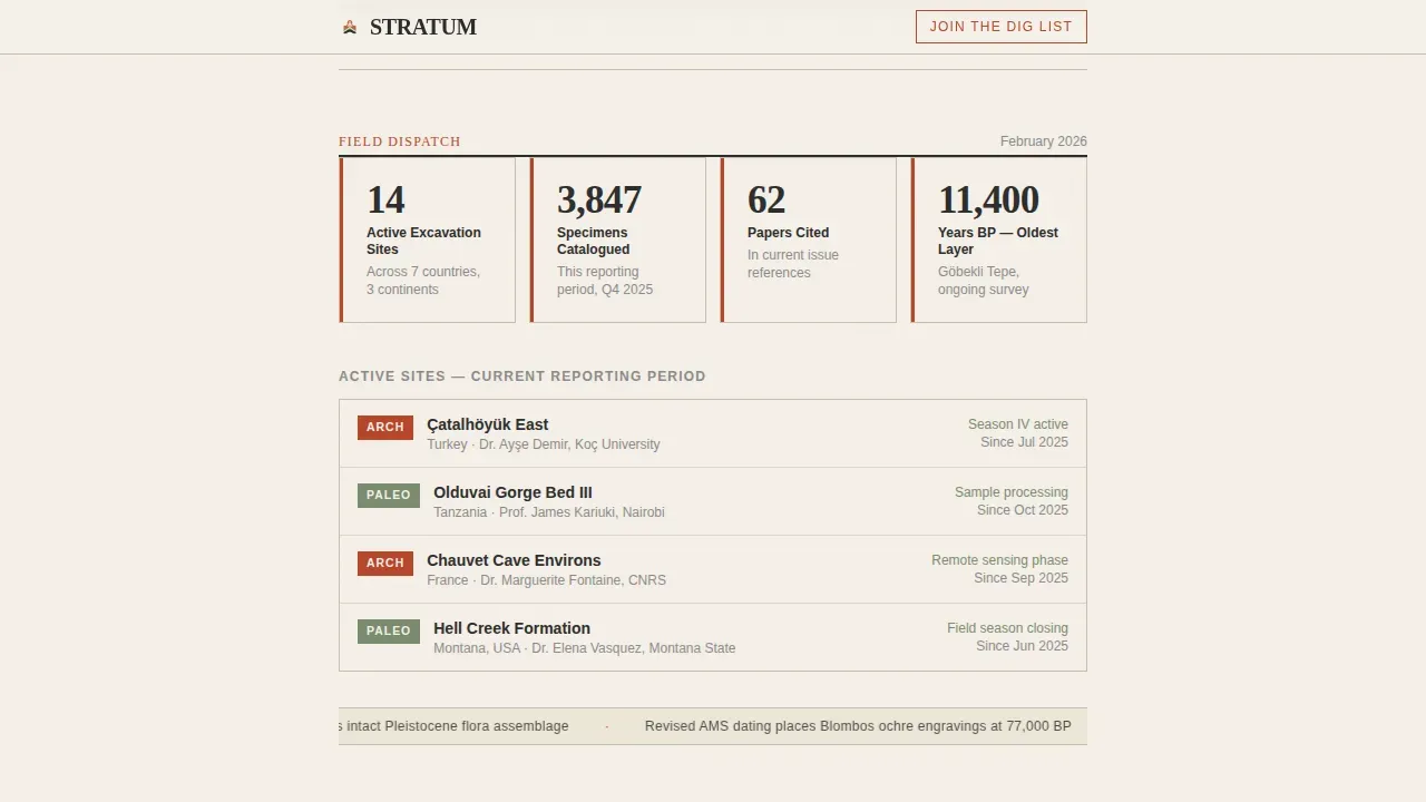
- A Field Dispatch summary block with key metrics displayed prominently (sites active, specimens catalogued, papers cited) followed by three longform article previews with drop caps and inline illustrations
- An email capture section with a first name and email field, an interest toggle for Archaeology, Paleontology, or Both, and a secondary path offering a free downloadable fieldwork reading list PDF
Feature list
This section gives a closer look at the individual capabilities built into this template. Each feature serves the template's core purpose: building a trustworthy editorial presence that converts curious readers into loyal subscribers.
Newspaper Masthead Header
The header is designed as a full-width publication masthead. "STRATUM" is set in a tall, condensed serif across the full column. A thin rule sits beneath it, followed by a dateline, a large editorial headline for the latest feature, a woodcut-style stratigraphic cross-section illustration rendered in sumi and vermillion, and a single-sentence italic deck. The composition reads like the front page of a quarterly journal found in a university library, not a website homepage.
Field Dispatch Metrics Block
Scrolling past the masthead, the visitor reaches a Field Dispatch summary. Key metrics are displayed in a scannable format: sites currently active, total specimens catalogued, and papers cited across the publication. This block acts as social proof grounded in fieldwork specifics rather than generic testimonials, giving the page the credibility of a quarterly dispatch rather than a personal blog diary.
Three Longform Article Previews
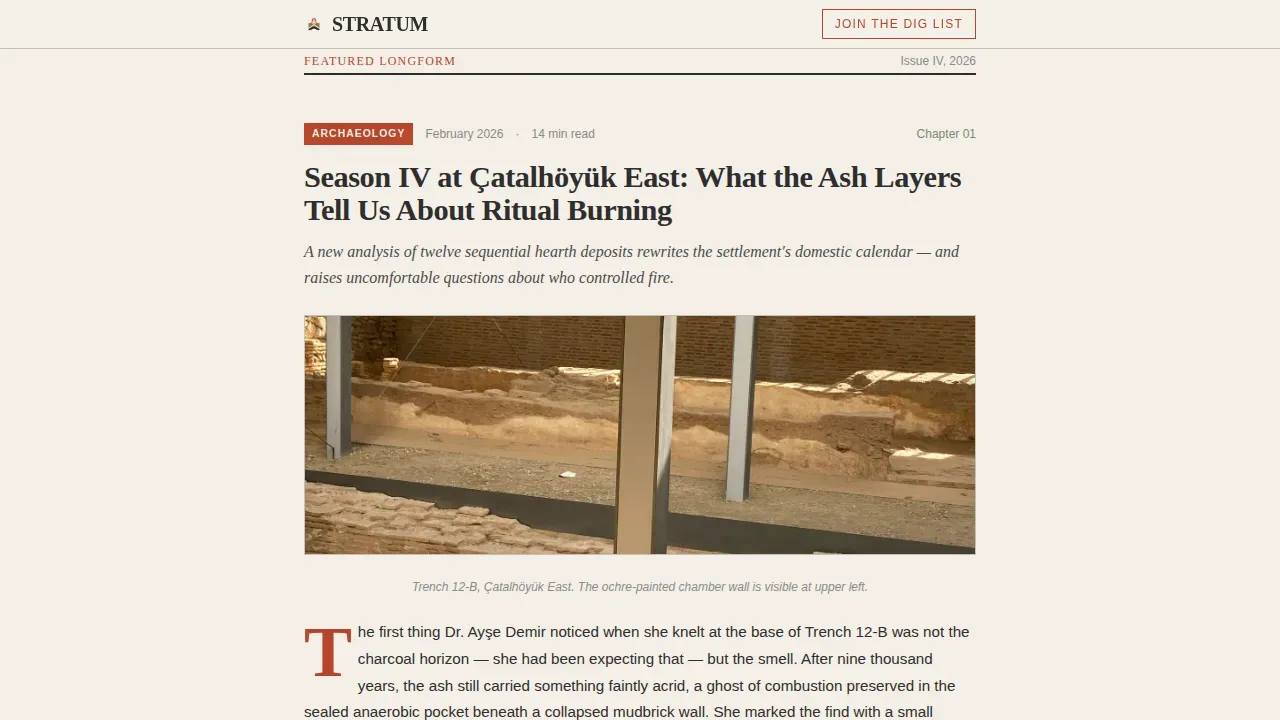
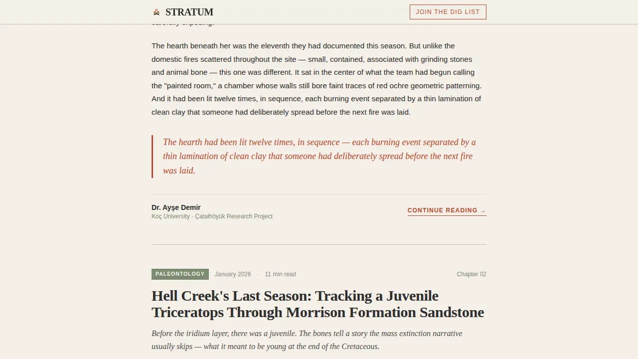
The template includes three featured article preview sections formatted as chapter entries. Each preview uses a large drop cap entrance, inline illustration placement, and a chapter-style heading. The first preview is pure narrative, the second incorporates data visualization of stratigraphic timelines, and the third focuses on primary source analysis with annotated photography. This step-by-step deepening of expertise builds authority quietly before the subscription ask appears.
Stratigraphic Data Visualization Section
A dedicated data visualization section presents stratigraphic timeline data and a specimen catalogue chart. Stratigraphic data visualization is displayed through interactive infographic-style layouts rather than long paragraphs, making complex geological layer relationships readable for both university researchers and engaged general readers. An interactive timeline lets visitors explore geological strata and the depth of time directly on the page.
Dual-Path Email Capture with Interest Toggle
The "Join the Dig List" capture section appears twice: first as a slim inline banner after the second article preview, then again as a full-width closing section. The form collects a first name and email address. A single toggle lets the reader self-identify as interested in Archaeology, Paleontology, or Both. A secondary conversion path offers a free downloadable PDF reading list gated behind the same email capture, giving readers two distinct reasons to act.
Single-Column Editorial Flow
The entire page is built as a single-column flow. A minimalist navigation structure guides users through the content in a linear narrative sequence, from masthead to dispatch to articles to data to subscription. This design choice protects reading momentum and keeps focus on the writing rather than site navigation, which is the right priority for a publication whose value lives in its words.
Page sections overview
| Section | Purpose |
|---|---|
| Newspaper Masthead Header | Establishes editorial identity with full-width headline, dateline, feature article title, stratigraphic illustration, and italic deck |
| Field Dispatch Metrics | Displays active sites, catalogued specimens, and cited papers as credibility signals in a scannable format |
| Featured Article One | Pure narrative longform preview with large drop cap and inline illustration |
| Featured Article Two | Data-driven preview incorporating stratigraphic timeline visualization |
| Inline Email Banner | First "Join the Dig List" capture point appearing mid-scroll after second article preview |
| Featured Article Three | Primary source analysis preview with annotated photography styling |
| Data Visualization Section | Stratigraphic timeline and specimen catalogue chart in interactive infographic layout |
| Full-Width Email Capture | Second and primary "Join the Dig List" section with interest toggle and PDF lead magnet |
| Horizontal Flow Footer | Closing footer using horizontal flow layout with publication metadata |
Design & branding system
The visual identity follows a Warm Artisan theme interpreted through a Japanese Zen color system. Every design decision is deliberate and unhurried, like a calligraphy brush resting beside a ceramic tea bowl. The palette, typography, and layout work together to make the page feel like a physical publication rather than a digital product, which builds a particular kind of trust with academic and research-adjacent readers.
- Colors: washi paper cream (#F5F0E8) dominates the reading surface; dry ink sumi (#2C2C2C) anchors headlines and body text; weathered torii vermillion (#B8452A) marks interactive elements and pull quotes; temple moss (#7A8B6F) appears in metadata, timestamps, and illustration borders
- Typography: Fraunces display serif for all editorial headings and drop caps; DM Sans for body text, form labels, and user interface elements; together they balance the weight of print with the readability of screen
- Visual texture: woodcut-style illustrations, parallax grain effects, scroll-reveal animations, and a marquee ticker add tactile depth without distracting from the longform content
Mobile & speed optimization
Over half of all traffic to websites arrives on mobile devices, and this template accounts for that reality. The design was built desktop-first because the primary audience includes graduate students working at a desk, cross-referencing site reports during a late-night work session. At the same time, the single-column layout adapts cleanly to smaller screens without requiring separate mobile redesign work.
- Server Components handle the static editorial content (masthead, article previews, dispatch metrics), keeping the heaviest page sections fast and lightweight for all users
- Client-side components manage interactive elements like the interest toggle, email form, and marquee ticker, so interactivity is added only where it genuinely serves the reader
- Large tap targets and readable type sizes are maintained throughout the mobile view, so fossil hunters reading on a phone in the field can navigate the page without frustration
How this template helps you convert
An effective landing page must blend scientific rigor with narrative storytelling, and this template is built around that principle. The page earns trust through content before it asks for anything. That sequencing is intentional and follows a proven editorial cadence that treats the reader as someone worth convincing rather than someone to be captured.
- The page displays three complete article previews before any email form appears, giving every visitor a genuine sample of the writing quality and establishing the publication's voice as authoritative, specific, and worth returning to each week
- The "Join the Dig List" form appears first as a low-friction inline banner mid-scroll, then as a full-width closing section with a secondary incentive: a free PDF reading list of twenty-five papers that changed how researchers read the ground, gated behind the same simple email capture
- The interest toggle (Archaeology, Paleontology, or Both) segments leads at the point of signup without adding form complexity, so the publication can deliver more relevant follow-up content from the first step of the subscriber relationship
Other information about this template
This template was created as a purpose-built solution for the archaeology and paleontology blog niche, where the relationship between editorial quality and subscriber trust is especially direct. Readers in this space are experienced evaluators. They work through primary sources, spend time at digs, and can detect weak research claims immediately. The page design respects that and works with it rather than against it.
- The template supports academic dating formats (Before Present and Before Common Era) in its dispatch and timeline sections, keeping the page appropriate for university-adjacent publishing contexts without extra customization
- Fieldwork journal templates like this one can be customized to fit specific research needs, and the structured section order (diary-style dispatch, then chapter articles, then data, then capture) means each editorial team can adapt the content blocks to their own publication rhythm
- Social proof in this template is built through field metrics and paper citation counts rather than star ratings, which is the right approach for a science diary aimed at researchers who would find generic testimonials unconvincing
- The "Field Notes" short-update approach is available inside the Field Dispatch block, allowing the publication to frame recent site activity as concise week-by-week dispatches rather than full reports, which protects the longform sections for deeper storytelling
- Structured fieldwork journal templates help organize observations and data systematically; sections for date, location, and site-specific notes are part of the dispatch block design, reflecting best practices for data collection and fieldwork documentation
- The page is a strong fit for building subscription income for independent science publishers, university extension programs, or museum education teams looking to grow a dedicated reader community over time
- Digital tools used to build and manage this template allow for easier data entry and content retrieval, making the editorial process more efficient for small teams with limited technical resources
- The template's unique value proposition centers on under-studied geological formations and fieldwork accuracy, which is precisely the focus that distinguishes a serious deep-time publication from general science blogging
Theme
Warm Artisan
Creative direction
Industry Report
Color system
Japanese Zen
Style
Single Column Flow
Direction
Lead Generation
Page Sections
Newspaper Masthead Header
Field Dispatch Metrics Block
Three Longform Article Previews
Stratigraphic Data Visualization
Dual-path Email Capture with Toggle
Single-column Editorial Flow
Related questions
Who is the primary audience for this template?
Does the page include a lead magnet option?
Can the article preview sections be adapted to different topics?
How does the interest toggle work in the email form?
Is this template suitable for a university research blog?



