Sleek Game Dev Blog Landing Page Template
Devlog is a dark mode editorial game development landing page template built for indie developers and studio leads who want a blog that thinks aloud. A hub and spoke layout guides readers through manifesto-style thesis sections covering mechanics, optimization, and shaders. The deep graphite color system, serif headlines, and scroll-reveal animations create a focused, premium reading environment before a single article loads.
by Rocket studio
Quick summary
Devlog is a single-page, anchor-nav landing page designed for editorial game development blogs. It uses a Luxe Minimal dark theme, Manifesto creative direction, and a Click-Through flow to move readers from atmospheric conviction straight into their first article. Every section teaches a perspective before asking for a click.
Who this template is for
This template is built for writers and developers who treat a devlog as serious editorial work, not just a progress dump. A devlog is a diary-style record where game developers document progress, design choices, and technical challenges. This page serves people who want that work to look as considered as it reads.
- Indie game developers running solo projects who want a landing page that reflects the depth of their craft
- Studio leads and senior developers looking to showcase a team blog with editorial credibility
- Hobbyists and career-changers who have shipped their first build and want a web presence that earns respect
What problem this template solves
Most game development blogs look like a default CMS dump: a list of post titles, a sidebar, and nothing that tells a new visitor why they should care. This template solves the first-impression problem. It replaces the content-index model with a manifesto model, where scrolling the landing page itself teaches a perspective.
- Visitors leave blog landing pages in seconds when there is no editorial voice holding them on the page
- Dark landing pages for developer audiences are expected to feel native, not like a light site with the colors inverted
- Creating a visual hierarchy that balances atmosphere with readability is a hard design problem this template already solves
What you get with this template
You get a fully structured, single-page layout with every section built and ready to customize. The design system, typography, animations, and component hierarchy are all pre-assembled. You adjust the content; the page does the rest.
- A hero section, sticky anchor nav, manifesto intro, four spoke sections with article cards, and a split-layout footer
- A Soft Mist color palette using deep graphite backgrounds, warm fog content cards, faint lilac nav accents, and pale gold pull-quote highlights
- Fraunces serif headlines paired with DM Sans body type, scroll-reveal animations, parallax hero, and hover micro-interactions on every card
Feature list
This template includes a focused set of components designed for editorial landing page design in a dark environment.
Type Over Image Hero
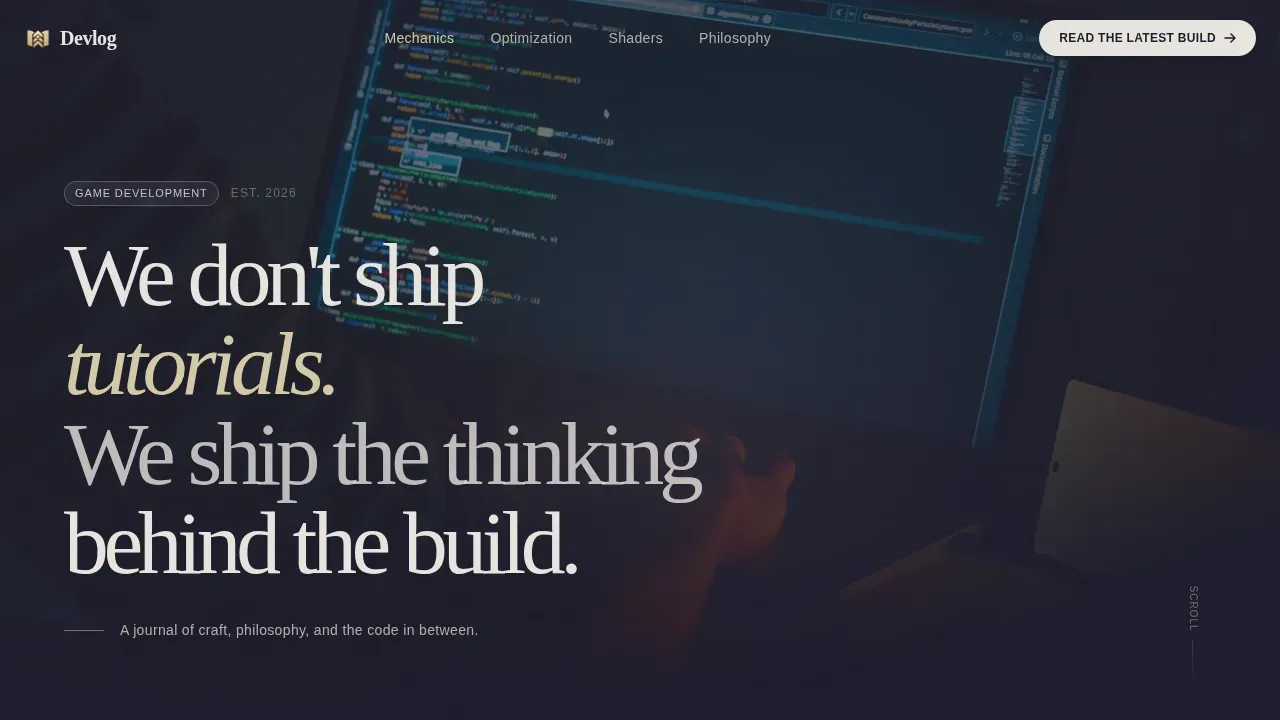
The hero is a full-screen composition with a moody, shallow-depth-of-field photograph underneath oversized serif type. The manifesto line sits left-aligned and low in the frame. No call to action, no navigation: pure atmosphere that holds the visitor still.
Sticky Anchor Navigation
A persistent nav bar keeps all spoke sections reachable at any scroll depth. Faint lilac accent tones mark the active page section. A persistent "Read the Latest Build" button sits inside the nav as a constant click-through trigger.
Manifesto Spoke Sections
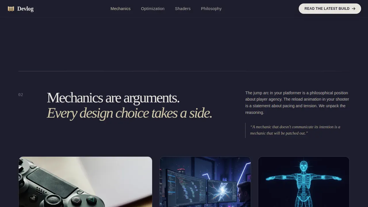
Four thesis-led content spokes cover Mechanics, Optimization, Shaders, and Philosophy. Each spoke opens with a bold editorial statement followed by a cluster of three to four article cards. The rhythm alternates between typographic conviction and visual evidence.
Article Cards with Social Proof
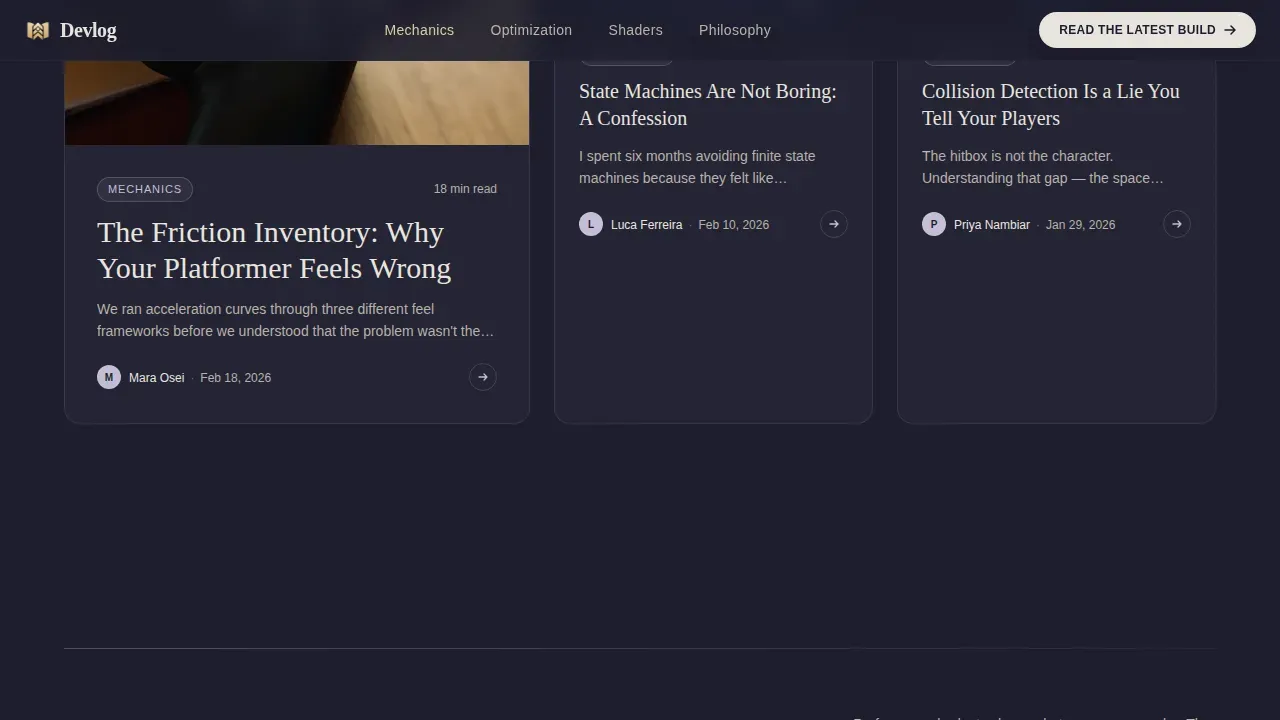
Each article card displays a specific post title, estimated read time, and author handle. This detail adds credibility without requiring a separate portfolio or author page. Cards include hover micro-interactions that reward attentive readers.
Scroll-Reveal Animations
Medium-intensity animations include a parallax hero, scroll-triggered content reveals, and hover states on interactive elements. The animations are purposeful and minimal, never distracting from the editorial content that matters most.
Split-Layout Footer
The footer uses an Arc Browser Split pattern: logo and tagline on the left, navigation links on the right. A secondary call to action, "Browse the Archive," appears here for returning users who want to explore beyond the landing page.
Page sections overview
| Section | Purpose |
|---|---|
| Hero, Type Over Image | Atmospheric opening with oversized serif manifesto line and full-screen dark background photograph |
| Sticky Anchor Nav | Persistent navigation bar with lilac accents and "Read the Latest Build" call to action |
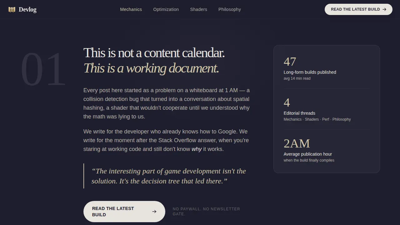
| Manifesto Intro | Editorial declaration of the blog's philosophy plus first primary call to action |
| Mechanics Spoke | "Mechanics are arguments" thesis with three article cards |
| Optimization Spoke | "Optimization is a design decision" thesis with three article cards |
| Shaders Spoke | "Every shader tells a story" thesis with three article cards |
| Philosophy Archive | Industry critique thesis, article cards, and "Browse the Archive" secondary call to action |
| Split Footer | Logo and tagline left, links right |
Design & branding system
The visual identity follows a Luxe Minimal dark theme using the Soft Mist color system. The goal is a dark landing environment that feels like a well-configured code editor: calm, high-contrast, and deeply intentional. True dark mode uses dark grays rather than pure black to reduce eye strain, and this palette follows that practice precisely.
- Deep graphite (#1E1E2E) as the primary page background, warm fog (#E8E4DF) for content cards, faint lilac (#C5BED6) for nav accents and hover states, pale gold (#D4C9A8) for active highlights and pull quotes
- Fraunces for all display and section headlines, DM Sans for body copy and interface elements, creating a clear typographic hierarchy between editorial voice and readable detail
- Adjusted contrast ratios across all text and background pairings keep the dark layout readable without harsh brightness spikes
Mobile & speed optimization
The template is desktop-first, matching the primary audience of developers working on large monitors. It includes a solid mobile fallback so the dark landing page reads cleanly on all screen sizes. Dark backgrounds on mobile devices can also save battery life on OLED and AMOLED screens, which is a genuine benefit for users reading late at night on a phone.
- Scroll-reveal animations and parallax effects are built with minimal JavaScript, keeping the page light across devices
- Static content components use server-side rendering patterns, reducing unnecessary client-side load for a faster initial page experience
- The responsive layout ensures the full editorial structure, from hero to footer, adapts cleanly across desktops, tablets, and phones
How this template helps you convert
This page earns the click through editorial conviction, not pressure. The design and copywriting structure work together to make clicking "Read the Latest Build" feel like the natural next step in a conversation already started.
- Each spoke section teaches a perspective through its thesis headline before showing any article cards, so users feel informed rather than marketed to when they reach the call to action
- Proper contrast between pale gold highlights and dark backgrounds makes calls to action visible and distinct without feeling aggressive, which supports higher click-through rates on dark landing pages
- The "Browse the Archive" secondary call to action at the philosophy spoke gives returning users a clear path deeper into the site without competing with the primary conversion goal
Other information about this template
This template sits at the intersection of editorial web design and the developer-audience dark interface expectation. Dark interfaces tend to resonate with younger, tech-savvy users across gaming platforms and developer tools communities. The design approach is particularly relevant for creative agencies, SaaS products, and premium content brands that want their landing pages to feel native to a modern design sensibility.
- Devlogs can be presented in various formats, including blog posts, videos, or hybrids. This template's card-based layout can support mixed media entries and is well-suited to that flexibility
- Dark mode has become a standard feature across operating systems, applications, and websites. Users increasingly expect dark interfaces, especially in developer and gaming contexts, making this an awesome foundation for a long-term web presence
- The color system avoids pure black in favor of calibrated dark grays, following modern dark mode best practices that also improve accessibility for extended reading sessions
- This template is an inspired starting point for any game developer, creative agency, or premium editorial brand looking to launch a distinctive blog with real visual work behind it
- Webflow developers and designers can use this as a foundation to scale an editorial site, adapting the components and hierarchy to fit any niche within the developer or gaming space
- CSS media queries can detect user preferences for dark mode, allowing future theme adjustments without restructuring the layout
Theme
Luxe Minimal
Creative direction
Manifesto
Color system
Soft Mist
Style
Hub & Spoke (Anchor Nav)
Direction
Click-Through
Page Sections
Type Over Image Manifesto Hero
Sticky Anchor Navigation Bar
Manifesto-led Spoke Sections
Article Cards with Author Detail
Scroll-reveal Animations
Split-layout Footer
Related questions
Who is this landing page template designed for?
Can I customize the color palette and typography?
Does this template work well on mobile devices?
Can the article card components support video or mixed media devlog formats?
Does the template include more than one call to action?



