Manufacturing Review Blog Landing Page Template
Chronicle is a masonry-style landing page template built for manufacturing review blogs. It pairs a cinematic split hero with a staggered review card grid, pull-quote banners, and a sticky archive call to action bar. The warm artisan design feels like a trusted trade journal, built to earn clicks from procurement managers, mechanical engineers, and small-batch founders.
by Rocket studio
Quick summary
Chronicle is a single-page template designed for manufacturing review blogs. It opens with a split hero section, moves through a short editorial manifesto, and flows into a masonry review grid interrupted by manufacturer pull-quotes. The warm Ink and Paper color system and serif-led typography give the page the authority of a well-worn trade journal.
Who this template is for
Chronicle is built for editors, publishers, and founders running manufacturing-focused blogs or review platforms. It suits anyone who needs to surface credible, process-specific content to a technically minded audience.
- Procurement managers comparing contract manufacturers and supplier capabilities
- Mechanical engineers evaluating CNC, injection molding, sheet metal, or additive manufacturing processes
- Small-batch founders searching for their first contract manufacturer and needing trusted editorial guidance
What problem this template solves
Most manufacturing blogs look like corporate spec sheets. They list capabilities without verdict, show polished photos without context, and fail to earn the trust of readers who make real sourcing decisions. Chronicle solves the credibility gap.
- It replaces generic layouts with a trade-journal aesthetic that signals editorial seriousness from the first scroll
- It structures review cards with star ratings, process tags, and one-line verdicts so readers get enough signal to want the full article
- It uses manufacturer pull-quote banners to build rhythmic social proof without relying on a form or a gate
What you get with this template
Chronicle delivers a fully structured landing page organized into five distinct content sections, each with a clear editorial purpose. The layout is ready to populate with your review photography, article verdicts, and manufacturer quotes.
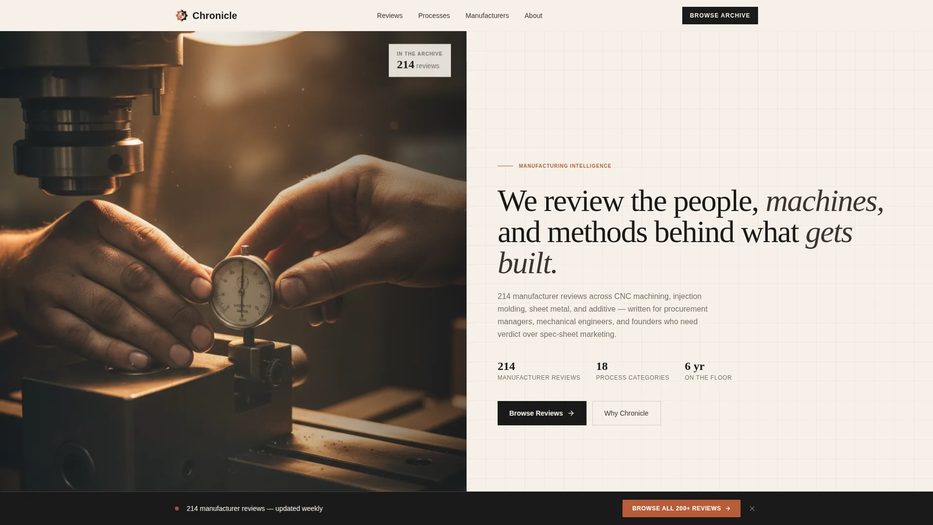
- A cinematic split hero with space for a factory photograph, a serif headline, a subline, and floating credibility badges
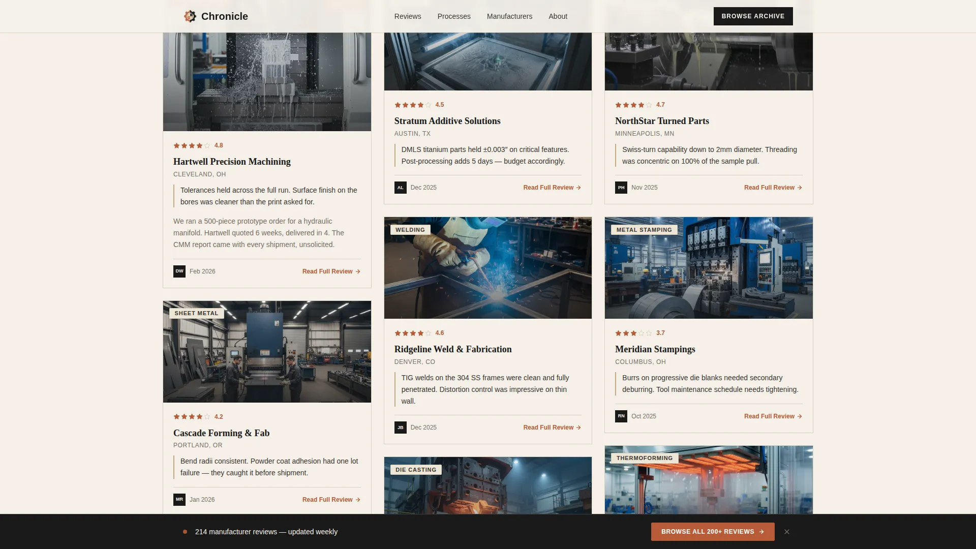
- A masonry review grid with staggered card heights, process category tags, star ratings, and terracotta "Read Full Review" calls to action
- A sticky bottom bar that appears after scrolling begins, linking readers to the full review archive
Feature list
Chronicle's feature set is shaped by the practical needs of a manufacturing review publication. Every component earns its place by helping a technically minded reader move from first impression to full article.
Cinematic Split Hero Section
The hero divides the viewport into two halves. The left side holds a close-cropped factory photograph with shallow depth of field and warm tungsten lighting. The right side carries a large serif headline, a descriptive subline naming article count and manufacturer roster, and floating credibility badges that establish depth immediately.
Staggered Masonry Review Grid
Cards sit at varied heights so the eye keeps moving. Each card carries a factory photograph, a star rating, a process tag (CNC, injection molding, sheet metal, or additive manufacturing), and a one-line verdict. The primary call to action on every card reads "Read Full Review" in terracotta.
Editorial Manifesto Block
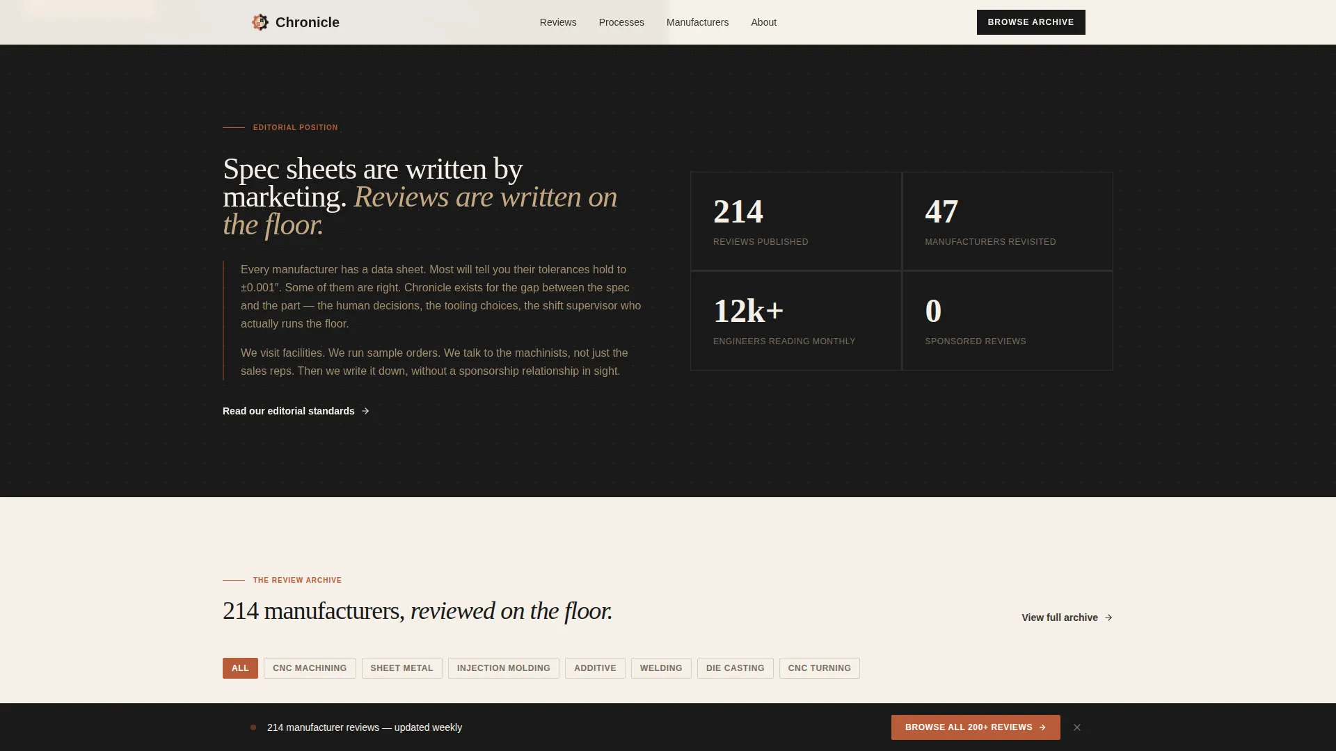
A short manifesto section opens the scroll below the hero. It states plainly why honest manufacturing coverage matters and dissolves naturally into the review grid. A key stats bar accompanies the manifesto to anchor credibility with numbers.
Manufacturer Pull-Quote Banners
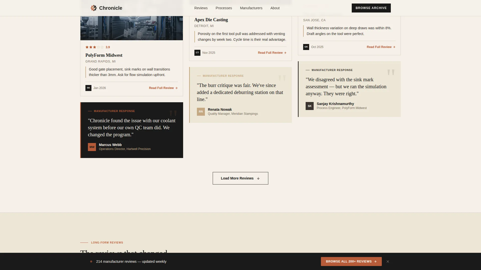
As readers scroll deeper into the grid, pull-quote banners interrupt the card flow. Each banner shows a real manufacturer response to a review. This rhythm of evidence keeps trust building before the reader commits to a full click.
Sticky Archive Call to Action Bar
A sticky bottom bar enters the viewport after three seconds of scrolling. It carries a single clear prompt: "Browse All 200+ Reviews." The bar links to the full archive and stays visible without blocking content, giving readers a persistent path forward.
Featured Reviews Section
A dedicated featured reviews block highlights selected long-form pieces. Terracotta calls to action draw the eye to the most important articles, separating editorial picks from the broader grid.
Page sections overview
| Section | Purpose |
|---|---|
| Split hero | Establish editorial authority with photography and headline |
| Editorial manifesto | State the blog's purpose and surface key credibility stats |
| Masonry review grid | Display staggered review cards with ratings, tags, and verdicts |
| Pull-quote banners | Interrupt the grid with manufacturer voices for social proof |
| Featured reviews | Highlight selected long-form pieces with prominent calls to action |
| Footer | Single-row linear footer with navigation and publication links |
Design & branding system
Chronicle uses the Ink and Paper color system to create a broadsheet-on-cotton-rag atmosphere. The Warm Artisan theme runs through every typographic and layout decision, making the page feel tactile and analog rather than corporate.
- Colors: unbleached cream (#F5F0E8) for backgrounds, letterpress black (#1A1A1A) for headlines and body text, shop-apron tan (#C4A882) for card edges and section dividers, and kiln-fired terracotta (#B85C38) for calls to action, hover states, and category tags
- Typography: Fraunces serif for display headlines and pull quotes, DM Sans for body text and card labels, creating a clear editorial hierarchy
- Visual rhythm: card hover states, scroll-linked section reveals, and a sticky bar entrance animation add medium-level motion without distracting from the editorial content
Mobile & speed optimization
Chronicle is designed desktop-first to serve procurement managers at workstations, and it extends cleanly to mobile viewports for on-site and in-shop reading. The build prioritizes static rendering and efficient asset handling.
- Images across the masonry grid are lazy-loaded so the page renders quickly before all photography is in view
- The sticky bottom bar and card hover states adapt gracefully to touch interaction on smaller screens
How this template helps you convert
Chronicle is a click-through landing page. Every design and layout decision exists to move a reader from the landing page into a full review article without friction, gates, or forms.
- The split hero and floating credibility badges create immediate trust, so readers who arrive skeptical stay long enough to scroll into the grid
- Each review card shows just enough verdict, rating, and photography to open an information gap that only the full article can close, driving the "Read Full Review" click
- The sticky archive bar gives persistent access to the full review index, capturing readers who want to browse rather than follow a single card
Other information about this template
Chronicle is built as a static-first landing page. This makes it straightforward to deploy on standard hosting without backend configuration. The template supports English (United States) localization with standard date formatting and no currency display.
- Template style: Masonry and Pinterest-style card grid with staggered heights and category filter tags
- Header concept: Half-page photo and text split, consistent with Vision and Mission creative direction
- The footer follows Pattern 1: a linear single-row layout for clean, minimal navigation
- No form, no gate, and no required sign-up flow are built into this template; the page earns the click through editorial quality alone
Theme
Warm Artisan
Creative direction
Vision & Mission
Color system
Ink & Paper
Style
Masonry/Pinterest
Direction
Click-Through
Page Sections
Cinematic Split Hero Section
Staggered Masonry Review Grid
Manufacturer Pull-quote Banners
Sticky Archive Call to Action Bar
Editorial Manifesto Block
Featured Reviews Section
Related questions
Who is this landing page template designed for?
Does this template include a contact form or lead capture form?
Can I change the color palette or typography to match my brand?
How many review cards can the masonry grid hold?
What process categories are supported in the review card tags?



