Nonprofit How-To Blog Landing Page Template
Chronicle is a nonprofit how-to blog landing page built for first-time founders who need real guidance on filing a 501(c)(3), writing grant narratives, and keeping clean books. The asymmetric 60/40 grid, warm Parchment and Rust palette, and day-in-the-life scroll structure make it feel like a trusted field guide, not a corporate resource portal.
by Rocket studio
Quick summary
Chronicle is a single-page content hub for grassroots nonprofit founders. It uses an asymmetric 60/40 grid, a Heritage and Story visual identity, and a day-in-the-life scroll flow. The page earns reader trust by showing real guide content before asking for an email. It is designed for people doing the work from church basements and kitchen tables.
Who this template is for
Chronicle is built for people who started something meaningful and now face a stack of paperwork they were never trained for. It speaks plainly to organizers in the thick of it, not to polished professionals with legal teams on speed dial.
- First-time executive directors running afterschool or community programs
- Volunteer treasurers tracking donations in spreadsheets and needing cleaner systems
- Retired professionals launching second-act foundations from home
What problem this template solves
Most nonprofit resource sites feel built for grant consultants, not for the volunteer treasurer working a Saturday morning. Chronicle solves the trust gap by leading with real content depth before asking for anything in return.
- Founders feel overwhelmed by 501(c)(3) paperwork and do not know where to begin
- Resource hubs often hide their best guides behind aggressive signup walls, eroding trust
- First-time executive directors need a warm, organized starting point, not a cold sales funnel
What you get with this template
You get a fully structured landing page that organizes nonprofit guidance into a natural daily rhythm. Every section is laid out and ready for your content to fill in.
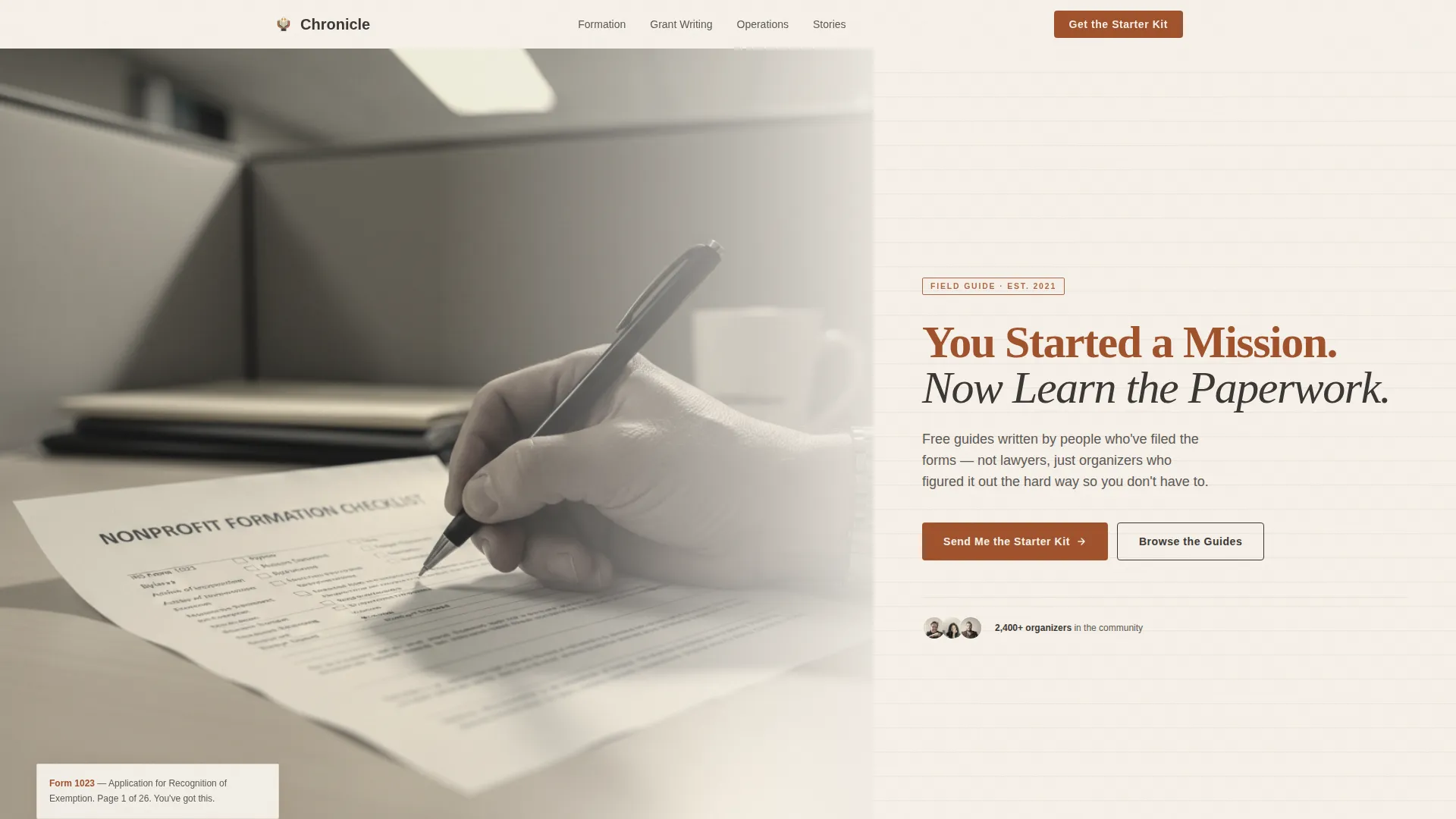
- A hero section with a sepia-toned 60/40 photo-and-text composition and a strong serif headline
- Four thematic content sections following a morning-to-evening arc, each with alternating grid layouts
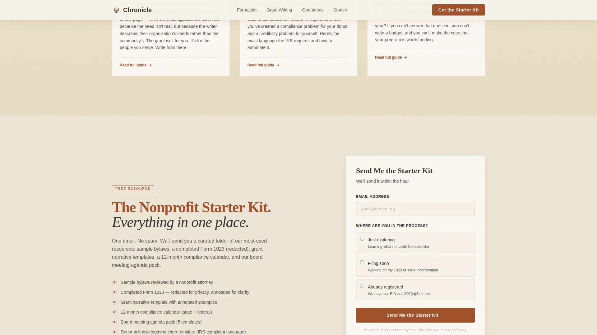
- An email capture block with a radio selection to segment new subscribers by where they are in the filing process
Feature list
Chronicle brings together a set of purposeful design and layout decisions. Each one reflects the real way nonprofit founders read, decide, and return to a resource they trust.
Asymmetric 60/40 Grid Layout
The page uses a consistent 60/40 split that alternates sides as you scroll through each thematic section. This creates a gentle visual rhythm that feels like turning pages in a well-used field guide.
Day-in-the-Life Scroll Structure
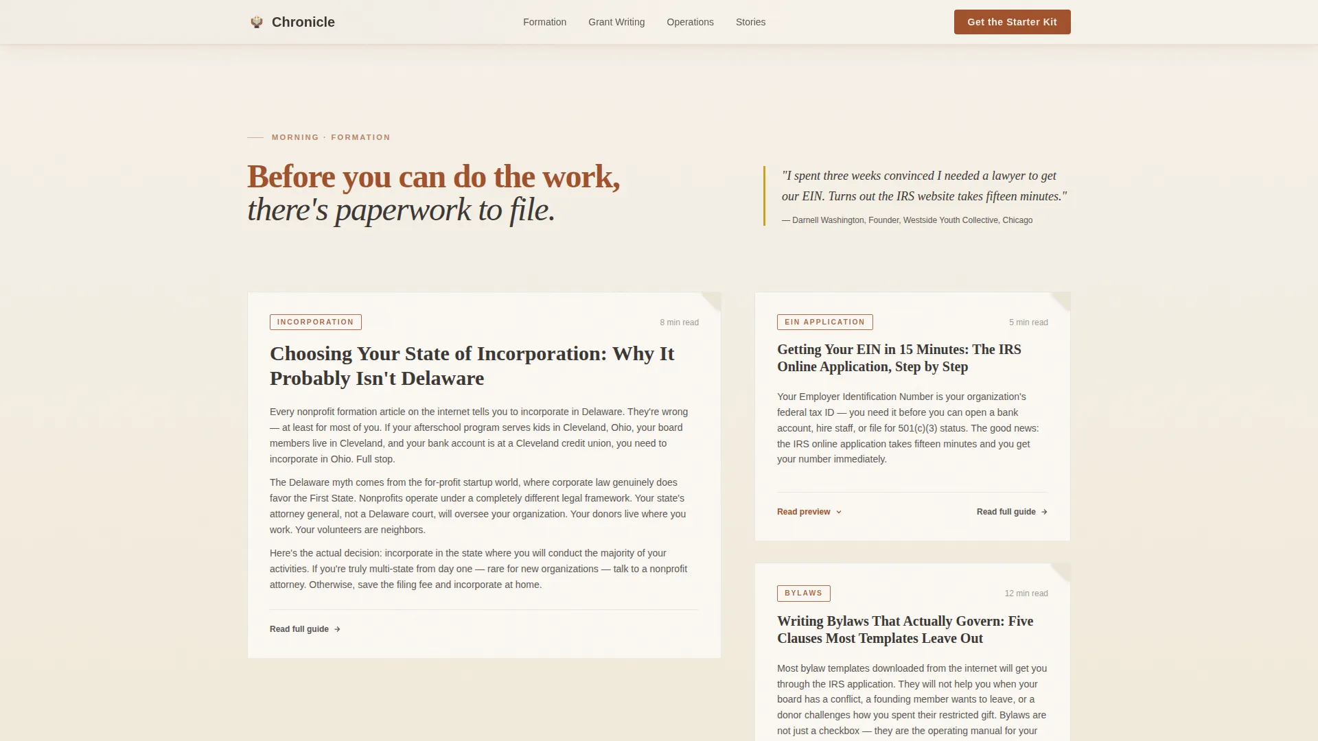
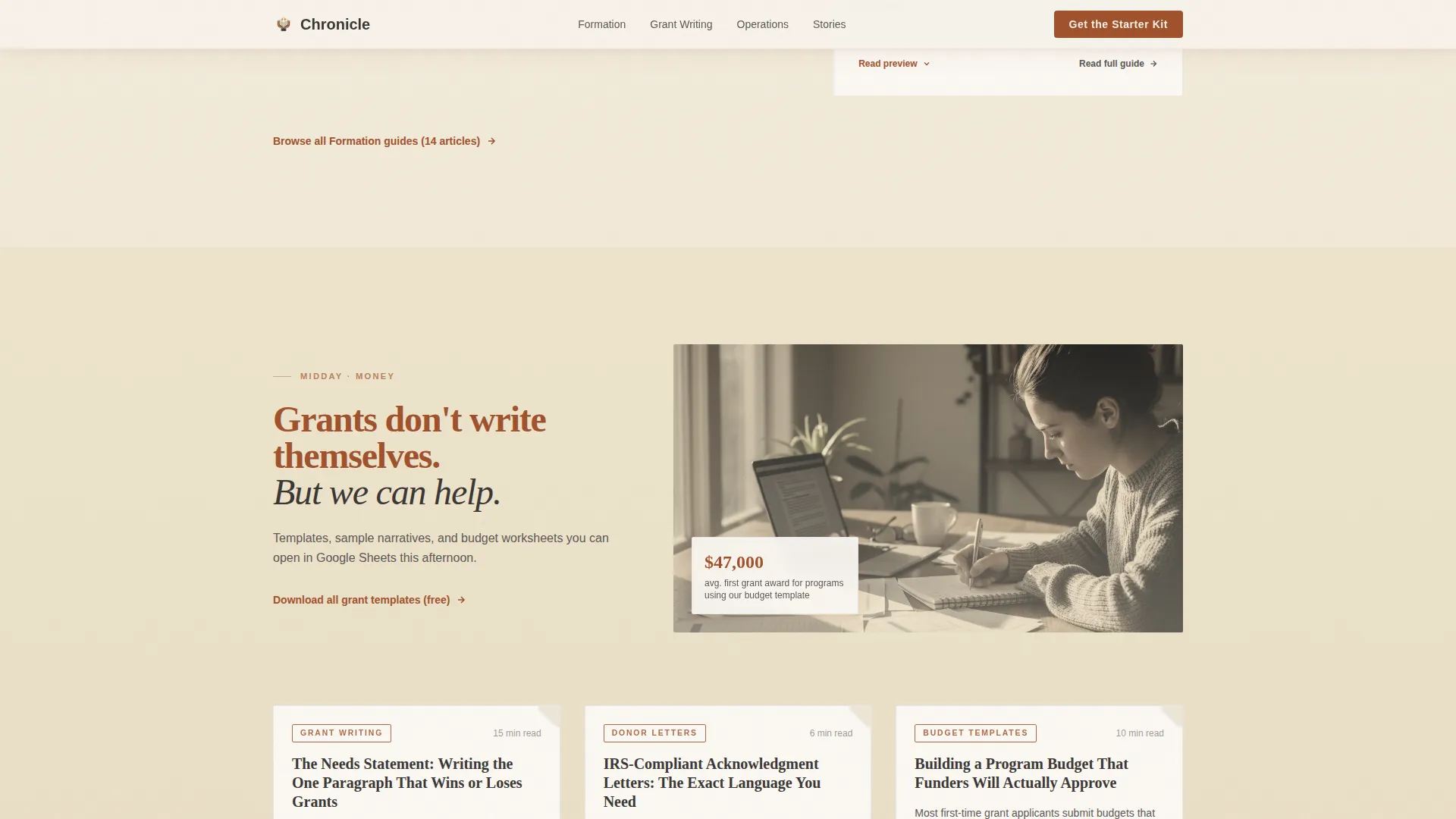
Content is organized across four time-of-day sections: Morning for formation topics, Midday for money and grants, Afternoon for operations, and Evening for founder stories and reflection. Background photo transitions shift from morning light to desk lamp glow as the reader moves down the page.
Open Article Previews
The first three paragraphs of each guide are displayed openly on the page. Readers see real depth before any signup is requested, which builds the trust needed to convert a curious visitor into a subscriber.
Email Capture with Segmentation
The "Send Me the Starter Kit" block collects only an email address and a single radio selection. The three options are "Just exploring," "Filing soon," and "Already registered," letting you understand where each new subscriber stands.
Pull Quotes and Social Proof
Organizer-archetype pull quotes appear throughout the page with goldenrod accent borders. They reinforce the voice of the community and make the page feel lived-in rather than produced.
Browse-Without-Subscribing Path
A secondary navigation path lets visitors browse the full guide library without signing up. This respects reader autonomy and reduces friction for people who are not yet ready to commit.
Page sections overview
| Section | Purpose |
|---|---|
| Hero, Photo and Text | Introduces the mission with a sepia photograph and a bold serif headline |
| Morning, Formation | Covers incorporation, bylaws, and EIN application articles with open previews |
| Midday, Money | Hosts grant writing templates, donor acknowledgment letters, and budget worksheets |
| Starter Kit call to action | Captures email and radio-selection data to segment subscribers by filing stage |
| Afternoon, Operations | Presents board agendas, volunteer waivers, and compliance calendar resources |
| Evening, Reflection | Features founder stories, burnout resources, and community question-and-answer recaps |
| Footer | Minimal horizontal footer in a clean, understated layout |
Design & branding system
The visual identity is built around a Heritage and Story theme. Every color and type choice is meant to feel earned rather than polished, like a stack of manila folders in a community center office.
- Color palette: warm parchment (#F5F0E8) background, deep rust (#A0522D) for headlines and primary buttons, charcoal (#3B3735) for body text, and muted goldenrod (#C9A227) for hover states and pull-quote borders
- Typography pairing: Fraunces serif for all headlines to carry editorial weight, DM Sans for body text and interface elements to keep readability high
- Visual texture: sepia-toned photography, slightly desaturated toward black and white, reinforces the field-guide aesthetic throughout
Mobile & speed optimization
Chronicle is designed desktop-first because resource hub readers typically sit at a desk with time to read. Full mobile fallback is built into the layout so no visitor is left behind.
- The 60/40 grid stacks cleanly to a single-column layout on smaller screens
- Scroll-reveal animations and subtle parallax effects on photo sections are handled by client components, keeping static content load lightweight
- Section background photo transitions are scoped to avoid layout shift on mobile devices
How this template helps you convert
Chronicle earns signups by giving value first. The conversion path is designed to feel like a natural progression, not a sales funnel.
- Open article previews show three full paragraphs of each guide before any gate, proving the content is genuinely useful and not a teaser for locked material
- The email capture block appears only after the first two content sections, when a reader has already spent time with real guides and has a reason to want more
- The secondary browse path keeps non-subscribing visitors engaged with the full library, extending time on page and giving them a second chance to convert on their own terms
Other information about this template
Chronicle is categorized under Blog and Editorial with a Nonprofit Blog and Media subcategory. It is a strong fit for any grassroots organizer who wants a credible web presence without the cost of a custom build.
- The template is built for English-language audiences using United States date formats and USD currency references
- Animation level is set to medium, with scroll-reveal staggered entry and section background transitions that do not require heavy scripting
- The footer follows a horizontal minimal pattern, keeping the bottom of the page clean and uncluttered
- The design style is intentionally worn and warm, with nothing polished or corporate about it, which matches the trust expectations of the nonprofit founder audience
Theme
Heritage & Story
Creative direction
Day-in-the-Life
Color system
Parchment & Rust
Style
Asymmetric Grid (60/40)
Direction
Content/Resource
Page Sections
Asymmetric 60/40 Grid Layout
Day-in-the-life Scroll Structure
Open Article Previews
Email Capture with Subscriber Segmentation
Pull Quotes with Goldenrod Accents
Secondary Browse-without-subscribing Path
Related questions
Can I use Chronicle if I have not filed for 501(c)(3) status yet?
Does the template include the actual guide content?
How does the radio selection in the email form work?
Can visitors read content without signing up?
Is this template a good fit for a small volunteer-run organization?



