Vibrant Editorial Newsletter Landing Page Template
Dispatch is a heritage editorial newsletter landing page built for independent newsletter operators who want to convert serious readers into paid subscribers. It uses a hub and spoke anchor navigation structure, a full-viewport manifesto header, three creator spotlight sections, and two strategically placed email capture points. The warm parchment and rust color system gives it the unhurried weight of a hardcover first edition.
by Rocket studio
Quick summary
Dispatch is a single-page, hub and spoke newsletter landing page designed for editorial newsletter businesses. It opens with a bold manifesto quote, guides visitors through three creator spotlight deep-dives via sticky anchor navigation, and closes with a second email capture. Every section earns the sign up by showing editorial quality before asking for the address.
Who this template is for
This newsletter landing page is built for a specific kind of operator. It speaks directly to newsletter publishers who have already found their footing and want a landing page that matches their editorial ambition.
- Independent newsletter operators generating between $8K and $80K monthly recurring revenue who need a landing page that reflects their product's depth
- Editorial newsletter founders who want to convert visitors through storytelling rather than hype, using creator spotlights as the primary proof mechanism
- Aspiring newsletter operators studying real growth playbooks and looking for newsletter landing page examples that prioritize substance over flash
What problem this template solves
Most newsletter landing page designs flatten the product. They reduce a forty-page editorial letter to a bullet list and a subscribe button. Potential subscribers leave without understanding what makes the content worth their inbox. The template solves this by letting the work speak first.
- Visitors arrive on a focused page with no competing navigation bar or external links pulling attention away from the sign up goal
- The creator spotlight structure gives readers fragments of real editorial depth, turning a standard newsletter page into a proof-of-quality experience before the ask
- A two-point email capture with a secondary free sample path removes friction and gives interested visitors two clear routes to engage, increasing newsletter sign ups without pressure tactics
What you get with this template
This template delivers a complete, ready-to-customize newsletter landing page structured around one clear purpose: converting visitors into subscribers. Every section is mapped to a specific conversion role, from the manifesto that sets tone to the pilot issue link that handles skeptics.
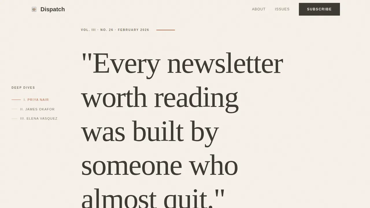
- Full-viewport Quote/Manifesto header with a bold headline in editorial serif type, a rust rule divider, and a founder byline that establishes editorial authority immediately
- Hub and spoke anchor navigation with a sticky left-edge chapter nav that names each creator spotlight like a table of contents entry, giving readers a sense of structure and progress
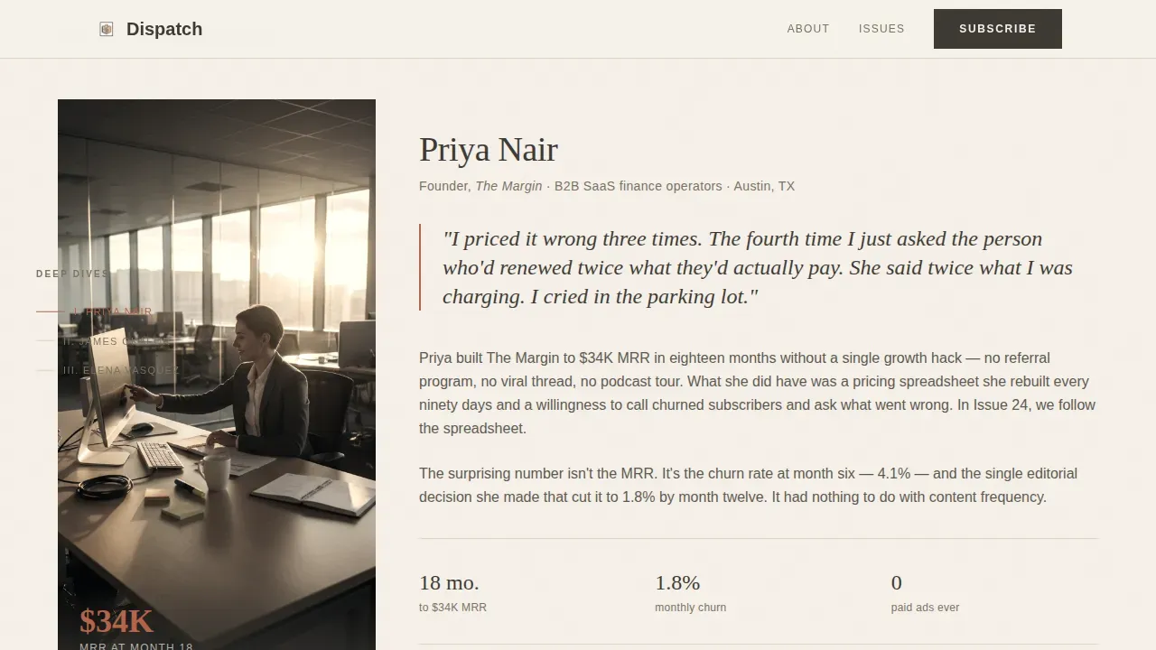
- Three creator spotlight sections with varying layout density, each featuring a desaturated portrait, a pull quote, a single surprising metric, and a teaser paragraph, plus two sign up form placements and a free sample PDF call to action
Feature list
This newsletter landing page template includes the following built-in features, each grounded in the editorial intent of the Dispatch concept.
Full-Viewport Manifesto Header
The header fills the entire screen with a single catchy headline set in large editorial serif type against bare parchment. A thin rust rule sits beneath it, and a founder byline anchors editorial authority. There is no image, no animation. The clean layout speaks directly to readers who value substance, and the sign up form sits directly below, making the primary call to action immediately visible.
Hub and Spoke Anchor Navigation
A sticky left-edge navigation bar names each creator spotlight section like a chapter in a table of contents. Visitors can jump to any section or scroll naturally. This navigation structure keeps the landing page focused while giving readers a sense of the full editorial scope, which supports longer dwell time and stronger conversion rates on a page of this depth.
Creator Spotlight Sections
Three individual creator spotlight sections form the editorial core of the landing page. Each section features a desaturated portrait in warm tones, a pull quote from the subject, one surprising subscriber metric as social proof, and a teaser paragraph that opens the full story without finishing it. Layout density varies across the three sections, rewarding readers who linger and reinforcing the anthology feel.
Dual Email Capture Points
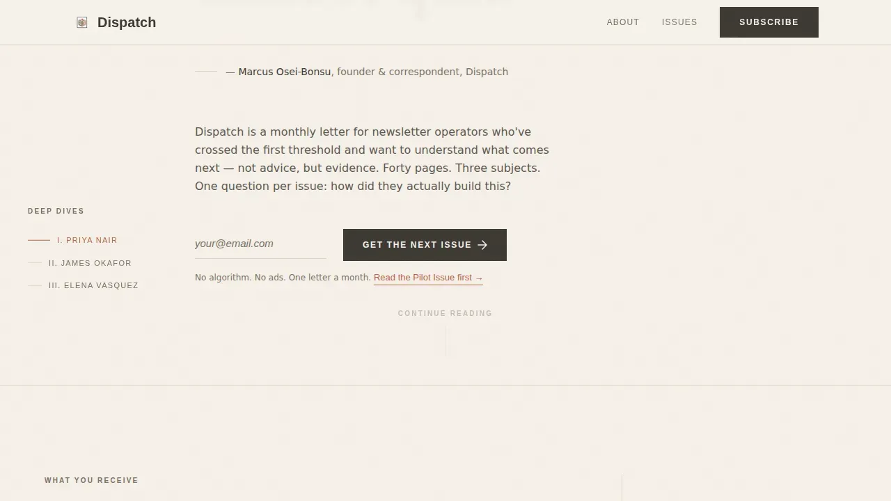
The sign up form appears twice: once directly beneath the manifesto header and once after the final creator spotlight. Both placements use the benefit-driven call to action button text "Get the Next Issue." This placement strategy follows best practice for good newsletter landing pages, where the main call to action appears above the fold and again at the natural point of decision.
Pilot Issue Free Sample Path
A secondary conversion path offers a free sample PDF of a past deep dive behind a "Read the Pilot Issue" link. This gives potential subscribers the ability to evaluate newsletter content quality before committing, which reduces skepticism and builds trust without requiring a second page. Providing excerpts of previous newsletter issues is one of the most effective ways to increase newsletter sign ups from visitors who need more evidence before they subscribe.
Heritage Cloud Canvas Color System
The color scheme uses warm parchment (#F5F0E8), soft graphite (#3D3A35), muted ink wash (#7A7265), and a quiet rust accent (#B5654A) for links and navigation markers. The palette is perfectly aligned with the letterpress broadsheet aesthetic described in the brief. Typography pairs Fraunces for display headings with DM Sans for body and interface copy, creating visual consistency between the editorial tone and the functional sign up elements.
Page sections overview
| Section | Purpose |
|---|---|
| Manifesto Header | Sets editorial tone with a full-viewport bold headline, rust rule, founder byline, and first sign up form |
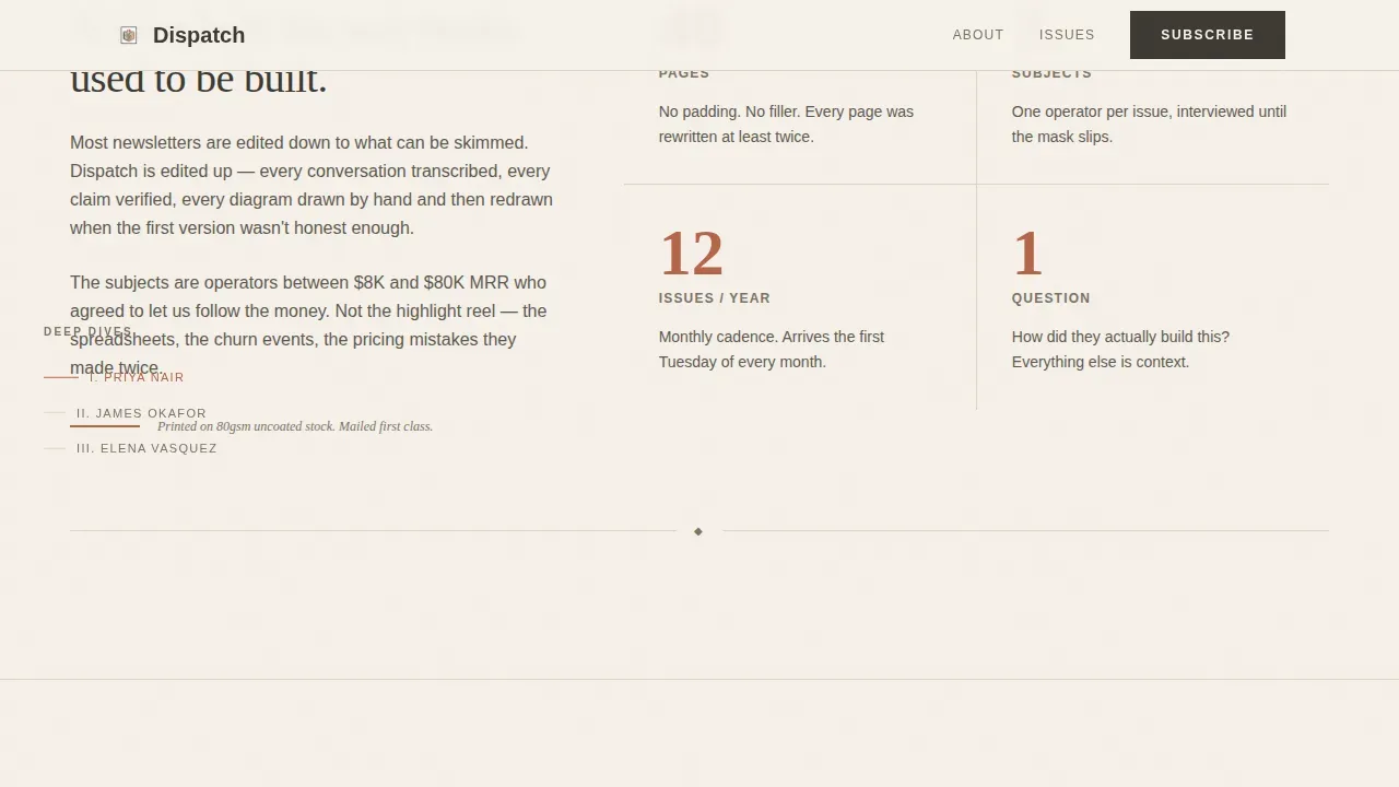
| About the Letter | Describes the editorial format, forty-page depth, and what arrives each month |
| Creator Spotlight One | First featured deep-dive subject with portrait, pull quote, metric, and story teaser |
| Creator Spotlight Two | Second featured subject in a different layout density for editorial rhythm |
| Creator Spotlight Three | Final creator section followed by second sign up form and pilot issue call to action |
| Minimal Footer | Horizontal flow footer with only essential information and no competing links |
Design & branding system
Creating a landing page for a heritage editorial newsletter means balancing timeless authority with a clean, modern experience that still drives subscriptions. The Dispatch visual identity achieves this through deliberate restraint. Every design decision prioritizes the feeling of a well-made printed object rather than a typical digital product page.
- The color scheme draws from the Cloud Canvas palette: parchment (#F5F0E8) as the page background, graphite (#3D3A35) for body type, ink wash (#7A7265) for secondary text and dividers, and rust (#B5654A) as the accent on links, call to action button borders, and navigation markers
- Typography pairs Fraunces, an optical-size serif display font, with DM Sans for interface elements, producing visual consistency between editorial headers and functional form labels while keeping the overall brand feeling intentionally analog
- The aesthetic of the landing page reflects a vintage style using serif fonts for body text and high contrast for readability, with generous white space between sections so each creator spotlight can breathe without competing for the reader's attention
Mobile & speed optimization
The Dispatch landing page is desktop-first by design, built for knowledge workers reading at a desk. However, the layout is responsive and adapts cleanly to mobile devices. The page uses server components and minimal JavaScript to keep interactions light, with scroll reveals as the only animation. This approach supports fast loading and a readable experience across all screen sizes.
- The layout responds to smaller screens without sacrificing the editorial tone: Fraunces headlines scale down gracefully, the sticky navigation bar collapses appropriately, and the sign up form remains prominent on mobile devices
- Low-motion design means no distracting transitions; the focus stays on the newsletter content itself rather than on interface effects, which also benefits readers accessing the page on slower connections
How this template helps you convert
The Dispatch newsletter landing page is built around a single conversion philosophy: earn the sign up before asking for it. Every structural choice, from the manifesto to the creator spotlights to the pilot issue link, moves visitors closer to the subscribe decision by demonstrating editorial value rather than asserting it.
- The manifesto header delivers a catchy headline and a concise value proposition above the fold, immediately setting clear expectations about what the newsletter stands for and who it is for, so visitors self-qualify before scrolling further
- The creator spotlight sections provide layered social proof through pull quotes, subscriber numbers, and surprising metrics, giving potential subscribers concrete evidence of the quality and actionable insights they can expect in every issue, which directly supports stronger conversion rates and more newsletter sign ups
- The dual sign up form placement with a benefit-driven call to action button and a secondary pilot issue path gives visitors two ways to convert, removing friction from the subscription process and addressing the pain points of readers who need to see the work before they commit
Other information about this template
The Dispatch template is one of the more distinctive newsletter landing page examples in the editorial category. It is designed for operators who understand that a good newsletter landing page is not just a collection form. It is an editorial product in itself. The sections below summarize additional context useful for operators choosing or customizing this template.
- A newsletter landing page is a dedicated, focused page designed to collect email subscribers around a single clear action; this template follows the "one page, one purpose" principle with no competing navigation links pulling visitors away from the sign up goal
- The best newsletter landing page approach for a deep editorial product means giving visitors access to real content before asking them to subscribe; the pilot issue path and creator teaser paragraphs fulfill this role without requiring a separate site or additional pages
- Platforms like Beehiiv, ConvertKit, or Mailchimp provide built-in landing page builders for newsletters, while dedicated builders like Unicorn Platform or Leadpages offer specific newsletter templates with more design flexibility; this template is built to be customized within whichever publishing environment the operator prefers
- The subscription form in this template uses a single required field (email address) to keep the subscription process as frictionless as possible; people rarely complete long or complex sign up forms, so the bare minimum field approach follows best practice for high converting landing pages
- Social proof is embedded naturally through subscriber numbers displayed alongside creator metrics, pull quotes as reader testimonials, and the option to include logos of top brands or notable organizations from the reader community to strengthen perceived authority
- For operators running paid ads or directing traffic from search engines, the page's lack of a navigation bar and its absence of competing links keeps all visitor attention on the newsletter sign ups goal, supporting stronger conversion rates from both paid and organic sources
- The overall brand consistency between this landing page and any referring sources (social profiles, podcast pages, or other site locations) is supported by the distinctive color scheme and Fraunces typography, which are immediately recognizable across contexts
- Recent newsletter topics can be surfaced through the creator spotlight teaser paragraphs, giving the newsletter page a sense of living, current content that makes potential subscribers feel they are joining something active rather than dormant
- Effective newsletter landing pages share consistent traits: persuasive copy, clean layouts, strategic call to action placement, and social proof; this template incorporates all of them within the editorial frame of the Dispatch concept
- The hero section follows the key elements structure for a strong landing page: a compelling headline, a supporting subheadline through the founder byline, a visible call to action, and engaging visuals through the desaturated creator portraits
Theme
Heritage & Story
Creative direction
Creator Spotlight
Color system
Cloud Canvas
Style
Hub & Spoke (Anchor Nav)
Direction
Lead Generation
Page Sections
Full-viewport Manifesto Header
Hub and Spoke Anchor Navigation
Three Creator Spotlight Sections
Dual Email Capture Placement
Pilot Issue Free Sample Path
Heritage Cloud Canvas Color System
Related questions
What kind of newsletter business is this landing page best suited for?
How does the sign up form work in this template?
Can this landing page template support a free sample or pilot issue offer?
How does the creator spotlight section work as social proof?
Is this template suitable for driving sign ups from search engines or paid ads?



