Expert Auto & Mobility Blog Blog & Content Website Template
Chronicle is a cinematic dark classic car landing page built for serious collectors, weekend restorers, and auction watchers. The masonry layout cascades editorial feature cards, archival photography, auction data callouts, and pull-quotes into a scrollable wall of provenance intelligence. A collage-scrapbook hero and a persistent email capture bar complete the page, making it ready to deploy for any classic car editorial project.
by Rocket studio
Quick summary
Chronicle is a single-page classic car editorial template with a masonry layout, a collage-style hero, and a cinematic dark color system. It is designed for content-led automotive publications that want to earn reader trust through visual depth and hard provenance data before asking for any commitment. The page is ready to set up quickly and easy to adapt for any automotive editorial project.
Who this template is for
This template is perfect for anyone running a serious classic car publication or collector-focused editorial site. It suits projects that prioritize depth, credibility, and a strong visual identity over generic blog aesthetics.
- Weekend restorers, serious collectors, and auction watchers who want a publication-grade web presence
- Design students and marque historians looking to showcase automotive research and archival work
- Editorial teams and independent writers ready to launch a classic car site with a modern, cinematic feel
What problem this template solves
Most blog templates feel interchangeable. They do not carry the weight or editorial personality that classic car content deserves. Visitors who can spot a repainted fender from thirty feet will not trust a page that looks like a generic content site. Chronicle solves that credibility gap.
- Generic layouts fail to communicate authority, making it hard for visitors to find the depth they are looking for
- Standard templates do not mix editorial beauty with hard data, so auction intelligence and provenance research look out of place
- Plain blog designs cannot create the layered, immersive view that serious collectors expect from a trusted automotive publication
What you get with this template
Chronicle delivers a fully formatted, single-page classic car landing page with every section designed to build reader trust through visual storytelling and editorial substance. The template is fast, simple, and easy to adapt for a range of classic car content projects.
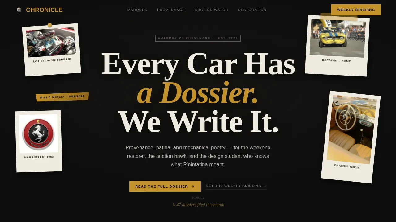
- A collage-scrapbook hero section with overlapping Polaroid-style images, hand-annotated elements, and a stamped condensed serif headline
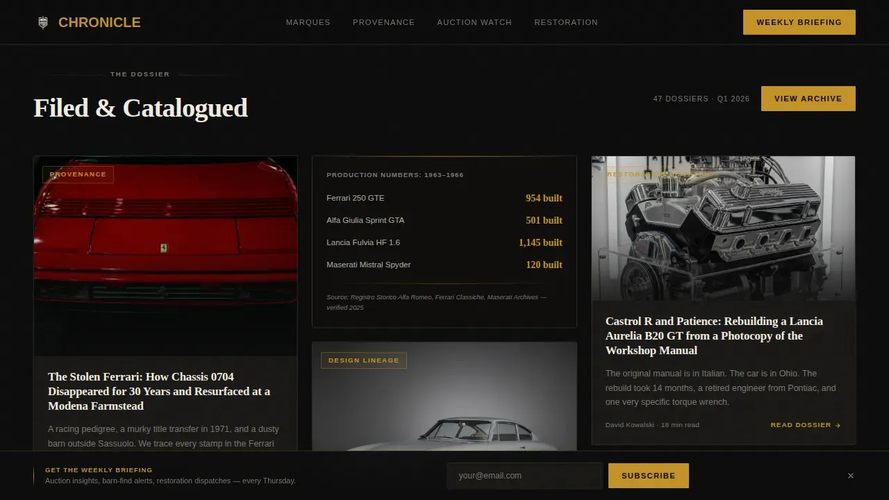
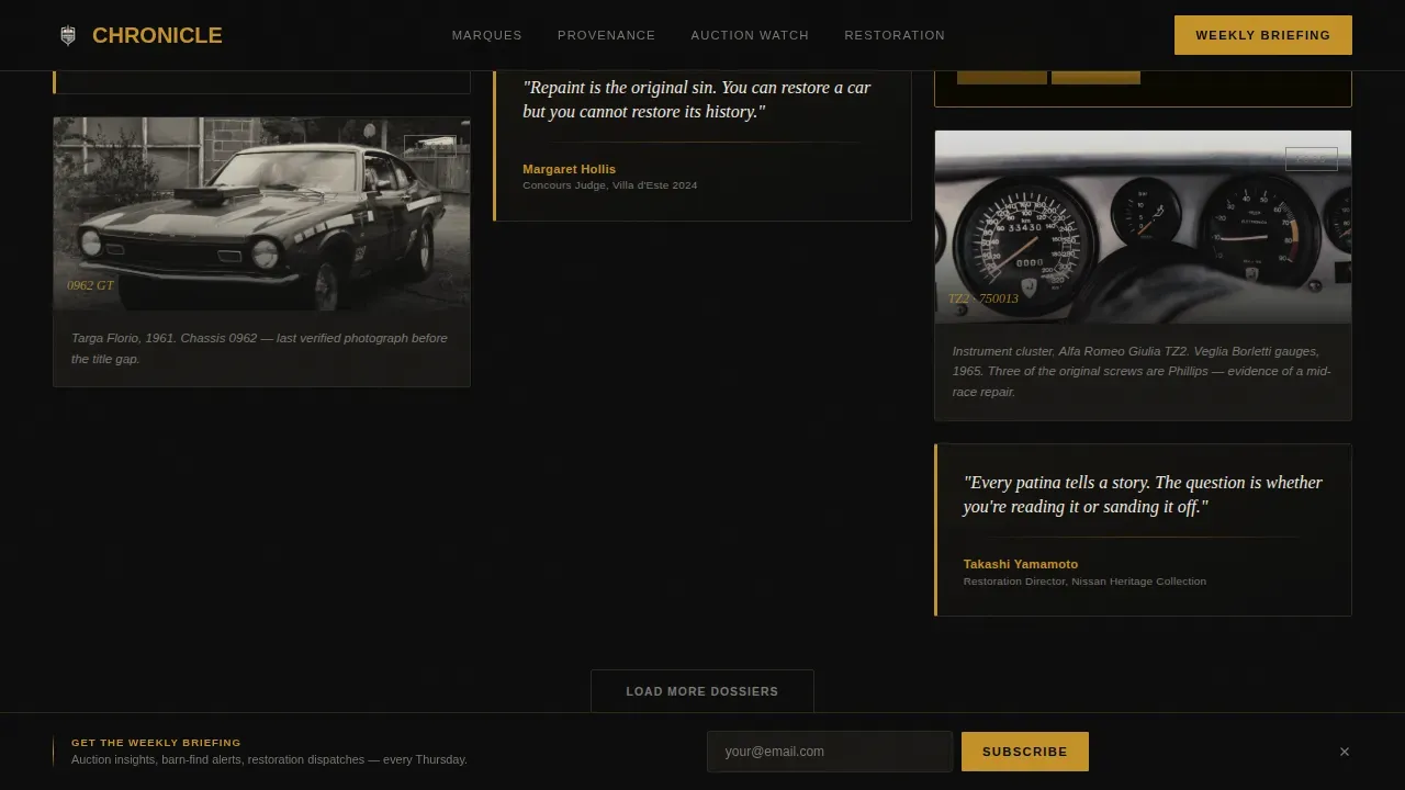
- Three rows of masonry grid cards mixing editorial feature thumbnails, amber-on-black data callouts, pull-quotes from marque historians, and archival photography
- A persistent bottom bar with a single email capture field and supporting copy, plus a footer in a horizontal flow layout
Feature list
This template comes with a focused set of design and layout features that serve the specific needs of a classic car editorial page. Each feature is included to help you create a site that looks authoritative and reads like insider intelligence.
Cinematic Dark Color System
The color palette is set around four precise values: darkroom black (#0D0D0D), developing-fluid amber (#C4922A), silver gelatin print gray (#B0ADA6), and pinstripe cream (#F0EBE0). These colors work together to create a warm, velvety visual style where text and graphics feel like they belong on a mahogany desk under tungsten light. Every card surface, heading color, and data callout follows this system.
Collage-Scrapbook Hero Section
The hero section layers overlapping Polaroid-style engine bay images, hand-written lot tags, a torn rally placard, and a cropped badge detail over a dark felt background. Elements are set at slight rotations, with one image pinned by a brass tack and another held under masking tape with a grease-pencil date. The headline is stamped in a condensed serif that anchors the composition.
Three-Row Masonry Grid Layout
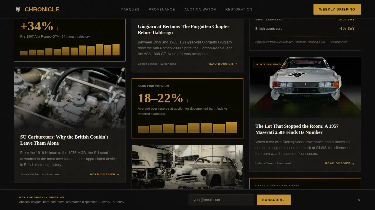
The masonry wall cascades editorial feature cards, archival photography, production number data cards, auction price trajectory callouts, and long-form feature thumbnails across three dense rows. Each row feels more authoritative than the last, moving visitors from editorial beauty into hard provenance data. Card hover animations lift each card, and the reveal is staggered for a polished editorial feel.
Amber-on-Black Data Callout Cards
Interspersed data cards present market stats, production numbers, and auction figures in developing-fluid amber text on darkroom black. These cards are formatted to feel like insider intelligence rather than casual content, giving the page credibility with serious collectors and auction watchers who view data as proof of editorial depth.
Persistent Bottom Bar with Email Capture
A fixed bottom bar stays visible as visitors scroll, offering a single email field and the line "Auction insights, barn-find alerts, restoration dispatches, every Thursday." This secondary conversion path is simple and low-friction. It allows the masonry wall to do the persuasion work before the email ask appears.
Parallax Hero and Staggered Reveal Animations
The hero Polaroid layers respond to scroll with a parallax effect, creating depth and a sense of physical weight. Masonry cards animate in with a staggered reveal on page load. These animations are set at a medium intensity to feel cinematic without slowing the editorial experience for desktop visitors.
Page sections overview
| Section | Purpose |
|---|---|
| Hero Collage Header | Sets the cinematic editorial tone with layered Polaroid images and a stamped headline |
| Masonry Row One | Mixes feature card thumbnails with amber-on-black market data callouts |
| Masonry Row Two | Presents pull-quotes, archival photography, and production number data cards |
| Masonry Row Three | Delivers long-form thumbnails, auction price trajectories, and provenance deep-dives |
| Persistent Bottom Bar | Captures email with a single field and editorial newsletter message |
| Horizontal Flow Footer | Closes the page with a clean, formatted footer in a horizontal layout |
Design & branding system
The design follows an Atelier Studio approach with a cinematic dark visual language. Every color, font choice, and layout decision is made to feel like a physical artifact rather than a digital page. This gives classic car content the visual gravity it deserves.
- Typography uses a condensed serif for headlines and a clean sans-serif for body text, creating a clear hierarchy between editorial weight and readable detail
- The four-color system of darkroom black, developing amber, silver gelatin gray, and pinstripe cream sets a consistent and sleek palette across all graphics, cards, and text elements
- Card surfaces, data callouts, pull-quote blocks, and the hero composition all follow the same visual language, keeping the page cohesive from top to bottom
Mobile & speed optimization
Chronicle is built desktop-first to match the browsing habits of serious classic car collectors. The layout is also responsive, so the page holds its editorial character on smaller screens. Images are lazy-loaded to keep the page feeling quick even with a dense masonry grid.
- The masonry grid uses CSS grid layout, allowing it to reflow cleanly across different screen sizes and each device type
- Lazy-loaded images keep the page performing well even as users scroll through three dense rows of editorial and archival photography
- Hover states, card lift animations, and parallax effects are designed to enhance the desktop view without disrupting the mobile reading experience
How this template helps you convert
The conversion strategy in Chronicle is built on editorial trust. Visitors are not asked to commit before the page has proven its value. The design earns the click by letting the masonry wall demonstrate the depth of the publication first.
- The collage hero and first row of masonry cards immediately signal that this is a serious classic car site, encouraging visitors to keep scrolling and explore more content
- By the third masonry row, visitors have already consumed archival photography, data callouts, and pull-quotes, making the "Read the Full Dossier" call to action on every card feel like a natural next step
- The persistent bottom bar is waiting at the bottom of every scroll position, so the email capture is always accessible without interrupting the reading experience
Other information about this template
The Chronicle cinematic dark classic car blog landing page template is an excellent fit for any automotive editorial project that needs to stand out in search results. The template is ready to use straight away and easy to edit without writing code.
- The Chronicle user interface kit template is perfect for blogging and excellent for a news, newspaper, magazine, publishing, or review site, making it versatile across different classic car content formats
- All templates on this platform were built using Webflow without writing code, and you can customize them using the visual interface to suit your personal brand needs
- The classic car landing page graphics included in this template are fully editable and suitable for commercial and personal use across multiple applications
- All objects and color values in the classic car graphics can be edited in Adobe Illustrator, and high-resolution files are available and ready to download for print or digital use
- AI-powered design tools allow users to build websites from natural-language prompts, and no-code tools enable non-technical people to create production-ready pages without traditional programming
- This template provides access to an incredible set of design services and project resources, including formatted data cards, archival image layouts, and a sleek luxury visual identity that protects the editorial tone of your classic car publication
- The page is built to help your site stand out in search results and give visitors a clear view of your publication's voice, creativity, and passion for classic car culture
- You can find, check, and set the color values, text styles, and graphics elements to follow your own vision without needing to count every manual adjustment
Theme
Atelier Studio
Creative direction
Industry Report
Color system
Cinematic Dark
Direction
Click-Through
Page Sections
Cinematic Dark Color System
Collage-scrapbook Hero Section
Three-row Masonry Grid Layout
Amber-on-black Data Callout Cards
Persistent Bottom Bar Email Capture
Parallax and Staggered Reveal Animations
Related questions
Can I edit the colors and text in this template?
Is this template suitable for commercial use?
Do I need to write code to use this template?
What kind of classic car site is this template best for?
Can AI-powered tools help me set up this template faster?



