Data Science Newsletter Blog Website Template
Cipher is a landing page template built for a monthly data science journal that goes deep on one concept per issue. The masonry layout, collage-style hero, and built-in "Find Your Blind Spot" quiz create a scroll-driven editorial experience. It is designed to turn curious visitors into $12/month subscribers through conviction-building content and a personalized diagnostic flow.
by Rocket studio
Quick summary
Cipher is a single-page landing page template for a monthly data science deep-dive journal. It combines a collage-style hero, a masonry issue grid, and a five-question interactive quiz to move mid-career practitioners from skeptical scrollers to committed subscribers. The Heritage and Story visual theme makes the page feel like a well-loved textbook, not a SaaS product pitch.
Who this template is for
This template is built for publishers, educators, and independent writers running a rigorous data science newsletter or subscription journal. It suits creators who want their page to reflect the depth of their content, not just announce it.
- Mid-career data scientists and machine learning engineers who are launching or growing a paid subscription publication
- Independent educators and technical writers offering monthly deep dives into mathematical or computational concepts
- PhD-level practitioners building a practitioner-facing journal where rigor and personality both matter
What problem this template solves
Most newsletter landing pages look identical: a headline, a bullet list of benefits, and a form. That approach fails for a publication whose entire value is intellectual depth. Visitors cannot feel the quality of the content from a generic page, so they do not subscribe.
- Shallow page designs undercut high-quality technical publications by making them look like any other email list
- Generic layouts give no space to demonstrate the actual texture of the content, such as annotated derivations or reproducible code
- Standard call-to-action flows ask for commitment too early, before visitors have experienced any of the journal's thinking
What you get with this template
You get a complete, ready-to-customize landing page that builds a compelling argument for your publication across every scroll position. The layout does not just describe the journal; it performs it.
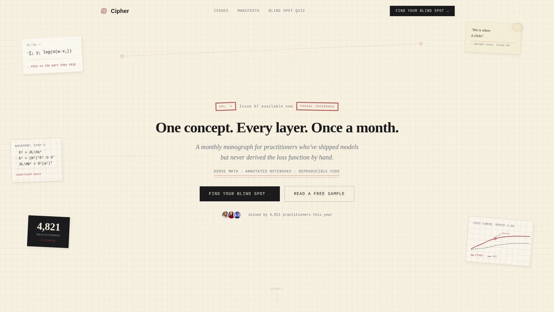
- A collage-style hero with overlapping equation fragments, rotated notebook cards, and a typewriter headline that sets the editorial tone immediately
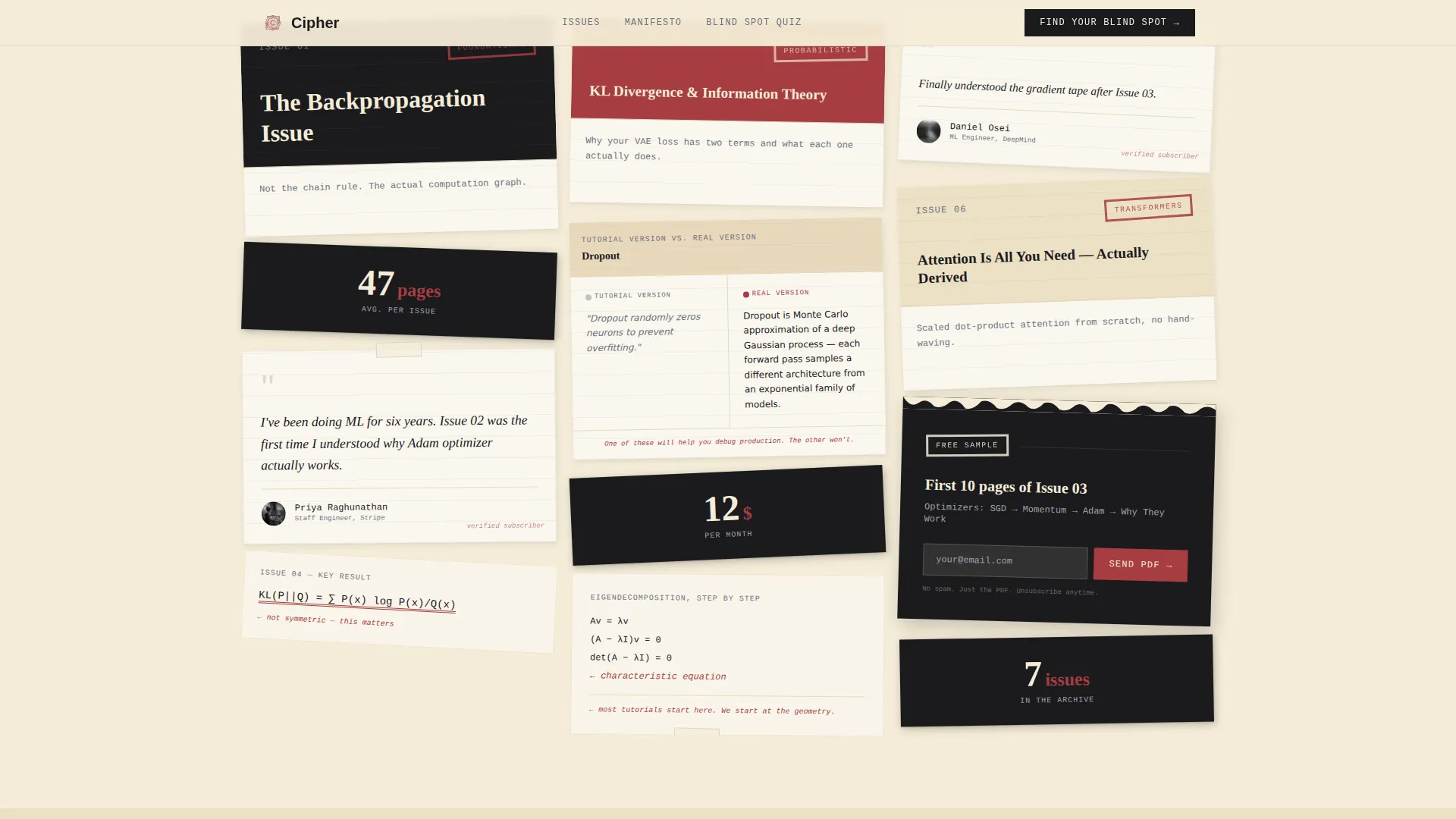
- A masonry card grid for past issues with varied card sizes, annotated covers, pull-quotes, and a torn-page free sample card gated behind email
- A five-question "Find Your Blind Spot" interactive quiz that delivers a personalized concept gap result and a tailored back-issue recommendation before the subscription prompt
Feature list
This section describes the key built-in capabilities of the Cipher landing page template.
Collage and Scrapbook Hero Section
The hero is a layered composition of handwritten equation fragments, partial notebook page derivations, vintage-style graph-paper plots, and a typewriter-set headline. Elements are slightly rotated and connected with red annotation circles, creating a detective-board energy that immediately signals intellectual depth.
Masonry Issue Grid
Past issues are displayed in a Pinterest-style masonry grid with intentionally varied card sizes. Small cards hold single equations or subscriber count badges. Large cards hold full annotated diagrams and issue covers. The rhythm mimics a mind working through a proof, alternating between quick observations and extended arguments.
Five-Question Blind Spot Quiz
The primary call to action launches a five-question diagnostic written like real interview problems. Each answer reveals a short explanation regardless of whether the visitor answered correctly. The quiz closes with a named concept gap and a specific back-issue recommendation, followed by the subscription prompt.
Manifesto Scroll Section
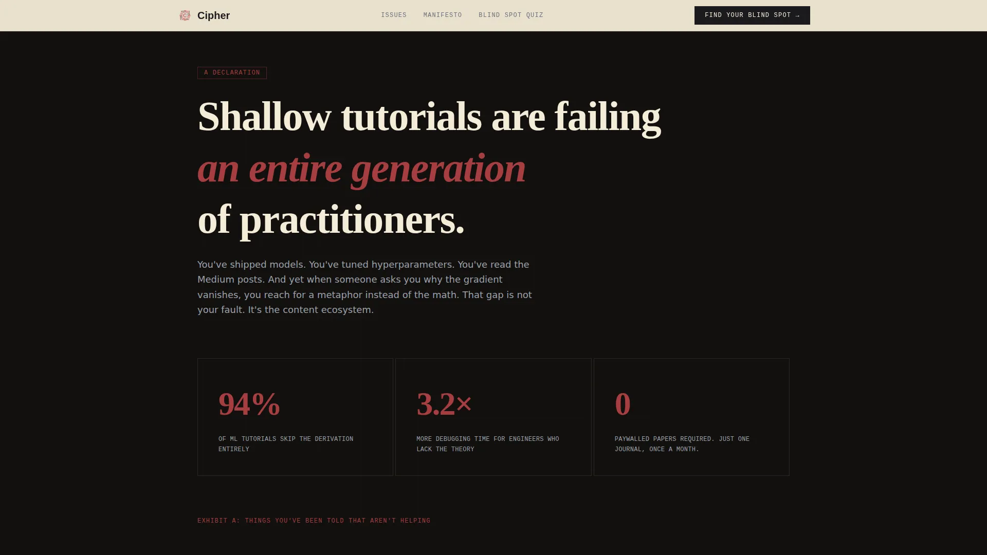
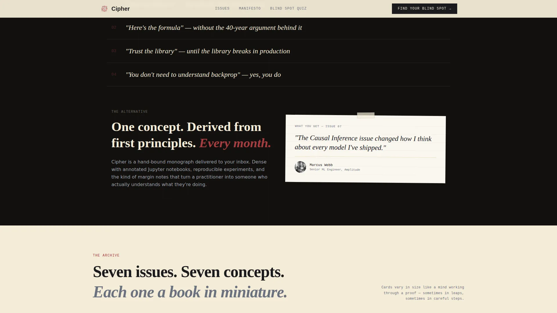
An ink-black background section builds a written argument against shallow tutorials. It escalates from identifying the problem to showing what genuine understanding looks like, anchoring the subscription offer in conviction rather than feature lists.
Testimonials and Free Sample Card
Pull-quote cards from subscribers sit alongside a torn-page styled card offering a free sample PDF of a past issue's first ten pages. The sample is gated behind an email field only, positioned halfway down the page as a lower-commitment conversion point.
Scroll-Reveal Animations and Derivation Unfold
The template includes CSS-driven scroll reveal animations using Intersection Observer. A derivation unfold animation shows a mathematical concept expanding step by step inside a card, giving visitors a taste of the journal's teaching style without leaving the page.
Page sections overview
| Section | Purpose |
|---|---|
| Hero Collage | Set editorial tone and surface primary quiz call to action |
| Manifesto Declaration | Build the argument against shallow data science tutorials |
| Issues Masonry Grid | Showcase past issues with annotated covers and varied card sizes |
| Blind Spot Quiz | Deliver personalized concept gap result and back-issue recommendation |
| Testimonials Masonry | Reinforce trust with subscriber pull-quotes and social proof metrics |
| Free Sample Card | Capture email with a low-commitment torn-page PDF offer |
| Footer Flow | Close the page with horizontal navigation and secondary links |
Design & branding system
The visual identity follows a Heritage and Story theme built on an Ink and Paper color palette. Every design decision references the feeling of opening a well-used mathematician's notebook discovered in a used bookshop, with yellowed pages, careful ink, and red underlines on the passages that matter most.
- Color palette: aged parchment (#F4ECD8) as the primary background, fountain-pen black (#1B1B1E) for body text and structure, marginalia red (#A63D40) for annotations and interactive highlights, and faded graphite (#6B717E) for secondary type and diagram lines
- Typography: Fraunces for serif display headings, DM Mono for code blocks and equations, and DM Sans for body text, creating a layered editorial voice across different content types
- Masonry cards are styled like torn pages pinned to a corkboard, each with slightly different typographic treatment to suggest they were written across different sittings
Mobile & speed optimization
The template is designed desktop-first, reflecting the reality that most of its target readers are data scientists working at a workstation. A mobile fallback layout is included so the page remains readable and functional on smaller screens.
- CSS animations and Intersection Observer-based scroll reveals keep interactions lightweight without requiring heavy JavaScript frameworks
- The masonry grid reflows for smaller viewports, preserving card readability and quiz usability on mobile devices
How this template helps you convert
The page is structured as a persuasion sequence, not a product brochure. Every section earns the next one, so the subscription prompt lands after the visitor already believes.
- The hero quiz call to action ("Find Your Blind Spot") gives visitors an active reason to engage immediately rather than passively scroll past a headline
- The manifesto section and escalating masonry grid build a specific argument about what shallow learning costs practitioners, creating felt need before any price is mentioned
- The free sample email gate placed halfway down the page offers a lower-commitment entry point that captures leads even from visitors who are not yet ready to subscribe
Other information about this template
This template is built for the Blog and Editorial category, specifically for the Data Science Newsletter and Data Science Monthly Deep Dive niche. It is a single-page landing page using a Masonry and Pinterest layout style with a Collage and Scrapbook header concept.
- The template is localized for English-language publications using United States dollar pricing and United States date formatting
- Subscription pricing displayed in the template follows the prompt brief at $12 per month, with the quiz result screen as the primary subscription prompt placement
- The creative direction follows a Manifesto approach, meaning the scroll is structured as a building argument rather than a feature list, which suits editorial and publishing use cases particularly well
- The Quiz and Assessment landing page direction is implemented as the five-question diagnostic with personalized output, distinguishing this template from standard newsletter page layouts
- Color and typographic choices are intentional signals of editorial seriousness, communicating to practitioners that the publication is not a beginner-facing tutorial aggregator
Theme
Heritage & Story
Creative direction
Manifesto
Color system
Ink & Paper
Style
Masonry/Pinterest
Direction
Quiz/Assessment
Page Sections
Collage Hero with Equation Fragments
Masonry Issue Grid with Varied Cards
Five-question Blind Spot Diagnostic
Manifesto Scroll on Ink-black Background
Scroll-reveal and Derivation Unfold Animations
Email-gated Free Sample Card
Related questions
Can I customize the quiz questions and personalized results?
Does the masonry grid scale as I add more past issues?
Is the free sample card already connected to an email platform?
Who is the intended reader this page is designed to speak to?
Can this template work for a technical publication outside data science?



