Cybersecurity Newsletter Pre-Launch Website Template
Cipher is a precision-built landing page template for a cybersecurity weekly newsletter. It uses a 60/40 asymmetric grid, a Japanese Zen color palette, and a creator-forward layout to convert security professionals into waitlist subscribers. Every section builds trust through curated social proof, redacted briefing previews, and a single-field email form with a vermillion call to action.
by Rocket studio
Quick summary
Cipher is a single-page waitlist template built for a weekly cybersecurity newsletter. It pairs a curator portrait with a sharp headline, styled intelligence briefing previews, and named testimonials from security professionals. The layout is asymmetric, the palette is minimal, and every design decision points toward one outcome: getting a work email into that form.
Who this template is for
This template is built for newsletter creators who operate in security and need to look the part before their first issue ships. It speaks directly to an audience of practitioners, not hobbyists.
- Independent security researchers or analysts launching a curated threat intelligence newsletter
- Former red team professionals or government intelligence veterans building a personal publishing brand
- Startup founders or senior security leaders who want a credible pre-launch presence fast
What problem this template solves
Most newsletter landing pages feel generic. For a cybersecurity audience, generic means untrustworthy. CISOs, senior penetration testers (professionals who test systems for exploitable weaknesses), and startup CTOs are pattern-matchers. They read visual signals as fast as they read threat feeds. A weak page loses them before the headline loads.
- Security professionals dismiss pages that look like every other SaaS waitlist
- Creators with strong credentials have no obvious way to surface that credibility quickly
- Pre-launch pages often ask for trust without giving anything first, losing high-signal visitors
What you get with this template
You get a fully structured, single-page waitlist layout designed to convert time-poor security professionals. Every section is purposeful, and nothing is decorative for its own sake.
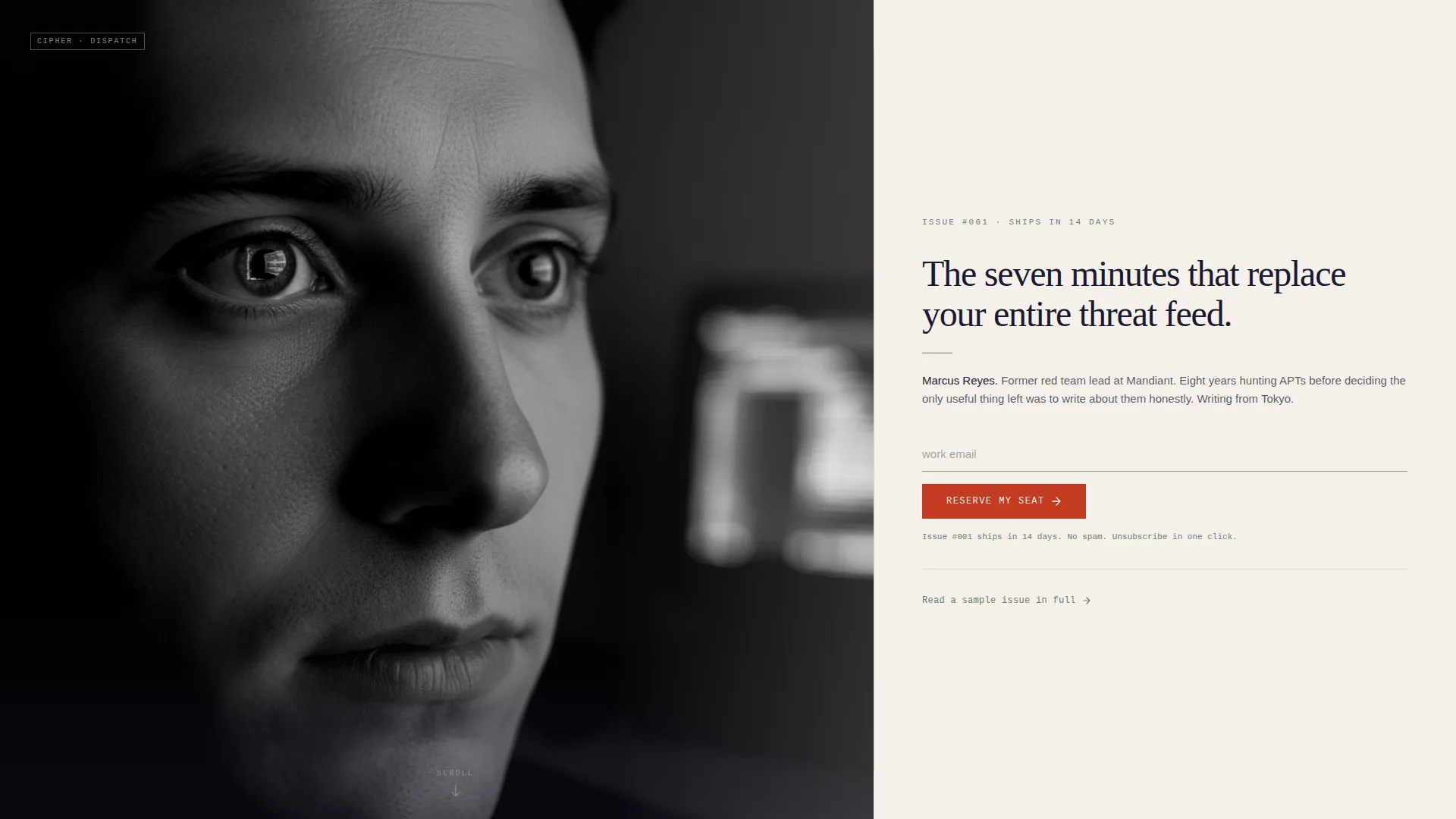
- A 60/40 hero split with a curator portrait zone and a headline, bio, and primary call-to-action column
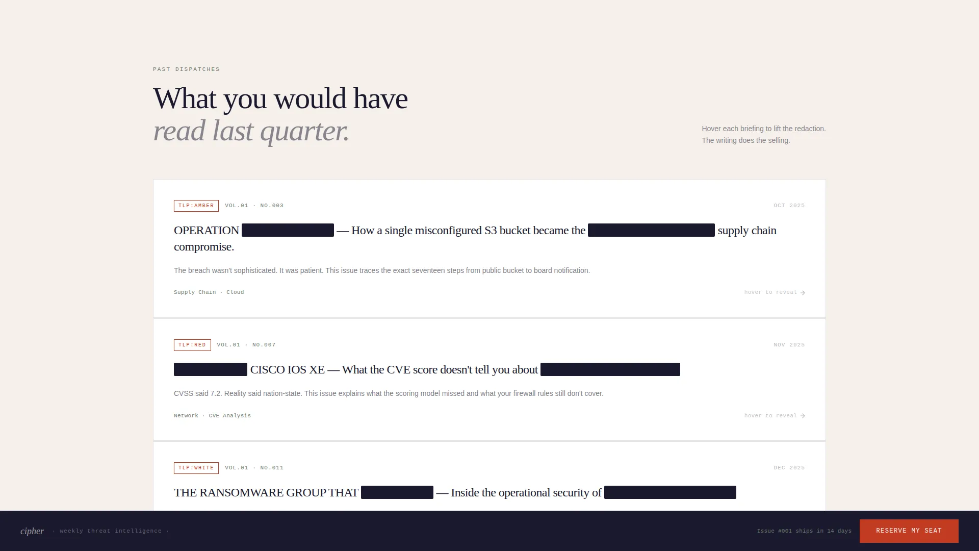
- Three redacted intelligence briefing headers that preview past issues with one revealed hook sentence each
- An asymmetric testimonial wall, animated counters for subscriber and reach statistics, and a single-field waitlist form
Feature list
Asymmetric 60/40 Hero Layout
The hero divides the viewport into a 60% portrait column and a 40% content column. The portrait zone holds a black-and-white curator photo with shallow depth of field. The content column carries a thin-serif 48px headline, a one-sentence creator bio, and the primary "Reserve My Seat" call to action in lacquer vermillion.
Redacted Briefing Preview Section
Three past issue subject lines are displayed as classified intelligence document headers. Each shows a single revealed sentence that teases the full issue. The redacted styling creates curiosity without giving everything away, letting the writing do the persuading.
Asymmetric Testimonial Wall
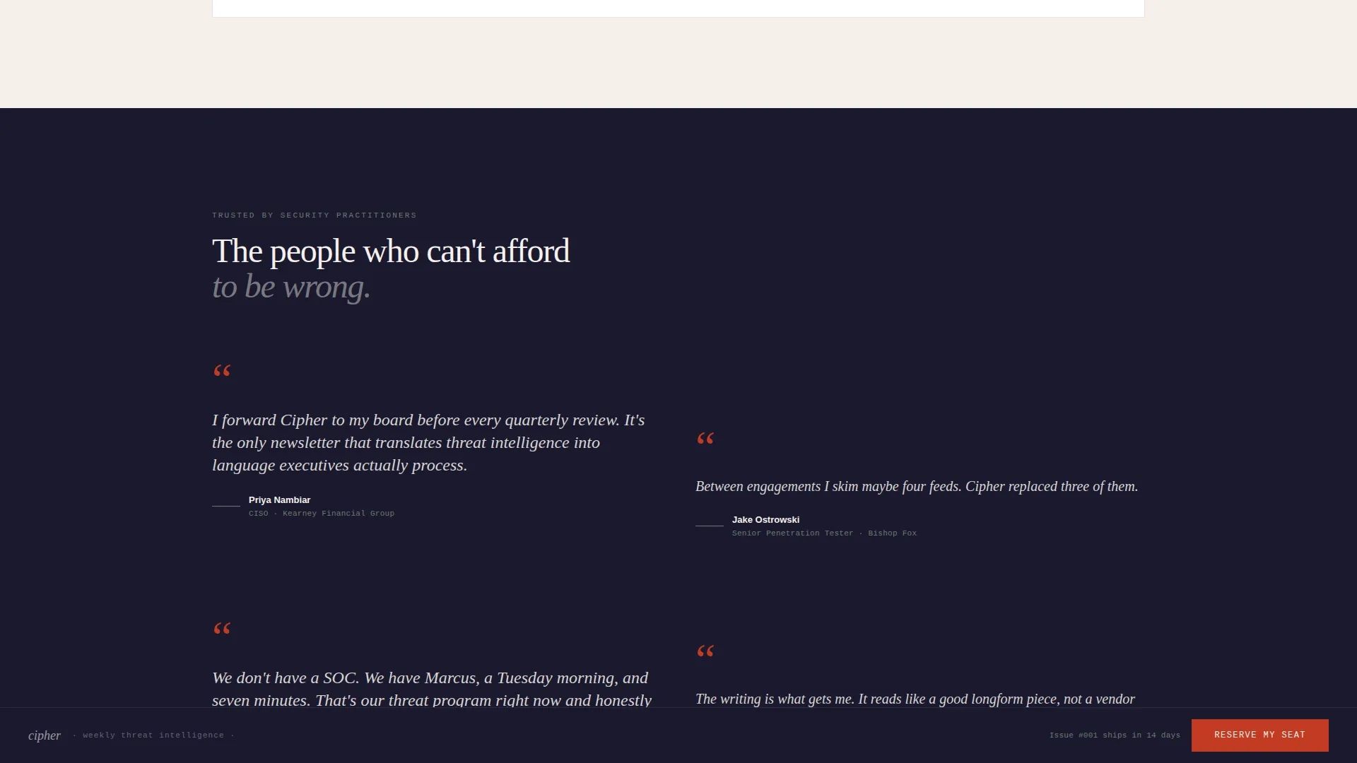
Named testimonials from security professionals with real titles and real companies are arranged in a deliberate off-grid layout. The asymmetric placement encourages the eye to drift and read rather than scan and skip, holding attention longer than a standard grid of quote cards.
Animated Statistics Counters
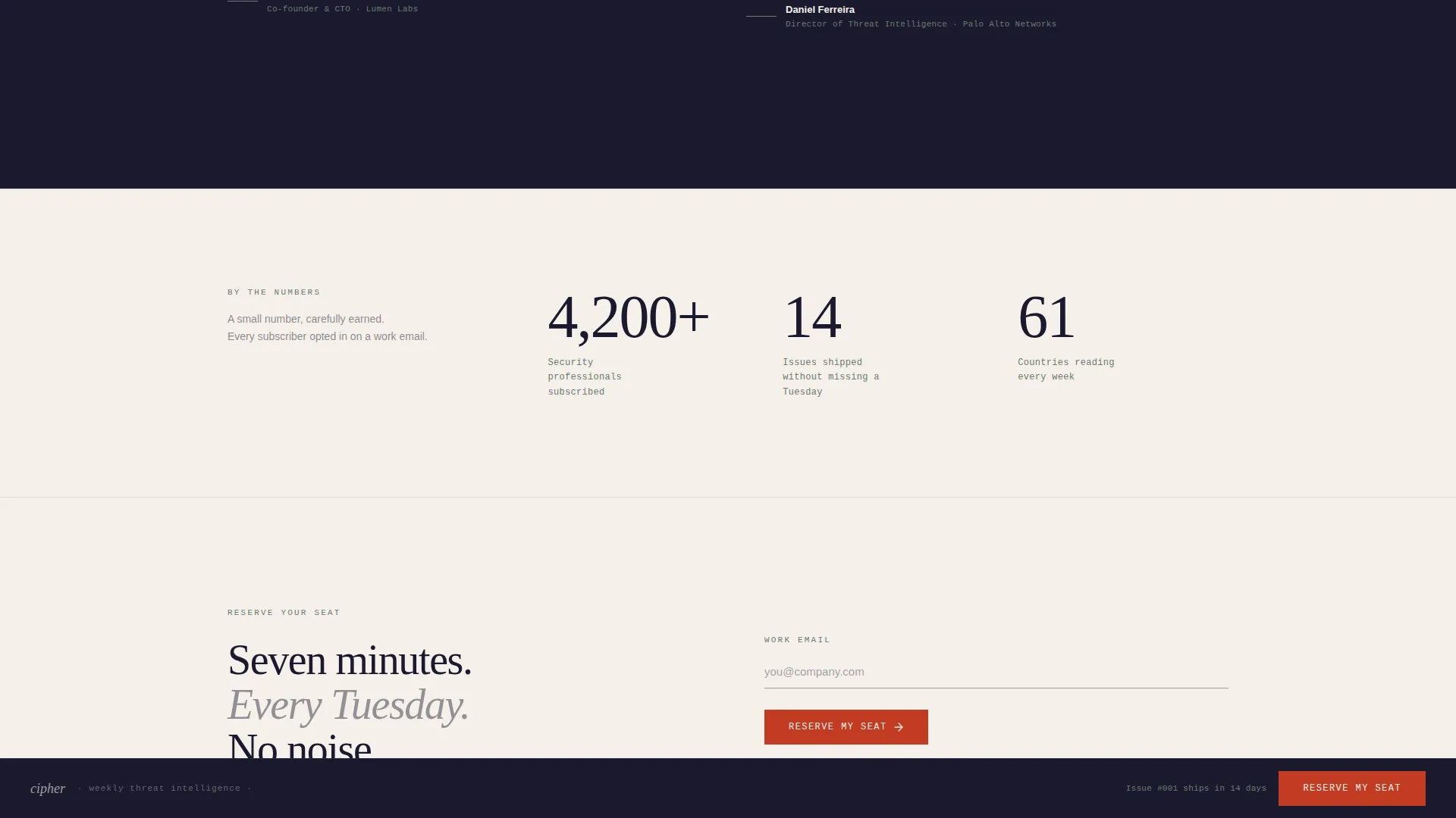
A dedicated section displays three animated counters: total subscribers, issues shipped, and countries reading. Each counter animates on scroll, giving the page a sense of live momentum without requiring a backend dashboard.
Sticky Waitlist Call to Action
After the first scroll, a sticky element appears carrying the "Reserve My Seat" button. The vermillion accent color is reserved exclusively for this button and alert-state elements, so it registers as urgent every time it appears.
Single-Field Waitlist Form
The conversion form asks for one thing only: a work email address. Below the input field, a reassurance line in moss stone reads the issue ship date, a no-spam promise, and a one-click unsubscribe note. A secondary link offers a sample issue for readers who want proof before committing.
Page sections overview
| Section | Purpose |
|---|---|
| Hero Split | Introduce curator, headline, and primary call to action |
| Redacted Briefings | Preview past issues styled as classified intel headers |
| Quote Wall | Build trust through named security professional testimonials |
| Animated Counters | Show subscriber count, issues shipped, and countries reached |
| Waitlist Form | Capture work email with reassurance and a sample issue link |
| Footer | Horizontal flow pattern with minimal supporting links |
Design & branding system
The visual identity follows a Luxe Minimal editorial style anchored in a Japanese Zen color system. Every color has a defined role, and no element borrows from another role's palette.
- Sumi ink (#1A1A2E) dominates typography and dark backgrounds; shoji screen (#F5F0EB) breathes across open space; moss stone (#6B7B6E) anchors section dividers and reassurance text
- Lacquer vermillion (#C23B22) appears only on the call-to-action button and alert-state elements, making every appearance feel intentional and urgent
- Typography uses DM Serif Display for headlines, IBM Plex Mono for data labels and counters, and Manrope for body text across all sections
Mobile & speed optimization
The template is designed desktop-first to match the primary audience of CISOs and senior practitioners working on laptops. Mobile parity is maintained so the layout holds at any screen size.
- The 60/40 grid reflows cleanly for smaller screens, keeping the portrait, headline, and call to action in the correct reading order
- Slow fade scroll transitions are used instead of hard cuts, reducing visual noise and maintaining the editorial tone across all devices
- Static sections use server-side rendering patterns; interactive elements such as counters and the sticky call to action use client-side components to stay responsive without slowing the page
How this template helps you convert
The page is built around one conversion goal: a work email on the waitlist. Every design and copy decision supports that goal without pressure or clutter.
- The curator portrait and bio establish personal credibility before the reader reaches the form, so trust is built during the scroll rather than demanded at the end.
- The redacted briefing previews and sample issue link give value before asking, letting the quality of the writing make the case for subscribing.
- The sticky vermillion call-to-action button keeps "Reserve My Seat" visible throughout the scroll, removing the need for the reader to hunt for the form.
Other information about this template
This template is a strong fit for newsletter creators working across the security content space, including threat intelligence digests, vulnerability roundups, and weekly security briefings. It is equally usable for solo analysts, small editorial teams, or security consultancies building an owned-audience channel.
- The footer follows a Vercel-style horizontal flow pattern, keeping the bottom of the page as clean as the top
- The Tokyo timezone reference and location detail in the bio section can be updated to match any creator's actual location
- Scroll transitions use a slow fade animation style, which suits the calm, deliberate tone of the Japanese Zen design theme
- The template supports a "coming soon" or pre-launch context out of the box, with the ship-date reassurance line ready to update as the launch date approaches
- Color roles are strictly enforced in the design: vermillion never appears outside call-to-action and alert contexts, keeping its visual weight intact
Theme
Luxe Minimal
Creative direction
Creator Spotlight
Color system
Japanese Zen
Style
Asymmetric Grid (60/40)
Direction
Waitlist/Coming Soon
Page Sections
Asymmetric 60/40 Hero Layout
Redacted Intelligence Briefing Previews
Asymmetric Testimonial Wall
Animated Scroll-triggered Counters
Sticky Waitlist Call-to-action Button
Single-field Conversion Form
Related questions
Who is this landing page template designed for?
Can I update the curator portrait and bio with my own details?
What does the waitlist form collect?
Does the template include the sample issue content?
Can this template be used for a newsletter outside of cybersecurity?



