CleanTech Startup Professional Website Template
This cleantech live comparison data grid landing page template gives climate investors, sustainability officers, and accelerator scouts a single page that replaces stacks of PDF pitch decks with a live, switchable data grid. Visitors compare efficiency ratings, funding rounds, carbon offset projections, and unit economics side by side, then gate a full dataset download behind a lightweight form.
by Rocket studio
Quick summary
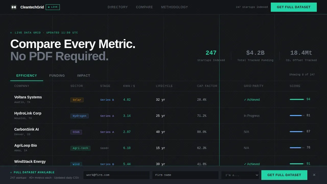
This template is a single-page dashboard built for the cleantech investment category. It opens with a live, tabbed data grid showcasing eight startups in rows and columns. Every section below the grid drills deeper: a filterable directory, a drag-to-compare module, a methodology panel, and a persistent bottom bar that gates a downloadable dataset. The layout is desktop-first, matte black, and engineered for data density.
Who this template is for
This template is built for professionals who work with hard numbers and need to move fast. The grid layout and tabbed interface are designed so serious analysts can navigate efficiently without hunting through menus.
- Climate-focused venture capital investors who review dozens of startup decks every week and need rapid side-by-side comparison
- Corporate sustainability officers evaluating cleantech partners for net-zero technology commitments
- Accelerator scouts identifying Series A candidates before Demo Day, who require quick access to structured startup data
What problem this template solves
Climate investors and sustainability teams lose hours every week sorting through unstructured PDF pitch decks. The problem is not a lack of data. The problem is that data arrives in incompatible formats, scattered across attachments, with no common structure to compare across companies. This template eliminates that friction by presenting every relevant metric inside a unified grid layout where rows and columns align perfectly across all indexed startups.
- Stops the PDF attachment cycle by surfacing efficiency ratings, funding rounds, carbon offset projections, and unit economics directly on the page
- Removes the effort of manually cross-referencing decks by letting visitors drag two startup cards into a head-to-head comparison slot instantly
- Builds analyst trust through a transparent methodology panel showing formulas, data sources, and last-updated timestamps
What you get with this template
You get a complete, production-ready single-page layout that functions as a data intelligence tool from the first scroll. Every section is purposeful. The grid layout forms the backbone of the presentation, and every subsequent section answers the next logical question an analyst would ask. The template is ready to customize to your own website and data set.
- A switchable hero grid with three tabs (Efficiency, Funding, and Impact), each surfacing a distinct set of columns for eight startup rows
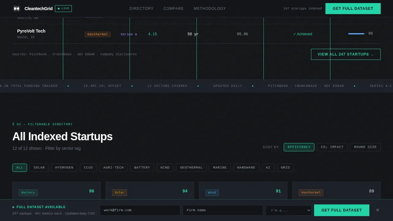
- A filterable directory with tag chip filters for categories like solar, hydrogen, carbon capture and utilization storage, and agri-tech
- A head-to-head comparison module, a methodology panel, and a scroll-triggered persistent bottom bar with a lightweight data-access form
Feature list
This template delivers a focused set of interactive components. Each feature is purposefully built for a data-dense, analyst-grade web design context. Together they create an immersive user experience that rewards careful reading and fast scanning alike.
Tabbed Live Data Grid
The hero section is a Feature Tab Switcher with three horizontal tabs: Efficiency, Funding, and Impact. Each tab re-populates the visible columns instantly. Efficiency surfaces kilowatt-hours per dollar and lifecycle metrics. Funding reveals round size, lead investor, and runway months. Impact shows tonnes of carbon dioxide avoided and Sustainable Development Goal alignment badges. Numbers tick into place with micro-transitions, and the active tab underline glows in signal-green, giving users a clear visual hierarchy at a glance.
Filterable Startup Directory
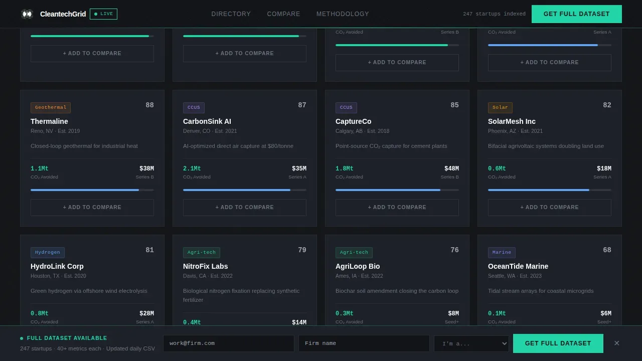
Below the hero grid, a full directory of indexed startup cards displays with tag chip filters. Users can narrow results in real time by selecting category tags such as solar, hydrogen, carbon capture, or agri-tech. The grid layout reflows instantly as filters are applied, keeping the presentation clean and user friendly. This section lets visitors quickly scan the full catalog without losing context or reloading any pages.
Drag-to-Compare Module
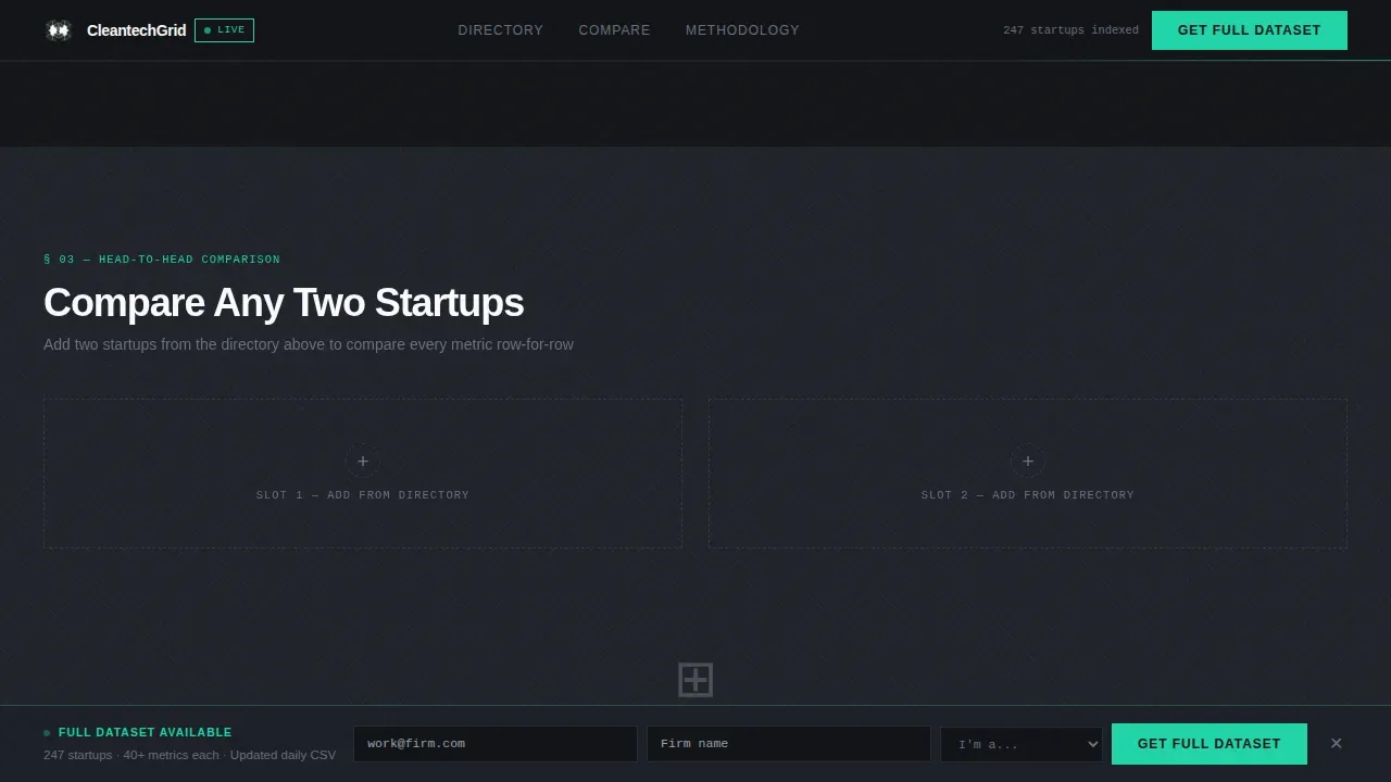
This is the core conversion tool. Visitors drag any two startup cards from the directory into dedicated comparison slots. Every metric aligns row for row across both cards, so differences in unit economics, runway, and carbon impact are immediately visible. The primary call to action, "Compare These Two," is embedded directly inside this module, making the tool itself the conversion moment rather than a separate sales pitch.
Methodology Panel
The methodology panel provides transparent formulas, named data sources, and last-updated timestamps for every metric in the grid. This section is essential for an analyst audience that will not act on numbers they cannot audit. It answers the credibility question before it is asked, building trust through openness rather than through marketing language. Live impact visualization and data freshness indicators help sustainability leaders verify what they are seeing.
Persistent Bottom Bar with Form Gate
After three scroll interactions, a bottom bar slides into view with the secondary call to action: "Get the Full Dataset." Clicking it reveals a lightweight form requesting a work email, firm name, and a single dropdown to identify the visitor as a venture capitalist, corporate buyer, accelerator, or other. The bar persists across the lower portion of the page without interrupting the browsing experience.
Carbon Fiber Visual System
Every visual element in this template follows a matte-black carbon fiber aesthetic. Backgrounds sit in the deep carbon black to woven graphite range. Data text renders in clean hydrogen white. Titanium mid-tone handles secondary descriptions and labels. A single signal-green accent powers every interactive affordance, from hover states on grid rows to the glowing tab underline and comparison toggle. This style ensures that the page feels engineered and credible, not decorative.
Page sections overview
| Section | Purpose |
|---|---|
| Hero Tab Grid | Tabbed live data grid showcasing eight cleantech startups across Efficiency, Funding, and Impact columns with ticker animations |
| Filterable Startup Directory | Tag chip filters narrow the full startup card grid in real time by category such as solar, hydrogen, and agri-tech |
| Head-to-Head Comparison | Drag-to-compare module aligns two startup cards row for row, with the primary "Compare These Two" call to action embedded inside |
| Methodology Panel | Transparent formulas, data sources, and timestamps build auditable trust with analyst-grade visitors |
| Persistent Bottom Bar | Scroll-triggered bar surfaces the "Get the Full Dataset" secondary call to action behind a lightweight form gate |
| Minimal Footer | Copyright line, Privacy, Terms, and Docs links in a developer-minimal footer pattern |
Design & branding system
The visual identity follows a Directory and Discovery theme using a Carbon Fiber color system. The palette is built to feel aerospace-grade: precise, functional, and without decoration. Web design decisions here are intentional at every layer, from background gradients to the single accent hue reserved for interactive grid elements.
- Color system: deep carbon black (#121417) base, woven graphite (#1E2128) panels, titanium mid-tone (#6B7280) for secondary text, clean hydrogen white (#F9FAFB) for primary data, and signal-green (#22D3A7) for all interactive affordances and live metric indicators
- Typography: DM Sans for all user interface labels and directory text; JetBrains Mono for all numeric metrics, timestamps, and grid cell values, preserving tabular alignment across columns and rows
- Animation style: beam-border entry effects, ticker number transitions in grid cells, stagger-reveal sequences on directory cards, and tab-switcher micro-transitions that keep motion purposeful and never decorative
Mobile & speed optimization
The template is designed desktop-first because data density requires wide viewports to display multiple columns and rows without collapsing the grid layout. On narrower screen sizes, the layout adapts to a condensed card stack so users on mobile devices can still access the core content. Responsive web design is crucial for an excellent online presence, and this template handles different screen sizes through a fully responsive design approach.
- Desktop viewport: full multi-column grid layout with all tabs, filters, and the drag-to-compare module visible at once
- Mobile and tablet: startup cards stack vertically, tabs remain accessible, and the bottom bar continues to trigger after scroll interactions on smaller device sizes
- The static shell is built with server components for fast initial load, while interactive grid elements and filters run as client components to keep the page user friendly and snappy across screen sizes
How this template helps you convert
Effective cleantech landing pages combine transparent, real-time data visualization with a benefit-driven narrative. This template earns the conversion by letting visitors use the product before asking for anything. Specialized layouts improve conversion rates by guiding users toward actions like downloading datasets, and this template implements that principle precisely.
- The tabbed data grid converts passive visitors into active users the moment the page loads. Seeing live numbers tick into place creates an immersive experience that immediately demonstrates the tool's value, making the "Compare These Two" click feel natural rather than pressured.
- The persistent bottom bar appears only after three scroll interactions, targeting users who have already engaged with the grid, the filters, and the comparison module. By the time the "Get the Full Dataset" bar appears, users have already experienced the product and understand what the full dataset offers.
Other information about this template
This template draws on broader trends shaping cleantech web design in 2026. Templates for cleantech companies now prioritize live data grids, content-management-system-driven impact metrics, and personalization layers that match investor preferences. The design approach here reflects those priorities without overbuilding.
- Grid systems underpin the entire page structure. Modular grid layouts allow flexible arrangements of widgets, data cards, and chart components. Successful implementation of grid systems can be seen on platforms like Bootstrap framework websites and Medium.com article layouts, and this template applies the same structural discipline to a cleantech investment context.
- The dark-mode aesthetic is consistent with modern, minimalist user interface conventions seen across data-heavy web pages, news websites, and analytical tools. News websites and data dashboards alike use dark backgrounds to reduce visual noise and let numbers read clearly.
- CSS grid layout generators help create responsive, structured web layouts effortlessly, and the underlying code in this template leverages grid structure throughout, making it straightforward for designers and developers to customize columns, rows, and spacing to fit their own project needs.
- Dynamic content scaling allows non-technical team members to update data grids without altering the underlying code, making this template accessible to marketing teams who need to refresh metrics between funding rounds or product launches.
- The grid layout is particularly effective for content-heavy websites. A well-designed grid layout helps users quickly find the information they need, whether they are scanning for a specific startup category or comparing unit economics across the full directory.
- Inspiration for this template's grid-based approach can be drawn from analytical tools like Nexus Energy, which focuses on grid management and features interactive energy flow visualizations, and from dashboard-oriented projects like Ecovate, tailored for IoT-enabled sustainable building with energy consumption layouts.
- The template code is structured so developers can implement new tag categories, add grid rows for additional startups, or customize the comparison module columns without rebuilding the page infrastructure from scratch.
- No-code or low-code options in the broader ecosystem allow for launching complex, data-rich sites in days rather than weeks, and this template is designed with a clean component structure to support that kind of rapid deployment.
- The footer follows a developer-minimal pattern with a copyright line, Privacy, Terms, and Docs links, leaving the full page space reserved for data presentation rather than promotional copy.
- For teams evaluating grid layout options, examples from the ecosystem include tools like TechCues, a responsive template optimized for data-heavy businesses featuring advanced CSS grid integration, and Mosaic Analytics, which uses modern front-end infrastructure for high-performance, real-time dashboards. Both serve as useful points of reference when deciding how to showcase a startup directory on your own website.
Theme
Directory & Discovery
Creative direction
Spec Sheet
Color system
Carbon Fiber
Style
Dashboard/Data Grid
Direction
Comparison/Versus
Page Sections
Tabbed Live Data Grid Hero
Real-time Filterable Directory
Drag-to-compare Startup Module
Transparent Methodology Panel
Scroll-triggered Dataset Gate
Carbon Fiber Visual and Type System
Related questions
Can I add more startups to the grid beyond the eight shown?
Does the drag-to-compare module require custom code to work?
Is this template usable on mobile devices?
How does the methodology panel build trust with analyst visitors?
Can I customize the tag filters and tab labels for a different cleantech category?



