Biotech Startup Professional Website Template
Helix is a single-page comparison table landing page built for growth-stage biotech companies. It uses a Data Command visual theme with electric indigo, deep black, and bioluminescent cyan to present platform metrics with authority. Four glowing header panels, a structured eight-row feature matrix, and a qualification-focused lead capture form make the data do the selling.
by Rocket studio
Quick summary
Helix is a precision-built landing page template for growth-stage biotech startups. It opens with four glowing metric panels, builds its argument through a structured platform comparison table, and closes with a lead generation form designed to qualify serious buyers. The aesthetic feels like a sequencing readout in a dim lab: precise, phosphorescent, and quietly relentless.
Who this template is for
This template is built for biotech companies at the growth stage that need to win over highly skeptical, data-driven audiences. If your platform has measurable advantages over competitors, this layout gives you the structure to show them clearly.
- Series B biotech founders and CEOs managing burn rates and pipeline credibility
- Pharma business development leads evaluating platform acquisitions
- Venture partners running diligence on pipeline depth and data architecture
What problem this template solves
Growth-stage biotech companies often struggle to communicate platform advantages in a format that serious buyers trust. A narrative pitch deck rarely survives a technical diligence call. This template replaces story-first persuasion with structured, evidence-first presentation.
- Visitors see differentiated proof points before they are asked for anything
- The comparison table format eliminates vague claims by forcing side-by-side data
- Lead capture is qualification-first, filtering for role and therapeutic area before collecting contact details
What you get with this template
You get a single-page layout designed around a Feature Matrix creative direction. Every section earns its place by adding another layer of evidence. The page is built to convert serious, high-intent visitors into qualified leads.
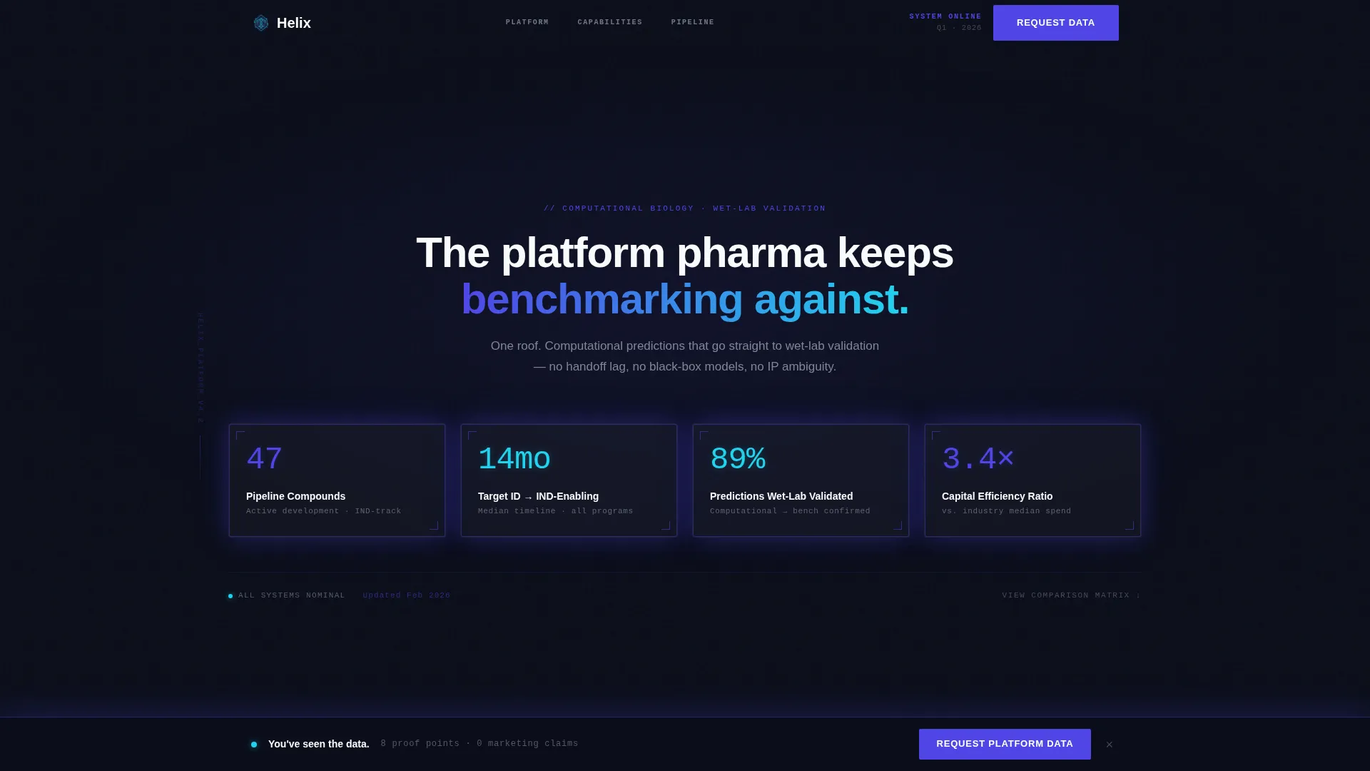
- A four-panel header section displaying live-feeling key performance metrics
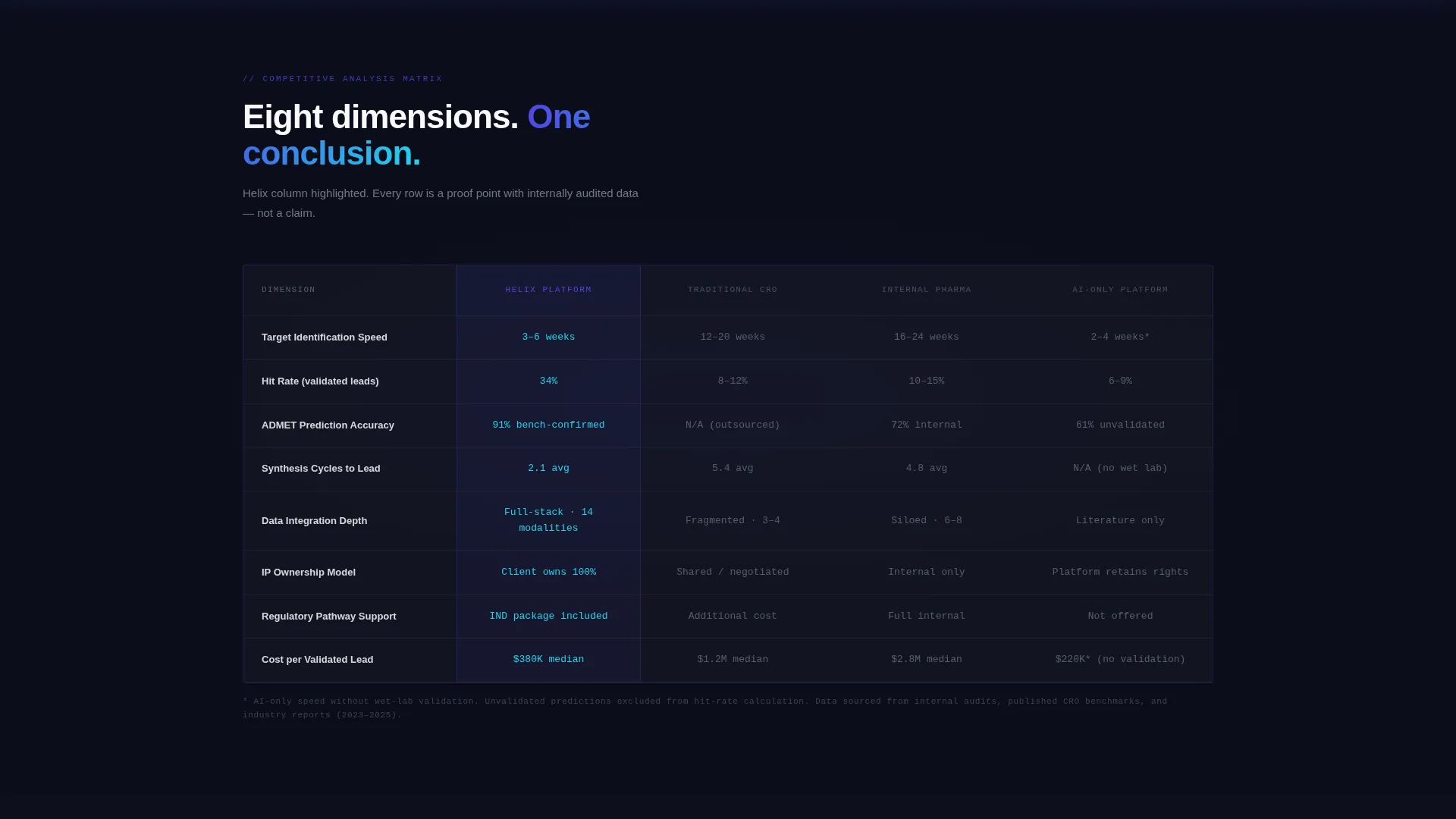
- An eight-dimension comparison table pitting your platform against traditional CRO timelines, internal pharma discovery, and AI-only competitors
- Two distinct lead capture paths: a full qualification form and a lighter gated download
Feature list
This template is built around a tight set of components that work together as a structured argument. Each piece below is drawn directly from the template design brief.
Four-Panel Metric Header
Four translucent glass panels float against a deep black background. Each panel holds a single glowing metric: pipeline compounds in active development, average months from target identification to IND-enabling studies, computational predictions validated in wet lab, and total capital efficiency ratio versus industry median. Indigo light edges the panels as if backlit by server racks.
Eight-Dimension Comparison Table
A structured comparison table pits the platform against three competitor types across eight rows: target identification speed, hit rate, ADMET (absorption, distribution, metabolism, excretion, and toxicity) prediction accuracy, synthesis cycles, data integration depth, IP ownership model, regulatory pathway support, and cost per validated lead. The platform column loads highlighted in electric indigo; competitor columns render in muted titanium gray.
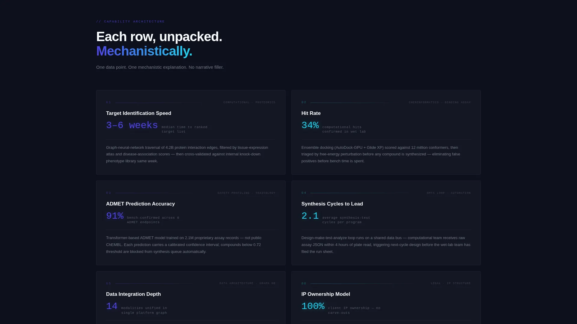
Expandable Capability Panels
Below the comparison table, each of the eight capabilities expands into its own glass-panel section. Each section contains a single supporting data point and a one-sentence mechanistic explanation. The scroll builds a cumulative case rather than a persuasive narrative.
Sticky Lead Capture Bar
After the comparison table, a sticky bar remains visible as the visitor scrolls. It carries a single call to action: "Request Platform Data." The bar reappears at page bottom, giving high-intent visitors two natural moments to convert without interrupting the data-reading flow.
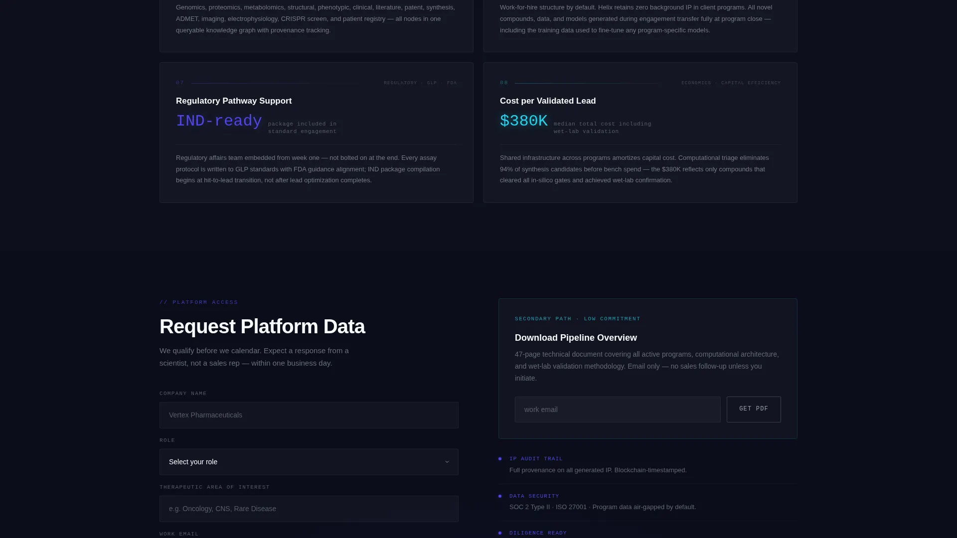
Qualification-First Lead Form
The lead capture form collects company name first, then role via a dropdown with options for business development, venture, chief scientific officer, and other. It then asks for therapeutic area of interest before requesting a work email. This sequence prioritizes lead quality over lead volume.
Gated Pipeline Download Path
A secondary conversion path offers a "Download Pipeline Overview" gated behind email only. This lighter gate catches visitors who are not ready for a full conversation but are willing to signal interest. It captures intent without requiring full qualification upfront.
Page sections overview
| Section | Purpose |
|---|---|
| Metric Header Panels | Display four key platform performance figures |
| Platform Comparison Table | Compare eight capability dimensions against three competitor types |
| Capability Expansion Panels | Support each table row with a data point and one-sentence explanation |
| Sticky call to action Bar | Keep "Request Platform Data" visible after the table |
| Secondary Download Gate | Capture early-stage interest via email-only pipeline download |
| Bottom Lead Form | Collect qualified leads from visitors who reach the page end |
Design & branding system
The visual identity follows a Data Command theme. The palette is built to feel like a bioluminescent sequencing readout: precise and quietly intense. Black dominates every background; indigo owns interactive surfaces; cyan appears only where a metric wins the argument.
- Deep mission-control black (#0B0E1A) as the dominant background color
- Electric indigo (#4F46E5) for active states, highlighted table columns, and interactive elements
- Bioluminescent cyan (#22D3EE) reserved for key metrics and hover states; cool titanium gray (#9CA3AF) for secondary text and table borders
Mobile & speed optimization
The template is structured for a clean reading experience across screen sizes. The Dark Glass Panels header and comparison table are laid out to remain legible and scannable on smaller viewports.
- The comparison table is designed to scroll horizontally on mobile without losing column context
- Glass panel sections stack vertically on narrow screens, keeping metric readability intact
- No hero images or stock photography are used, which keeps the visual weight low and the layout fast to render
How this template helps you convert
This template converts by showing proof before making any ask. By the time a visitor reaches either call to action, they have already reviewed eight structured proof points. The layout earns the click rather than chasing it.
- The metric header panels establish platform credibility in the first viewport, giving data-literate visitors an immediate reason to keep reading
- The comparison table removes ambiguity by placing the platform's advantages directly next to competitor benchmarks, row by row
- Two conversion paths serve different buyer readiness levels: a full qualification form for decision-ready visitors and a lightweight download gate for early-stage researchers
Other information about this template
This template sits within the Startup and Launch category, specifically the Biotech Growth Stage Startup niche. It is designed as a single-page comparison table landing page, making it well suited for targeted outreach campaigns, investor relations microsites, and partnership prospecting pages.
- The template style is Comparison Table with a Feature Matrix creative direction
- The header concept is Dark Glass Panels, requiring no photography or illustration assets
- The lead generation direction is qualification-first, built for high-value B2B conversion contexts
- This layout works well alongside pitch materials, conference follow-up campaigns, and pharma business development outreach sequences
Theme
Data Command
Creative direction
Feature Matrix
Color system
Electric Indigo
Style
Comparison Table
Direction
Lead Generation
Page Sections
Four-panel Metric Header
Eight-dimension Comparison Table
Expandable Capability Panels
Qualification-first Lead Form
Dual Conversion Path Design
Related questions
Who is the primary audience for this template?
Can I customize the comparison table dimensions?
Do I need design assets or photography to use this template?
How does the dual conversion path work?
Is this template suitable for a pharma partnership or investor relations page?



