Advanced RegTech Startup Privacy Policy & Terms Website Template
Comply is a dashboard-style landing page template built for RegTech Series A startups. It pairs a void-black AI Iridescent color system with a live-dashboard product screenshot header, a real-time regulatory ticker, and a structured comparison grid, giving compliance-focused products the Launch Energy presence they need to convert serious buyers on first contact.
by Rocket studio
Quick summary
Comply is a single-page, dashboard-driven landing page template designed for RegTech startups raising or announcing a Series A. It leads with a pixel-perfect product screenshot, accelerates through a live ticker and comparison data grid, and closes with a persistent demo call to action. Every visual choice reinforces that the product is already running and already catching things.
Who this template is for
This template is built for teams that sell compliance intelligence to financial professionals. The target buyer already understands regulatory risk, they need a page that proves competence without explaining basics.
- Compliance officers at mid-market fintechs who are overwhelmed by fragmented alert channels
- GRC (Governance, Risk, and Compliance) analysts at banks still managing rule changes in spreadsheets
- In-house counsel at crypto exchanges who need proactive regulatory coverage, not reactive news feeds
What problem this template solves
Most RegTech landing pages describe a product and ask for a demo. They lose the sophisticated buyer before the scroll ends. This template flips that order by demonstrating the product's value before making any ask.
- Buyers arrive skeptical and leave convinced, because the page shows real enforcement data, not just feature bullets
- The live ticker and comparison grid prove the product is active and current, not a brochure dressed as a platform
- The persistent demo call to action removes friction by routing to a product environment, not a lead-capture form
What you get with this template
You get a fully structured, section-led landing page with a clear visual hierarchy and a built-in conversion sequence. Every section is designed to do a specific job in the buyer journey.
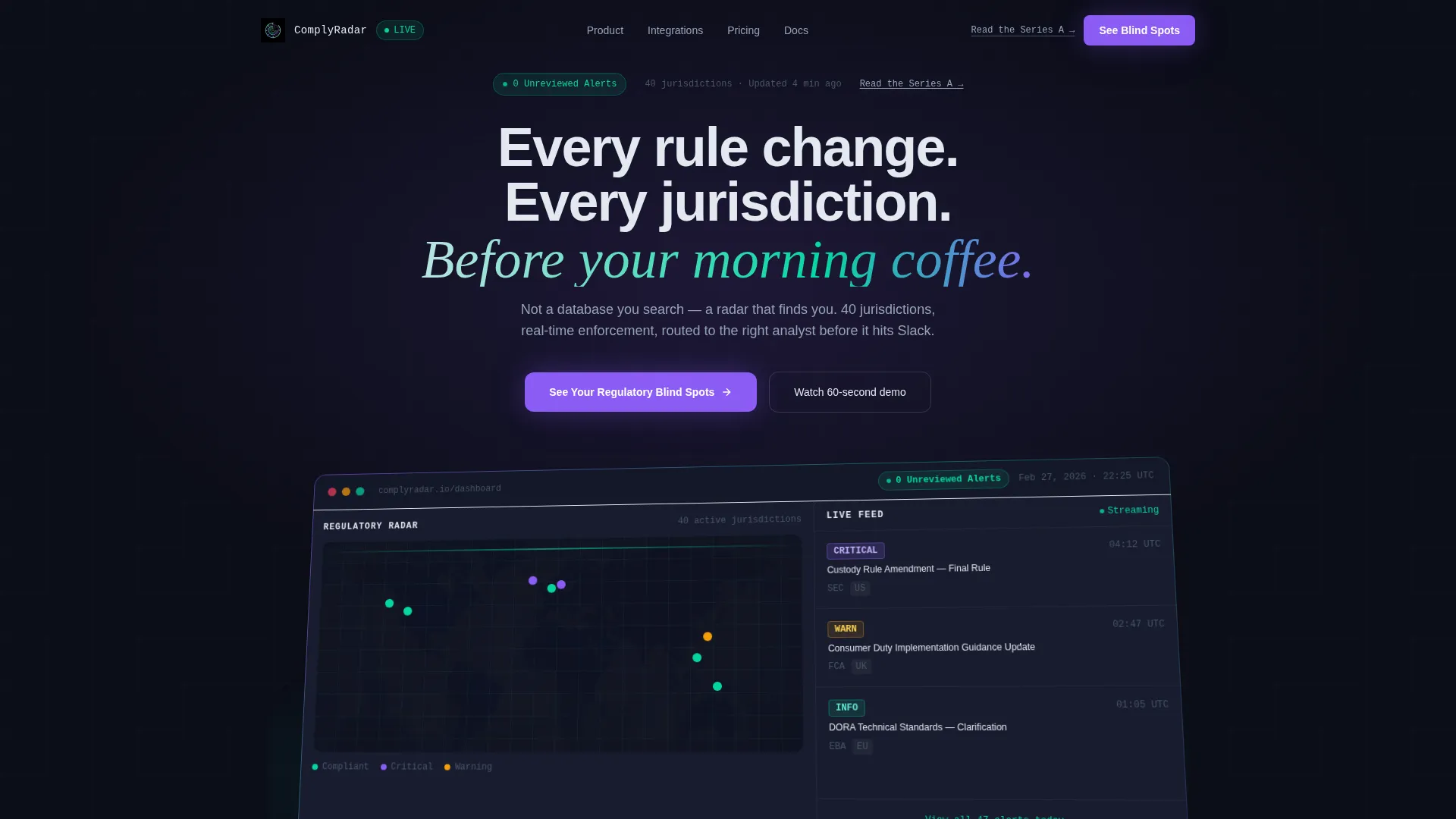
- A product screenshot header with iridescent particle animation, regulatory radar map, and severity-coded alert feed
- A three-column data comparison grid, a looping workflow video block, and a live integration connection diagram
- A persistent bottom call to action bar, a full-width demo button, and a secondary investor text link in the header
Feature list
This template ships with six purpose-built sections that move a technical buyer from curiosity to commitment. Each component is detailed below.
Live Regulatory Ticker Strip
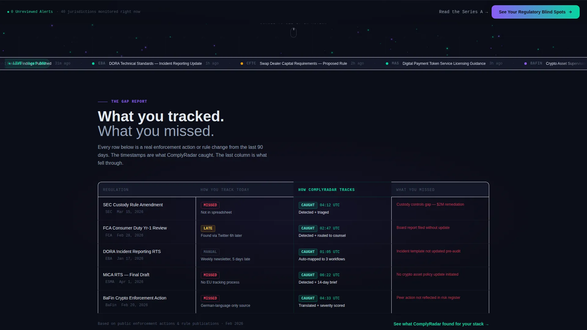
A full-width ticker running below the header displays real regulatory updates from the last 24 hours. It signals product activity immediately, before the buyer reads a single word of copy.
Three-Column Comparison Data Grid
A structured grid places "How you track today," "How Comply tracks," and "What you missed" side by side. Each row uses a specific regulation with real timestamps, making the value gap visible and concrete.
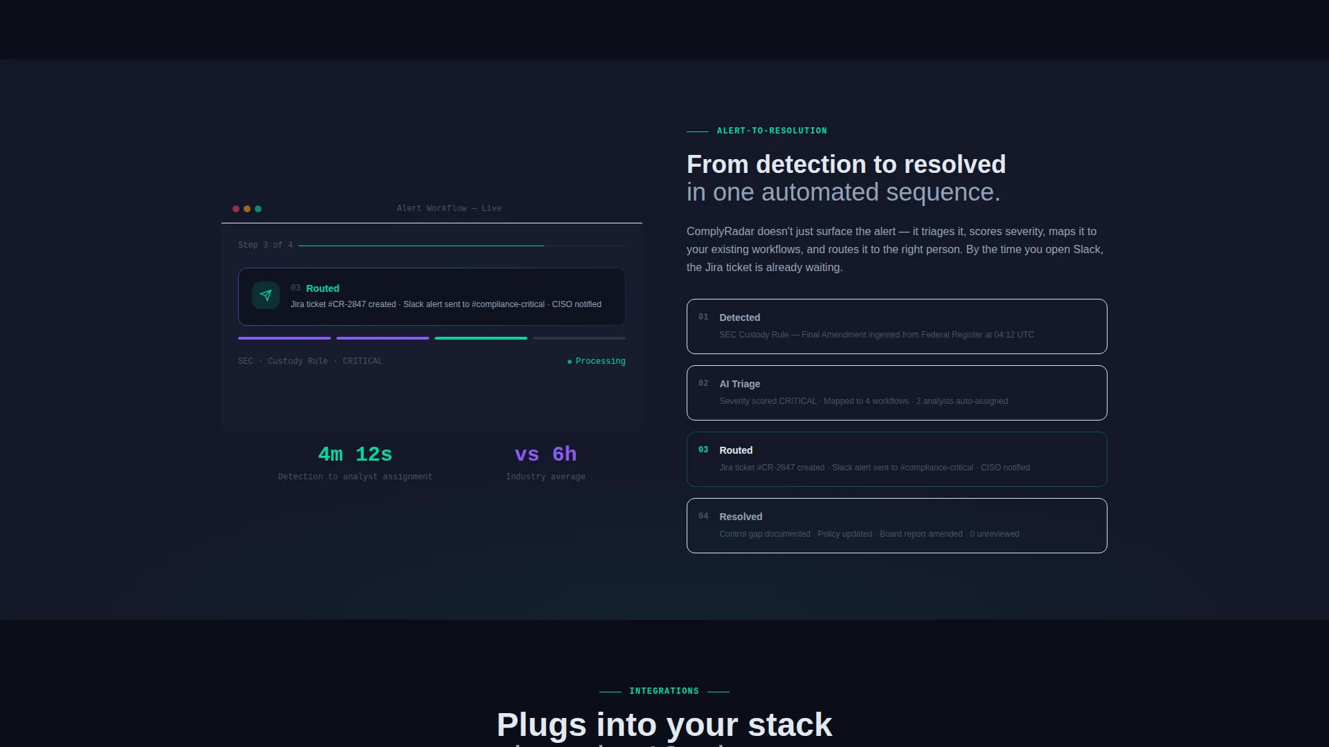
Looping Workflow Video Block
A fifteen-second, no-audio video loop shows a rule change being detected, triaged by AI, and routed to the right analyst. It demonstrates the alert-to-resolution workflow faster than any paragraph could.
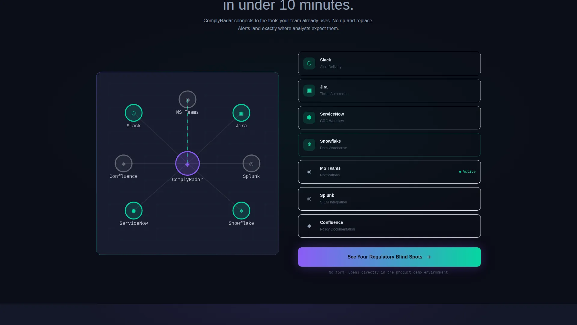
Live Integration Connection Diagram
Integration partners are shown as a pulsing node diagram rather than a static logo bar. Active connection lines between nodes reinforce that the platform is live and connected, not just compatible.
Persistent Demo call to action Bar
After the first scroll, a bottom bar reading "See Your Regulatory Blind Spots" stays on screen. It remains available without interrupting the buyer's reading flow.
Isometric Product Screenshot Header
The header occupies roughly 70 percent of the viewport at a slight isometric angle. Inside the screenshot: a regulatory radar map, a live enforcement feed with severity chips, and a top bar reading "0 Unreviewed Alerts" in green.
Page sections overview
| Section | Purpose |
|---|---|
| Isometric Header | Anchors credibility with a live-dashboard product screenshot |
| Headline Block | Delivers the core value promise above the screenshot |
| Particle Animation Layer | Adds AI-processing atmosphere without generic imagery |
| Regulatory Ticker Strip | Proves real-time product activity on first scroll |
| Comparison Data Grid | Quantifies the gap between manual tracking and Comply |
| Workflow Video Block | Shows alert-to-resolution flow in fifteen seconds |
| Integration Node Diagram | Visualizes live connections to key workflow tools |
| Primary call to action Button | Routes directly to the product demo environment |
| Persistent call to action Bar | Keeps the demo action available throughout the scroll |
| Investor Text Link | Offers a low-friction path for press and investor readers |
Design & branding system
The color system is built around an AI Iridescent palette that reads like a spacecraft cockpit, dark enough that every lit element carries meaning, iridescent enough that the intelligence layer feels alive.
- Void black (#0B0D17) as the primary background, holographic violet (#8B5CF6) for active states and AI insight badges, spectral teal (#06D6A0) for confirmed-safe compliance signals, and cool pearl (#E2E8F0) for body text and data labels
- Violet-to-teal gradients bleed subtly behind cards and chart containers, suggesting the AI layer without decorating it
- Micro-animations trigger on section load, each feeling like a system booting up and reinforcing that the product is live and running
Mobile & speed optimization
The template is structured for a focused single-page scroll experience with lean section layouts. Visual components are intentionally contained to keep the reading flow intact across screen sizes.
- The isometric product screenshot and data grid are sized to remain readable and proportional on smaller viewports
- Section-load micro-animations are designed as lightweight triggers rather than heavy render dependencies
- The persistent call to action bar is built as a fixed bottom element that stays usable without obstructing content on mobile screens
How this template helps you convert
The conversion logic in this template is sequential and deliberate. Each section earns the next click rather than asking for trust upfront.
- The live ticker and real enforcement data in the comparison grid prove the product is already working, so the buyer arrives at the call to action already convinced of relevance.
- The persistent bottom bar and full-width demo button both route to a product demo environment rather than a form, removing the single biggest drop-off point in B2B SaaS conversion flows.
Other information about this template
This template is categorized under Startup and Launch with a RegTech Series A niche focus. It is built around a Directory and Discovery theme with Launch Energy creative direction.
- The template style is Dashboard and Data Grid, making it well-suited for platforms that surface structured data as their core product experience
- The header concept is a Product Screenshot, which works especially well for compliance intelligence tools where seeing the actual interface builds immediate trust
- The landing page direction is Click-Through, meaning every call to action routes to a live product experience rather than a static form or gated PDF
- A secondary text link reading "Read the Series A Announcement" sits in the header as a low-friction entry point for investors and press visitors
- The AI Iridescent color system and iridescent particle drift are designed to communicate intelligence and precision without relying on overused neural-net or circuit-board imagery
Theme
Directory & Discovery
Creative direction
Launch Energy
Color system
AI Iridescent
Style
Dashboard/Data Grid
Direction
Click-Through
Page Sections
Isometric Product Screenshot Header
Live Regulatory Ticker Strip
Three-column Comparison Data Grid
Looping Workflow Video Block
Pulsing Integration Node Diagram
Persistent Demo Call to Action Bar
Related questions
Who is this landing page template designed for?
Can I replace the product screenshot with my own dashboard?
Does the template include the video content for the workflow block?
How does the integration node diagram work?
Is this template suitable for a crypto compliance or digital assets startup?



