Cinematic FIRE Community Waitlist Landing Page
Compound is a cinematic dark landing page template built for FIRE community waitlists. It presents as a full-viewport newspaper masthead, unfolds into a masonry pinboard of member content, and closes with a waitlist form. The design blends editorial gravitas with intimate financial storytelling, built for serious financial independence practitioners ready to stop lurking and start building.
by Rocket studio
Quick summary
Compound is a single-page waitlist template for financial independence communities. It opens with a broadsheet masthead, flows into an uneven masonry content preview, and drives signups through a purpose-built waitlist form. The cinematic dark palette, serif typography, and blurred members-only cards create a sense of earned exclusivity that converts curious visitors into committed founding members.
Who this template is for
This template is designed for founders and community builders in the FIRE (Financial Independence, Retire Early) space who want to launch a premium waitlist before opening their doors. It speaks directly to an audience that values substance over hype.
- Community founders launching a private FIRE membership or cohort-based program
- Financial educators building a serious alternative to free forums and subreddits
- High-earner content creators serving software engineers, dual-income households, and career changers pursuing financial independence
What problem this template solves
Generic waitlist pages do not communicate depth. A plain email capture form cannot convince a burned-out nurse or a software engineer with a 70% savings rate that this community is worth their trust. This template solves the credibility gap before the community even opens.
- Visitors arrive skeptical; the newspaper masthead and member milestones establish authority immediately
- A frosted-glass preview teases real community content without giving it away, creating desire rather than confusion
- The optional "What's your FI number?" input makes the signup feel personal, not transactional
What you get with this template
You get a fully structured, single-page waitlist landing page with five clearly defined sections, a cinematic visual identity, and high-animation interaction design. Every component is drawn from the source brief and built to serve one goal: turning a visitor into a founding-member signup.
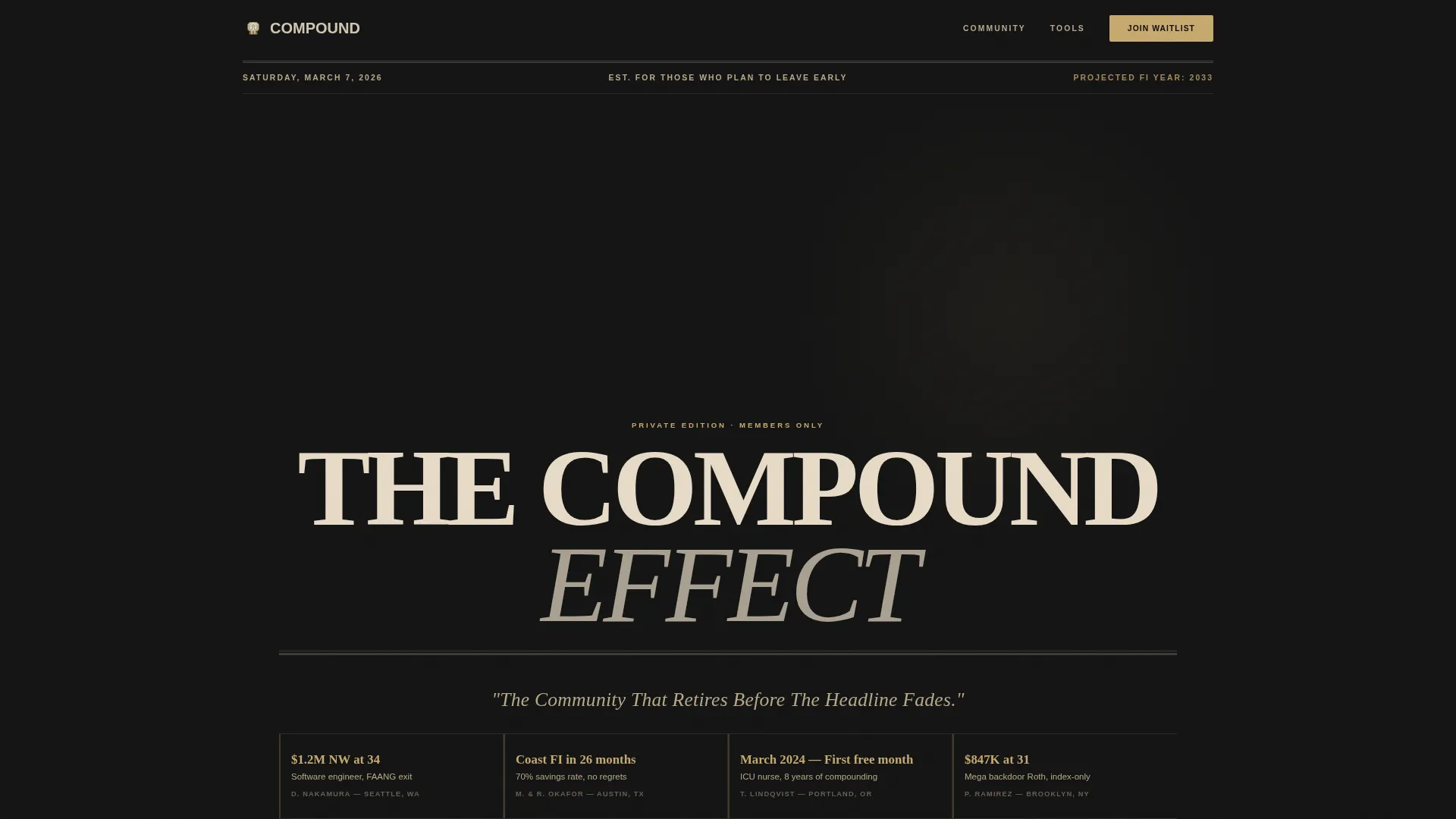
- A full-viewport newspaper masthead hero with member milestone editorial snippets below the fold line
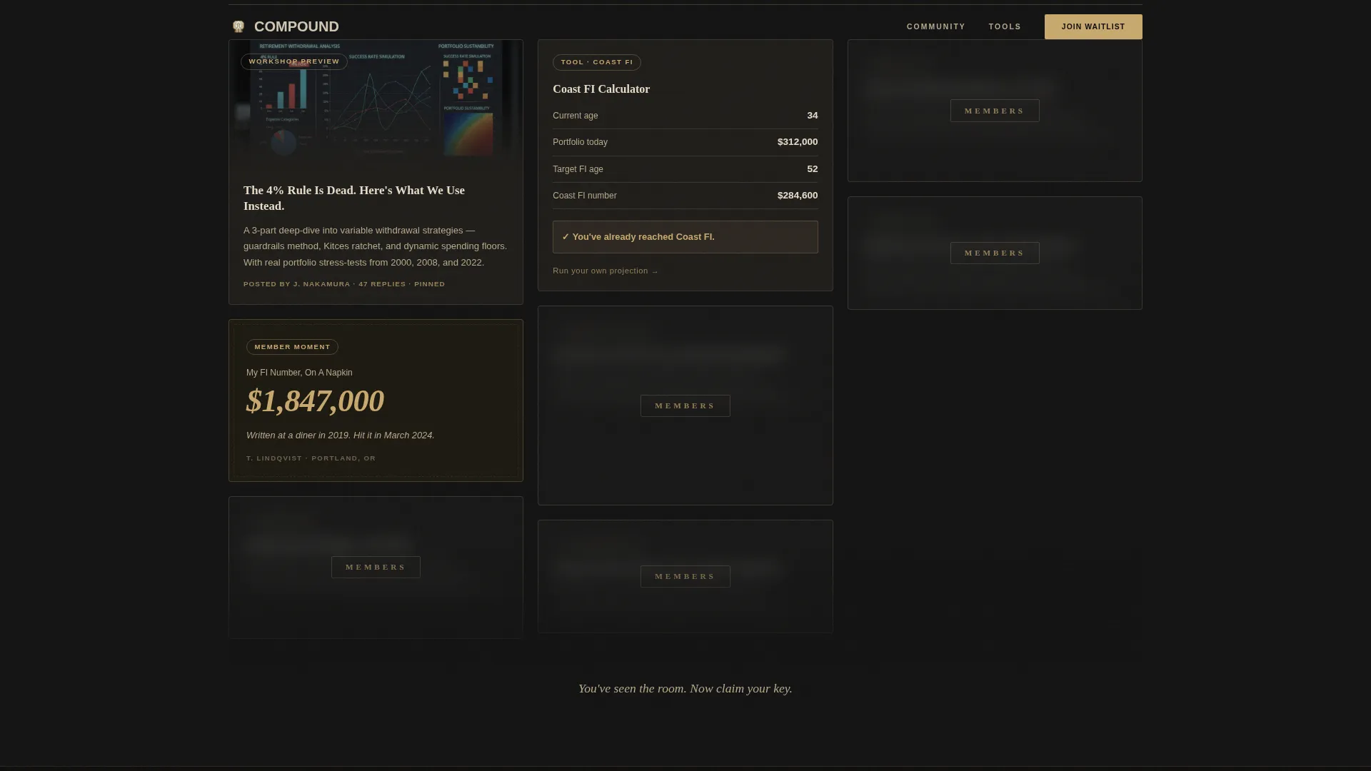
- A masonry preview section with three unlocked content cards and additional cards blurred behind a frosted-glass overlay
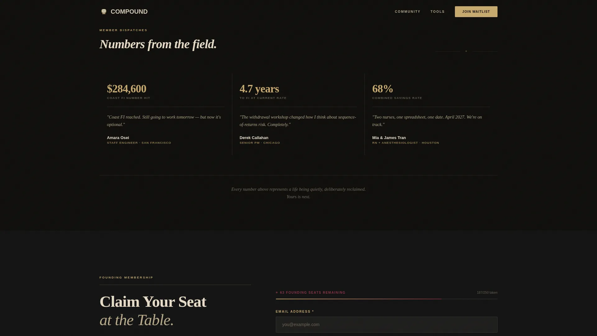
- A waitlist conversion section with an email field, an optional FI number input, and an animated capacity bar showing founding member slots
Feature list
This template packages several distinct, prompt-defined capabilities into one cohesive page.
Full-Viewport Newspaper Masthead Hero
The hero section renders as a broadsheet front page. "THE COMPOUND EFFECT" is typeset in Fraunces serif across the full viewport. A dateline implies the visitor's projected financial independence year. Member milestone snippets styled as editorial bylines sit below the fold line, with pull quotes referencing real figures like "$1.2M NW at 34" and "Coast FI reached in 26 months."
Masonry Pinboard Content Preview
The core scroll experience tiles unevenly like pinned notes on a studio wall. Three cards are fully unlocked and show real community content previews: a withdrawal strategy workshop, a savings rate leaderboard screenshot, and a coast FI calculator interface. Remaining cards carry a frosted-glass blur overlay with the word "Members" etched across them, making the locked content visible but just out of reach.
Waitlist Conversion Form with Capacity Bar
The primary call to action reads "Claim Your Seat at the Table." The form includes a single email field and an optional secondary input asking for the visitor's FI number. An animated capacity bar beneath the form shows founding member slots remaining, adding real urgency without relying on countdown timers.
Scroll-Linked Animation and Parallax Layers
The template is built for high interactivity. Scroll-linked reveals bring sections into view progressively. The masthead uses parallax layering. Masonry cards respond to hover states. The capacity bar animates on load. GSAP handles scroll effects while CSS animations cover the rest, keeping the experience fluid.
Mission Narrative with Asymmetric Columns
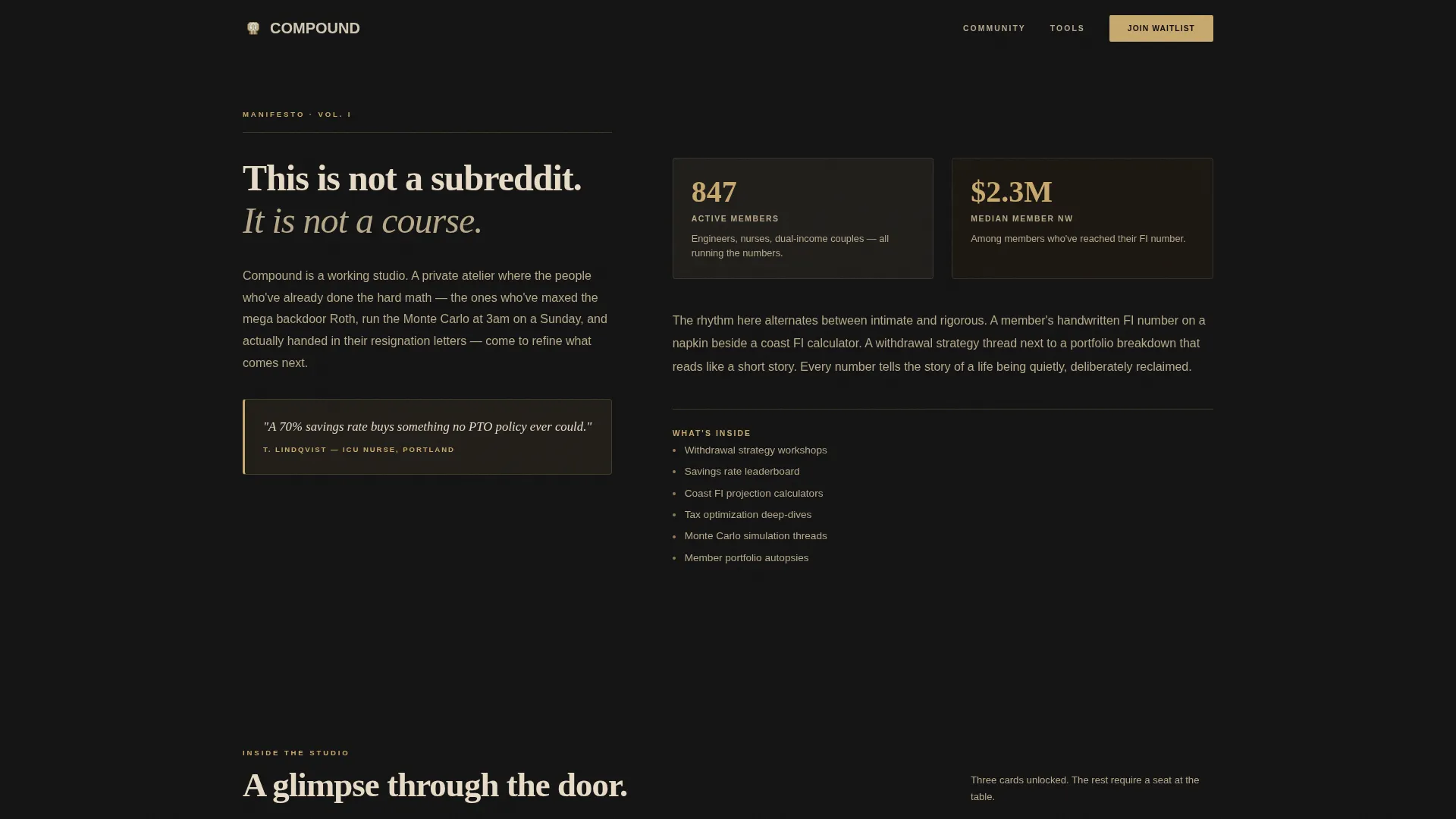
A dedicated narrative section follows the hero using asymmetric text columns. Pull quotes reinforce the "studio not subreddit" positioning. This section builds the emotional case for why the community exists and why it is different from free alternatives.
Arc Browser Split Footer
The footer follows a split layout: logo and tagline on the left, navigation links on the right. It closes the page cleanly without distraction, keeping the visitor's attention on the waitlist action above.
Page sections overview
| Section | Purpose |
|---|---|
| Newspaper Masthead Hero | Establish editorial authority and present member milestone snippets |
| Mission Narrative Columns | Communicate community positioning through asymmetric pull-quote layout |
| Masonry Content Preview | Tease community depth with unlocked and blurred member-only cards |
| Waitlist Conversion Form | Capture email and optional FI number with animated capacity bar |
| Social Proof Strip | Reinforce credibility through real member milestones styled as bylines |
| Arc Split Footer | Close the page with logo, tagline, and navigation links |
Design & branding system
The visual identity follows an Atelier Studio theme rendered in a Cinematic Dark color system. Every design decision reinforces the feeling of a private library at midnight, where every highlight is earned rather than given.
- Color palette: deep charcoal (#121212) canvas, warm parchment (#E8DCC8) for type and card surfaces, muted gold (#C9A96E) on interactive elements and accent borders, and burgundy (#6B2737) reserved for urgency moments like the capacity bar
- Typography: Fraunces serif for the masthead and all primary headlines; DM Sans for body text and user interface elements
- Texture and atmosphere: frosted-glass blur on locked cards, parallax masthead layers, cursor-reactive hero, and scroll-linked reveals that keep the cinematic dark mood consistent throughout
Mobile & speed optimization
The template is designed desktop-first, honoring the broadsheet newspaper metaphor that anchors the hero section. A graceful mobile fallback is included so the page remains usable on smaller screens without sacrificing the core visual identity.
- Static-first build approach: CSS animations handle the majority of motion, with GSAP used selectively for scroll effects to keep load weight low
- Masonry layout adapts to narrower viewports while preserving the pinboard rhythm and the frosted-glass overlay behavior on locked cards
How this template helps you convert
The template is engineered to move a skeptical, high-information visitor toward a single action: joining the waitlist.
- The newspaper masthead and member milestone snippets establish credibility in the first viewport, giving the visitor a reason to keep scrolling before a single word of sales copy appears
- The masonry preview creates desire through partial access: three unlocked cards show enough real community content to make the locked cards feel genuinely valuable, while the frosted-glass overlay and "Members" label make the ask feel natural rather than forced
- The capacity bar and optional FI number input personalize the conversion moment, making the visitor feel they are claiming a specific seat rather than submitting a generic form
Other information about this template
This template is built for the FIRE niche but the waitlist structure and cinematic editorial aesthetic can serve any premium community or membership launch. A few additional details worth knowing before you customize:
- American financial terminology is baked into the placeholder content, including references to Roth accounts, 401(k) structures, mega backdoor contributions, and Monte Carlo retirement simulations
- The page is localized for a United States audience using USD currency formatting and MM/YYYY date conventions
- The template style is classified as Masonry/Pinterest, meaning the card grid does not follow a uniform row-column structure; cards tile with intentional size variation to create visual rhythm
- The editorial snippets and member milestone figures shown in the template are placeholder examples intended to be replaced with real member data or community-specific social proof
Theme
Atelier Studio
Creative direction
Vision & Mission
Color system
Cinematic Dark
Style
Masonry/Pinterest
Direction
Waitlist/Coming Soon
Page Sections
Newspaper Masthead Hero Section
Masonry Pinboard Preview Grid
Waitlist Form with Animated Capacity Bar
Scroll-linked Animations and Parallax
Mission Narrative with Pull Quotes
Related questions
Can I use this template for a community that is not focused on FIRE?
How does the frosted-glass card overlay work?
Is the animated capacity bar connected to live signup data?
What does the optional FI number input field do?
Does the template include actual FIRE calculators or workshops?



