FIRE (Financial Independence) Content Reviews Website Template
Compound is a Financial Independence, Retire Early (FIRE) newsletter landing page built for publishers who write for serious, numbers-driven readers. The template combines an editorial magazine aesthetic with a focused lead generation layout. It features three signup form placements, a curated issue preview flow, social proof sections, and a sticky conversion bar, all wrapped in a warm, luxe minimal visual style.
by Rocket studio
Quick summary
Compound is a FIRE newsletter landing page template designed for calm, editorial-first subscriber acquisition. It pairs a cinematic half-page hero with a scrollable curated issue preview flow, three strategically placed signup forms, and a sticky bottom bar. The parchment and rust color system gives it the feel of a trusted financial almanac rather than a typical email capture page.
Who this template is for
This template is built for newsletter publishers who write about financial independence topics for an informed, high-earning audience. It suits creators who want their landing page to feel as considered as the content itself.
- FIRE newsletter writers targeting senior engineers, dual-income households, or physicians building replacement-income portfolios
- Personal finance content creators whose readers already understand concepts like index funds, tax-loss harvesting, and geographic arbitrage
- Independent publishers who need a polished, trust-building subscriber page without a complex setup
What problem this template solves
Most newsletter landing pages look like generic email capture forms. That approach repels sophisticated readers who associate cheap design with shallow content. This template solves the credibility gap between the quality of your writing and the first impression your page makes.
- Readers who already run the numbers need a page that matches their expectations before they hand over their email address
- Standard templates offer no sense of editorial depth, leaving visitors with no reason to subscribe beyond a vague promise
- This layout proves value before the signup by letting visitors read real issue previews and see subscriber social proof first
What you get with this template
You get a complete single-page layout purpose-built for FIRE newsletter subscriber acquisition. Every section is designed to build trust progressively as the reader scrolls.
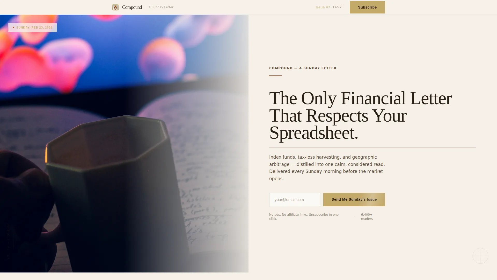
- A half-page hero with cinematic editorial photo area, headline, and inline signup form
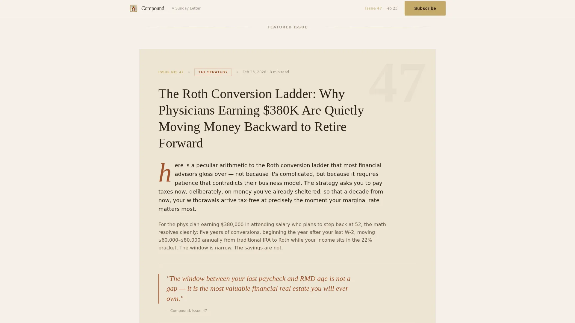
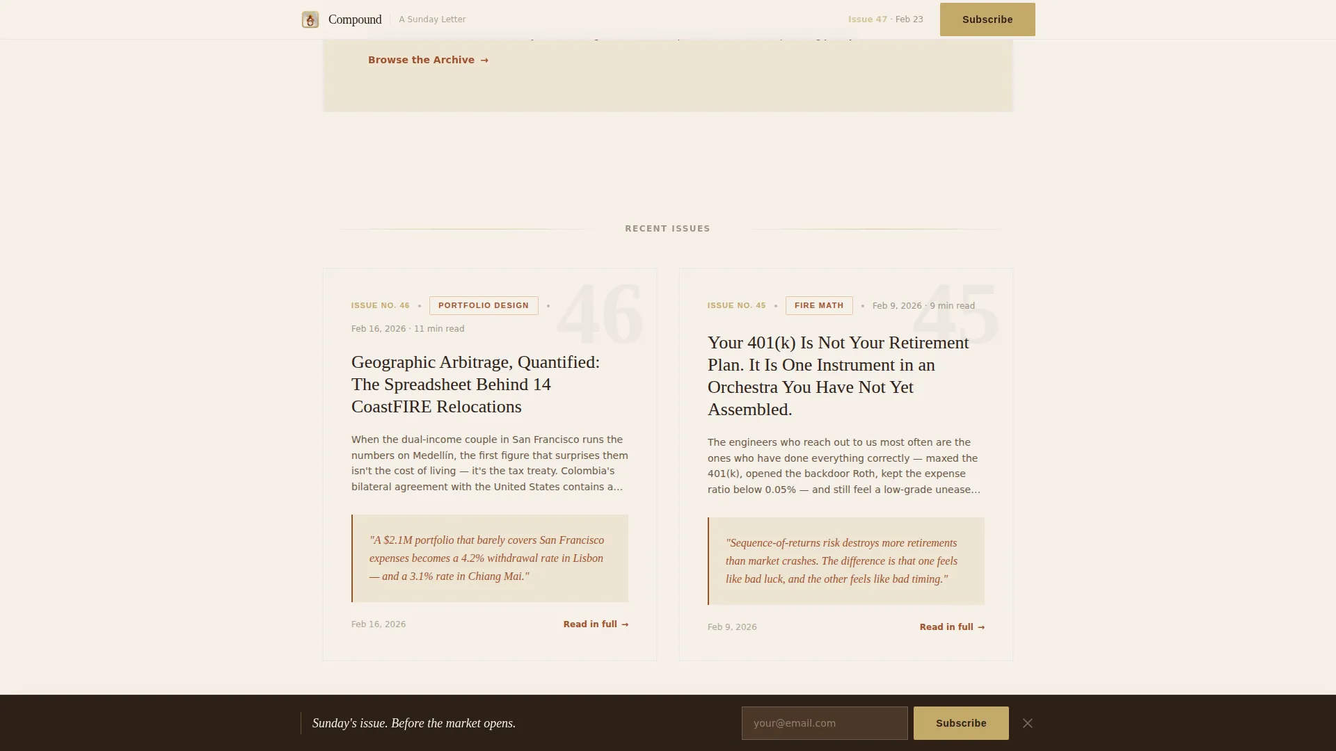
- A curated issue preview flow with drop cap cards, pull quotes, a two-column row, and a six-card archive grid
- Three signup form placements including a sticky bottom bar that activates after 40 percent scroll depth, plus an archive modal that gates full issue titles behind an email submission
Feature list
This template is built around six core capabilities drawn directly from the editorial and lead generation brief.
Half-Page Hero with Inline Signup
The hero splits the viewport into two balanced halves. The left side holds a full editorial photograph area. The right side carries the headline set in a refined serif display font, a supporting sentence, a rust-colored rule, and the first signup form with a single email field and a brass-colored submit button.
Curated Issue Preview Flow
The page scrolls like flipping through a typeset magazine. It opens with a single featured issue card using a large drop cap and category tag, followed by a two-column dual issue row with rust-colored pull quotes set against parchment panels. The sequence ends with a six-card issue grid that creates a visible sense of accumulated archive depth.
Three-Placement Signup System
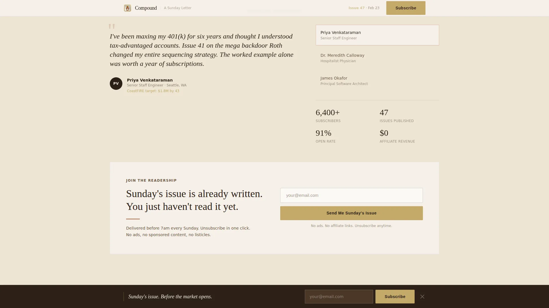
The primary call to action, "Send Me Sunday's Issue," appears three times: in the hero, mid-scroll above a social proof block, and inside the sticky bottom bar. This ensures the conversion opportunity is always within reach without feeling aggressive.
Social Proof Block with Subscriber Milestones
A dedicated section sits directly above the mid-page signup form. It displays role-based testimonials and subscriber portfolio milestones with specific context. This gives prospective subscribers a concrete, trust-building reason to act at the exact moment conversion intent is highest.
Sticky Bottom Conversion Bar
A slim signup bar activates after the reader has scrolled through 40 percent of the page. It stays visible during continued scrolling and disappears naturally on scroll back up. This passive prompt catches readers who are engaged but not yet ready to commit.
Gated Archive Modal
A secondary call to action labeled "Browse the Archive" opens a modal overlay. It displays redacted issue titles: visible enough to demonstrate depth and editorial range, but gated behind the signup to make the full list an earned reward.
Page sections overview
| Section | Purpose |
|---|---|
| Hero: Photo + Signup | Establish editorial tone and capture early sign-ups |
| Featured Issue Card | Showcase a single issue with drop cap and category tag |
| Dual Issue Row | Display two issues side by side with rust pull quotes |
| Social Proof + Form | Build credibility and present the second signup form |
| Six-Card Issue Grid | Demonstrate archive depth and accumulated value |
| Sticky Bottom Bar | Passive persistent conversion prompt after 40% scroll |
| Minimal Footer | Close the page with clean horizontal editorial layout |
Design & branding system
The visual identity follows a Luxe Minimal editorial direction. The palette and type choices evoke a first-edition financial almanac: unhurried, precise, and built to be kept.
- Color system: aged parchment (#F5F0E8) background, deep walnut ink (#2C2118) for body text and headlines, oxidized rust (#A0522D) for pull quotes and accent borders, and muted brass (#C4A96A) for buttons, issue numbers, and hover states
- Typography: Fraunces serif display at 72px for the hero headline, DM Sans for body text and interface elements, creating a clear editorial hierarchy
- Scroll-linked reveal animations and a shimmer effect on the call to action button add motion without distracting from reading
Mobile & speed optimization
The template is designed desktop-first to match the working habits of its primary audience, with a solid and fully considered mobile layout for readers on the go.
- Desktop-first layout proportions ensure the half-page hero, dual-column issue rows, and six-card grid render with full editorial intent on larger screens
- Server Components handle static sections to keep client-side JavaScript minimal, supporting fast initial render across devices
- The sticky bottom bar, archive modal, and scroll-linked animations are scoped to lightweight interactions that do not bloat the page
How this template helps you convert
Every design and layout decision supports one goal: turning a curious reader into a confirmed subscriber.
- The three-placement signup system keeps the "Send Me Sunday's Issue" form visible at the hero, mid-scroll, and via the persistent sticky bar, so the ask is always present without being intrusive.
- The issue preview flow builds progressive trust by letting readers experience the quality and depth of the newsletter before committing, making the email submission feel like a natural next step rather than a cold request.
Other information about this template
This template is a strong fit for publishers building a premium Financial Independence, Retire Early content brand. A few additional details worth knowing before you get started:
- The template style is Editorial/Magazine, making it suitable for content brands that prioritize reading experience alongside subscriber growth
- The creative direction is Curated Collection, meaning the scroll rhythm is intentionally paced to simulate flipping through back issues of a quality publication
- The header concept is a Half-Page Photo and Text composition, so you will want a high-quality editorial photograph to occupy the left viewport
- The lead generation direction means every section has been sequenced to move readers from awareness to action rather than simply displaying information
- The parchment and rust color system is fully applied across all interactive and static states, so the brass hover on the call to action button and the rust rule beneath the headline are already built in
- This template is localized for English language content, United States dollar references, and United States date formats
Theme
Luxe Minimal
Creative direction
Curated Collection
Color system
Parchment & Rust
Style
Editorial/Magazine
Direction
Lead Generation
Page Sections
Half-page Editorial Hero
Curated Issue Preview Flow
Three-placement Signup System
Social Proof with Portfolio Milestones
Gated Archive Modal
Sticky Bottom Conversion Bar
Related questions
How many times does the signup form appear on the page?
What is the archive modal and how does it work?
Who is this landing page template designed for?
What does the social proof section include?
What typography and color choices does the template use?



