Trusted Biotech Solutions Landing Page Template
Formulary is a heritage editorial landing page template built for pharmaceutical thought leadership publishers. It combines a 19th-century scientific journal aesthetic with a modern, high-interactivity layout. The page features a curated thematic collection structure, a seven-question evidence gap assessment, and an author credentials section, all designed to position your publication as an authoritative institution in drug lifecycle analysis.
by Rocket studio
Quick summary
Formulary is a single-page editorial template for pharmaceutical thought leadership. It presents long-form content across four thematic issue sections, drives engagement through a seven-question progressive diagnostic, and converts readers into subscribers or assessment completers. The Heritage and Story visual identity makes every scroll feel like leafing through a first-edition medical journal.
Who this template is for
This template is built for publishers, agencies, and content teams operating at the intersection of pharmaceutical science and strategic communication. It suits organizations that produce rigorous, practitioner-authored analysis rather than general health content.
- Medical affairs teams and former regulatory professionals publishing practitioner-grade editorial
- Pharmaceutical strategy consultancies launching a thought leadership content channel
- Specialty media brands covering drug lifecycle management for senior industry audiences
What problem this template solves
Generic blog templates cannot carry the credibility weight that pharmaceutical professionals expect. Readers in this field arrive with skepticism. A template that looks like a marketing site immediately signals low value. The result is high bounce rates and no subscriber growth.
- Most editorial templates lack the structural depth to organize content into thematic issues with editorial framing
- There is no standard mechanism to qualify readers by role and strategic priority before asking for their contact details
- Pharma-adjacent audiences respond to institutional trust signals that consumer blog formats simply cannot provide
What you get with this template
The template delivers a complete single-page editorial experience with five major layout zones and two distinct conversion paths. Everything is structured to reward slow, deliberate reading while still moving goal-oriented visitors toward a clear next step.
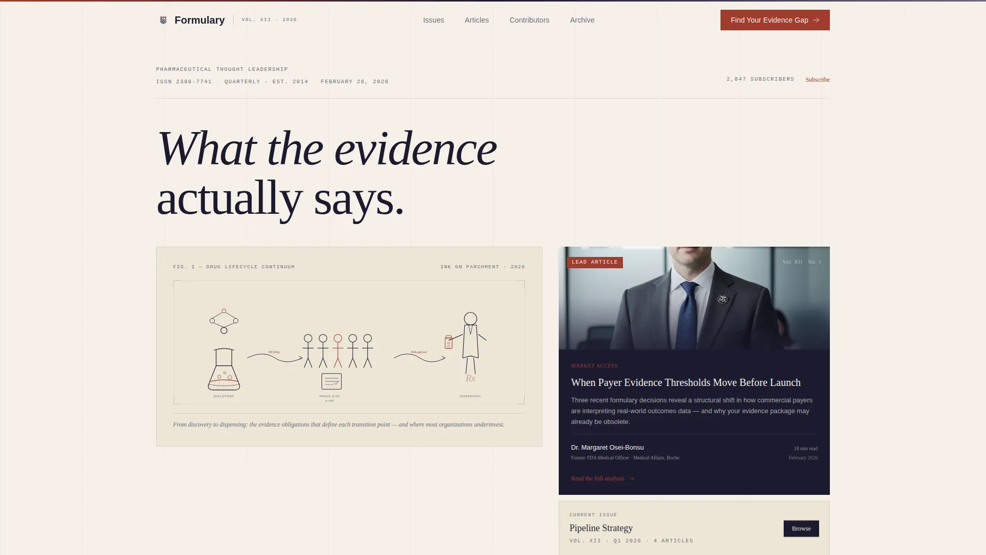
- A hero section with a bento editorial grid, a featured article spotlight, and a floating Latest Issue card
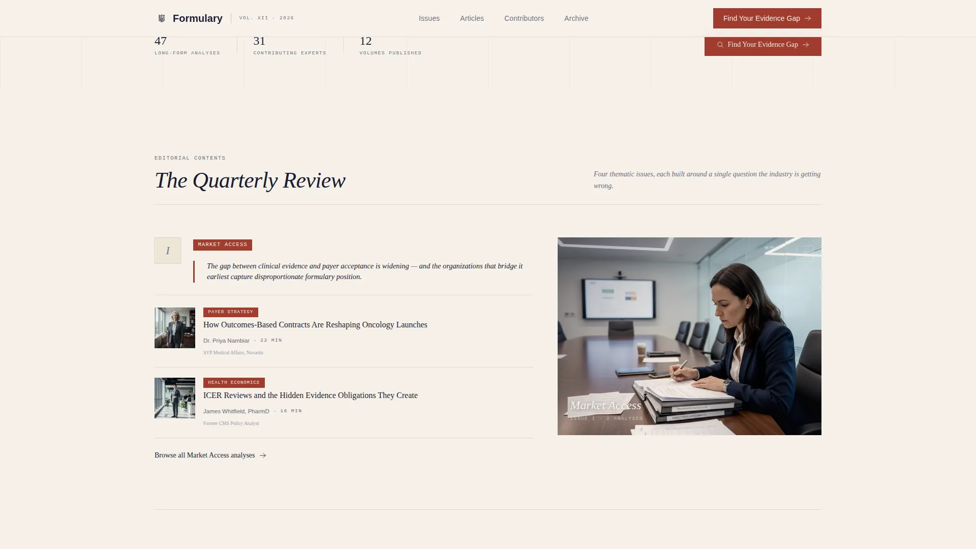
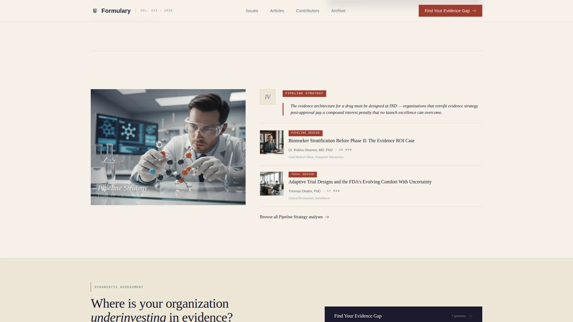
- Four thematic issue sections each introduced by an illustrated vignette and a one-sentence editorial thesis
- A seven-question progressive evidence gap assessment gated behind an email and company name field, plus a lower-friction quarterly subscription prompt
Feature list
A crisp paragraph introduces the feature set: every component listed below is built directly from the template brief, serving the specific reading habits and conversion goals of senior pharmaceutical professionals.
Curated Thematic Issue Structure
The scroll is organized as a literary table of contents across four editorial sections: Market Access, Regulatory Intelligence, Real-World Evidence (RWE), and Pipeline Strategy. Each section opens with an illustrated vignette and a single editorial thesis sentence, giving the page the cadence of a quarterly review rather than a feed.
Seven-Question Evidence Gap Assessment
The primary call to action is a progressive diagnostic titled "Find Your Evidence Gap." Questions use progressive disclosure, starting with therapeutic area, then role, then strategic priority. Results are personalized and delivered as a one-page brief, gated behind an email address and company name.
Article Cover Cards with Author Credentials
Featured articles are presented as editorial cover cards. Each card displays estimated reading time, author credentials such as former FDA reviewer or medical affairs director, and a single provocative subheadline. Social proof is embedded at the content level, not isolated to a separate testimonial section.
Cross-Hatched Header Illustration
The hero section features a custom, hand-drawn cross-hatched illustration rendered in the style of 19th-century scientific engravings. The scene depicts a molecule's journey across its lifecycle, from a chemist's flask through a clinical trial cohort to a pharmacist dispensing to a patient. A serif headline fades in below with the phrase "What the evidence actually says."
Dual Conversion Path Architecture
The template supports two parallel conversion flows. The evidence gap assessment captures high-intent visitors willing to share professional context. The quarterly subscription prompt requires only an email address, lowering the barrier for readers who are not yet ready for the full diagnostic.
GSAP Scroll Animations and Staggered Cards
The template includes medium-weight animation using GSAP scroll reveals, staggered article card entrances, and a parallax effect on the header illustration. Interactivity is reserved for the quiz component and animations; the rest of the page renders as static content for reliable load behavior.
Page sections overview
| Section | Purpose |
|---|---|
| Hero Editorial Grid | Anchors the page with featured article, floating Latest Issue card, and serif headline |
| Thematic Issue One | Introduces Market Access editorial section with vignette and thesis |
| Thematic Issue Two | Introduces Regulatory Intelligence section with inline assessment prompt |
| Thematic Issue Three | Introduces Real-World Evidence section with article cover cards |
| Thematic Issue Four | Introduces Pipeline Strategy section with article cover cards |
| Evidence Gap Assessment | Seven-question progressive diagnostic with email and company name gate |
| Contributors Section | Author credibility display with credentials and role context |
| Page Footer | Arc Browser Split layout with logo and tagline left, navigation links right |
Design & branding system
The visual identity follows a Heritage and Story theme built around the Ink and Paper color system. The palette is drawn from the physical language of manuscript editing, referencing the look of a marked-up galley proof on a mahogany editor's desk.
- Colors: parchment (#F5F0E8) as the dominant background, deep manuscript ink (#1B1B2F) for headlines and pull quotes, marginalia red (#A03C2F) for interactive elements and byline accents, and annotation graphite (#6B6B7B) for body text and column dividers
- Typography: Fraunces serif for headlines to reinforce the institutional tone, DM Sans for body text to maintain readability, and JetBrains Mono for metadata fields like reading time and article date
- Decorative details follow 19th-century scientific engraving conventions, including dense linework, cross-hatching, and fine rules between content columns
Mobile & speed optimization
The template is designed with a desktop-first priority, reflecting the reality that its core audience reads at enterprise workstations rather than on mobile devices. The layout is structured to deliver the full editorial experience at larger viewport widths.
- Static-first rendering ensures the page loads as lightweight HTML; client-side JavaScript activates only for the quiz component and GSAP animations
- The bento grid, cover cards, and thematic section layouts are structured to reflow cleanly at tablet and mobile breakpoints without losing editorial hierarchy
How this template helps you convert
The conversion architecture is layered deliberately. Casual readers are eased into engagement before being asked for personal details.
- The inline evidence gap prompt appears after the second thematic section, catching readers who have already demonstrated interest by scrolling through two full issue blocks before asking them to self-assess
- The gated results mechanic exchanges a personalized one-page brief for an email address and company name, making the value of sharing contact details explicit and immediate
- The lower-friction quarterly subscription prompt provides a parallel path for readers who want to stay connected without committing to the full diagnostic
Other information about this template
This template is well suited for teams building a pharmaceutical thought leadership blog that needs to signal institutional depth from the first visit. The layout borrows editorial conventions from print medical journals and applies them to a digital single-page format.
- The desktop-first build reflects an enterprise professional audience; the template is localized for English-language content using United States date formats and currency conventions
- Article read counts and subscriber counts are included as social proof elements alongside author credentials, supporting the sense that the publication has an established readership
- The footer follows the Arc Browser Split pattern, keeping the logo and tagline prominent on the left while navigation links sit cleanly on the right

Theme
Heritage & Story
Creative direction
Curated Collection
Color system
Ink & Paper
Style
Editorial/Magazine
Direction
Quiz/Assessment
Page Sections
Curated Thematic Issue Structure
Seven-question Evidence Gap Assessment
Article Cover Cards with Author Credentials
Cross-hatched Header Illustration
Dual Conversion Path Architecture
GSAP Scroll Animations and Staggered Cards
Related questions
Who is the intended reader for a Formulary-style publication?
How does the evidence gap assessment work?
Can I organize different types of pharmaceutical content with this template?
Is there a lower-friction option for visitors not ready to complete the assessment?
What makes this template look different from a standard pharmaceutical blog?



