Luxe Hospitality Review Blog Landing Page Template
Concierge is a masonry-style hospitality review landing page built for editorial blogs covering elite hotels, restaurants, and hidden bars. A collage hero, Pinterest-style critic cards, a full-width video spotlight, and a five-question travel style quiz work together to pull readers into a community of taste and convert them into loyal newsletter subscribers.
by Rocket studio
Quick summary
Concierge is a single-page hospitality review template designed for discerning editorial platforms. It layers a scrapbook-style hero, a masonry critic grid, a featured video panel, and a personalized travel style quiz into one cinematic dark canvas. The goal is simple: turn a curious visitor into a newsletter subscriber who feels seen before being asked for anything.
Who this template is for
This template is made for editorial voices with a strong point of view on luxury travel and dining. It suits independent critics and curated review platforms that want their content to feel handcrafted, not algorithmic.
- Hospitality review bloggers and travel editors publishing critic-led content
- Luxury-curious creatives building aspirational destination guides
- Editorial teams running multi-critic platforms that need a structured, browsable grid
What problem this template solves
Most hospitality blog templates feel either too generic or too corporate. They bury the critic's voice behind stock imagery and templated layouts that look like every other travel site. Concierge solves the credibility gap.
- Critic identity is front and center, with named portraits, star ratings, and gold italic verdicts on every card
- Visitors have no clear path to content that matches their taste, so they leave without subscribing
- A standard static page cannot pace a reader between browsing many reviews and pausing on one standout property
What you get with this template
You get a fully structured landing page that moves visitors through discovery, connection, and conversion in one uninterrupted scroll. Every section has a distinct job, and nothing is decorative without purpose.
- A collage hero with polaroid-style overlapping images, a typewriter headline, and boarding pass details
- A masonry review grid with critic portraits, signature property photos, verdict quotes, and star micro-ratings
- A five-question visual travel style quiz that delivers a personalized hospitality profile with three matched reviews and a newsletter opt-in
Feature list
This template is built around five core capabilities drawn directly from the brief.
Collage Scrapbook Hero
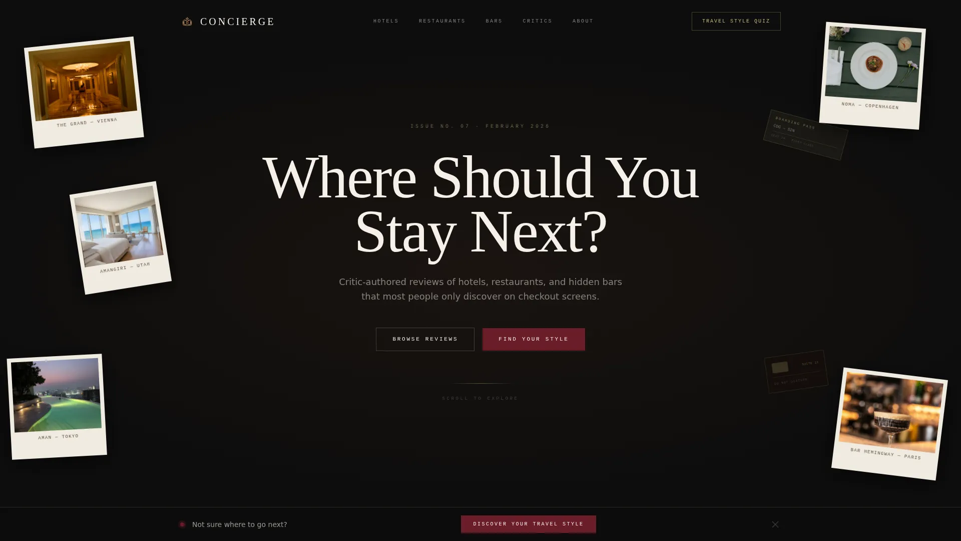
The header layers overlapping polaroid photographs of hotel lobbies, plated dishes, and rooftop pools against a deep black canvas. A boarding pass stub and a room key card appear tucked behind other elements. The headline "Where Should You Stay Next?" renders letter by letter using a typewriter animation, evoking an intimate, handwritten editorial tone.
Masonry Critic Review Grid
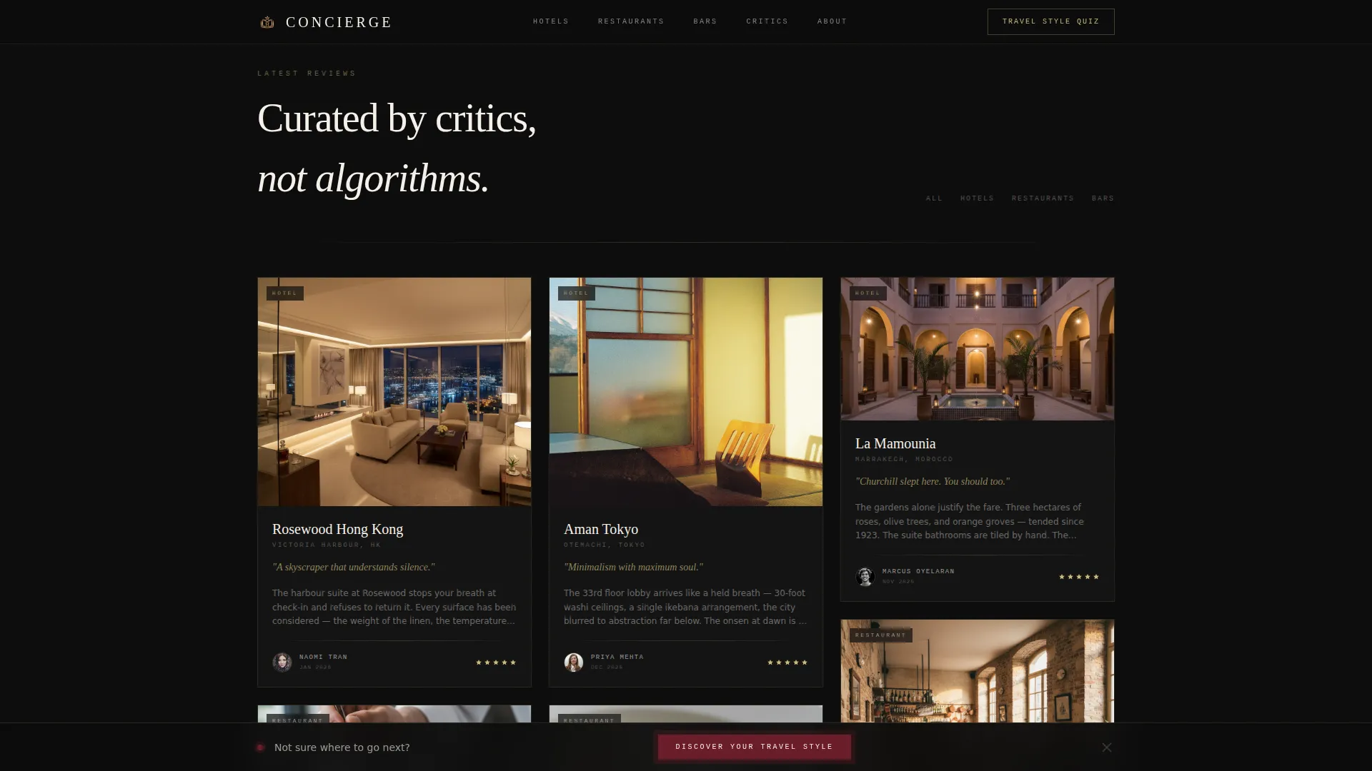
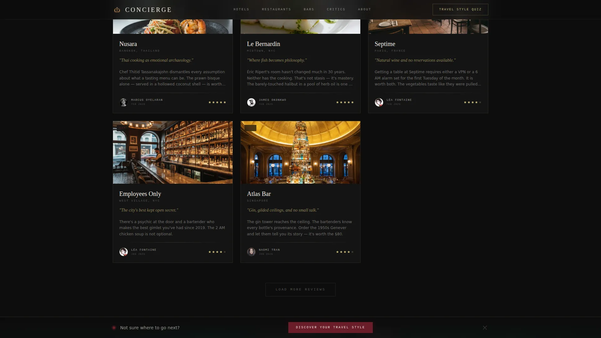
Review cards are arranged in a Pinterest-style masonry grid. Each card shows a named critic with a circular portrait, a single signature property photograph, a one-line verdict in gold italic, and a star micro-rating. Staggered scroll reveals animate cards into view as visitors move down the page.
Full-Width Featured Video Panel
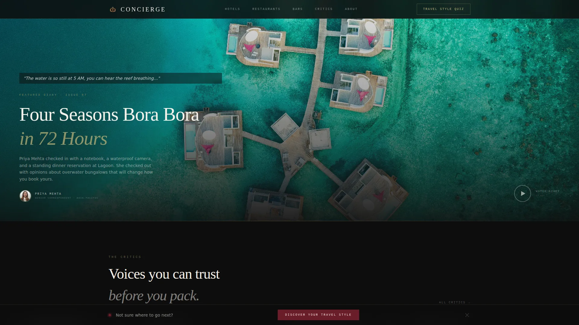
The grid rhythm breaks occasionally for a full-width spotlight panel. A featured critic's short video diary from inside a property plays on autoplay with the sound muted. Ivory subtitles appear over a dark overlay, giving the panel a cinematic quality that slows the scroll and builds trust through a single voice.
Five-Question Travel Style Quiz
A sticky bottom bar pulses with the burgundy accent after three seconds of scroll, anchoring the primary call to action: "Discover Your Travel Style." Clicking opens a modal quiz with five visual questions covering room view preference, dinner format, travel pace, budget comfort zone, and a dream destination text field. Results deliver a personalized hospitality profile card with three matched property reviews.
Personalized Newsletter Opt-In
The quiz result card includes a newsletter opt-in that is pre-checked by default, set to deliver weekly reviews matched to the visitor's profile. The opt-in earns the click by making the visitor feel understood first, then asking for their email address.
Horizontal Critic Roster
A horizontally scrolling section near the footer introduces the full critic roster. Each critic appears with a signature photograph, allowing visitors to browse contributors quickly and choose whose voice resonates most before reading full reviews.
Page sections overview
| Section | Purpose |
|---|---|
| Hero Collage Header | Opens with layered polaroid imagery, typewriter headline, and boarding pass details to set editorial tone |
| Masonry Review Grid | Displays critic-authored review cards with portraits, verdicts, and star ratings in a browsable Pinterest layout |
| Featured Video Spotlight | Full-width autoplay muted video diary panel that pauses the scroll rhythm and deepens engagement |
| Travel Style Quiz | Five-question visual assessment that delivers a personalized hospitality profile and matched review results |
| Horizontal Critic Roster | Scrollable strip of named critics and signature shots near the footer for contributor discovery |
| Footer | Horizontal flow footer pattern wrapping navigation, newsletter context, and closing brand details |
Design & branding system
The visual identity is built on a Luxe Minimal aesthetic inside a Cinematic Dark color system. Every design decision reinforces an editorial, almost filmic quality that feels earned rather than assembled.
- Color palette: deep screening-room black (#0D0D0D) for all backgrounds, warm ivory (#F5F0E8) for body text, muted champagne gold (#C9B97A) for section dividers and bylines, and theatre-curtain burgundy (#6B1D2A) reserved exclusively for hover states and active links
- Typography: Fraunces serif for headlines, DM Sans for body copy, and JetBrains Mono for bylines and labels, creating a layered editorial hierarchy
- Decorative details include torn-edge masking on hero images, slight rotation on polaroid-style photographs, gold trace dividers, and a dark corkboard texture that makes every element feel hand-pinned
Mobile & speed optimization
The template is designed desktop-first to match the browsing behavior of a luxury audience, with a polished mobile experience built in. Animation and interactivity scale responsibly across screen sizes.
- Intersection Observer triggers are used for masonry scroll reveals and staggered card entry animations, so elements load into view as the visitor reaches them
- CSS scroll-behavior and optimized image handling keep the visual experience smooth without sacrificing the layered detail the Cinematic Dark palette requires
- The sticky quiz bar and video autoplay panel are designed to behave cleanly on both large desktop viewports and scaled mobile screens
How this template helps you convert
Every layout decision in Concierge serves the same conversion goal: a newsletter subscription that feels earned, not forced.
- The quiz call-to-action pulses into view after three seconds of scroll, meeting the visitor at the moment of engagement rather than demanding attention on arrival, which reduces friction and increases click-through to the quiz modal.
- The five-question quiz personalizes the result before asking for an email address, so when the newsletter opt-in appears pre-checked on the profile card, the visitor already feels the platform understands their taste.
- The masonry grid and featured video panel build credibility through named critics and intimate property coverage, giving the visitor enough trust in the editorial voice to want more of it in their inbox each week.
Other information about this template
This template is a strong fit for editorial platforms that want to differentiate on voice and curation rather than volume. A few additional details worth noting before you start building.
- The template supports international property locations, with content written in English and pricing context in USD
- The footer uses a horizontal flow pattern that suits platforms with multiple critic contributors and review categories
- The quiz modal includes a pre-checked newsletter opt-in by default; this default state should be reviewed against applicable email marketing consent requirements for your audience's jurisdiction
- The masonry layout and scrapbook visual language translate well to social sharing, particularly for audiences who discover content through image-driven platforms
- The template is built as a single landing page and does not include multi-page routing or internal blog archive pages out of the box
Theme
Luxe Minimal
Creative direction
Creator Spotlight
Color system
Cinematic Dark
Style
Masonry/Pinterest
Direction
Quiz/Assessment
Page Sections
Collage Scrapbook Hero
Masonry Critic Review Grid
Full-width Video Spotlight Panel
Five-question Travel Style Quiz
Personalized Newsletter Opt-in
Horizontal Critic Roster
Related questions
Who is the Concierge template best suited for?
Does the template include the travel style quiz functionality?
Can I use the template with multiple named critics or contributors?
Is the featured video spotlight section required?
What typography does the template use?



