Conduit - Powerful Submarine Cable Landing Page Template
Conduit is a bold brutalist landing page template built for submarine cable operators. It opens with an oversized stats wall, then guides visitors through a progressive scroll reveal featuring a network topology map, a rigid capability comparison grid, and a redundancy architecture section. The page drives toward an app download with dual call-to-action paths for active customers and new prospects.
by Rocket studio
Quick summary
Conduit is a single-page scroll reveal template designed for submarine cable operators. It leads with raw infrastructure metrics, then progressively unlocks a feature matrix that doubles as a product preview. Two conversion paths run in parallel: a direct app download for customers with active circuits, and a demo request form for prospects still evaluating capacity options.
Who this template is for
This template is built for organizations that operate or sell access to subsea fiber infrastructure. It speaks directly to technically sophisticated buyers who evaluate vendors on hard data, not marketing language.
- Submarine cable operators marketing lit fiber capacity to enterprise and hyperscale clients
- Carrier and telecom teams offering dark fiber leases or wavelength services across ocean routes
- Network operations teams that need a public-facing page to drive adoption of their monitoring app
What problem this template solves
Most telecom landing pages either overwhelm visitors with jargon or undersell the actual depth of the network. Conduit solves both problems. It leads with proof, raw numbers, and then earns deeper attention through a structured, progressive reveal.
- Visitors with no active context leave before they understand the offer
- Technical buyers distrust vague claims and need verifiable metrics up front
- Prospects considering a demo need a clear secondary path that does not interrupt the primary conversion flow
What you get with this template
You get a fully structured, single-page scroll reveal layout with every section pre-built and ready to customize. The template covers the full buyer journey from first impression to conversion action.
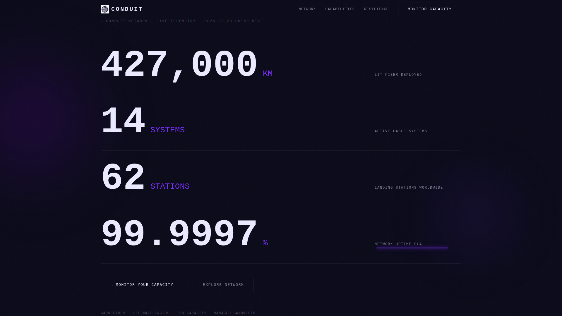
- A stats and metrics header block with oversized monospaced typography and an animated violet pulse on the uptime figure
- A three-phase feature matrix with a topology map, a comparison grid, and a redundancy architecture section
- Two conversion zones: a ghost button in the header and a full-width call-to-action slab after the feature matrix
Feature list
This template includes six purpose-built sections that work together as one continuous experience. Each section is designed to hold a specific layer of information and advance visitor trust at the right moment.
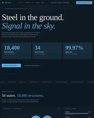
Oversized Stats Header Block
The header contains no image and no illustration. Four infrastructure metrics render in oversized monospaced type on an abyssal black background. A single violet underline animates beneath the uptime figure like a live pulse signal, giving the page immediate technical credibility before any scroll occurs.
Progressive Scroll Reveal Architecture
The page uses a scroll reveal pattern that releases information in layers. Content blocks appear as the visitor scrolls, creating a sense of earned access. Each section feels denser and more detailed than the one before it, matching the mental model of moving deeper into a secured network environment.
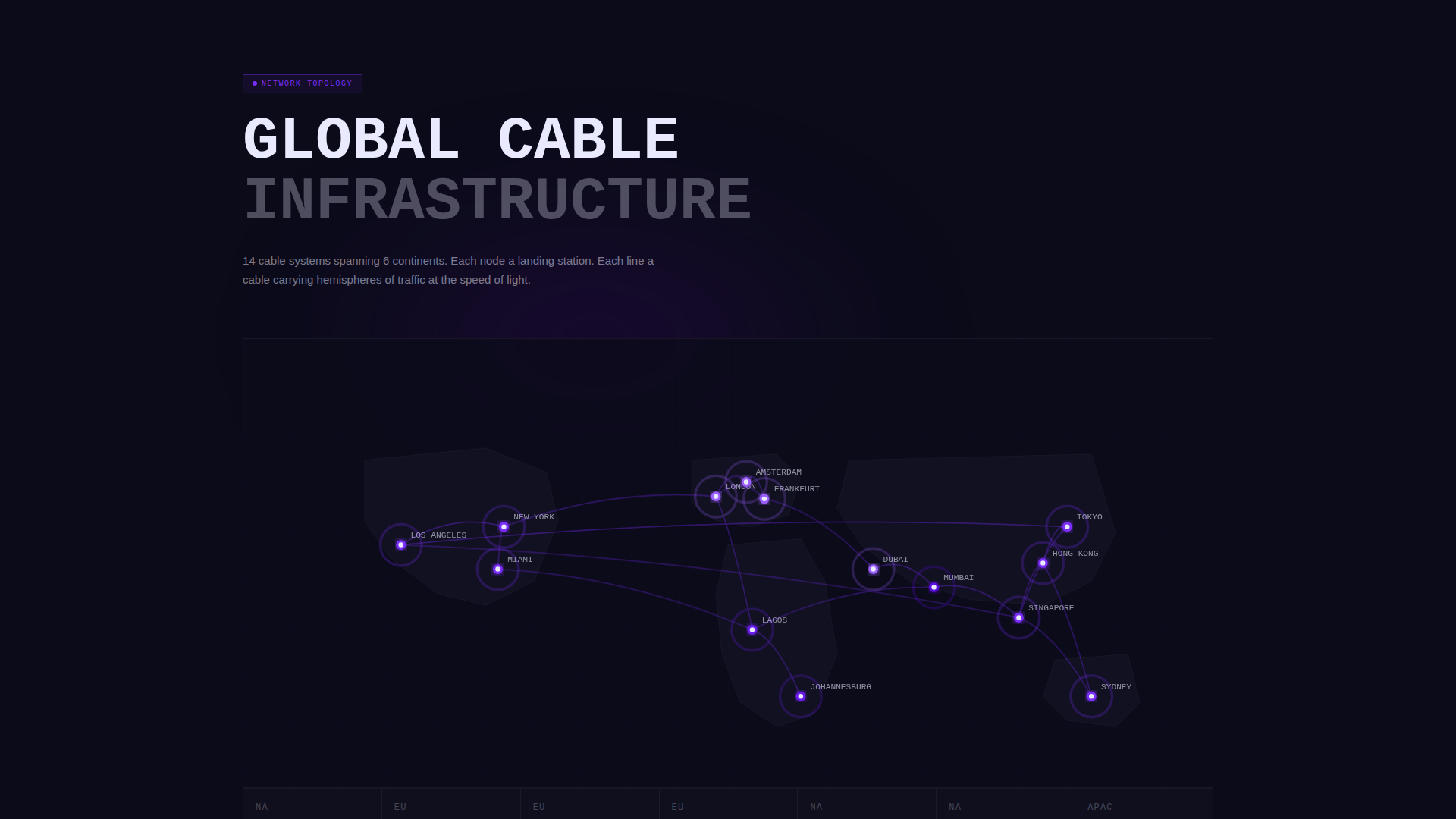
Network Topology Map Section
The first scroll layer reveals a network topology map that fades in node by node. Each landing station activates with a violet ping as it appears. This section communicates geographic reach and route diversity without requiring the visitor to read a single word of body copy.
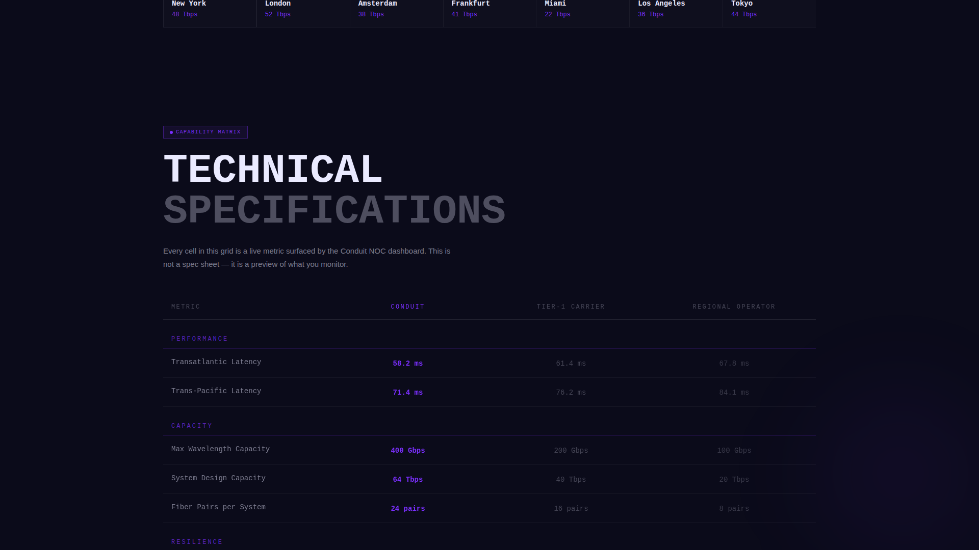
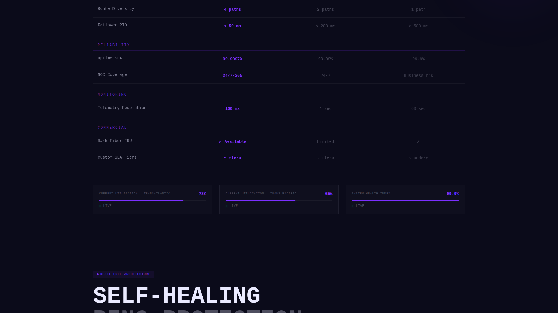
Capability Comparison Grid
The second scroll layer presents a rigid comparison grid covering latency, capacity, route diversity, and service level agreement tiers. Columns lock into position like closing bulkhead doors. Each grid cell includes a screenshot of what the monitoring app surfaces live, making the matrix a direct product preview.
Redundancy Architecture Section
The third scroll layer shows self-healing ring protection with animated failover paths. This section addresses the specific concern of hyperscale and sovereign telecom buyers who need visible proof of redundancy before committing to a route dependency.
Dual Call-to-Action Conversion Zone
The primary call to action, "Monitor Your Capacity," appears first as a ghost button in the metrics header and again as a full-width violet slab after the feature matrix. Tapping it detects the visitor's operating system and routes to the correct app store. A secondary path offers a demo request form that collects only an email address and an Autonomous System Number (ASN).
Page sections overview
| Section | Purpose |
|---|---|
| Stats Metrics Header | Establish credibility with raw infrastructure numbers |
| Topology Map Reveal | Show geographic reach node by node |
| Capability Comparison Grid | Compare latency, capacity, and service tiers |
| Redundancy Architecture | Demonstrate self-healing failover protection |
| Primary call to action Slab | Drive app download with OS-aware routing |
| Demo Request Form | Capture prospects via email and ASN input |
Design & branding system
The visual identity follows a Bold Brutalist theme built entirely around the Electric Indigo color system. There are no gradients, no soft shadows, and no section dividers. Content blocks collide directly against each other like poured concrete slabs, and every color choice is deliberate and high-contrast.
- Core palette: abyssal black (#0B0B1A) for backgrounds, deep indigo (#2E0854) for structural depth, high-voltage violet (#7B2FFF) for interactive elements and data highlights, and raw signal white (#EAEAFF) for all body and display typography
- Typography uses oversized monospaced type for metric figures, delivering a dense, technical, terminal-style reading experience
- Violet activates on hover states, loading bars, and live metric indicators, ensuring interactive moments feel charged rather than decorative
Mobile & speed optimization
The scroll reveal pattern and dense typographic layout are designed to translate cleanly across screen sizes. The template's structure prioritizes visual hierarchy over decorative complexity, keeping the mobile experience focused and fast to load.
- Oversized monospaced figures scale responsively so metric blocks remain readable on small screens without layout collapse
- The OS-detection logic on the primary call-to-action button routes mobile visitors directly to the correct app store without extra steps
- Animation triggers are tied to scroll position, so reveal effects fire at the right moment regardless of device or viewport height
How this template helps you convert
The conversion strategy built into this template is sequential and deliberate. Every section earns the next one, and both call-to-action paths appear at the right moment in the visitor journey.
- The stats header blocks doubt in the first three seconds by leading with verifiable infrastructure figures rather than brand claims, giving technical buyers an immediate reason to keep scrolling.
- The feature matrix acts as a product preview, showing exactly what the monitoring app surfaces live so visitors understand the value of the download before they tap the button.
- The dual call-to-action structure captures both ready-to-download customers and early-stage prospects simultaneously, without forcing either group down the wrong path.
Other information about this template
Conduit is built specifically for the submarine cable operator niche inside the broader telecom and connectivity category. It is suited for teams operating within the telecom services and platforms subcategory who need a credible, technically serious public-facing page.
- Template style: Scroll Reveal (Progressive), meaning content layers appear as the visitor moves down the page
- The demo request form is intentionally minimal, asking only for an email address and an ASN (Autonomous System Number) to reduce friction for prospects evaluating capacity options
- The template is designed for a single-page layout, making it straightforward to deploy without a full multi-page site build
- The Bold Brutalist theme and Electric Indigo color system are matched specifically to the aesthetic expectations of hyperscale cloud providers, content delivery networks, and sovereign telecom authorities
Theme
Bold Brutalist
Creative direction
Feature Matrix
Color system
Electric Indigo
Style
Scroll Reveal (Progressive)
Direction
App Download
Page Sections
Oversized Stats Metrics Header
Progressive Scroll Reveal Layout
Node-by-node Topology Map
Rigid Capability Comparison Grid
Animated Redundancy Architecture
Os-aware Dual Call-to-action Zone
Related questions
Who is this landing page template designed for?
What are the two conversion paths included in this template?
Does this template include pre-built animation or scroll effects?
Can I customize the infrastructure metrics shown in the header?
Is this template suitable for a team without a full website?