Connect - Reliable Internet Landing Page Template
Connect is a bento grid landing page template built for regional cable internet providers. It uses a Tech Glass visual identity with a Carbon Fiber color system to present speed tiers, pricing, equipment details, and contract terms in an asymmetrical card layout. The goal is simple: show every decision-making detail upfront, then earn the address input with one clear call to action.
by Rocket studio
Quick summary
Connect is a single-page bento grid template designed for cable internet providers. It opens with a logo bar of familiar app and platform icons, then lays out plan details across interactive cards. The primary call to action is an address-check field that leads visitors to a personalized plan page. Everything is built to reduce hesitation and make the next step feel obvious.
Who this template is for
This template is built for regional cable and fiber-hybrid internet providers who need a landing page that sells on clarity rather than hype. It works best when your audience already knows what they want and just needs to confirm it is available at their address.
- Internet service providers offering tiered speed plans to residential households
- Regional providers serving remote workers, gaming households, and multi-device families
- Marketing teams who want a polished, conversion-focused page without a complex build
What problem this template solves
Most internet provider pages bury the useful details under hero imagery and vague promises. Visitors arrive with specific questions about speed, price, equipment, and contract terms, and they leave frustrated when those answers are hard to find.
- Scattered plan information forces visitors to hunt across multiple pages before they can decide
- Generic layouts fail households with very different needs, from low-latency gaming to all-day video calls
- Weak calls to action do not create enough momentum to get the address input that drives conversions
What you get with this template
You get a fully structured bento grid landing page with every key decision-making section already in place. The layout is asymmetrical by design, with larger cards handling interactive content and smaller cards delivering single, punchy stats.
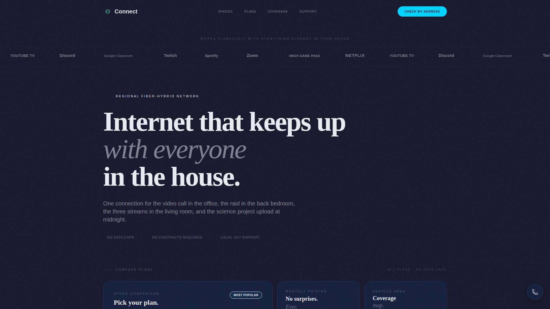
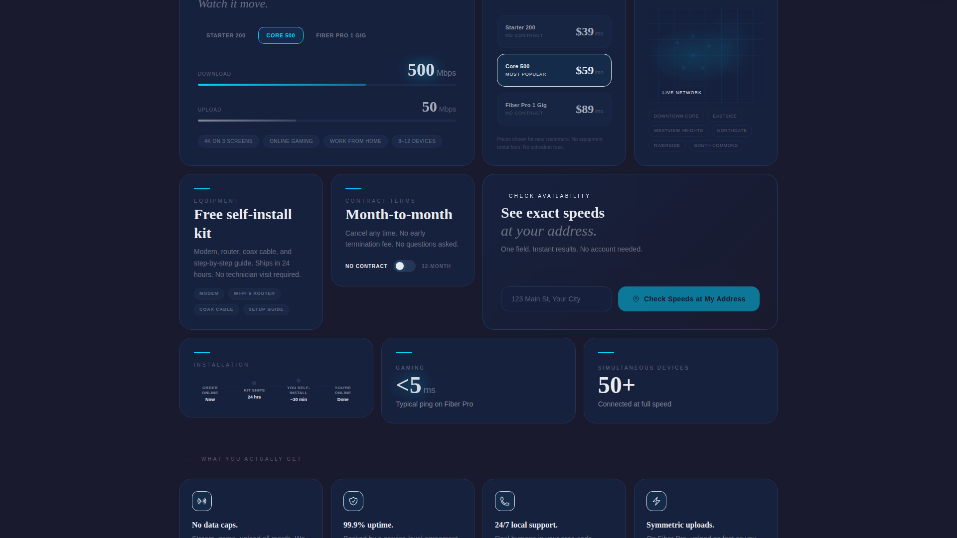
- An interactive speed comparison section where visitors toggle between plans and watch download and upload numbers animate in electric cyan
- Single-stat cards covering essentials like no data caps, a free self-install kit, and 24/7 local support
- A pinned mobile call-to-action bar and embedded desktop address-check fields inside the two largest cards
Feature list
This section covers the core functional and visual capabilities built into the Connect template.
Bento Grid Card Layout
The page breaks into asymmetrical cards of varying sizes below the header. Larger cards hold richer interactive content while smaller cards display single stats. The grid tightens as visitors scroll, mimicking the feeling of narrowing a choice down to one obvious answer.
Interactive Speed Tier Toggle
Visitors can switch between available speed plans directly on the page. Download and upload numbers animate in electric cyan as each plan is selected, making speed differences immediately tangible without requiring a separate comparison page.
Logo Bar Header
The header opens with a horizontal strip of recognizable platform icons rendered in frosted white against carbon black. This proves broad compatibility before any written claim is made, building instant recognition and trust at the top of the page.
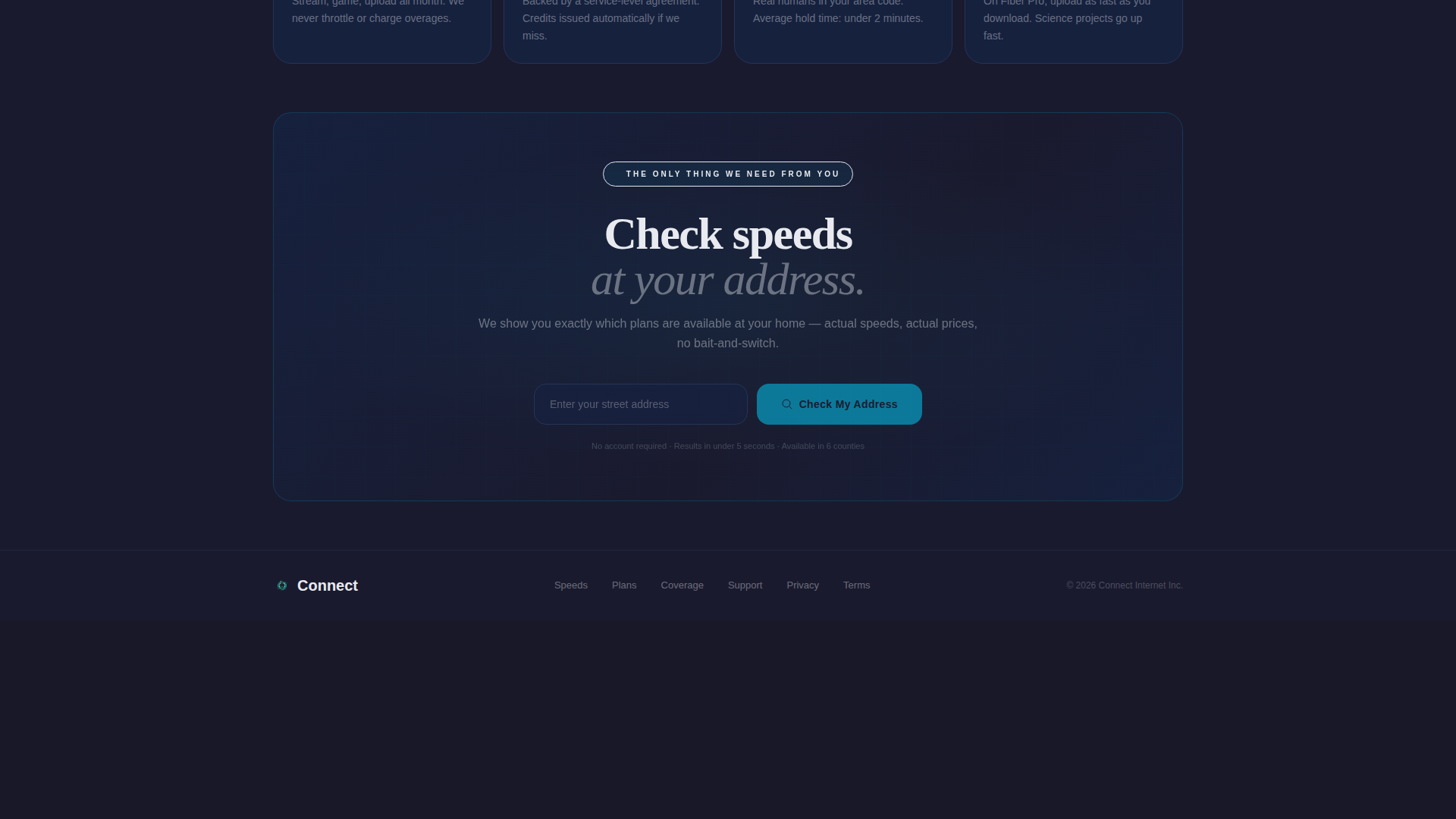
Pinned Address-Check Call to Action
The primary call to action is a single street address field with autocomplete. On mobile it is pinned to the bottom of the viewport. On desktop it is embedded inside the two largest bento cards. Clicking through takes the visitor to a personalized plan page based on their exact location.
Floating Local Call Button
A secondary conversion element sits as a floating button with a local area code displayed. It gives visitors a direct, low-friction path to speak with someone without leaving the page or digging for contact information.
Coverage and Plan Detail Cards
Dedicated cards cover each decision dimension: speed tiers, monthly price, included equipment, contract terms, installation timeline, and a coverage map. Each card is focused on one topic, keeping the layout scannable and the information easy to compare.
Page sections overview
| Section | Purpose |
|---|---|
| Logo Bar Header | Establish platform compatibility at a glance |
| Headline Block | Anchor the page with one clear positioning statement |
| Speed Tier Cards | Let visitors compare plans interactively |
| Pricing Detail Cards | Show monthly cost clearly per plan |
| Equipment Info Card | Confirm free self-install kit inclusion |
| Contract Terms Card | Address commitment concerns upfront |
| Installation Timeline Card | Set realistic expectations for setup |
| Coverage Map Card | Show service area visually |
| Single-Stat Cards | Highlight no data caps and 24/7 support |
| Address Check call to action | Capture address input and drive click-through |
| Floating Call Button | Provide a direct local contact option |
Design & branding system
The Connect template uses a Tech Glass theme built on a Carbon Fiber color system. The palette is engineered to feel cool, dense, and modern, like the surface of a matte-black smartphone running at full performance.
- Deep carbon black (#1A1A2E) and woven graphite (#16213E) form the background and card surfaces, while frosted glass white (#E8EAF0) carries all body text and plan names
- Electric cyan (#00D4FF) activates on hover states, toggle switches, and download-speed animations, firing through the layout like a pulse through fiber optic cable
- All type is set in oversized medium-weight styling for the headline, with clean body text on every card to keep the layout scannable at any scroll depth
Mobile & speed optimization
The template is built with mobile users in mind from the start. The bento grid adapts to smaller screens, and the primary call to action is always visible without scrolling.
- The address-check call to action is pinned to the bottom of the viewport on mobile, so it is always one tap away regardless of scroll position
- The grid layout tightens on smaller screens, keeping cards dense and readable without sacrificing the asymmetrical structure that makes the desktop version distinct
How this template helps you convert
The Connect template is engineered around one conversion goal: get the address input. Every design and layout decision works toward that single action.
- The logo bar and single-stat cards handle objections silently, confirming compatibility, equipment inclusion, and support quality before a visitor even reads the headline
- The interactive speed toggle makes plan differences tangible and personal, so visitors arrive at the address field already knowing which plan they want
- The pinned call-to-action bar on mobile and the embedded address fields on desktop mean the next step is always visible, reducing the friction between intent and action
Other information about this template
The Connect template is a strong fit for regional providers who want a page that feels enterprise-grade without requiring a large development team to build or maintain it.
- The template is built as a single-page bento grid, so all content lives in one scrollable layout rather than across multiple linked pages
- The floating call button displays a local area code, which reinforces a regional, community-focused brand identity rather than a generic national carrier feel
- The overall design aesthetic, a Tech Glass theme with a Carbon Fiber palette, positions the provider as a technically capable and modern brand without relying on flashy imagery

Theme
Tech Glass
Creative direction
Feature Matrix
Color system
Carbon Fiber
Style
Bento Grid
Direction
Click-Through
Page Sections
Bento Grid Card Layout
Interactive Speed Tier Toggle
Logo Bar Header
Pinned Address-check Call to Action
Floating Local Call Button
Decision-focused Stat Cards
Related questions
What kind of internet provider is this template designed for?
Can I display multiple speed plans on the same page?
How does the address-check call to action work?
Is there a direct contact option for visitors who prefer to call?
What makes the bento grid format effective for a cable internet provider page?