Investigative Ethics Blog Landing Page Template
Conscience is a hub-and-spoke landing page template built for ethical consumer journalism. It presents as a broadsheet-style digital publication with a sticky anchor navigation, three editorial content rooms covering Wardrobe, Pantry, and Home, and a torn-paper-edge email signup strip. The warm Ink and Paper design makes investigative storytelling feel as welcoming as a Sunday morning read.
by Rocket studio
Quick summary
Conscience is a single-page editorial landing page template designed for ethical consumer blogs and investigative supply-chain journalism. It uses a broadsheet newspaper aesthetic, a sticky anchor navigation, and three themed content rooms to guide readers from global supply chains down to their own household shelves. It is built to convert browsers into committed readers.
Who this template is for
This template suits editorial publishers, independent journalists, and sustainability-focused content creators who need a structured, beautiful home for investigative writing. It works especially well for publications that cover consumer ethics, supply chains, or conscious living.
- Ethical consumer journalists and solo investigative writers
- Sustainability blogs covering food, fashion, or household products
- New media publications targeting label-reading, transparency-minded readers
What problem this template solves
Most blog templates feel generic. They give you a header, a post grid, and a footer. Conscience solves the problem of presenting investigative long-form content in a way that earns trust before the reader even clicks through to a full article.
- Readers need enough of the story up front to feel compelled to read more
- Standard blog layouts break the editorial mood that investigative writing requires
- There is no natural way to group supply-chain stories by life category on a typical blog
What you get with this template
You get a fully structured landing page with a broadsheet masthead, three editorial content rooms, a sticky navigation bar, and a dedicated email signup strip. Every section is designed to hold the reader's attention through immersive editorial layout choices.
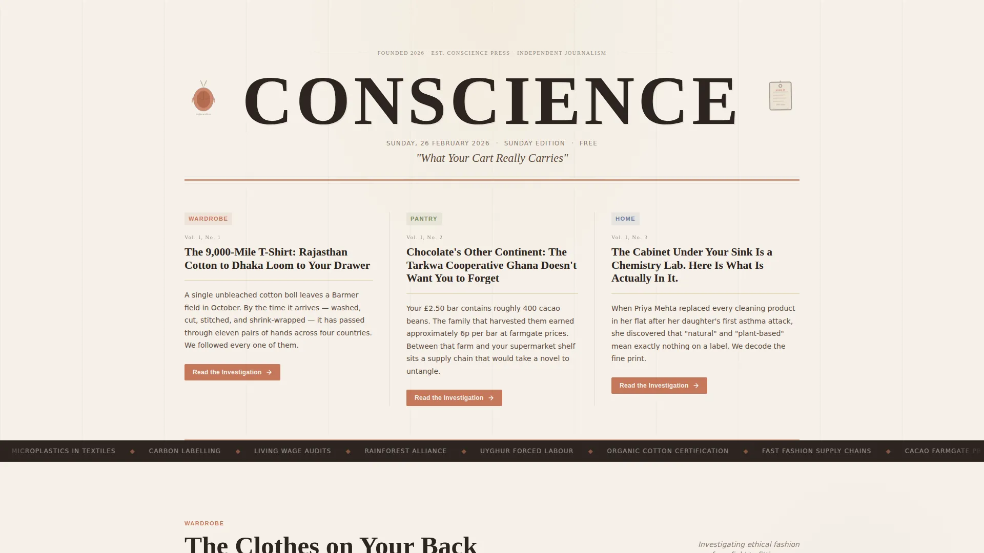
- A full-width newspaper masthead with asymmetric headline columns and category slugs
- Three scrollable content rooms: Wardrobe, Pantry, and Home, each with framed story cards
- A torn-paper-edge email signup strip labeled "Get the Sunday Edition"
Feature list
The template is built around a small set of carefully considered features. Each one serves the editorial experience and the conversion goal without adding unnecessary complexity.
Broadsheet Masthead Header
The header is styled as a full-width newspaper masthead. "CONSCIENCE" appears in a large high-contrast serif at broadsheet scale. A dateline tagline reading "What Your Cart Really Carries" sits beneath it, flanked by two column teasers with woodcut-style coffee cherry and garment tag illustrations.
Sticky Anchor Navigation
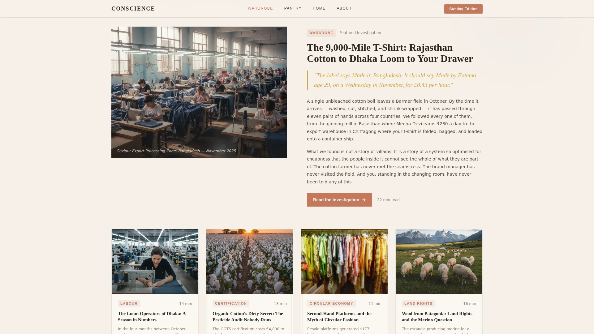
A sticky navigation bar sits below the masthead fold line. It lets readers jump directly to any of the three content rooms: Wardrobe, Pantry, or Home. Active links are marked with a pencil-underline gold indicator, and hover states use the same gold accent to reinforce orientation.
Gallery Walk Content Rooms
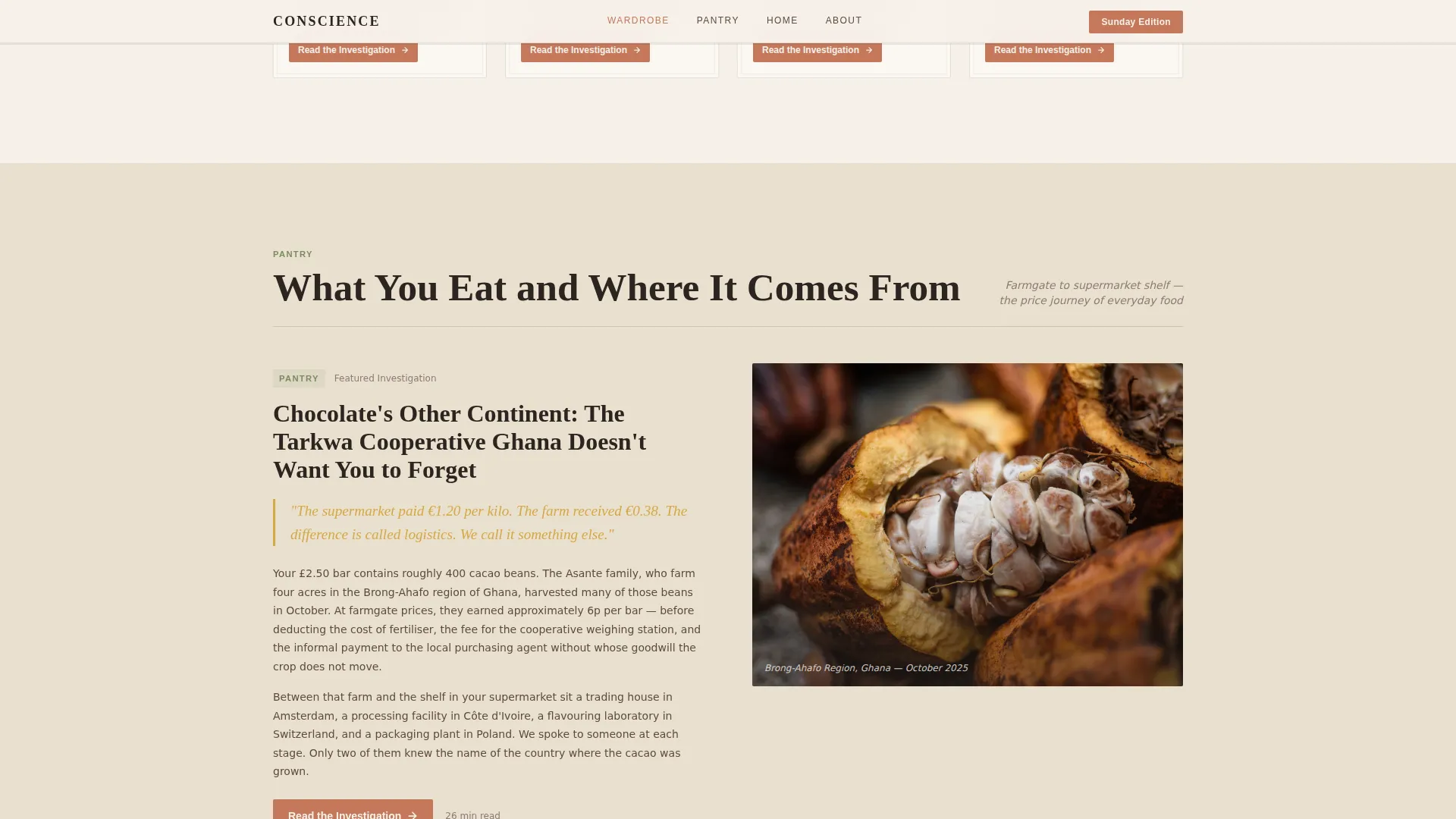
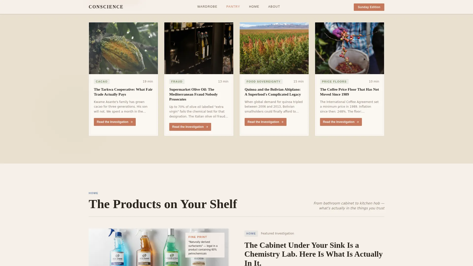
Each content room is structured as an editorial gallery space. Rooms open with a large editorial image and a short investigative lede, then present a grid of three to four story cards. Pull quotes appear in pencil gold. The experience moves from global supply chains to the reader's own bathroom shelf as they scroll.
Investigation Excerpt Hooks
Every featured story card surfaces the first two paragraphs of the full investigation directly on the landing page. This gives readers enough context to feel the story's pull without delivering the complete piece, encouraging click-throughs to the full article.
Terracotta Call-to-Action Buttons
Each story card ends with a primary call-to-action button labeled "Read the Investigation," styled in terracotta. This reinforces the visual identity while creating a consistent and recognizable conversion moment across all three content rooms.
Email Signup Strip
A torn-paper-edge strip sits at the bottom of the page. It carries the label "Get the Sunday Edition" with a single email input field and a submit button labeled "Deliver It." This secondary conversion path captures readers who browsed the full page but are not yet ready to click into a single article.
Page sections overview
| Section | Purpose |
|---|---|
| Newspaper Masthead | Establishes the publication brand and sets the broadsheet editorial tone |
| Headline Story Columns | Presents three asymmetric teaser columns with category slugs in small caps |
| Wardrobe Room | Showcases ethical fashion investigations with framed editorial spreads |
| Pantry Room | Features food supply chain stories with pull quotes and story cards |
| Home Room | Investigates household products and draws the reader toward their own shelf |
| Email Signup Strip | Captures newsletter subscribers with a "Get the Sunday Edition" prompt |
Design & branding system
The visual identity uses an Ink and Paper theme built on a Warm Stone color system. Every color choice references printed matter: unbleached newsprint, dried ink, terracotta margin notes, and a pencil-underline gold for interactive states. The result feels warm without being soft and serious without being sterile.
- Colors: newsprint white (#F5F0E8), dried ink dark (#2C2420), terracotta accent (#C4785B), parchment alternate (#EAE0D0), and gold hover (#D4A843)
- Typography: Fraunces serif for all headlines and display text, DM Sans for body copy and interface elements
- Backgrounds alternate between newsprint and a slightly deeper parchment tone, with generous line spacing throughout
Mobile & speed optimization
The template is designed desktop-first to honor the Sunday morning broadsheet reading experience. It scales responsively to smaller screens so the editorial content remains accessible on any device.
- Layouts reflow from asymmetric broadsheet columns to single-column mobile stacks
- Scroll-reveal animations, floating elements, and a marquee scroll effect are included at medium intensity
- Static server-rendered content keeps initial page load clean and reduces unnecessary client-side work
How this template helps you convert
The conversion strategy is built into the editorial experience itself. Readers are not pushed toward a signup or click. They are drawn in through the quality and intimacy of the content that is already on the page.
- Investigation excerpt hooks give away the first two paragraphs of each story, creating genuine curiosity and earning the "Read the Investigation" click without hard selling
- The sticky anchor navigation keeps readers oriented across the page, reducing drop-off as they move between the Wardrobe, Pantry, and Home rooms
- The "Get the Sunday Edition" email strip captures readers at the natural end of their scroll journey, when their interest in the publication is at its highest
Other information about this template
This template is a strong fit for ethical consumer publications that cover topics like supply-chain transparency, conscious shopping, and sustainable living. It is equally useful for solo writers launching a new investigative publication or for established editorial teams wanting a dedicated content hub page.
- The template style is Hub and Spoke with anchor navigation, meaning every content room links back to a central orientation point
- The landing page direction is Click-Through, optimized to move readers from teaser content to full-length investigations
- The header concept is a Newspaper Publication layout, making it a natural fit for content-first brands in the ethical journalism space
- Localization details in the brief reference English-language content with INR and USD currency context and a DD Month YYYY date format, suitable for India-facing or globally-focused publications
- Interactivity includes accordion components, hover state transitions, and a sticky navigation bar that keeps the reader's place across all rooms
Theme
Ink & Paper
Creative direction
Gallery Walk
Color system
Warm Stone
Style
Hub & Spoke (Anchor Nav)
Direction
Click-Through
Page Sections
Broadsheet Masthead Header
Sticky Anchor Navigation
Gallery Walk Content Rooms
Investigation Excerpt Hooks
Terracotta Story Card Buttons
Torn-paper Email Signup Strip
Related questions
Can I change the three content rooms to different topics?
Does the template include the actual article content?
Is this template suitable for a solo writer or a small team?
How does the email signup section work?
Can I adjust the color palette or typography?



