Entertainment Blog & Media Booking Website Template
The Byline editorial craft how-to blog landing page template is a masonry-style, waitlist-ready landing page for an entertainment craft publication. It pairs a half-page photo-and-text hero with a staggered content-category grid, a sticky "Hold My Spot" call-to-action bar, and a warm Parchment and Rust color system that feels like a well-worn magazine pulled from a used bookstore shelf.
by Rocket studio
Quick summary
Byline is a single-page, waitlist-focused landing page template built for an entertainment craft blog. It blends editorial magazine aesthetics with practical conversion design. The layout uses a masonry grid to present content pillars, a sticky call-to-action bar, and a minimal waitlist form. Everything on the page is crafted to make visitors feel they have already read the publication before they even sign up.
Who this template is for
This template was designed for creative founders, editorial teams, and independent writers who want to launch a craft-focused blog with a strong visual identity before their first post goes live. If you are building a publication around a specific niche, this layout gives your ideas a home that looks and feels authoritative from day one.
- Aspiring screenwriters who want to write and publish a blog teaching pilot structure, scene blocking, and story craft
- Bedroom DJs, sound designers, and music-focused writers building a blog around the practical side of their creative process
- Theater students, directors, and early-career entertainment workers who want to share expertise and grow an audience before they launch
What problem this template solves
Starting a blog in a crowded niche is hard. Most writers stall at the blinking cursor stage because the page looks empty before there is enough content to fill it. A waitlist landing page solves this by letting you establish your voice, present your content verticals, and collect readers before you publish a single full blog post.
- Writers lose momentum when their site looks unfinished. This template makes the blog feel alive and credible the moment it loads, using a grid of category cards as visual proof of what is coming.
- Readers need a reason to sign up before they can read anything. The editorial layout and two-sentence mission statements for each craft vertical do the persuasion work so your waitlist form does not have to.
- Founders often overthink the writing process before launch and delay going live. This template gives a clear, focused structure so you can start writing content and collect emails at the same time.
What you get with this template
You get a complete, single-page editorial landing page ready to customize and launch as a waitlist collection site for your craft blog. Every section is built to serve a specific purpose in the visitor journey, from first impression to signup. The page is structured around a clear blog post outline logic: hook first, then proof, then a single call to action.
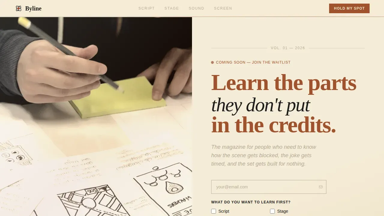
- A half-page photo-and-text hero section with an editorial headline, italic subhead in pencil-margin gray, and a lone waitlist email field
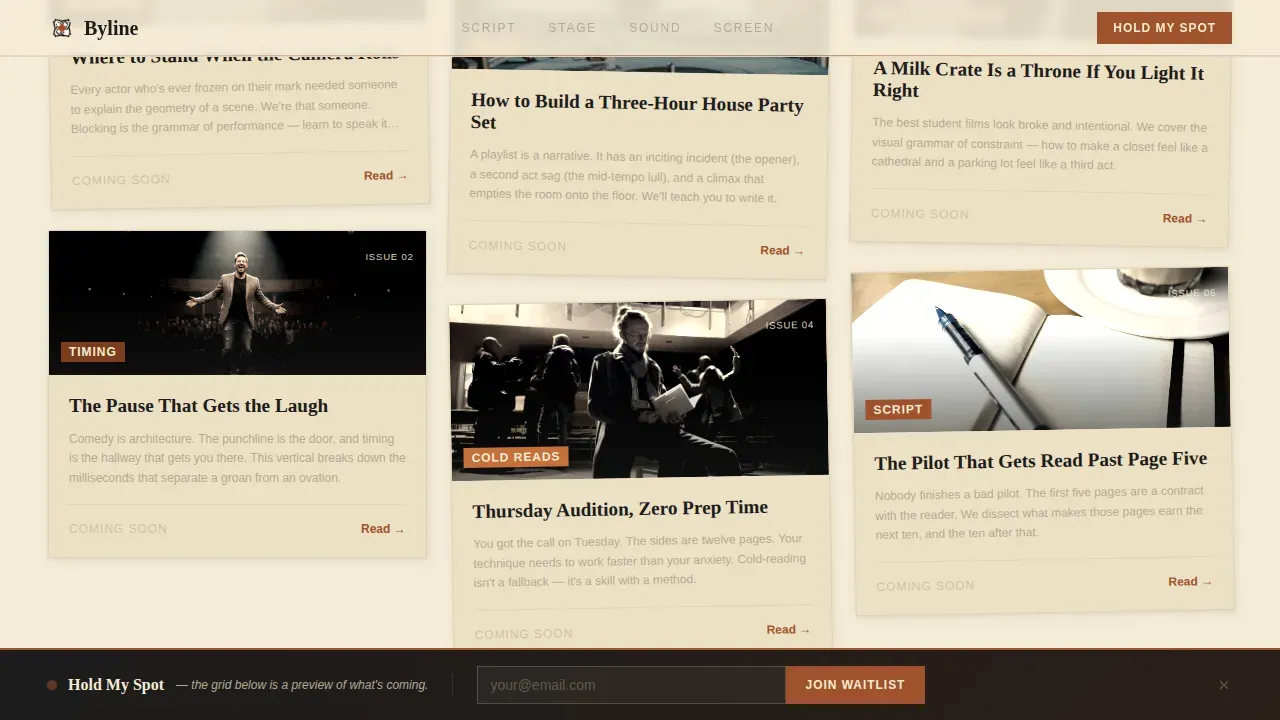
- A masonry grid of five content-category cards styled as magazine cover thumbnails, each carrying a two-sentence mission statement for that craft vertical
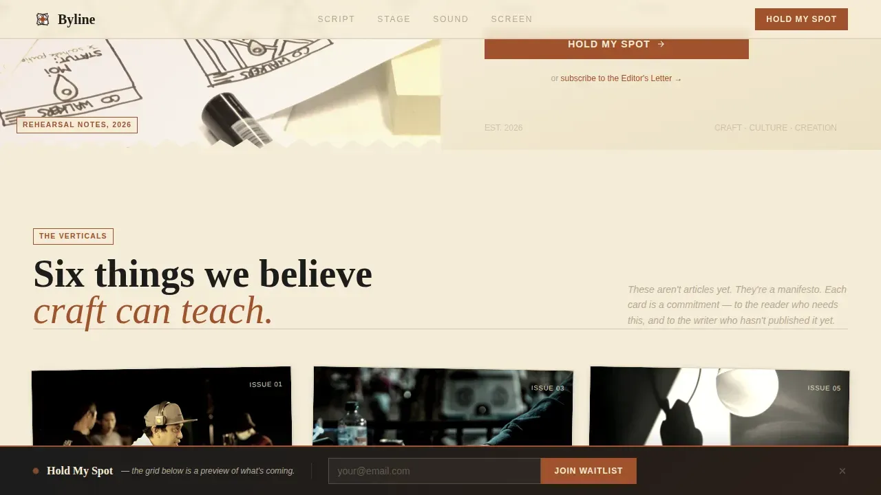
- A sticky "Hold My Spot" bottom bar that appears after the third scroll depth, plus an RSS-style secondary subscribe path labeled "Subscribe to the Editor's Letter"
Feature list
Every feature in this template is drawn directly from the project brief. Nothing is speculative. Each component was chosen to support the core goal: give aspiring writers, creators, and craft enthusiasts a reason to trust the blog and join the waitlist.
Half-Page Editorial Hero
The hero uses a split layout. The left side holds a grainy, high-contrast photograph of a hand scribbling blocking notes on a rehearsal script. The right side carries a large condensed serif headline, an italic gray subhead, and a single email field. This composition puts the headline, author byline area, and key summary in the first screen view, which is where credibility must be established. The design principle here mirrors editorial best practice: establish authority at the top of the page before asking for anything.
Masonry Category Grid
The manifesto grid is the heart of the page. Five content-category cards are styled as magazine cover thumbnails and staggered at different heights, like pinned tearsheets on a corkboard. Categories include Blocking, Timing, Mixing, Cold Reads, and Set Design on $0. Each card carries a two-sentence mission statement for that vertical. The grid tells readers what the blog is about without a single full article being live. It makes the blog's content feel real and worth waiting for.
Sticky Waitlist Call-to-Action Bar
A sticky bottom bar labeled "Hold My Spot" appears after the visitor reaches the third scroll depth. This is a deliberate pacing decision. By the time the bar appears, the visitor has already seen the hero, read the category missions, and built enough interest to act. The waitlist form asks only for an email address and a single checkbox grid asking what the reader wants to learn first, with options for Script, Stage, Sound, and Screen. The form is intentionally minimal to reduce friction.
RSS-Style Editor's Letter Subscribe Path
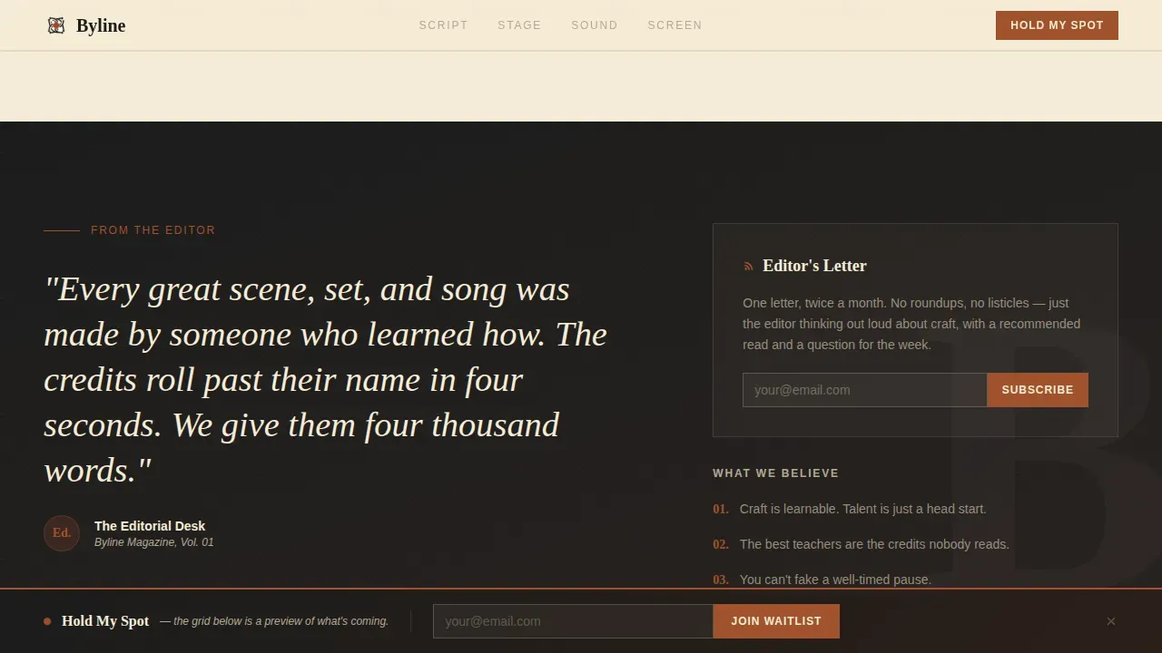
A secondary conversion path lets visitors subscribe to the Editor's Letter through an RSS-style link. This gives readers who are not ready to commit to the full waitlist a softer entry point. It also sets up the habit of reading the blog on a regular basis before the first issue drops. From a content marketing standpoint, this secondary path widens the top of the funnel without adding visual noise to the primary call to action.
Editorial Parchment and Rust Color System
The color system uses four values: aged paper cream at #F5ECD7 for the background, oxidized iron at #A0522D for headlines and hover states, inkwell black at #1C1C1C for body text, and pencil-margin gray at #B5A994 for metadata and dividers. Using a limited color palette is a key element of clear editorial-style layout design. The palette keeps the site focused, reduces cognitive load, and signals the vintage Esquire reference point the brief called for.
Fraunces and DM Sans Typography Pairing
The template uses Fraunces for all serif headlines and DM Sans for body text and user interface elements. This is a deliberate pairing. Using a serif font for headings conveys authority and elegance. Pairing it with a clean sans-serif body font enhances readability across screen sizes. Limiting design to these two high-quality typefaces improves legibility and evokes a traditional print feel. The layout also respects a narrower reading width that keeps line lengths comfortable for long-form editorial content.
Page sections overview
| Section | Purpose |
|---|---|
| Hero split layout | Introduces the editorial headline and collects waitlist emails |
| Manifesto category grid | Presents the five craft verticals as magazine cover thumbnails |
| Craft verticals showcase | Highlights the five pillars with asymmetric layout and mission statements |
| Editor's Letter block | Delivers a quote-style social proof element and RSS subscribe link |
| Sticky call-to-action bar | Resurfaces "Hold My Spot" after the third scroll depth |
| Footer horizontal flow | Closes the page with navigation and secondary links |
Design & branding system
The design language is vintage editorial. It draws from the visual grammar of print magazines, letterpress texture, and the feeling of reading something that was made carefully by hand. Every color and type choice reinforces the idea that craft is worth serious attention. The goal is to make readers feel the blog already exists and is worth reading right now.
- Parchment cream (#F5ECD7) dominates the background like uncoated paper stock; rust (#A0522D) commands every headline and hover state; inkwell black (#1C1C1C) anchors body text; pencil gray (#B5A994) softens dividers and metadata into quiet accents between cards
- Fraunces condensed serif headlines set the editorial tone; DM Sans handles body text and interface labels with clarity; the pairing follows the print convention of pairing a display serif with a utilitarian sans-serif
- Staggered card reveals, hover states on category cards, and a scroll-depth-triggered sticky bar add medium animation depth without distracting from the editorial reading experience
Mobile & speed optimization
The template was designed mobile-first. The brief explicitly notes that target readers are on their phones in coffee shops, which means the layout has to work at small screen sizes before it scales up to a desktop editorial spread. Nearly 83 percent of visitors to lifestyle and creative blogs arrive from mobile devices, so easy tap targets and readable type at small sizes are not optional.
- The masonry grid reflows for mobile viewports, keeping cards readable and tap-friendly without losing the staggered editorial feel
- The sticky "Hold My Spot" bar is sized for thumb interaction on mobile screens, and the waitlist form uses a single email field plus a checkbox grid to minimize typing effort
- Server components are used for static content sections and JavaScript is kept minimal, which supports faster initial page loads across devices
How this template helps you convert
The entire page is structured around a single conversion goal: get the visitor to join the waitlist. Every design and copy decision leads toward that moment. The page earns the signup by making the visitor feel they have already experienced the blog before they commit.
- The hero section establishes the editorial voice and presents the waitlist field immediately, so visitors who arrive ready to act can sign up without scrolling; the headline "Learn the parts they don't put in the credits" tells readers exactly what the blog is about in one sentence
- The masonry category grid builds conviction by showing the blog's content verticals in detail; each card functions as a mini blog post outline for that vertical, giving readers a clear picture of what they will get when the blog launches
- The sticky bar closes the loop; after the visitor has scrolled through the hero and the grid, the "Hold My Spot" prompt reappears at exactly the right moment, when interest is highest and the decision to act feels natural
Other information about this template
This template is well-suited for any creative niche where the blog's content needs to feel credible before a single full post goes live. The same concept applies equally to a food craft blog, a photography technique site, or a design process publication. The waitlist model works because blogging is a powerful way to drive web traffic over time, but that traffic has to start somewhere. A well-designed landing page is where that process begins.
Craft blogs that want to grow need a strategy beyond just publishing. Using keyword research to find what your target audience is already searching for is one of the most reliable ways to generate topic ideas that resonate. A solid blog post outline for each article, with effective headings and a clear writing process from introduction to conclusion, helps you write articles that both readers and search engines reward. Search engine optimization built into your blog post structure, from the page title to the featured image alt text, helps your posts appear in search results over time.
Writers who want to establish themselves as a thought leader in their niche should also think about how content marketing works across channels. Sharing each new blog post on social media, cross-linking to other websites in your vertical, and inviting comments on every article all build the kind of community that turns one-time visitors into loyal readers. Guest posting on other websites in the entertainment and creative arts space can also help build backlinks that improve your site's standing with search engines on a regular basis.
The Byline template is built to support all of this from the moment you launch. It gives you a home for your blog that signals expertise and invites readers in, even before your first article is ready to publish.
- This template is ideal for blog writers who want to avoid writer's block during the pre-launch phase by giving the site a finished, credible look before any posts go live
- The masonry grid layout keeps the blog's home page visually organized and makes it easy for visitors to identify the content categories they are most interested in
- The Editor's Letter subscribe path is a free resource entry point that lets readers opt in at a lower commitment level, which is a helpful content marketing tactic for early-stage blogs
- Writers can use the five craft-vertical cards as a blog post outline framework, turning each category mission statement into a series of in-depth articles over time
- The template supports a clear writing process for the blog operator: define your verticals, write a post for each, link each post back to the landing page, and build from there
- For writers who want to grow beyond the blog, the same structure can support a YouTube channel, a podcast, or a course by swapping out the category cards and calls to action
- Social media promotion, including a twitter account and facebook page for the publication, can link back to this landing page to funnel new readers into the waitlist
- The blog's content pillars as defined in this template (Script, Stage, Sound, Screen) double as content marketing categories that are easy to explain to readers and to pitch to other websites for guest contributions
- Including industry lingo in the article titles and card mission statements, such as "blocking," "cold reads," and "set design," helps the blog rank for specific google search terms that aspiring creators are already typing into search engines
- Expert writers and experienced craft educators launching a new publication will find this template gives them the credibility signals they need: clean layout, strong typography, and a focused single-page goal that does not overwhelm first-time visitors
Theme
Editorial Magazine
Creative direction
Vision & Mission
Color system
Parchment & Rust
Style
Masonry/Pinterest
Direction
Waitlist/Coming Soon
Page Sections
Half-page Editorial Hero with Waitlist Field
Staggered Masonry Category Grid
Scroll-depth Sticky Call-to-action Bar
Minimal Waitlist Form with Checkbox Grid
Editor's Letter Secondary Subscribe Path
Editorial Parchment and Rust Visual Identity
Related questions
Can I use this template before I have any blog posts written?
How does the waitlist form work?
Is the sticky call-to-action bar shown immediately on page load?
Can I adapt this template for a different creative niche?



